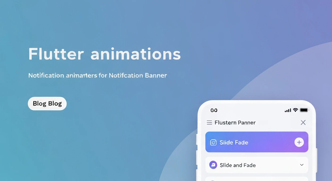

Flutter Slide & Fade Animations for Notification Banners
Creating engaging and intuitive user interfaces is paramount in modern application development. In Flutter, animations play a crucial role in achieving this, transforming static experiences into dynamic and delightful ones. Notification banners, in particular, benefit immensely from well-crafted animations, providing clear visual cues without being intrusive. This article delves into implementing a professional-grade slide and fade animation for notification banners in Flutter, enhancing the user experience with smooth transitions.
The Importance of Animated Notification Banners
A notification banner's primary purpose is to convey important, often temporary, information to the user. Without animation, a banner's sudden appearance and disappearance can be jarring. Animations like sliding and fading offer several advantages:
- Improved User Experience: Smooth transitions make the interface feel more polished and responsive.
- Enhanced Clarity: Animations guide the user's eye, making it clear when a new element appears or an existing one departs.
- Reduced Cognitive Load: Gradual changes are easier for the brain to process than abrupt ones.
- Modern Aesthetic: Animated UIs are a hallmark of contemporary application design.
Understanding the Core Animation Components
Flutter's animation system is powerful and flexible. For our slide and fade banner, we'll primarily leverage the following:
AnimationController: Manages the animation's state (play, pause, reverse, duration, etc.). It produces values over a given duration.Tween: Defines the range of values an animation should produce (e.g., from 0.0 to 1.0 for opacity, or from one Offset to another for position).CurvedAnimation: Applies a non-linear curve to an animation, making it feel more natural (e.g., ease-out, bounce).SlideTransition: An animated widget that translates its child's position based on anAnimation.FadeTransition: An animated widget that changes its child's opacity based on anAnimation.AnimatedBuilder: A widget that rebuilds itself whenever the givenAnimationchanges value. Useful when you don't want to rebuild the entire widget tree.
Here's how an AnimationController is typically set up:
class _MyWidgetState extends State<MyWidget> with SingleTickerProviderStateMixin {
  late AnimationController _controller;

  @override
  void initState() {
    super.initState();
    _controller = AnimationController(
      vsync: this, // The TickerProvider
      duration: const Duration(milliseconds: 300),
    );
  }

  @override
  void dispose() {
    _controller.dispose();
    super.dispose();
  }
}
Step-by-Step Implementation
1. The Basic Notification Banner Widget
First, let's create a simple stateless widget for our banner's content. This helps separate concerns.
import 'package:flutter/material.dart';

class NotificationBannerContent extends StatelessWidget {
  final String message;
  final Color backgroundColor;
  final IconData icon;

  const NotificationBannerContent({
    Key? key,
    required this.message,
    this.backgroundColor = Colors.blue,
    this.icon = Icons.info_outline,
  }) : super(key: key);

  @override
  Widget build(BuildContext context) {
    return Material(
      color: backgroundColor,
      child: Padding(
        padding: const EdgeInsets.symmetric(horizontal: 16.0, vertical: 12.0),
        child: Row(
          children: [
            Icon(icon, color: Colors.white),
            const SizedBox(width: 12),
            Expanded(
              child: Text(
                message,
                style: const TextStyle(color: Colors.white, fontSize: 16),
                overflow: TextOverflow.ellipsis,
              ),
            ),
          ],
        ),
      ),
    );
  }
}
2. Implementing the Slide Animation
We'll create a StatefulWidget that manages the animation controller and uses SlideTransition. The banner will slide from the top of the screen into view.
class AnimatedNotificationBanner extends StatefulWidget {
  final String message;
  final Color backgroundColor;
  final IconData icon;
  final Duration displayDuration;
  final VoidCallback? onDismissed;

  const AnimatedNotificationBanner({
    Key? key,
    required this.message,
    this.backgroundColor = Colors.blue,
    this.icon = Icons.info_outline,
    this.displayDuration = const Duration(seconds: 3),
    this.onDismissed,
  }) : super(key: key);

  @override
  _AnimatedNotificationBannerState createState() => _AnimatedNotificationBannerState();
}

class _AnimatedNotificationBannerState extends State<AnimatedNotificationBanner>
    with SingleTickerProviderStateMixin {
  late AnimationController _controller;
  late Animation<Offset> _slideAnimation;

  @override
  void initState() {
    super.initState();
    _controller = AnimationController(
      vsync: this,
      duration: const Duration(milliseconds: 400), // Animation entry/exit duration
    );

    // Defines the slide animation from top (-1.0) to in-view (0.0)
    _slideAnimation = Tween<Offset>(
      begin: const Offset(0.0, -1.0), // Start from just above the screen
      end: Offset.zero, // End at its natural position
    ).animate(CurvedAnimation(
      parent: _controller,
      curve: Curves.easeOutCubic, // A nice easing curve
    ));

    // Start the animation to show the banner
    _controller.forward();

    // Set a timer to dismiss the banner after displayDuration
    Future.delayed(widget.displayDuration + _controller.duration!, () {
      if (mounted) {
        _controller.reverse().then((_) {
          widget.onDismissed?.call();
        });
      }
    });
  }

  @override
  void dispose() {
    _controller.dispose();
    super.dispose();
  }

  @override
  Widget build(BuildContext context) {
    return SlideTransition(
      position: _slideAnimation,
      child: NotificationBannerContent(
        message: widget.message,
        backgroundColor: widget.backgroundColor,
        icon: widget.icon,
      ),
    );
  }
}
3. Implementing the Fade Animation
Now let's integrate a fade effect to make the appearance and disappearance even smoother. This is achieved using FadeTransition.
class _AnimatedNotificationBannerState extends State<AnimatedNotificationBanner>
    with SingleTickerProviderStateMixin {
  late AnimationController _controller;
  late Animation<Offset> _slideAnimation;
  late Animation<double> _fadeAnimation; // New fade animation

  @override
  void initState() {
    super.initState();
    _controller = AnimationController(
      vsync: this,
      duration: const Duration(milliseconds: 400),
    );

    _slideAnimation = Tween<Offset>(
      begin: const Offset(0.0, -1.0),
      end: Offset.zero,
    ).animate(CurvedAnimation(
      parent: _controller,
      curve: Curves.easeOutCubic,
    ));

    // Defines the fade animation from transparent (0.0) to opaque (1.0)
    _fadeAnimation = Tween<double>(begin: 0.0, end: 1.0).animate(
      CurvedAnimation(
        parent: _controller,
        curve: Curves.easeIn, // Fade in
        reverseCurve: Curves.easeOut, // Fade out
      ),
    );

    _controller.forward();

    Future.delayed(widget.displayDuration + _controller.duration!, () {
      if (mounted) {
        _controller.reverse().then((_) {
          widget.onDismissed?.call();
        });
      }
    });
  }

  @override
  void dispose() {
    _controller.dispose();
    super.dispose();
  }

  @override
  Widget build(BuildContext context) {
    // Combine SlideTransition and FadeTransition
    return FadeTransition(
      opacity: _fadeAnimation,
      child: SlideTransition(
        position: _slideAnimation,
        child: NotificationBannerContent(
          message: widget.message,
          backgroundColor: widget.backgroundColor,
          icon: widget.icon,
        ),
      ),
    );
  }
}
4. Triggering and Positioning the Banner
To display the banner, we can use a Stack widget, which allows layering widgets. The banner should typically be placed at the top of the screen, using Positioned.
class MyApp extends StatefulWidget {
  const MyApp({Key? key}) : super(key: key);

  @override
  State<MyApp> createState() => _MyAppState();
}

class _MyAppState extends State<MyApp> {
  bool _showBanner = false;

  void _triggerBanner() {
    setState(() {
      _showBanner = true;
    });
    // The banner itself will handle its dismissal via onDismissed callback
  }

  void _onBannerDismissed() {
    setState(() {
      _showBanner = false;
    });
  }

  @override
  Widget build(BuildContext context) {
    return MaterialApp(
      title: 'Flutter Notification Banner',
      home: Scaffold(
        appBar: AppBar(title: const Text('Animated Banner Demo')),
        body: Stack(
          children: [
            Center(
              child: Column(
                mainAxisAlignment: MainAxisAlignment.center,
                children: [
                  const Text('Tap the button to show a notification!'),
                  const SizedBox(height: 20),
                  ElevatedButton(
                    onPressed: _triggerBanner,
                    child: const Text('Show Notification'),
                  ),
                ],
              ),
            ),
            if (_showBanner)
              Positioned(
                top: 0,
                left: 0,
                right: 0,
                child: AnimatedNotificationBanner(
                  message: 'This is a success message!',
                  backgroundColor: Colors.green,
                  icon: Icons.check_circle_outline,
                  displayDuration: const Duration(seconds: 4),
                  onDismissed: _onBannerDismissed,
                ),
              ),
          ],
        ),
      ),
    );
  }
}
Full Example Code
Here's the complete, runnable code for the animated notification banner:
import 'package:flutter/material.dart';

void main() {
  runApp(const MyApp());
}

class MyApp extends StatefulWidget {
  const MyApp({Key? key}) : super(key: key);

  @override
  State<MyApp> createState() => _MyAppState();
}

class _MyAppState extends State<MyApp> {
  bool _showBanner = false;

  void _triggerBanner() {
    setState(() {
      _showBanner = true;
    });
    // The banner itself will handle its dismissal via onDismissed callback
    // You could also add a timer here to hide it from the parent state,
    // but having the banner manage its own timeout is often cleaner.
  }

  void _onBannerDismissed() {
    setState(() {
      _showBanner = false;
    });
    print('Banner was dismissed!');
  }

  @override
  Widget build(BuildContext context) {
    return MaterialApp(
      title: 'Flutter Notification Banner',
      theme: ThemeData(
        primarySwatch: Colors.indigo,
        visualDensity: VisualDensity.adaptivePlatformDensity,
      ),
      home: Scaffold(
        appBar: AppBar(title: const Text('Animated Banner Demo')),
        body: Stack(
          children: [
            Center(
              child: Column(
                mainAxisAlignment: MainAxisAlignment.center,
                children: [
                  const Text(
                    'Tap the button to show a notification!',
                    style: TextStyle(fontSize: 18),
                  ),
                  const SizedBox(height: 20),
                  ElevatedButton.icon(
                    onPressed: _triggerBanner,
                    icon: const Icon(Icons.notifications_active),
                    label: const Text('Show Notification Banner'),
                    style: ElevatedButton.styleFrom(
                      padding: const EdgeInsets.symmetric(horizontal: 24, vertical: 12),
                      textStyle: const TextStyle(fontSize: 16),
                    ),
                  ),
                ],
              ),
            ),
            // Positioned the banner at the top
            if (_showBanner)
              Positioned(
                top: 0,
                left: 0,
                right: 0,
                child: AnimatedNotificationBanner(
                  message: 'Your settings have been saved successfully!',
                  backgroundColor: Colors.green.shade700,
                  icon: Icons.check_circle_outline,
                  displayDuration: const Duration(seconds: 4), // Banner visible duration
                  onDismissed: _onBannerDismissed,
                ),
              ),
          ],
        ),
      ),
    );
  }
}


class NotificationBannerContent extends StatelessWidget {
  final String message;
  final Color backgroundColor;
  final IconData icon;

  const NotificationBannerContent({
    Key? key,
    required this.message,
    this.backgroundColor = Colors.blue,
    this.icon = Icons.info_outline,
  }) : super(key: key);

  @override
  Widget build(BuildContext context) {
    return Material(
      color: backgroundColor,
      elevation: 4.0, // Add some shadow for depth
      child: SafeArea( // Ensure content is not under status bar
        child: Padding(
          padding: const EdgeInsets.symmetric(horizontal: 16.0, vertical: 12.0),
          child: Row(
            children: [
              Icon(icon, color: Colors.white, size: 24),
              const SizedBox(width: 12),
              Expanded(
                child: Text(
                  message,
                  style: const TextStyle(color: Colors.white, fontSize: 16, fontWeight: FontWeight.w500),
                  overflow: TextOverflow.ellipsis,
                  maxLines: 2,
                ),
              ),
              // Optionally add a close button
              IconButton(
                icon: const Icon(Icons.close, color: Colors.white),
                onPressed: () {
                  // This action should trigger the banner to dismiss,
                  // usually handled by the parent or the banner itself.
                  // For this example, we'll let the auto-dismiss handle it.
                  // A more advanced setup might pass a dismiss callback here.
                },
              ),
            ],
          ),
        ),
      ),
    );
  }
}

class AnimatedNotificationBanner extends StatefulWidget {
  final String message;
  final Color backgroundColor;
  final IconData icon;
  final Duration displayDuration;
  final VoidCallback? onDismissed;

  const AnimatedNotificationBanner({
    Key? key,
    required this.message,
    this.backgroundColor = Colors.blue,
    this.icon = Icons.info_outline,
    this.displayDuration = const Duration(seconds: 3),
    this.onDismissed,
  }) : super(key: key);

  @override
  _AnimatedNotificationBannerState createState() => _AnimatedNotificationBannerState();
}

class _AnimatedNotificationBannerState extends State<AnimatedNotificationBanner>
    with SingleTickerProviderStateMixin {
  late AnimationController _controller;
  late Animation<Offset> _slideAnimation;
  late Animation<double> _fadeAnimation;

  @override
  void initState() {
    super.initState();
    _controller = AnimationController(
      vsync: this,
      duration: const Duration(milliseconds: 400), // Animation entry/exit duration
    );

    _slideAnimation = Tween<Offset>(
      begin: const Offset(0.0, -1.0), // Start from just above the screen
      end: Offset.zero, // End at its natural position
    ).animate(CurvedAnimation(
      parent: _controller,
      curve: Curves.easeOutCubic, // A nice easing curve for entry
      reverseCurve: Curves.easeInCubic, // A slight different curve for exit
    ));

    _fadeAnimation = Tween<double>(begin: 0.0, end: 1.0).animate(
      CurvedAnimation(
        parent: _controller,
        curve: Curves.easeIn, // Fade in quickly
        reverseCurve: Curves.easeOut, // Fade out smoothly
      ),
    );

    // Start the animation to show the banner
    _controller.forward();

    // Set a timer to dismiss the banner after displayDuration
    Future.delayed(widget.displayDuration + _controller.duration!, () {
      if (mounted) {
        _controller.reverse().then((_) {
          widget.onDismissed?.call();
        });
      }
    });
  }

  @override
  void dispose() {
    _controller.dispose();
    super.dispose();
  }

  @override
  Widget build(BuildContext context) {
    return FadeTransition(
      opacity: _fadeAnimation,
      child: SlideTransition(
        position: _slideAnimation,
        child: NotificationBannerContent(
          message: widget.message,
          backgroundColor: widget.backgroundColor,
          icon: widget.icon,
        ),
      ),
    );
  }
}
Conclusion and Best Practices
Implementing slide and fade animations for notification banners in Flutter significantly elevates the user experience. By gracefully appearing and disappearing, these banners become less intrusive and more effective at communicating temporary information.
Best Practices:
- Keep Durations Reasonable: Animations should be fast enough to not impede the user, but slow enough to be noticed. 300-500ms is a good range for banners.
- Choose Appropriate Curves: Experiment with different
Curves(Curves.easeOutCubicfor entry,Curves.easeInCubicfor exit, etc.) to give your animations a natural feel. - Accessibility: Ensure that important information is also accessible without relying solely on animation for understanding. Consider providing options to reduce motion for users with vestibular disorders.
- Resource Management: Always dispose of your
AnimationControllers in thedispose()method of yourStatefulWidgetto prevent memory leaks. - Modularity: Separate the banner's content from its animation logic, as demonstrated, to make components reusable and easier to maintain.
By following these guidelines and leveraging Flutter's powerful animation framework, you can create professional, fluid, and user-friendly notification banners that enhance the overall quality of your applications.


