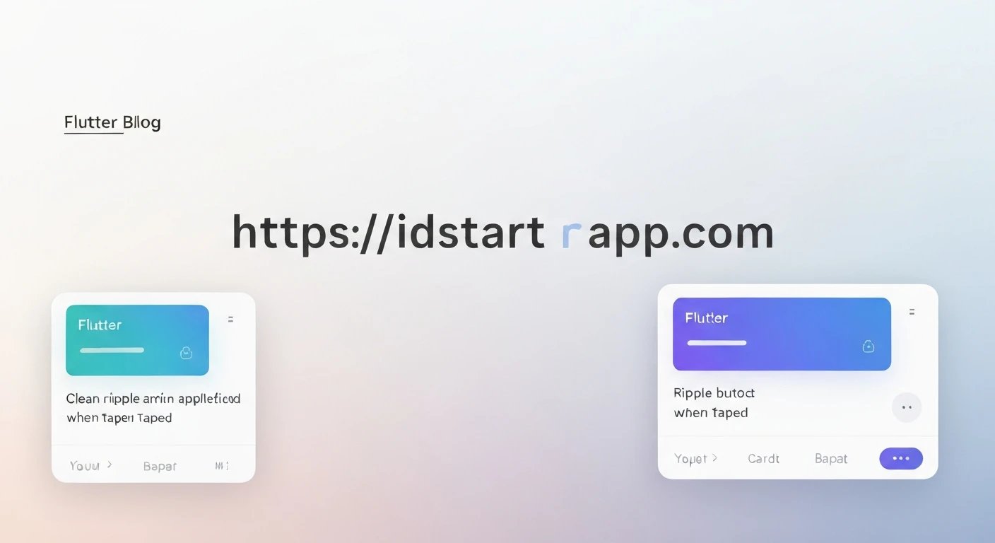

Flutter Ripple Effect Animation for Card and Button Tap
The ripple effect is a cornerstone of Material Design, providing delightful and intuitive visual feedback to users when they interact with UI elements. It simulates a wave-like expansion from the point of touch, indicating that an action has been registered. In Flutter, implementing this effect for interactive components like cards and buttons is straightforward, enhancing the user experience by making applications feel more responsive and polished.
Understanding the Ripple Effect in Flutter
Flutter's Material library provides widgets designed to easily incorporate Material Design aesthetics, including touch feedback. The core components for achieving the ripple effect are InkWell and InkResponse. These widgets work in conjunction with a Material widget (or any widget that provides a Material ancestor, like a Card or Scaffold) to paint ink effects directly onto the Material's canvas.
InkWell: A rectangular area of a Material that responds to touch. When tapped, it shows a visual ripple effect (splash) and a highlight. It's ideal for adding tap functionality to custom widgets or areas like cards.InkResponse: Similar toInkWellbut offers more granular control over the shape of the ink splash (e.g., circular) and more callbacks for various gesture types. For simple ripple effects,InkWellis often sufficient.
Implementing Ripple Effect for Cards
Cards are versatile containers for related content, often requiring tap interactions. To add a ripple effect to a Card, simply wrap its content with an InkWell widget. The Card itself is a Material widget, so it automatically provides the canvas for the ink effects.
Example: Ripple on a Card
Here's how to create a tappable card with a ripple animation:
import 'package:flutter/material.dart';

void main() {
  runApp(MyApp());
}

class MyApp extends StatelessWidget {
  @override
  Widget build(BuildContext context) {
    return MaterialApp(
      home: Scaffold(
        appBar: AppBar(title: Text('Card Ripple Effect')),
        body: Center(
          child: Card(
            elevation: 4,
            margin: EdgeInsets.all(20),
            child: InkWell(
              onTap: () {
                print('Card tapped!');
                // Perform action on card tap
              },
              // The child of InkWell is the actual content that is tappable
              child: Padding(
                padding: const EdgeInsets.all(16.0),
                child: Column(
                  mainAxisSize: MainAxisSize.min,
                  children: [
                    Icon(Icons.lightbulb, size: 40, color: Colors.amber),
                    SizedBox(height: 8),
                    Text(
                      'Tap for inspiration!',
                      style: TextStyle(fontSize: 18, fontWeight: FontWeight.bold),
                    ),
                    Text(
                      'Get a new quote every time you tap.',
                      textAlign: TextAlign.center,
                    ),
                  ],
                ),
              ),
            ),
          ),
        ),
      ),
    );
  }
}
In this example, the InkWell wraps the Padding widget, making the entire padded area responsive to taps. The ripple effect will spread across the card's surface.
Implementing Ripple Effect for Buttons
Flutter's built-in Material buttons (ElevatedButton, TextButton, OutlinedButton, FloatingActionButton, IconButton) come with the ripple effect enabled by default. When you provide an onPressed callback, the button automatically handles the visual feedback.
Example: Built-in Buttons
import 'package:flutter/material.dart';

void main() {
  runApp(MyApp());
}

class MyApp extends StatelessWidget {
  @override
  Widget build(BuildContext context) {
    return MaterialApp(
      home: Scaffold(
        appBar: AppBar(title: Text('Button Ripple Effect')),
        body: Center(
          child: Column(
            mainAxisAlignment: MainAxisAlignment.center,
            children: [
              ElevatedButton(
                onPressed: () {
                  print('Elevated Button tapped!');
                },
                child: Text('Elevated Button'),
              ),
              SizedBox(height: 20),
              TextButton(
                onPressed: () {
                  print('Text Button tapped!');
                },
                child: Text('Text Button'),
              ),
              SizedBox(height: 20),
              OutlinedButton(
                onPressed: () {
                  print('Outlined Button tapped!');
                },
                child: Text('Outlined Button'),
              ),
            ],
          ),
        ),
      ),
    );
  }
}
Implementing Ripple for Custom Buttons
If you're creating a highly customized button from scratch (e.g., a Container with specific decorations), you'll need to use InkWell or InkResponse to add the ripple effect manually. It's crucial to wrap your custom button with a Material widget if it doesn't already have a Material ancestor that can act as the canvas for the ink.
When using InkWell or InkResponse for a custom button, remember to set the borderRadius property on both the Material and the InkWell (or InkResponse) to ensure the ripple effect is clipped correctly and doesn't overflow.
Example: Ripple on a Custom Button
import 'package:flutter/material.dart';

void main() {
  runApp(MyApp());
}

class MyApp extends StatelessWidget {
  @override
  Widget build(BuildContext: context) {
    return MaterialApp(
      home: Scaffold(
        appBar: AppBar(title: Text('Custom Button Ripple')),
        body: Center(
          child: Material( // Required for InkWell to paint
            color: Colors.deepPurple,
            borderRadius: BorderRadius.circular(10.0), // Match border radius of your custom button
            child: InkWell(
              onTap: () {
                print('Custom Button tapped!');
              },
              // borderRadius must match the Material's to clip the splash correctly
              borderRadius: BorderRadius.circular(10.0),
              child: Container(
                padding: EdgeInsets.symmetric(horizontal: 40, vertical: 15),
                child: Text(
                  'Custom Ripple Button',
                  style: TextStyle(color: Colors.white, fontSize: 18),
                ),
              ),
            ),
          ),
        ),
      ),
    );
  }
}
Customizing the Ripple Effect
InkWell and InkResponse offer properties to customize the appearance of the ripple effect:
splashColor: The color of the splash ink ripple.highlightColor: The color of the highlight overlay that appears on tap down.borderRadius: Controls the shape of the ink splash, especially important for non-rectangular widgets.radius(only forInkResponse): Defines the maximum radius of the ink splash.
Example: Customized Ripple Effect
import 'package:flutter/material.dart';

void main() {
  runApp(MyApp());
}

class MyApp extends StatelessWidget {
  @override
  Widget build(BuildContext context) {
    return MaterialApp(
      home: Scaffold(
        appBar: AppBar(title: Text('Customized Ripple')),
        body: Center(
          child: Material(
            color: Colors.green,
            borderRadius: BorderRadius.circular(20.0),
            child: InkWell(
              onTap: () {
                print('Customized ripple tapped!');
              },
              splashColor: Colors.redAccent.withOpacity(0.6), // A vibrant splash color
              highlightColor: Colors.lightGreenAccent.withOpacity(0.3), // A subtle highlight
              borderRadius: BorderRadius.circular(20.0),
              child: Container(
                width: 200,
                height: 100,
                alignment: Alignment.center,
                child: Text(
                  'Custom Ripple',
                  style: TextStyle(color: Colors.white, fontSize: 20),
                ),
              ),
            ),
          ),
        ),
      ),
    );
  }
}
Conclusion
The ripple effect is a small but significant detail that greatly enhances the perceived quality and responsiveness of a Flutter application. By leveraging InkWell and InkResponse in conjunction with the Material widget, developers can easily integrate this Material Design animation into cards, custom buttons, and virtually any tappable area, creating a more engaging and user-friendly interface.


