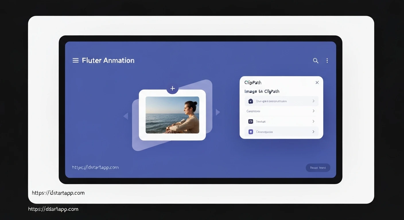

Flutter Image Reveal Animation with ClipPath
Dynamic and engaging user interfaces are crucial for modern applications. Flutter, with its powerful rendering engine, offers immense flexibility to create stunning animations. One such captivating effect is the "Image Reveal" animation, where an image progressively appears, often from a central point, giving a sense of discovery or focus. This article will guide you through implementing a sophisticated image reveal animation in Flutter using ClipPath and CustomClipper, driven by AnimationController and Tween.
Understanding the Core Concepts
Before diving into the code, let's briefly understand the key components:
-
ClipPath: A Flutter widget that clips its child using a path. It's incredibly versatile for creating non-rectangular shapes. -
CustomClipper: An abstract class that allows you to define a custom clipping path. You overridegetClipto draw your path andshouldReclipto specify when the clipper needs to redraw (e.g., when animation values change). -
AnimationController: Manages an animation. It can be started, stopped, forward, reversed, and set to loop. It provides values from 0.0 to 1.0 over a specified duration. -
Tween: Defines a range of values over which an animation should interpolate. For instance, aTweenwill animate from 0.0 to 1.0.(begin: 0.0, end: 1.0) -
AnimatedBuilder: A widget that rebuilds its child in response to anAnimationchanging value. It's efficient because it only rebuilds the parts of the widget tree that depend on the animation, leaving the rest of the widget subtree intact.
Implementation Steps
Let's build a circular image reveal animation step-by-step.
1. Create a CustomClipper for the Reveal Effect
We need a clipper that defines a circle whose radius changes based on an animation value. This clipper will take a revealPercent value (from 0.0 to 1.0) to determine the current size of the circle.
import 'package:flutter/material.dart';
import 'dart:math' as math;

class CircleRevealClipper extends CustomClipper {
  final double revealPercent;

  CircleRevealClipper(this.revealPercent);

  @override
  Path getClip(Size size) {
    final center = Offset(size.width / 2, size.height / 2);
    // Calculate the maximum possible radius needed to cover the entire rectangle
    final maxRadius = math.sqrt(size.width * size.width + size.height * size.height) / 2;
    // Scale the maxRadius by revealPercent to get the current radius
    final radius = maxRadius * revealPercent;

    return Path()..addOval(Rect.fromCircle(center: center, radius: radius));
  }

  @override
  bool shouldReclip(covariant CircleRevealClipper oldClipper) {
    return oldClipper.revealPercent != revealPercent;
  }
}
Explanation:
- The
CircleRevealClippertakes arevealPercent(a double between 0.0 and 1.0) in its constructor. getClipcalculates the center of the widget and determines the maximum possible radius needed to cover the entire rectangle (half of the diagonal length) whenrevealPercentis 1.0. It then scales this maximum radius byrevealPercentto get the current radius for the circle.addOval(Rect.fromCircle(...))creates a circular path.shouldReclipensures the clipper rebuilds only whenrevealPercentchanges, optimizing performance by avoiding unnecessary re-clipping.
2. Set Up the StatefulWidget for Animation
Next, we'll create a StatefulWidget to manage the AnimationController and Tween, and integrate the CustomClipper with an image.
import 'package:flutter/material.dart';
// Import CircleRevealClipper if it's in a separate file
// import 'circle_reveal_clipper.dart';

class ImageRevealAnimation extends StatefulWidget {
  final String imageUrl;

  const ImageRevealAnimation({Key? key, required this.imageUrl}) : super(key: key);

  @override
  _ImageRevealAnimationState createState() => _ImageRevealAnimationState();
}

class _ImageRevealAnimationState extends State
    with SingleTickerProviderStateMixin {
  late AnimationController _controller;
  late Animation _animation;

  @override
  void initState() {
    super.initState();
    _controller = AnimationController(
      vsync: this,
      duration: const Duration(milliseconds: 1000), // 1 second animation
    );

    _animation = Tween(begin: 0.0, end: 1.0).animate(
      CurvedAnimation(
        parent: _controller,
        curve: Curves.easeOutCubic, // Customize your curve here
      ),
    );

    // Start the animation when the widget is initialized
    _controller.forward();
  }

  @override
  void dispose() {
    _controller.dispose();
    super.dispose();
  }

  @override
  Widget build(BuildContext context) {
    return AnimatedBuilder(
      animation: _animation,
      builder: (context, child) {
        return ClipPath(
          clipper: CircleRevealClipper(_animation.value),
          child: child,
        );
      },
      child: Image.network(
        widget.imageUrl,
        fit: BoxFit.cover,
        width: double.infinity,
        height: double.infinity,
      ),
    );
  }
}
Explanation:
SingleTickerProviderStateMixinis used to provide aTickerforAnimationController, preventing animations from consuming resources when off-screen._controlleris initialized with a duration andvsync: this._animationis created using aTweenfrom 0.0 to 1.0, wrapped in aCurvedAnimationfor a smoother effect (e.g.,Curves.easeOutCubic)._controller.forward()starts the animation when the widget first builds.dispose()is crucial to release resources held by theAnimationControllerwhen the widget is removed from the tree.- The
buildmethod usesAnimatedBuilder. This widget listens to_animationand calls itsbuilderfunction whenever the animation value changes. - Inside the
builder,ClipPathusesCircleRevealClipperwith the current_animation.valueto clip its child. - The
childofAnimatedBuilder(theImage.networkin this case) is created once and passed to thebuilderfunction. This is an optimization, as the image itself doesn't rebuild unnecessarily with every animation frame.
3. Integrating the Animation into Your Application
You can now use the ImageRevealAnimation widget anywhere in your Flutter app.
import 'package:flutter/material.dart';
// Ensure ImageRevealAnimation and CircleRevealClipper are imported
// import 'image_reveal_animation.dart'; // Assuming they are in the same file or properly imported

void main() {
  runApp(const MyApp());
}

class MyApp extends StatelessWidget {
  const MyApp({Key? key}) : super(key: key);

  @override
  Widget build(BuildContext context) {
    return MaterialApp(
      debugShowCheckedModeBanner: false,
      home: Scaffold(
        appBar: AppBar(
          title: const Text('Image Reveal Demo'),
        ),
        body: Center(
          child: Container( // Using Container for better size control
            width: 300,
            height: 200,
            decoration: BoxDecoration(
              border: Border.all(color: Colors.grey, width: 2),
              borderRadius: BorderRadius.circular(12),
            ),
            child: ClipRRect( // Clip the image reveal within a rounded rectangle
              borderRadius: BorderRadius.circular(10),
              child: ImageRevealAnimation(
                imageUrl: 'https://picsum.photos/id/237/800/600', // Example image URL
              ),
            ),
          ),
        ),
      ),
    );
  }
}
Further Enhancements (Optional)
- Different Shapes: Modify
getClipin yourCustomClipperto create square, star, or custom polygon reveals. - Reverse Animation: Call
_controller.reverse()or add a button/gesture to trigger the reverse reveal, making the image disappear. - Conditional Reveal: Trigger the animation based on user interaction (e.g., button press, scroll position, visibility).
- Overlay Effect: Combine
ClipPathwith anAnimatedOpacityto fade in the image simultaneously with the reveal. - Local Images: Use
Image.assetinstead ofImage.networkfor local image assets by adjusting theImageRevealAnimationwidget constructor.
Conclusion
The combination of ClipPath, CustomClipper, and Flutter's animation framework provides a powerful toolkit for crafting unique and engaging visual effects. The image reveal animation, as demonstrated, is just one example of how these elements can be orchestrated to enhance the user experience, adding a layer of professionalism and delight to your Flutter applications. By understanding these core concepts, you're well-equipped to explore and implement even more complex and creative animations.


