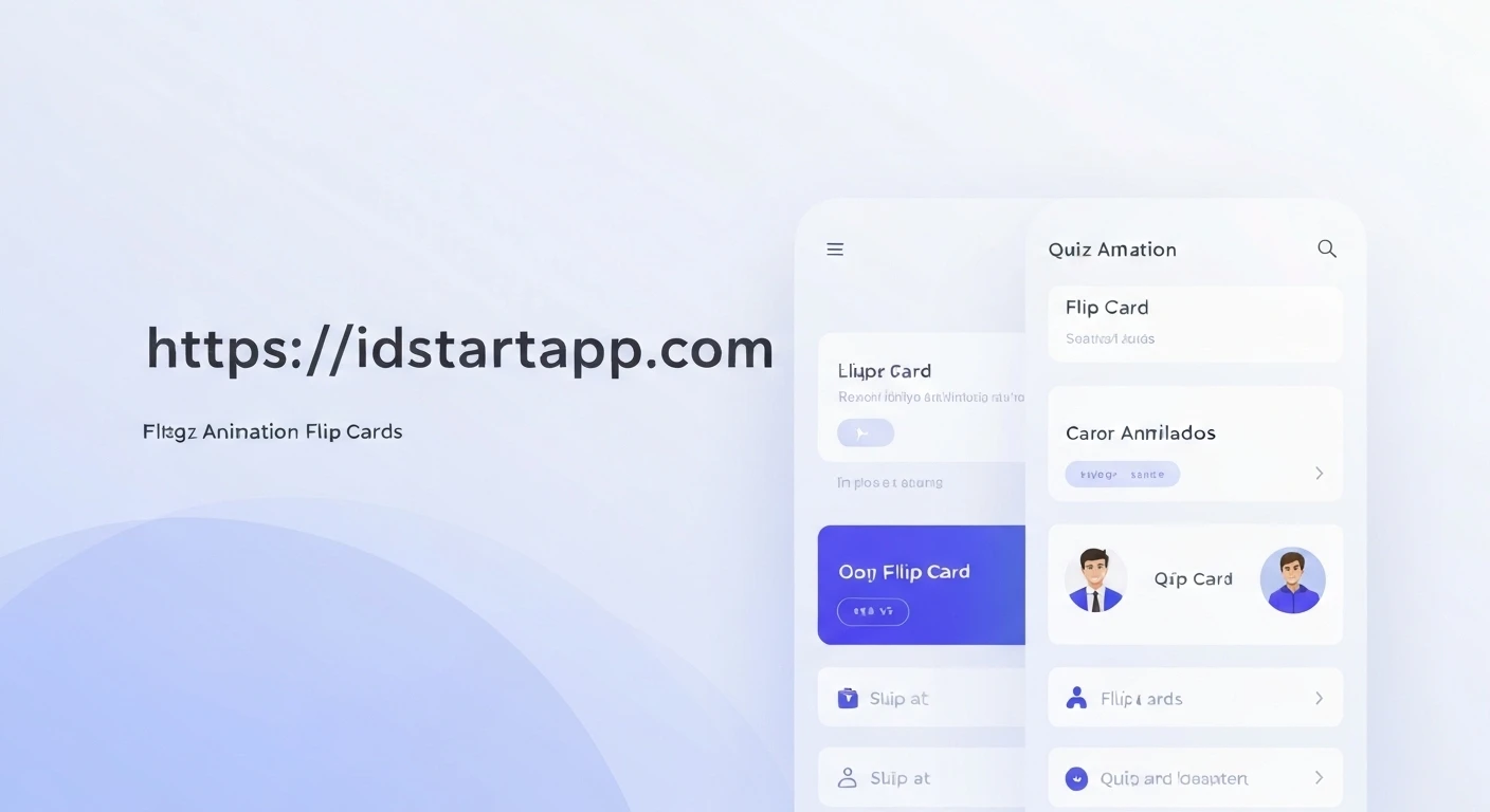

Flutter Flip Card Animation for Quiz App
Creating engaging user interfaces is crucial for modern mobile applications. In quiz applications, dynamic elements can significantly enhance the user experience, making learning more interactive and fun. A flip card animation, where a card smoothly rotates to reveal its other side, is a perfect candidate for displaying questions and answers in a visually appealing manner.
This article will guide you through implementing a customizable flip card animation in Flutter, specifically tailored for a quiz application context. We'll cover the core animation concepts and how to integrate this component into a functional quiz flow.
Core Animation Concepts in Flutter
Flutter's animation system is powerful and flexible, built around several key components:
AnimationController: Manages the animation's state, starting, stopping, and reversing it. It produces values ranging from 0.0 to 1.0 over a specified duration.Tween: Defines the range of values an animation should produce (e.g., 0 to 180 degrees for rotation). It interpolates values between a begin and end point.CurvedAnimation: Applies a non-linear curve to anAnimationController's output, allowing for effects like ease-in, ease-out, or bounce.AnimatedBuilder: A performance optimization widget that rebuilds only the animating part of the widget tree when the animation's value changes, avoiding unnecessary full widget tree rebuilds.Transform: A widget that applies a transformation (like rotation, scaling, or translation) to its child. For 3D effects,Matrix4is used to define the transformation matrix, including perspective.
Implementing the Flip Card Widget
We'll create a reusable FlipCard widget that can display any two widgets as its front and back sides. The card's flip state will be controlled externally, making it easy to integrate into a quiz application.
1. Create the FlipCard Widget
This widget will be a StatefulWidget because it manages its own animation state. It will take front and back widgets, an isFlipped boolean to control its state, and optional parameters for animation duration and curve.
import 'dart:math' as math;
import 'package:flutter/material.dart';

class FlipCard extends StatefulWidget {
  final Widget front;
  final Widget back;
  final bool isFlipped;
  final Duration animationDuration;
  final Curve animationCurve;

  const FlipCard({
    Key? key,
    required this.front,
    required this.back,
    this.isFlipped = false,
    this.animationDuration = const Duration(milliseconds: 600),
    this.animationCurve = Curves.easeInOut,
  }) : super(key: key);

  @override
  _FlipCardState createState() => _FlipCardState();
}

class _FlipCardState extends State with SingleTickerProviderStateMixin {
  late AnimationController _controller;
  late Animation _animation;
  bool _showFront = true; // Tracks which side is currently visible during the flip

  @override
  void initState() {
    super.initState();
    _controller = AnimationController(
      vsync: this,
      duration: widget.animationDuration,
    );
    _animation = Tween(begin: 0, end: 1).animate(
      CurvedAnimation(parent: _controller, curve: widget.animationCurve),
    );

    // Initialize flip state if the card starts flipped
    if (widget.isFlipped) {
      _controller.value = 1;
      _showFront = false;
    }

    // Listener to switch between front and back child during the animation
    _controller.addListener(() {
      if (_controller.value >= 0.5) {
        if (_showFront) {
          setState(() {
            _showFront = false;
          });
        }
      } else {
        if (!_showFront) {
          setState(() {
            _showFront = true;
          });
        }
      }
    });
  }

  @override
  void didUpdateWidget(covariant FlipCard oldWidget) {
    super.didUpdateWidget(oldWidget);
    // Respond to changes in the isFlipped property from the parent widget
    if (widget.isFlipped != oldWidget.isFlipped) {
      if (widget.isFlipped) {
        _controller.forward();
      } else {
        _controller.reverse();
      }
    }
    // Update animation duration/curve if they change
    if (widget.animationDuration != oldWidget.animationDuration) {
      _controller.duration = widget.animationDuration;
    }
    if (widget.animationCurve != oldWidget.animationCurve) {
      _animation = Tween(begin: 0, end: 1).animate(
        CurvedAnimation(parent: _controller, curve: widget.animationCurve),
      );
    }
  }

  @override
  void dispose() {
    _controller.dispose();
    super.dispose();
  }

  @override
  Widget build(BuildContext context) {
    return AnimatedBuilder(
      animation: _animation,
      builder: (context, child) {
        // Calculate the rotation angle based on the animation value
        final double rotation = _animation.value * math.pi; // Rotate 180 degrees (pi radians)

        return Transform(
          alignment: FractionalOffset.center,
          transform: Matrix4.identity()
            ..setEntry(3, 2, 0.001) // Apply perspective for a 3D effect
            ..rotateY(rotation), // Rotate around the Y-axis
          child: _showFront
              ? widget.front
              : Transform(
                  alignment: FractionalOffset.center,
                  transform: Matrix4.identity()..rotateY(math.pi), // Rotate the back side an additional 180 degrees to face front
                  child: widget.back,
                ),
        );
      },
    );
  }
}
Explanation of Key Parts:
_FlipCardStatewithSingleTickerProviderStateMixin: This mixin is essential forAnimationControllerto function, providing a "ticker" that drives the animation frames.initState(): Initializes theAnimationControllerandTween. The_animationinterpolates from 0 to 1. An important listener is added to `_controller` to switch the `_showFront` boolean when the animation passes the halfway point (0.5). This ensures the correct child (`front` or `back`) is rendered to prevent rendering glitches during the flip.didUpdateWidget(): This method is crucial for reacting to changes in the `isFlipped` property passed from the parent. If `isFlipped` changes, it either calls `_controller.forward()` to flip to the back or `_controller.reverse()` to flip back to the front.build()withAnimatedBuilderandTransform:AnimatedBuilderrebuilds only its `builder` function when the `_animation` value changes, making it efficient.Transformapplies the 3D rotation. `Matrix4.identity()` creates a 4x4 identity matrix.- `setEntry(3, 2, 0.001)` adds a perspective effect, making the card appear to recede or protrude as it rotates.
- `rotateY(rotation)` applies the rotation around the Y-axis. The `_animation.value` (0.0 to 1.0) is multiplied by `math.pi` (180 degrees) to get the desired rotation angle.
- The conditional rendering (`_showFront ? widget.front : ...`) ensures that only the currently visible side is rendered. The `back` widget is also wrapped in a `Transform` with `rotateY(math.pi)` to ensure it is initially rendered "face-down" (rotated 180 degrees) so it appears correctly when flipped into view.
Integrating into a Quiz Application
Now, let's see how this FlipCard widget can be used in a simple quiz application. The quiz app will manage the current question and the flip state of the card.
2. Quiz Screen Implementation
The parent widget (e.g., a QuizScreen) will be a StatefulWidget that holds the current question data and controls the isFlipped state of the FlipCard.
import 'package:flutter/material.dart';
// Make sure to import your FlipCard widget
// import 'path/to/flip_card.dart';

class QuizScreen extends StatefulWidget {
  const QuizScreen({Key? key}) : super(key: key);

  @override
  _QuizScreenState createState() => _QuizScreenState();
}

class _QuizScreenState extends State {
  bool _isCardFlipped = false;
  int _currentQuestionIndex = 0;

  final List<Map<String, String>> _questions = [
    {'question': 'What is the capital of France?', 'answer': 'Paris'},
    {'question': 'Who painted the Mona Lisa?', 'answer': 'Leonardo da Vinci'},
    {'question': 'What is the chemical symbol for water?', 'answer': 'H2O'},
  ];

  void _flipCard() {
    setState(() {
      _isCardFlipped = !_isCardFlipped;
    });
  }

  void _nextQuestion() {
    setState(() {
      _isCardFlipped = false; // Reset flip state for new question
      _currentQuestionIndex = (_currentQuestionIndex + 1) % _questions.length;
    });
  }

  @override
  Widget build(BuildContext context) {
    final currentQuestion = _questions[_currentQuestionIndex];

    return Scaffold(
      appBar: AppBar(
        title: const Text('Flutter Quiz App'),
      ),
      body: Center(
        child: Column(
          mainAxisAlignment: MainAxisAlignment.center,
          children: [
            SizedBox(
              width: 300,
              height: 200,
              child: GestureDetector(
                onTap: _flipCard, // Tap to flip the card
                child: FlipCard(
                  isFlipped: _isCardFlipped,
                  front: Card(
                    color: Colors.blueAccent,
                    elevation: 5,
                    shape: RoundedRectangleBorder(borderRadius: BorderRadius.circular(15)),
                    child: Center(
                      child: Padding(
                        padding: const EdgeInsets.all(16.0),
                        child: Text(
                          currentQuestion['question']!,
                          textAlign: TextAlign.center,
                          style: const TextStyle(fontSize: 20, color: Colors.white, fontWeight: FontWeight.bold),
                        ),
                      ),
                    ),
                  ),
                  back: Card(
                    color: Colors.green,
                    elevation: 5,
                    shape: RoundedRectangleBorder(borderRadius: BorderRadius.circular(15)),
                    child: Center(
                      child: Padding(
                        padding: const EdgeInsets.all(16.0),
                        child: Text(
                          currentQuestion['answer']!,
                          textAlign: TextAlign.center,
                          style: const TextStyle(fontSize: 20, color: Colors.white, fontWeight: FontWeight.bold),
                        ),
                      ),
                    ),
                  ),
                ),
              ),
            ),
            const SizedBox(height: 30),
            ElevatedButton(
              onPressed: _nextQuestion,
              style: ElevatedButton.styleFrom(
                padding: const EdgeInsets.symmetric(horizontal: 40, vertical: 15),
                textStyle: const TextStyle(fontSize: 18),
              ),
              child: const Text('Next Question'),
            ),
          ],
        ),
      ),
    );
  }
}
In this quiz app example:
- The `_isCardFlipped` boolean state controls whether the `FlipCard` shows its front (question) or back (answer).
- Tapping the `GestureDetector` wrapped around the `FlipCard` toggles this boolean, triggering the flip animation.
- The "Next Question" button resets `_isCardFlipped` to `false` and advances to the next question in the `_questions` list.
- The `front` and `back` properties of `FlipCard` are simple `Card` widgets containing the question and answer text, respectively. These can be customized with any Flutter widgets.
Enhancements and Considerations
- Customization: The `FlipCard` widget already supports custom `animationDuration` and `animationCurve`. You can further expose parameters for `alignment` or even different rotation axes (`rotateX`, `rotateZ`).
- Accessibility: Ensure that the content on both sides of the card is accessible. Consider adding `Semantics` widgets if the visual flip is the primary means of conveying information.
- Performance: For complex cards, ensure the content inside `front` and `back` widgets is optimized. `AnimatedBuilder` already helps by limiting rebuilds.
- State Management: For larger quiz apps, consider integrating a state management solution (like Provider, Riverpod, BLoC, GetX) to manage quiz state (`_isCardFlipped`, `_currentQuestionIndex`, etc.) more robustly.
- Multiple Cards: If you need multiple flip cards on the same screen, each would need its own `FlipCard` instance, and its `isFlipped` state would be managed independently.
Conclusion
Implementing a flip card animation in Flutter for a quiz app is an excellent way to add interactivity and a polished feel. By understanding Flutter's core animation widgets like `AnimationController`, `Tween`, `AnimatedBuilder`, and `Transform`, you can create a highly customizable and performant UI component. The modular `FlipCard` widget developed here provides a solid foundation that can be easily integrated and extended to fit various quiz designs and other interactive card-based interfaces.


