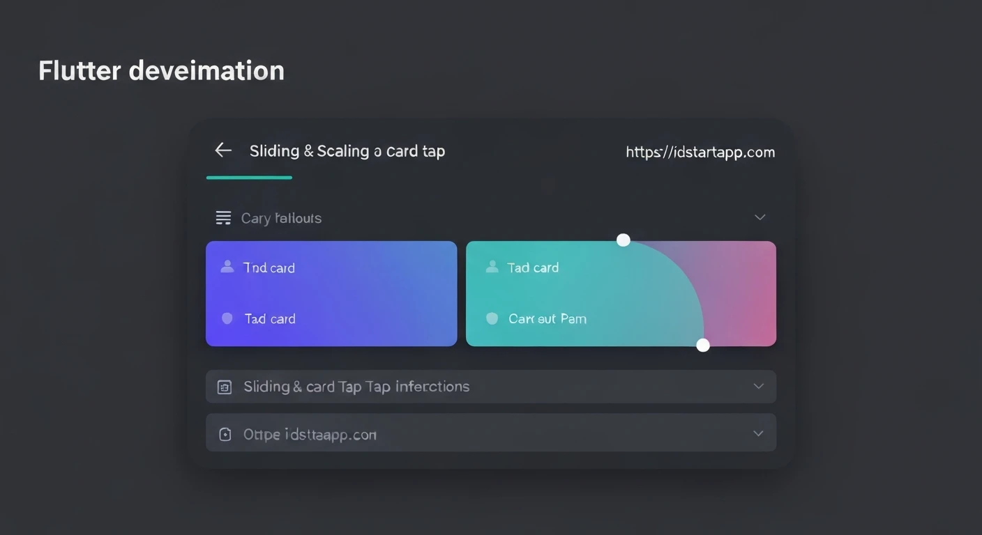

Flutter Animation: Slide & Scale on Card Tap Interaction
Micro-interactions play a crucial role in enhancing user experience by providing visual feedback and making an application feel more alive and responsive. In Flutter, creating such delightful animations is straightforward thanks to its powerful animation framework. This article will guide you through implementing a common and engaging animation: a slide and scale effect on a card when it is tapped.
Understanding the Core Animation Concepts in Flutter
Before diving into the code, let's briefly touch upon the core components of Flutter's animation system we'll be using:
AnimationController: Manages the animation. It can be started, stopped, reversed, and gives notification about its progress.Tween: Defines the range of values an animation can interpolate between. For example, aTweenfor scaling from 1.0 to 1.1, or aTweenfor sliding.CurvedAnimation: Applies a non-linear curve to an animation controller's progress, making animations feel more natural (e.g., ease-in, ease-out).AnimatedBuilder: A widget that rebuilds its children whenever the animation changes value. This is highly efficient as it only rebuilds the animated part of the widget tree.TransformWidgets: Widgets likeTransform.scaleandTransform.translateare used to apply scale, position, and rotation transformations to their child widgets.
Setting Up Your Project
First, create a new Flutter project if you haven't already:
flutter create card_animation_demo
cd card_animation_demo
Now, open lib/main.dart. We'll start with a basic structure:
import 'package:flutter/material.dart';

void main() {
  runApp(const MyApp());
}

class MyApp extends StatelessWidget {
  const MyApp({super.key});

  @override
  Widget build(BuildContext context) {
    return MaterialApp(
      title: 'Card Animation Demo',
      theme: ThemeData(
        primarySwatch: Colors.blue,
      ),
      home: const MyHomePage(),
    );
  }
}

class MyHomePage extends StatelessWidget {
  const MyHomePage({super.key});

  @override
  Widget build(BuildContext context) {
    return Scaffold(
      appBar: AppBar(
        title: const Text('Interactive Card'),
      ),
      body: Center(
        child: Padding(
          padding: const EdgeInsets.all(16.0),
          child: AnimatedCard(), // Our custom card widget will go here
        ),
      ),
    );
  }
}
Designing the Interactive Card Widget
Our interactive card needs to manage its animation state, so it will be a StatefulWidget. Let's create a new file, say lib/animated_card.dart, or directly implement it in main.dart for simplicity.
For this example, we'll implement it directly within main.dart.
// ... (previous code)

class AnimatedCard extends StatefulWidget {
  const AnimatedCard({super.key});

  @override
  State createState() => _AnimatedCardState();
}

class _AnimatedCardState extends State with SingleTickerProviderStateMixin {
  late AnimationController _controller;
  late Animation _slideAnimation;
  late Animation _scaleAnimation;

  @override
  void initState() {
    super.initState();
    _controller = AnimationController(
      vsync: this,
      duration: const Duration(milliseconds: 300),
    );

    _slideAnimation = Tween(
      begin: Offset.zero,
      end: const Offset(0, -0.05), // Slide up by 5% of its height
    ).animate(CurvedAnimation(
      parent: _controller,
      curve: Curves.easeOutBack,
    ));

    _scaleAnimation = Tween(
      begin: 1.0,
      end: 1.05, // Scale up by 5%
    ).animate(CurvedAnimation(
      parent: _controller,
      curve: Curves.easeOutBack,
    ));
  }

  @override
  void dispose() {
    _controller.dispose();
    super.dispose();
  }

  void _handleTap() {
    if (_controller.isDismissed) {
      _controller.forward();
    } else if (_controller.isCompleted) {
      _controller.reverse();
    }
  }

  @override
  Widget build(BuildContext context) {
    return GestureDetector(
      onTap: _handleTap,
      child: AnimatedBuilder(
        animation: _controller,
        builder: (context, child) {
          return Transform.translate(
            offset: _slideAnimation.value * 20, // Multiply by a factor for more visible slide
            child: Transform.scale(
              scale: _scaleAnimation.value,
              child: Card(
                elevation: 4,
                shape: RoundedRectangleBorder(borderRadius: BorderRadius.circular(12)),
                child: const SizedBox(
                  width: 300,
                  height: 200,
                  child: Center(
                    child: Text(
                      'Tap Me!',
                      style: TextStyle(fontSize: 24, fontWeight: FontWeight.bold),
                    ),
                  ),
                ),
              ),
            ),
          );
        },
      ),
    );
  }
}
Full Code Example
Here's the complete main.dart file for a runnable example:
import 'package:flutter/material.dart';

void main() {
  runApp(const MyApp());
}

class MyApp extends StatelessWidget {
  const MyApp({super.key});

  @override
  Widget build(BuildContext context) {
    return MaterialApp(
      title: 'Card Animation Demo',
      theme: ThemeData(
        primarySwatch: Colors.blue,
        visualDensity: VisualDensity.adaptivePlatformDensity,
      ),
      home: const MyHomePage(),
    );
  }
}

class MyHomePage extends StatelessWidget {
  const MyHomePage({super.key});

  @override
  Widget build(BuildContext context) {
    return Scaffold(
      appBar: AppBar(
        title: const Text('Interactive Card'),
        centerTitle: true,
      ),
      body: Center(
        child: Padding(
          padding: const EdgeInsets.all(16.0),
          child: AnimatedCard(),
        ),
      ),
    );
  }
}

class AnimatedCard extends StatefulWidget {
  const AnimatedCard({super.key});

  @override
  State createState() => _AnimatedCardState();
}

class _AnimatedCardState extends State with SingleTickerProviderStateMixin {
  late AnimationController _controller;
  late Animation _slideAnimation;
  late Animation _scaleAnimation;

  @override
  void initState() {
    super.initState();
    _controller = AnimationController(
      vsync: this,
      duration: const Duration(milliseconds: 300),
    );

    // Slide animation: Moves the card up
    _slideAnimation = Tween(
      begin: Offset.zero,
      end: const Offset(0, -0.1), // Slide up by 10% of its own height
    ).animate(CurvedAnimation(
      parent: _controller,
      curve: Curves.easeOutBack, // A bouncy effect
    ));

    // Scale animation: Enlarges the card slightly
    _scaleAnimation = Tween(
      begin: 1.0,
      end: 1.05, // Scales up by 5%
    ).animate(CurvedAnimation(
      parent: _controller,
      curve: Curves.easeOutBack,
    ));
  }

  @override
  void dispose() {
    _controller.dispose();
    super.dispose();
  }

  void _handleTap() {
    if (_controller.isDismissed) {
      _controller.forward(); // Start animation
    } else if (_controller.isCompleted) {
      _controller.reverse(); // Reverse animation
    }
  }

  @override
  Widget build(BuildContext context) {
    return GestureDetector(
      onTap: _handleTap,
      child: AnimatedBuilder(
        animation: _controller,
        builder: (context, child) {
          return Transform.translate(
            offset: _slideAnimation.value * 20, // Apply the slide offset. Multiplying by a factor makes it more visible.
            child: Transform.scale(
              scale: _scaleAnimation.value, // Apply the scale value
              alignment: Alignment.center, // Scale from the center
              child: Card(
                elevation: 4,
                shape: RoundedRectangleBorder(borderRadius: BorderRadius.circular(12)),
                child: const SizedBox(
                  width: 300,
                  height: 200,
                  child: Center(
                    child: Text(
                      'Tap Me!',
                      style: TextStyle(fontSize: 24, fontWeight: FontWeight.bold, color: Colors.blueAccent),
                    ),
                  ),
                ),
              ),
            ),
          );
        },
      ),
    );
  }
}
Code Explanation
Let's break down the key parts of the _AnimatedCardState:
with SingleTickerProviderStateMixin: This mixin provides thevsyncobject required byAnimationController. It ensures that animations only consume resources when they are visible._controller = AnimationController(...):vsync: this: Links the controller to the widget's lifecycle.duration: const Duration(milliseconds: 300): Sets the total time for the animation to complete.
_slideAnimation = Tween:(...).animate(...) - A
Tweenis used for the slide effect, defining the start (Offset.zero, no change) and end (Offset(0, -0.1), moving up 10% of the widget's height). CurvedAnimation(parent: _controller, curve: Curves.easeOutBack): Wraps the controller to apply aneaseOutBackcurve, giving a slight "overshoot" effect before settling, which makes the animation more dynamic.
- A
_scaleAnimation = Tween:(...).animate(...) - A
Tweenis used for the scale effect, interpolating from1.0(original size) to1.05(5% larger). - It also uses the same
CurvedAnimationfor consistent timing and feel.
- A
_handleTap():- This method is called when the
GestureDetectordetects a tap. _controller.isDismissedchecks if the animation is at its start state. If so,_controller.forward()starts it._controller.isCompletedchecks if the animation is at its end state. If so,_controller.reverse()plays it backward. This creates the toggle effect.
- This method is called when the
AnimatedBuilder(animation: _controller, builder: ...):- This widget is crucial. It listens to
_controllerand rebuilds itsbuildercallback whenever the animation's value changes. - Inside the
builder,Transform.translateandTransform.scaleare used.Transform.translateapplies the_slideAnimation.valueto move the card. We multiply_slideAnimation.valueby 20 to make the slide more noticeable, asOffset(0, -0.1)provides a normalized value relative to the card's size.Transform.scaleapplies the_scaleAnimation.valueto change the size of the card.alignment: Alignment.centerensures the scaling happens from the center of the card.
- This widget is crucial. It listens to
dispose(): It's critical to dispose of theAnimationControllerwhen the state object is removed from the tree to prevent memory leaks.
Conclusion
You've successfully implemented a engaging slide and scale animation for a card in Flutter. This pattern of using AnimationController, Tween, CurvedAnimation, and AnimatedBuilder is fundamental to creating most explicit animations in Flutter. By understanding these core concepts, you can create a wide array of sophisticated and user-friendly animations, making your application stand out. Feel free to experiment with different Tween values, Curves, and durations to achieve unique visual effects!


