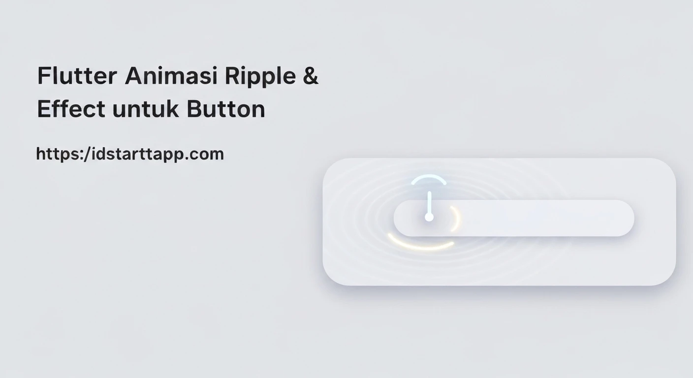

Flutter Animation: Crafting Dynamic Ripple and Glow Effects for Buttons
In the vibrant world of mobile application development, user experience often hinges on subtle yet impactful visual cues. Flutter, with its declarative UI and powerful animation framework, provides developers with the tools to create highly engaging and interactive interfaces. Among these, the ripple and glow effects on buttons stand out as excellent ways to provide immediate visual feedback and enhance the aesthetic appeal of an application.
This article will guide you through implementing sophisticated ripple and glow animations for buttons in Flutter, transforming static UI elements into dynamic, responsive components that captivate users.
Understanding Ripple and Glow Effects
The Ripple Effect
A ripple effect typically simulates a "wave" emanating from the point of interaction, expanding outwards and then fading away. It's a common material design pattern that provides visual confirmation of a tap or press, making the UI feel more tangible and responsive. In Flutter, this is often achieved by dynamically scaling a widget or a circular shape.
The Glow Effect
The glow effect, on the other hand, involves a subtle light or color diffusion around an element, often used to signify selection, focus, or an active state. It adds a touch of elegance and draws the user's eye to important interactive elements. Implementing a glow usually involves animating properties like color, opacity, and blur radius of a shadow.
Flutter's Animation Framework Core Concepts
To create these effects, we'll leverage Flutter's core animation components:
StatefulWidget: Necessary because animations often involve changing state over time.SingleTickerProviderStateMixin: Provides a ticker that drives animations and prevents animations from consuming unnecessary resources when off-screen.AnimationController: Manages the animation's progress (start, stop, forward, reverse) and duration.Tween: Defines a range of values an animation can interpolate between (e.g., from 0.0 to 1.0 for scale, or from one color to another).Animation: Represents the current value of an animation, typically driven by aTweenand anAnimationController.AnimatedBuilder: A widget that rebuilds its children whenever anAnimationchanges value, optimizing performance by only rebuilding the animated parts of the widget tree.
Implementing the Ripple Effect
Let's start by creating a button with a ripple effect on tap. We'll use Transform.scale to animate the size of an underlying circle.
Step 1: Create a StatefulWidget and initialize AnimationController
import 'package:flutter/material.dart';

class RippleButton extends StatefulWidget {
  final Widget child;
  final VoidCallback onPressed;

  const RippleButton({
    Key? key,
    required this.child,
    required this.onPressed,
  }) : super(key: key);

  @override
  _RippleButtonState createState() => _RippleButtonState();
}

class _RippleButtonState extends State with SingleTickerProviderStateMixin {
  late AnimationController _controller;
  late Animation _scaleAnimation;

  @override
  void initState() {
    super.initState();
    _controller = AnimationController(
      vsync: this,
      duration: const Duration(milliseconds: 300),
    );
    _scaleAnimation = Tween(begin: 0.0, end: 1.0).animate(
      CurvedAnimation(
        parent: _controller,
        curve: Curves.easeOut,
      ),
    );
  }

  @override
  void dispose() {
    _controller.dispose();
    super.dispose();
  }

  void _handleTap() {
    _controller.forward(from: 0.0).then((_) {
      _controller.reverse();
    });
    widget.onPressed();
  }

  @override
  Widget build(BuildContext context) {
    return GestureDetector(
      onTap: _handleTap,
      child: Stack(
        alignment: Alignment.center,
        children: [
          widget.child,
          AnimatedBuilder(
            animation: _scaleAnimation,
            builder: (context, child) {
              return Transform.scale(
                scale: _scaleAnimation.value,
                child: Opacity(
                  opacity: 1.0 - _scaleAnimation.value, // Fade out as it expands
                  child: Container(
                    width: 80.0, // Max ripple size
                    height: 80.0,
                    decoration: BoxDecoration(
                      shape: BoxShape.circle,
                      color: Colors.white.withOpacity(0.5),
                    ),
                  ),
                ),
              );
            },
          ),
        ],
      ),
    );
  }
}
In this code:
_controlleranimates for 300ms._scaleAnimationscales a value from 0.0 to 1.0 with an ease-out curve.- On tap,
_handleTapstarts the animation forward, then reverses it to create a quick pulse. AnimatedBuilderrebuilds theTransform.scaleandOpacitywidgets, making a white circle expand and fade out from the center.
Adding the Glow Effect
Now, let's integrate a subtle glow effect, perhaps to indicate the button is interactable or to add visual flair on press. We'll use BoxShadow for this.
Step 2: Extend with Glow Animation
We'll add another animation for the glow, interpolating shadow properties.
import 'package:flutter/material.dart';

class GlowRippleButton extends StatefulWidget {
  final Widget child;
  final VoidCallback onPressed;
  final Color baseColor;
  final Color glowColor;

  const GlowRippleButton({
    Key? key,
    required this.child,
    required this.onPressed,
    this.baseColor = Colors.blue,
    this.glowColor = Colors.white,
  }) : super(key: key);

  @override
  _GlowRippleButtonState createState() => _GlowRippleButtonState();
}

class _GlowRippleButtonState extends State with SingleTickerProviderStateMixin {
  late AnimationController _controller;
  late Animation _scaleAnimation;
  late Animation _glowAnimation; // For glow effect

  @override
  void initState() {
    super.initState();
    _controller = AnimationController(
      vsync: this,
      duration: const Duration(milliseconds: 300),
      reverseDuration: const Duration(milliseconds: 200), // Faster reverse for glow
    );

    _scaleAnimation = Tween(begin: 0.0, end: 1.0).animate(
      CurvedAnimation(
        parent: _controller,
        curve: Curves.easeOut,
        reverseCurve: Curves.easeIn,
      ),
    );

    _glowAnimation = Tween(begin: 0.0, end: 1.0).animate(
      CurvedAnimation(
        parent: _controller,
        curve: Curves.easeOutCirc,
        reverseCurve: Curves.easeInCirc,
      ),
    );
  }

  @override
  void dispose() {
    _controller.dispose();
    super.dispose();
  }

  void _handleTapDown(TapDownDetails details) {
    _controller.forward();
  }

  void _handleTapUp(TapUpDetails details) {
    _controller.reverse();
    widget.onPressed();
  }

  void _handleTapCancel() {
    _controller.reverse();
  }

  @override
  Widget build(BuildContext context) {
    return GestureDetector(
      onTapDown: _handleTapDown,
      onTapUp: _handleTapUp,
      onTapCancel: _handleTapCancel,
      child: AnimatedBuilder(
        animation: _glowAnimation,
        builder: (context, child) {
          final double glowStrength = _glowAnimation.value;
          return Container(
            decoration: BoxDecoration(
              color: widget.baseColor,
              borderRadius: BorderRadius.circular(8.0),
              boxShadow: [
                BoxShadow(
                  color: widget.glowColor.withOpacity(0.5 * glowStrength),
                  blurRadius: 10.0 * glowStrength,
                  spreadRadius: 2.0 * glowStrength,
                  offset: const Offset(0, 0),
                ),
              ],
            ),
            child: Stack(
              alignment: Alignment.center,
              children: [
                widget.child,
                AnimatedBuilder(
                  animation: _scaleAnimation,
                  builder: (context, child) {
                    return Transform.scale(
                      scale: _scaleAnimation.value * 0.8, // Slightly smaller ripple
                      child: Opacity(
                        opacity: 1.0 - _scaleAnimation.value,
                        child: Container(
                          width: 80.0,
                          height: 80.0,
                          decoration: BoxDecoration(
                            shape: BoxShape.circle,
                            color: widget.glowColor.withOpacity(0.4),
                          ),
                        ),
                      ),
                    );
                  },
                ),
              ],
            ),
          );
        },
      ),
    );
  }
}
Key changes and additions:
- We've added
_glowAnimation, which also interpolates from 0.0 to 1.0. - Instead of `onTap`, we use
onTapDownto start the animation andonTapUp(oronTapCancel) to reverse it. This makes the glow appear immediately on press. - The outer
AnimatedBuilderuses_glowAnimation.valueto dynamically adjust theBoxShadowproperties (color opacity, blurRadius, spreadRadius) of the button's container, creating a pulsating glow. - The ripple circle's color is now tied to
glowColorfor consistency.
Integrating and Using the Custom Button
To use this enhanced button, simply wrap your desired content within it:
import 'package:flutter/material.dart';
// Import GlowRippleButton from where you defined it

void main() {
  runApp(MyApp());
}

class MyApp extends StatelessWidget {
  @override
  Widget build(BuildContext context) {
    return MaterialApp(
      home: Scaffold(
        appBar: AppBar(title: const Text('Flutter Animated Buttons')),
        body: Center(
          child: Column(
            mainAxisAlignment: MainAxisAlignment.center,
            children: [
              GlowRippleButton(
                onPressed: () {
                  print('Button 1 Pressed!');
                },
                baseColor: Colors.deepPurple,
                glowColor: Colors.purpleAccent,
                child: const Padding(
                  padding: EdgeInsets.all(16.0),
                  child: Text(
                    'Tap Me!',
                    style: TextStyle(color: Colors.white, fontSize: 20),
                  ),
                ),
              ),
              const SizedBox(height: 30),
              GlowRippleButton(
                onPressed: () {
                  print('Button 2 Pressed!');
                },
                baseColor: Colors.teal,
                glowColor: Colors.lightBlueAccent,
                child: const Padding(
                  padding: EdgeInsets.all(16.0),
                  child: Icon(
                    Icons.star,
                    color: Colors.white,
                    size: 30,
                  ),
                ),
              ),
            ],
          ),
        ),
      ),
    );
  }
}
Conclusion
By combining Flutter's robust animation framework with careful state management, we've created a custom button that responds to user interaction with both ripple and glow effects. These dynamic visual cues not only make the application more appealing but also significantly improve the user experience by providing clear, immediate feedback. Experiment with different durations, curves, and color combinations to tailor these effects to your application's unique design language and truly bring your UI to life.


