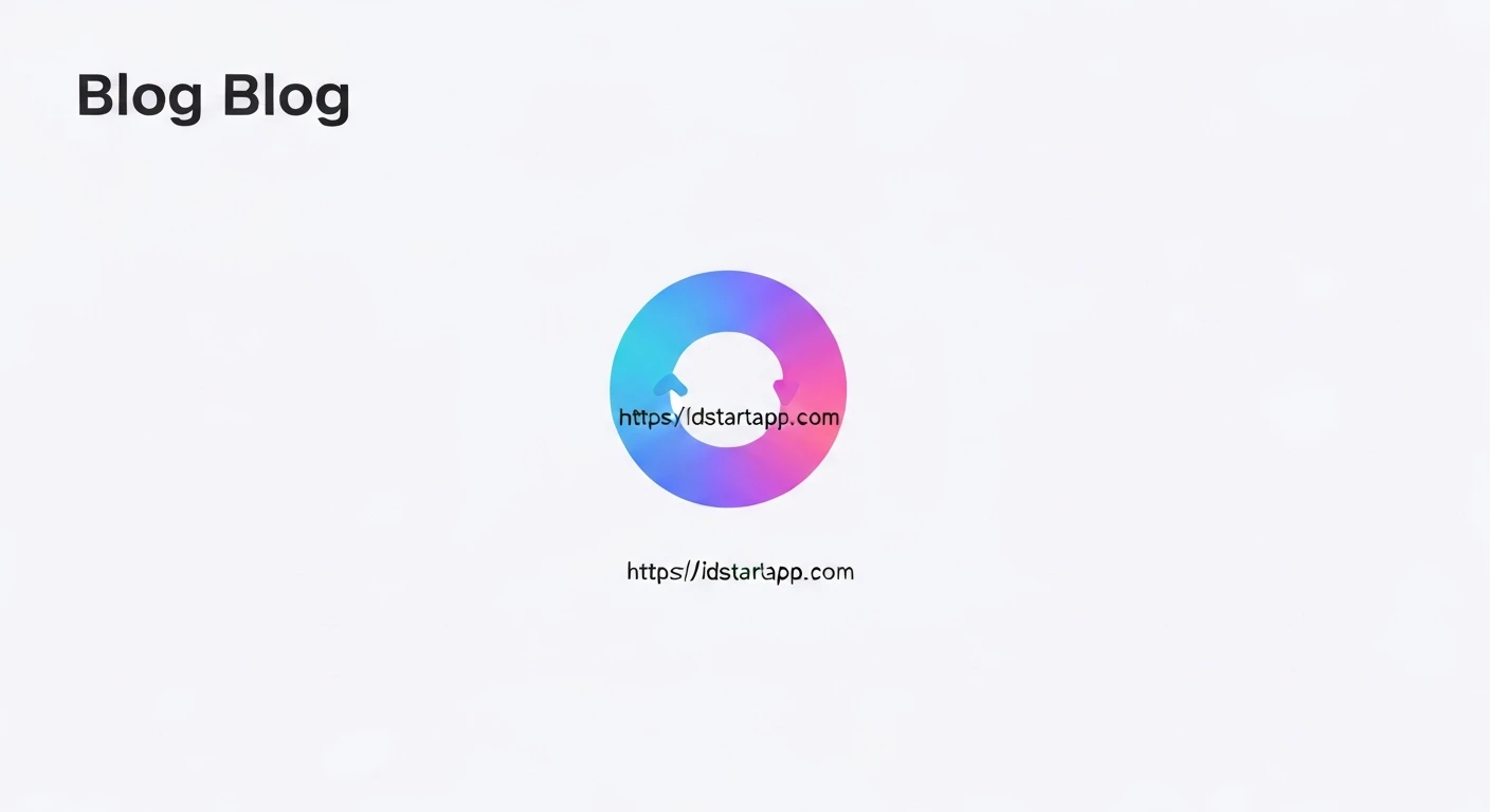

Flutter Animated Rotating Loader with Gradient and Bounce Effect
Creating engaging user interfaces often involves subtle animations that provide feedback and delight users. A custom loader is a perfect example, transforming a mundane waiting period into a more pleasant experience. This article will guide you through building a Flutter animated rotating loader with a vibrant gradient and a playful bounce effect.
Introduction
Loaders are essential UI components that indicate ongoing processes, preventing users from wondering if an application has frozen. While Flutter provides built-in progress indicators, a custom loader can significantly enhance an application's brand identity and user experience. We will combine several Flutter animation and painting concepts to achieve a visually appealing and dynamic loader:
AnimationControllerfor managing animation state and duration.Tweenfor defining animation ranges.AnimatedBuilderfor efficient widget rebuilding during animation.Transform.rotateandTransform.scalefor geometric transformations.CustomPainterfor drawing custom shapes, specifically an arc.LinearGradientfor adding color transitions to our loader.Curvesfor defining non-linear animation effects, such as bouncing.
Core Concepts
AnimationController and Tweens
An AnimationController manages the animation. It requires a vsync object (typically the TickerProviderStateMixin) and a duration. Tweens define the start and end values of an animation. For rotation, we'll animate from 0 to 2π radians. For scaling (bounce), we'll animate between 1.0 and a slightly larger value.
AnimatedBuilder
AnimatedBuilder is a highly optimized widget for animations. It rebuilds its child when an Animation object notifies its listeners. This allows us to separate the animation logic from the widget's build method, improving performance by only rebuilding the animated parts of the widget tree.
CustomPainter with LinearGradient
To draw the arc of our loader, we'll use a CustomPainter. This class provides a Canvas and a Size object, allowing us to draw directly onto the screen. We'll create a Paint object and assign a LinearGradient to its shader property to give the arc a dynamic color transition.
Transformations (Rotate and Scale)
Flutter's Transform widget allows us to apply various transformations like rotation, scaling, and translation. We'll use Transform.rotate driven by our rotation animation and Transform.scale for the bounce effect.
Implementation Steps
1. Setting up the Widget
We'll create a StatefulWidget called RotatingLoader to manage the animation controllers and state. It will need TickerProviderStateMixin for vsync.
import 'package:flutter/material.dart';
import 'dart:math' as math;

class RotatingLoader extends StatefulWidget {
  final double size;
  final double strokeWidth;
  final Duration rotationDuration;
  final Duration bounceDuration;
  final List<Color> gradientColors;

  const RotatingLoader({
    Key? key,
    this.size = 100.0,
    this.strokeWidth = 8.0,
    this.rotationDuration = const Duration(seconds: 2),
    this.bounceDuration = const Duration(milliseconds: 700),
    this.gradientColors = const [Colors.blue, Colors.purple],
  }) : super(key: key);

  @override
  _RotatingLoaderState createState() => _RotatingLoaderState();
}

class _RotatingLoaderState extends State<RotatingLoader> with TickerProviderStateMixin {
  late AnimationController _rotationController;
  late AnimationController _bounceController;
  late Animation<double> _rotationAnimation;
  late Animation<double> _bounceAnimation;

  @override
  void initState() {
    super.initState();

    _rotationController = AnimationController(
      vsync: this,
      duration: widget.rotationDuration,
    )..repeat(); // Repeat indefinitely for continuous rotation

    _rotationAnimation = Tween<double>(begin: 0, end: 2 * math.pi).animate(
      _rotationController,
    );

    _bounceController = AnimationController(
      vsync: this,
      duration: widget.bounceDuration,
    )..repeat(reverse: true); // Repeat with reverse for a pulsating bounce

    _bounceAnimation = Tween<double>(begin: 1.0, end: 1.15).animate(
      CurvedAnimation(
        parent: _bounceController,
        curve: Curves.elasticOut, // Or Curves.bounceOut for a different feel
      ),
    );
  }

  @override
  void dispose() {
    _rotationController.dispose();
    _bounceController.dispose();
    super.dispose();
  }

  @override
  Widget build(BuildContext context) {
    return AnimatedBuilder(
      animation: _rotationAnimation,
      builder: (context, child) {
        return Transform.rotate(
          angle: _rotationAnimation.value,
          child: AnimatedBuilder(
            animation: _bounceAnimation,
            builder: (context, child) {
              return Transform.scale(
                scale: _bounceAnimation.value,
                child: SizedBox(
                  width: widget.size,
                  height: widget.size,
                  child: CustomPaint(
                    painter: _LoaderPainter(
                      strokeWidth: widget.strokeWidth,
                      gradientColors: widget.gradientColors,
                    ),
                  ),
                ),
              );
            },
          ),
        );
      },
    );
  }
}
2. Creating the Custom Painter
The _LoaderPainter class will handle drawing the arc. It will receive the strokeWidth and gradientColors from the parent widget.
class _LoaderPainter extends CustomPainter {
  final double strokeWidth;
  final List<Color> gradientColors;

  _LoaderPainter({required this.strokeWidth, required this.gradientColors});

  @override
  void paint(Canvas canvas, Size size) {
    final rect = Rect.fromLTWH(0, 0, size.width, size.height);
    final gradient = LinearGradient(
      colors: gradientColors,
      begin: Alignment.topLeft,
      end: Alignment.bottomRight,
    );

    final paint = Paint()
      ..shader = gradient.createShader(rect)
      ..strokeWidth = strokeWidth
      ..style = PaintingStyle.stroke
      ..strokeCap = StrokeCap.round; // Gives rounded ends to the arc

    // Draw an arc covering a segment of the circle.
    // Here, we draw from 0 radians (3 o'clock position) for 3/4 of a circle (1.5 * pi)
    canvas.drawArc(
      rect,
      0, // startAngle
      1.5 * math.pi, // sweepAngle (e.g., 270 degrees)
      false, // useCenter
      paint,
    );
  }

  @override
  bool shouldRepaint(covariant _LoaderPainter oldDelegate) {
    return oldDelegate.strokeWidth != strokeWidth ||
           oldDelegate.gradientColors != gradientColors;
  }
}
Full Code Example
To put it all together, here's a complete main.dart file demonstrating how to use the RotatingLoader:
import 'package:flutter/material.dart';
import 'dart:math' as math;

void main() {
  runApp(const MyApp());
}

class MyApp extends StatelessWidget {
  const MyApp({Key? key}) : super(key: key);

  @override
  Widget build(BuildContext context) {
    return MaterialApp(
      title: 'Flutter Custom Loader',
      theme: ThemeData(
        primarySwatch: Colors.blue,
        brightness: Brightness.dark,
      ),
      home: const MyHomePage(),
    );
  }
}

class MyHomePage extends StatelessWidget {
  const MyHomePage({Key? key}) : super(key: key);

  @override
  Widget build(BuildContext context) {
    return Scaffold(
      appBar: AppBar(
        title: const Text('Custom Rotating Loader'),
      ),
      body: Center(
        child: RotatingLoader(
          size: 150.0,
          strokeWidth: 10.0,
          rotationDuration: const Duration(seconds: 3),
          bounceDuration: const Duration(seconds: 1),
          gradientColors: const [
            Color(0xFF8A2387), // Vivid Violet
            Color(0xFFE94057), // Sunset Orange
            Color(0xFFF27121), // Electric Orange
          ],
        ),
      ),
    );
  }
}

class RotatingLoader extends StatefulWidget {
  final double size;
  final double strokeWidth;
  final Duration rotationDuration;
  final Duration bounceDuration;
  final List<Color> gradientColors;

  const RotatingLoader({
    Key? key,
    this.size = 100.0,
    this.strokeWidth = 8.0,
    this.rotationDuration = const Duration(seconds: 2),
    this.bounceDuration = const Duration(milliseconds: 700),
    this.gradientColors = const [Colors.blue, Colors.purple],
  }) : super(key: key);

  @override
  _RotatingLoaderState createState() => _RotatingLoaderState();
}

class _RotatingLoaderState extends State<RotatingLoader> with TickerProviderStateMixin {
  late AnimationController _rotationController;
  late AnimationController _bounceController;
  late Animation<double> _rotationAnimation;
  late Animation<double> _bounceAnimation;

  @override
  void initState() {
    super.initState();

    _rotationController = AnimationController(
      vsync: this,
      duration: widget.rotationDuration,
    )..repeat();

    _rotationAnimation = Tween<double>(begin: 0, end: 2 * math.pi).animate(
      _rotationController,
    );

    _bounceController = AnimationController(
      vsync: this,
      duration: widget.bounceDuration,
    )..repeat(reverse: true);

    _bounceAnimation = Tween<double>(begin: 1.0, end: 1.15).animate(
      CurvedAnimation(
        parent: _bounceController,
        curve: Curves.elasticOut,
      ),
    );
  }

  @override
  void dispose() {
    _rotationController.dispose();
    _bounceController.dispose();
    super.dispose();
  }

  @override
  Widget build(BuildContext context) {
    return AnimatedBuilder(
      animation: _rotationAnimation,
      builder: (context, child) {
        return Transform.rotate(
          angle: _rotationAnimation.value,
          child: AnimatedBuilder(
            animation: _bounceAnimation,
            builder: (context, child) {
              return Transform.scale(
                scale: _bounceAnimation.value,
                child: SizedBox(
                  width: widget.size,
                  height: widget.size,
                  child: CustomPaint(
                    painter: _LoaderPainter(
                      strokeWidth: widget.strokeWidth,
                      gradientColors: widget.gradientColors,
                    ),
                  ),
                ),
              );
            },
          ),
        );
      },
    );
  }
}

class _LoaderPainter extends CustomPainter {
  final double strokeWidth;
  final List<Color> gradientColors;

  _LoaderPainter({required this.strokeWidth, required this.gradientColors});

  @override
  void paint(Canvas canvas, Size size) {
    final rect = Rect.fromLTWH(0, 0, size.width, size.height);
    final gradient = LinearGradient(
      colors: gradientColors,
      begin: Alignment.topLeft,
      end: Alignment.bottomRight,
    );

    final paint = Paint()
      ..shader = gradient.createShader(rect)
      ..strokeWidth = strokeWidth
      ..style = PaintingStyle.stroke
      ..strokeCap = StrokeCap.round;

    canvas.drawArc(
      rect,
      0,
      1.5 * math.pi,
      false,
      paint,
    );
  }

  @override
  bool shouldRepaint(covariant _LoaderPainter oldDelegate) {
    return oldDelegate.strokeWidth != strokeWidth ||
           oldDelegate.gradientColors != gradientColors;
  }
}
Conclusion
We've successfully created a custom animated rotating loader in Flutter, featuring a vibrant gradient and an elastic bounce effect. This example demonstrates the power and flexibility of Flutter's animation framework, CustomPainter, and geometric transformations. By understanding these core concepts, you can design and implement a wide array of unique and engaging UI elements that truly differentiate your application.
Feel free to experiment with different gradient colors, sweep angles for the arc, animation durations, and `Curves` to create a loader that perfectly fits your application's aesthetic.


