Flutter Animated Fade and Slide for Modal Dialogs and Popups
Introduction
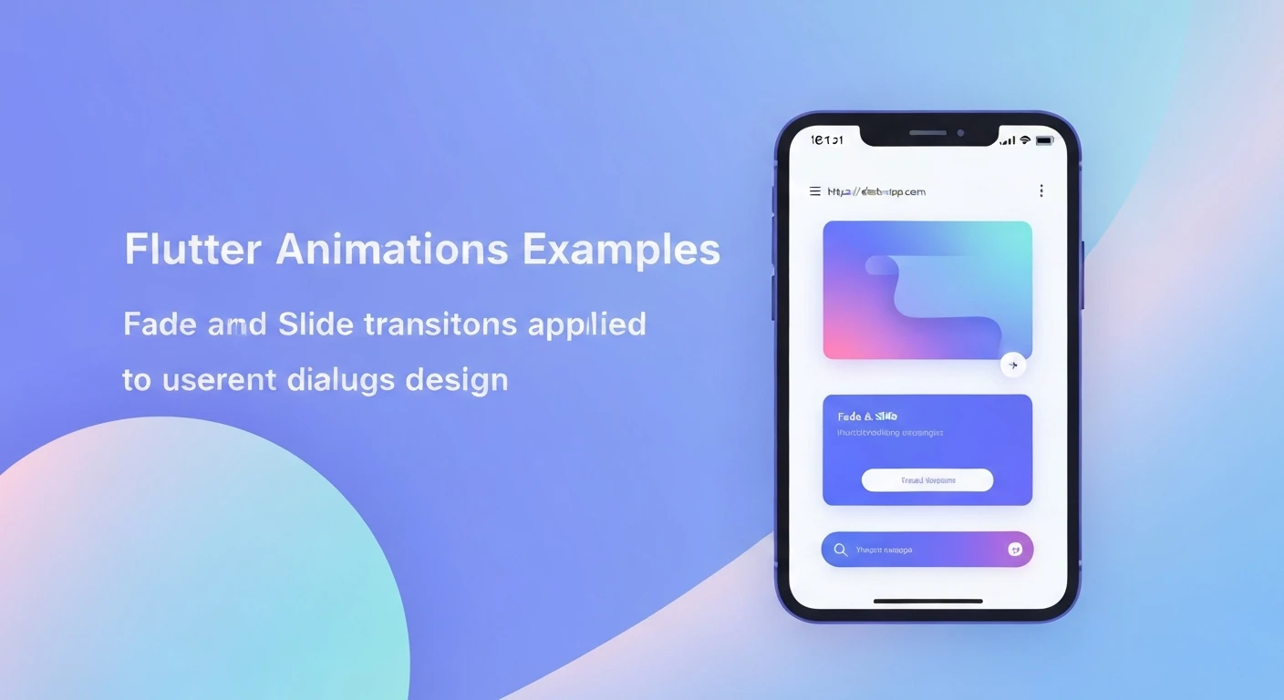
Animations are crucial for creating engaging and intuitive user interfaces. In Flutter, adding subtle or dynamic animations to elements like modal dialogs and popups can significantly enhance the user experience by providing visual cues and making transitions feel smoother and more natural. This article delves into implementing fade and slide animations for modals and popups using Flutter's powerful animation framework.
Understanding Core Animation Concepts in Flutter
Before diving into code, let's quickly review the fundamental building blocks of Flutter animations:
- AnimationController: Manages the state of an animation, including starting, stopping, and reversing. It requires a `vsync` object, typically provided by `SingleTickerProviderStateMixin` for `StatefulWidget`s.
- Animation: An abstract class that stores the animated value. `Animation` is common for opacity or scaling, while `Animation` is used for sliding.
- Tween: Defines the range of an animation (e.g., `Tween(begin: 0.0, end: 1.0)`). It maps the controller's value to the desired output range.
- CurvedAnimation: Allows applying a non-linear curve to an animation, making it accelerate or decelerate more naturally (e.g., `Curves.easeOut`).
- Transition Widgets: Flutter provides several built-in transition widgets like `FadeTransition`, `SlideTransition`, `ScaleTransition`, etc., that take an `Animation` and a `child` widget to animate its properties.
Implementing a Fade Animation
A fade animation gradually changes the opacity of a widget, making it appear or disappear smoothly. This is often the simplest and most elegant animation for modal entrances.
Code Example: Simple Fade Transition Widget
import 'package:flutter/material.dart';

class FadeInTransition extends StatefulWidget {
  final Widget child;
  final Duration duration;

  const FadeInTransition({
    Key? key,
    required this.child,
    this.duration = const Duration(milliseconds: 300),
  }) : super(key: key);

  @override
  _FadeInTransitionState createState() => _FadeInTransitionState();
}

class _FadeInTransitionState extends State with SingleTickerProviderStateMixin {
  late AnimationController _controller;
  late Animation _animation;

  @override
  void initState() {
    super.initState();
    _controller = AnimationController(
      vsync: this,
      duration: widget.duration,
    );
    _animation = CurvedAnimation(
      parent: _controller,
      curve: Curves.easeOut,
    );
    _controller.forward(); // Start the animation
  }

  @override
  void dispose() {
    _controller.dispose();
    super.dispose();
  }

  @override
  Widget build(BuildContext context) {
    return FadeTransition(
      opacity: _animation,
      child: widget.child,
    );
  }
}
Implementing a Slide Animation
A slide animation makes a widget appear to slide into view from a particular direction (e.g., bottom, top, left, right). This adds a sense of depth and motion to the UI.
Code Example: Simple Slide Transition Widget
import 'package:flutter/material.dart';

class SlideInTransition extends StatefulWidget {
  final Widget child;
  final Duration duration;
  final Offset beginOffset; // Where the slide starts relative to its end position

  const SlideInTransition({
    Key? key,
    required this.child,
    this.duration = const Duration(milliseconds: 300),
    this.beginOffset = const Offset(0.0, 1.0), // Starts from bottom (1.0 means 100% of height)
  }) : super(key: key);

  @override
  _SlideInTransitionState createState() => _SlideInTransitionState();
}

class _SlideInTransitionState extends State with SingleTickerProviderStateMixin {
  late AnimationController _controller;
  late Animation _animation;

  @override
  void initState() {
    super.initState();
    _controller = AnimationController(
      vsync: this,
      duration: widget.duration,
    );
    _animation = Tween(
      begin: widget.beginOffset,
      end: Offset.zero, // Slides to its original position
    ).animate(
      CurvedAnimation(
        parent: _controller,
        curve: Curves.easeOutCubic,
      ),
    );
    _controller.forward(); // Start the animation
  }

  @override
  void dispose() {
    _controller.dispose();
    super.dispose();
  }

  @override
  Widget build(BuildContext context) {
    return SlideTransition(
      position: _animation,
      child: widget.child,
    );
  }
}
Combining Fade and Slide Animations
To create a more dynamic and sophisticated entrance, you can combine both fade and slide animations. This is achieved by nesting the `FadeTransition` and `SlideTransition` widgets.
Code Example: Combined Fade and Slide Transition Widget
import 'package:flutter/material.dart';

class FadeSlideTransition extends StatefulWidget {
  final Widget child;
  final Duration duration;
  final Offset beginOffset;

  const FadeSlideTransition({
    Key? key,
    required this.child,
    this.duration = const Duration(milliseconds: 400),
    this.beginOffset = const Offset(0.0, 0.2), // Slight slide from bottom
  }) : super(key: key);

  @override
  _FadeSlideTransitionState createState() => _FadeSlideTransitionState();
}

class _FadeSlideTransitionState extends State with SingleTickerProviderStateMixin {
  late AnimationController _controller;
  late Animation _fadeAnimation;
  late Animation _slideAnimation;

  @override
  void initState() {
    super.initState();
    _controller = AnimationController(
      vsync: this,
      duration: widget.duration,
    );

    // Fade animation (0.0 to 1.0)
    _fadeAnimation = Tween(begin: 0.0, end: 1.0).animate(
      CurvedAnimation(
        parent: _controller,
        curve: Curves.easeOut,
      ),
    );

    // Slide animation (from beginOffset to Offset.zero)
    _slideAnimation = Tween(
      begin: widget.beginOffset,
      end: Offset.zero,
    ).animate(
      CurvedAnimation(
        parent: _controller,
        curve: Curves.easeOutCubic,
      ),
    );

    _controller.forward(); // Start the animation
  }

  @override
  void dispose() {
    _controller.dispose();
    super.dispose();
  }

  @override
  Widget build(BuildContext context) {
    return SlideTransition(
      position: _slideAnimation,
      child: FadeTransition(
        opacity: _fadeAnimation,
        child: widget.child,
      ),
    );
  }
}
Implementing Animations in Modal Dialogs and Popups
Flutter provides `showDialog` for standard Material Design dialogs and `showGeneralDialog` for highly customized dialogs and popups. For custom entrance and exit animations, `showGeneralDialog` is the preferred choice due to its `transitionBuilder` argument.
The `transitionBuilder` receives an `animation` object (which goes from 0.0 to 1.0 on entrance and 1.0 to 0.0 on exit) that you can use to drive your transition widgets.
Using showGeneralDialog for Custom Transitions
import 'package:flutter/material.dart';

void showAnimatedModal(BuildContext context) {
  showGeneralDialog(
    context: context,
    pageBuilder: (context, animation, secondaryAnimation) {
      // This is the actual content of your dialog or popup.
      // Wrap it in Material to give it theme properties and elevation if needed.
      return Center(
        child: Material(
          type: MaterialType.transparency, // Essential for transparent background
          child: Container(
            padding: EdgeInsets.all(20),
            margin: EdgeInsets.symmetric(horizontal: 20),
            decoration: BoxDecoration(
              color: Colors.white,
              borderRadius: BorderRadius.circular(15),
              boxShadow: [
                BoxShadow(
                  color: Colors.black.withOpacity(0.15),
                  blurRadius: 10,
                  offset: Offset(0, 5),
                ),
              ],
            ),
            child: Column(
              mainAxisSize: MainAxisSize.min,
              children: [
                Text(
                  'Animated Dialog Title',
                  style: TextStyle(fontSize: 24, fontWeight: FontWeight.bold, color: Colors.blueGrey),
                  textAlign: TextAlign.center,
                ),
                SizedBox(height: 15),
                Text(
                  'This modal dialog beautifully animates into view using a combined fade and slide effect. Enhance your UI with smooth transitions!',
                  textAlign: TextAlign.center,
                  style: TextStyle(fontSize: 16, color: Colors.blueGrey.shade700),
                ),
                SizedBox(height: 25),
                ElevatedButton(
                  onPressed: () {
                    Navigator.of(context).pop(); // Close the dialog
                  },
                  style: ElevatedButton.styleFrom(
                    primary: Colors.blue,
                    onPrimary: Colors.white,
                    padding: EdgeInsets.symmetric(horizontal: 30, vertical: 12),
                    shape: RoundedRectangleBorder(borderRadius: BorderRadius.circular(10)),
                  ),
                  child: Text(
                    'Got It!',
                    style: TextStyle(fontSize: 18),
                  ),
                ),
              ],
            ),
          ),
        ),
      );
    },
    transitionBuilder: (context, animation, secondaryAnimation, child) {
      // Create a CurvedAnimation for the entrance and exit
      final CurvedAnimation curvedAnimation = CurvedAnimation(
        parent: animation,
        curve: Curves.easeOutCubic, // Curve for the dialog entrance
        reverseCurve: Curves.easeInCubic, // Curve for the dialog exit
      );

      // Define the slide tween: starts slightly from bottom, ends at original position
      final Tween slideTween = Tween(
        begin: const Offset(0.0, 0.2), // Start 20% below its final position
        end: Offset.zero,
      );

      // Define the fade tween: starts transparent, ends opaque
      final Tween fadeTween = Tween(
        begin: 0.0,
        end: 1.0,
      );

      return SlideTransition(
        position: slideTween.animate(curvedAnimation),
        child: FadeTransition(
          opacity: fadeTween.animate(curvedAnimation),
          child: child, // The dialog content built by pageBuilder
        ),
      );
    },
    transitionDuration: Duration(milliseconds: 400), // Duration for both entrance and exit
    barrierDismissible: true, // Allows dismissing by tapping outside
    barrierLabel: 'Dismiss',
    barrierColor: Colors.black54, // Semi-transparent black barrier
  );
}

// Example usage in a main application widget:
class MyHomePage extends StatelessWidget {
  @override
  Widget build(BuildContext context) {
    return Scaffold(
      appBar: AppBar(
        title: Text('Flutter Animated Modals'),
        backgroundColor: Colors.blueAccent,
      ),
      body: Center(
        child: ElevatedButton(
          onPressed: () => showAnimatedModal(context),
          style: ElevatedButton.styleFrom(
            primary: Colors.blue,
            onPrimary: Colors.white,
            padding: EdgeInsets.symmetric(horizontal: 30, vertical: 15),
            textStyle: TextStyle(fontSize: 18, fontWeight: FontWeight.bold),
            shape: RoundedRectangleBorder(borderRadius: BorderRadius.circular(10)),
          ),
          child: Text('Show Animated Dialog'),
        ),
      ),
    );
  }
}

// To run this example, you would typically wrap MyHomePage in a MaterialApp:
// void main() {
//   runApp(MaterialApp(
//     debugShowCheckedModeBanner: false,
//     home: MyHomePage(),
//   ));
// }
Best Practices and Tips
- Choose Appropriate Durations: Too fast and the animation might be missed; too slow and it can feel sluggish. 300-500 milliseconds is often a good range.
- Select Suitable Curves: `Curves.easeOutCubic`, `Curves.decelerate`, or `Curves.bounceOut` can add character. Use `reverseCurve` for exit animations to make them distinct or mirror the entrance.
- Keep it Lightweight: While powerful, complex animations can impact performance. Stick to simple transformations like opacity, position, and scale for modals to ensure smooth operation on all devices.
- Contextual Animation: Consider the purpose of the modal. A simple notification might use a subtle fade, while a critical warning could use a more prominent slide from the top.
- Accessibility: Ensure animations do not negatively impact users with motion sensitivities. Flutter allows respecting system animation preferences, which can be checked via `MediaQuery.of(context).platformBrightness`.
Conclusion
Flutter's animation framework offers robust and flexible tools to create stunning UI transitions. By leveraging `AnimationController`, `Tween`, `CurvedAnimation`, and built-in transition widgets like `FadeTransition` and `SlideTransition`, you can easily implement sophisticated entrance and exit animations for modal dialogs and popups. `showGeneralDialog` provides the necessary control to integrate these custom animations, transforming a static UI element into a dynamic and delightful user experience. Master these techniques to bring your Flutter applications to life!