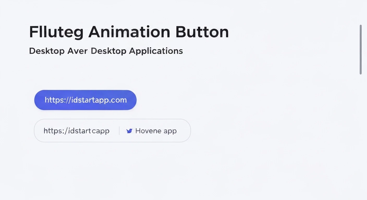

Flutter Animated Button Hover for Desktop Apps
Creating engaging user interfaces is paramount for any modern application, and desktop applications built with Flutter are no exception. A subtle yet powerful way to enhance user experience is through interactive elements like buttons that respond dynamically to user input. This article will guide you through implementing an animated button hover effect specifically tailored for Flutter desktop applications, utilizing core Flutter widgets to create a smooth and professional feel.
The Importance of Hover Effects in Desktop UI/UX
Unlike mobile interfaces where touch is the primary interaction, desktop applications heavily rely on mouse and keyboard input. Hover effects provide crucial visual feedback, indicating that an element is interactive and responsive. This pre-action feedback improves usability, guides the user's eye, and makes the application feel more alive and polished. For Flutter desktop apps, implementing such effects is key to delivering a native-like and intuitive experience.
Core Concepts: MouseRegion and AnimatedContainer
To achieve a sophisticated button hover animation, we will leverage two fundamental Flutter widgets:
MouseRegion
The
MouseRegion
MouseRegion(
  onEnter: (event) {
    // Handle mouse entering
  },
  onExit: (event) {
    // Handle mouse exiting
  },
  child: // Your button widget
)
AnimatedContainer
AnimatedContainer
AnimatedContainer(
  duration: Duration(milliseconds: 300),
  curve: Curves.easeInOut,
  color: _isHovering ? Colors.blueAccent : Colors.blue,
  width: _isHovering ? 200.0 : 150.0,
  height: 50.0,
  child: // Content of the container
)
Step-by-Step Implementation
Let's walk through building a custom animated button hover effect. We'll create a
StatefulWidget1. Create a StatefulWidget
First, set up a
StatefulWidget_isHovering
import 'package:flutter/material.dart';

class HoverAnimatedButton extends StatefulWidget {
  final String text;
  final VoidCallback onPressed;

  const HoverAnimatedButton({
    Key? key,
    required this.text,
    required this.onPressed,
  }) : super(key: key);

  @override
  _HoverAnimatedButtonState createState() => _HoverAnimatedButtonState();
}

class _HoverAnimatedButtonState extends State {
  bool _isHovering = false;

  @override
  Widget build(BuildContext context) {
    // Build method content will go here
    return Container(); // Placeholder
  }
}
2. Integrate MouseRegion for Hover Detection
Wrap your button's visual representation (e.g., a
ContainerMouseRegion_isHoveringonEnteronExit
// Inside _HoverAnimatedButtonState's build method
MouseRegion(
  onEnter: (event) => setState(() => _isHovering = true),
  onExit: (event) => setState(() => _isHovering = false),
  child: GestureDetector( // Use GestureDetector for onTap
    onTap: widget.onPressed,
    child: AnimatedContainer(
      // AnimatedContainer properties will go here
      duration: Duration(milliseconds: 200),
      curve: Curves.easeInOut,
      // Placeholder for now
      alignment: Alignment.center,
      child: Text(
        widget.text,
        style: TextStyle(
          color: Colors.white,
          fontWeight: FontWeight.bold,
        ),
      ),
    ),
  ),
)
3. Animate Properties with AnimatedContainer
Now, enhance the
AnimatedContainer_isHovering
// Inside _HoverAnimatedButtonState's build method, replacing the previous AnimatedContainer
MouseRegion(
  onEnter: (event) => setState(() => _isHovering = true),
  onExit: (event) => setState(() => _isHovering = false),
  child: GestureDetector(
    onTap: widget.onPressed,
    child: AnimatedContainer(
      duration: Duration(milliseconds: 200),
      curve: Curves.easeInOut,
      height: 50.0,
      width: _isHovering ? 200.0 : 180.0, // Expand width on hover
      decoration: BoxDecoration(
        color: _isHovering ? Colors.blue[700] : Colors.blue, // Darken color on hover
        borderRadius: BorderRadius.circular( _isHovering ? 12.0 : 8.0), // Change border radius
        boxShadow: [
          BoxShadow(
            color: Colors.black.withOpacity(_isHovering ? 0.3 : 0.1),
            blurRadius: _isHovering ? 10.0 : 4.0,
            offset: Offset(0, _isHovering ? 6.0 : 2.0),
          ),
        ],
      ),
      alignment: Alignment.center,
      child: Text(
        widget.text,
        style: TextStyle(
          color: Colors.white,
          fontSize: _isHovering ? 18.0 : 16.0, // Enlarge text on hover
          fontWeight: FontWeight.bold,
        ),
      ),
    ),
  ),
)
Full Example
Here's the complete code for a customizable animated hover button:
import 'package:flutter/material.dart';

void main() {
  runApp(MyApp());
}

class MyApp extends StatelessWidget {
  @override
  Widget build(BuildContext context) {
    return MaterialApp(
      title: 'Flutter Desktop Hover Button',
      theme: ThemeData(
        primarySwatch: Colors.blue,
      ),
      home: Scaffold(
        appBar: AppBar(
          title: Text('Hover Button Demo'),
        ),
        body: Center(
          child: Column(
            mainAxisAlignment: MainAxisAlignment.center,
            children: [
              HoverAnimatedButton(
                text: 'Click Me!',
                onPressed: () {
                  print('Button Pressed!');
                },
              ),
              SizedBox(height: 30),
              HoverAnimatedButton(
                text: 'Another Button',
                onPressed: () {
                  print('Another Button Pressed!');
                },
                baseColor: Colors.green,
                hoverColor: Colors.green[700],
                initialWidth: 220,
                hoverWidth: 250,
              ),
            ],
          ),
        ),
      ),
    );
  }
}

class HoverAnimatedButton extends StatefulWidget {
  final String text;
  final VoidCallback onPressed;
  final Color baseColor;
  final Color? hoverColor;
  final double initialWidth;
  final double hoverWidth;
  final double height;
  final double initialFontSize;
  final double hoverFontSize;
  final Duration animationDuration;
  final Curve animationCurve;

  const HoverAnimatedButton({
    Key? key,
    required this.text,
    required this.onPressed,
    this.baseColor = Colors.blue,
    this.hoverColor,
    this.initialWidth = 180.0,
    this.hoverWidth = 200.0,
    this.height = 50.0,
    this.initialFontSize = 16.0,
    this.hoverFontSize = 18.0,
    this.animationDuration = const Duration(milliseconds: 200),
    this.animationCurve = Curves.easeInOut,
  }) : super(key: key);

  @override
  _HoverAnimatedButtonState createState() => _HoverAnimatedButtonState();
}

class _HoverAnimatedButtonState extends State {
  bool _isHovering = false;

  @override
  Widget build(BuildContext context) {
    return MouseRegion(
      onEnter: (event) => setState(() => _isHovering = true),
      onExit: (event) => setState(() => _isHovering = false),
      child: GestureDetector(
        onTap: widget.onPressed,
        child: AnimatedContainer(
          duration: widget.animationDuration,
          curve: widget.animationCurve,
          height: widget.height,
          width: _isHovering ? widget.hoverWidth : widget.initialWidth,
          decoration: BoxDecoration(
            color: _isHovering
                ? (widget.hoverColor ?? widget.baseColor.shade700)
                : widget.baseColor,
            borderRadius: BorderRadius.circular(_isHovering ? 12.0 : 8.0),
            boxShadow: [
              BoxShadow(
                color: Colors.black.withOpacity(_isHovering ? 0.3 : 0.1),
                blurRadius: _isHovering ? 10.0 : 4.0,
                offset: Offset(0, _isHovering ? 6.0 : 2.0),
              ),
            ],
          ),
          alignment: Alignment.center,
          child: Text(
            widget.text,
            style: TextStyle(
              color: Colors.white,
              fontSize: _isHovering ? widget.hoverFontSize : widget.initialFontSize,
              fontWeight: FontWeight.bold,
            ),
          ),
        ),
      ),
    );
  }
}
Customization and Best Practices
The provided example offers a solid foundation. Here are some ways to customize and best practices to follow:
- Animation Properties: Experiment with different
andduration
values forcurve
to achieve various animation speeds and styles.AnimatedContainer
orCurves.easeOutBack
can add a bouncy effect.Curves.elasticOut - Animated Properties: Beyond color, width, and shadow, consider animating
,padding
,margin
, or even aalignment
property usingtransform
for more complex visual changes (e.g., slight scaling).Matrix4 - Icons and Text: You can animate the color or size of icons and text within the button as well, using
for text or wrapping an icon in anotherAnimatedDefaultTextStyle
.AnimatedContainer - Reusability: Encapsulate your animated button logic into a separate widget, as shown in the full example, to promote reusability across your application.
- Accessibility: Ensure that the visual feedback is clear and that the button remains tappable/clickable across different states.
- Performance: While
is efficient, be mindful of animating too many complex properties simultaneously, especially on less powerful hardware.AnimatedContainer
Conclusion
Implementing animated button hover effects in your Flutter desktop applications significantly enhances user engagement and polish. By combining the power of
MouseRegionAnimatedContainer


