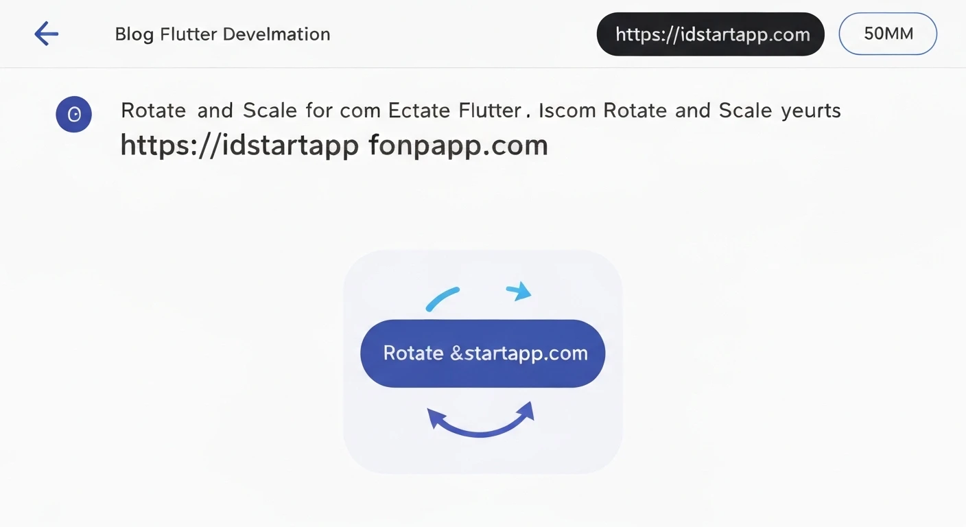

Enhancing User Experience with Flutter Rotate & Scale Animations for Icon Buttons
Animations are crucial for creating engaging and intuitive user interfaces. In Flutter, implementing dynamic visual feedback for user interactions, such as tapping an icon button, can significantly improve the user experience. This article will guide you through creating a sophisticated rotate and scale animation for an icon button using Flutter's built-in animation framework, making your application feel more responsive and polished.
Why Animate Icon Buttons?
Icon buttons are common interactive elements across almost all applications. Adding animations to them provides immediate visual feedback, confirms user actions, and can subtly guide the user's attention. A rotate and scale animation, for instance, can signify an item being added, a menu expanding, a state change (like a favorite button), or simply add a touch of delight, making the application feel much more alive and engaging.
Core Concepts in Flutter Animation
Before diving into the code, let's briefly review the key components of Flutter's animation system, which we'll utilize for our icon button animation:
1. AnimationController
The AnimationController is the heart of many Flutter animations. It manages the animation's progress, duration, and state. It requires a vsync object (typically provided by a TickerProvider mixin like SingleTickerProviderStateMixin) to prevent off-screen animations from consuming resources. You can use it to play, stop, reverse, or reset an animation.
2. Tween
A Tween (short for "in-between") defines a range of values over which an animation should interpolate. For our case, we'll use Tween<double> to define the rotation angle (e.g., from 0 to π/2 radians for 90 degrees) and the scale factor (e.g., from 1.0 to 1.2 for a slight enlargement).
3. CurvedAnimation
CurvedAnimation allows you to apply a non-linear curve to an animation. Instead of a linear progression, you can make the animation accelerate, decelerate, bounce, or ease in/out, which makes the motion feel more natural and appealing. Flutter provides a rich set of predefined curves in the Curves class.
4. AnimatedBuilder
AnimatedBuilder is a performance-optimized widget that rebuilds only its child widget whenever the animation changes. This approach is highly efficient as it separates the animation logic from the widget's build method, preventing unnecessary rebuilds of the entire widget tree and ensuring smooth animations.
Step-by-Step Implementation
1. Setup Your Widget
Start by creating a StatefulWidget and mix in SingleTickerProviderStateMixin. This mixin provides the vsync object required by AnimationController.
import 'package:flutter/material.dart';

class AnimatedIconButtonExample extends StatefulWidget {
  @override
  _AnimatedIconButtonExampleState createState() => _AnimatedIconButtonExampleState();
}

class _AnimatedIconButtonExampleState extends State
    with SingleTickerProviderStateMixin {
  // Animation controllers and tweens will be declared here

  @override
  void initState() {
    super.initState();
    // Initialize animations here
  }

  @override
  Widget build(BuildContext context) {
    return Scaffold(
      appBar: AppBar(title: Text('Animated Icon Button')),
      body: Center(
        child: // The animated button will be placed here
      ),
    );
  }

  @override
  void dispose() {
    // Dispose animation controllers here
    super.dispose();
  }
}
2. Initialize AnimationController and Tweens
Declare and initialize your AnimationController with a desired duration. Then, define Tween objects for rotation and scale, and use CurvedAnimation to apply smooth, non-linear effects.
late AnimationController _controller;
late Animation _rotateAnimation;
late Animation _scaleAnimation;

@override
void initState() {
  super.initState();
  _controller = AnimationController(
    vsync: this,
    duration: Duration(milliseconds: 400), // Animation duration
  );

  // Define the rotation animation: from 0.0 to 90 degrees (PI/2 radians)
  _rotateAnimation = Tween(begin: 0.0, end: 0.5 * 3.14159).animate(
    CurvedAnimation(parent: _controller, curve: Curves.easeOutCubic),
  );

  // Define the scale animation: from 1.0 (original size) to 1.2 (20% larger)
  _scaleAnimation = Tween(begin: 1.0, end: 1.2).animate(
    CurvedAnimation(parent: _controller, curve: Curves.easeOutBack),
  );
}
3. Create the Animated Button with AnimatedBuilder
Wrap your IconButton with an AnimatedBuilder. Inside the builder's callback, use Transform.rotate and Transform.scale widgets to apply the continuously updated animation values from your _rotateAnimation and _scaleAnimation. The child parameter of the AnimatedBuilder is your static IconButton, which prevents it from being rebuilt on every animation tick.
Center(
  child: AnimatedBuilder(
    animation: _controller,
    builder: (context, child) {
      return Transform.rotate(
        angle: _rotateAnimation.value,
        child: Transform.scale(
          scale: _scaleAnimation.value,
          child: child, // The IconButton is passed as child for efficiency
        ),
      );
    },
    child: IconButton(
      icon: Icon(Icons.add_circle, size: 70.0),
      color: Colors.deepPurple,
      onPressed: () {
        // Implement onPressed logic here
      },
    ),
  ),
)
4. Implement onPressed Logic
In the onPressed callback of your IconButton, control the animation based on its current state. A common pattern is to toggle the animation between playing forward and reversing back to its initial state.
onPressed: () {
  if (_controller.isCompleted) {
    _controller.reverse(); // If animation completed, reverse it
  } else {
    _controller.forward(); // Otherwise, play it forward
  }
},
5. Dispose the Controller
It's crucial to dispose of the AnimationController when the StatefulWidget is removed from the widget tree to prevent memory leaks and ensure resources are properly managed.
@override
void dispose() {
  _controller.dispose();
  super.dispose();
}
Full Code Example
Here's the complete code for an animated icon button that rotates and scales on press:
import 'package:flutter/material.dart';

void main() {
  runApp(MyApp());
}

class MyApp extends StatelessWidget {
  @override
  Widget build(BuildContext context) {
    return MaterialApp(
      title: 'Flutter Animated Icon Button',
      theme: ThemeData(
        primarySwatch: Colors.blue,
        visualDensity: VisualDensity.adaptivePlatformDensity,
      ),
      home: AnimatedIconButtonExample(),
    );
  }
}

class AnimatedIconButtonExample extends StatefulWidget {
  @override
  _AnimatedIconButtonExampleState createState() => _AnimatedIconButtonExampleState();
}

class _AnimatedIconButtonExampleState extends State
    with SingleTickerProviderStateMixin {
  late AnimationController _controller;
  late Animation _rotateAnimation;
  late Animation _scaleAnimation;

  @override
  void initState() {
    super.initState();
    _controller = AnimationController(
      vsync: this,
      duration: Duration(milliseconds: 400), // Animation duration
    );

    // Define the rotation animation: from 0.0 to 90 degrees (PI/2 radians)
    _rotateAnimation = Tween(begin: 0.0, end: 0.5 * 3.14159).animate(
      CurvedAnimation(parent: _controller, curve: Curves.easeOutCubic),
    );

    // Define the scale animation: from 1.0 (original size) to 1.2 (20% larger)
    _scaleAnimation = Tween(begin: 1.0, end: 1.2).animate(
      CurvedAnimation(parent: _controller, curve: Curves.easeOutBack),
    );
  }

  @override
  Widget build(BuildContext context) {
    return Scaffold(
      appBar: AppBar(
        title: Text('Flutter Animated Icon Button'),
      ),
      body: Center(
        child: AnimatedBuilder(
          animation: _controller,
          builder: (context, child) {
            return Transform.rotate(
              angle: _rotateAnimation.value,
              child: Transform.scale(
                scale: _scaleAnimation.value,
                child: child, // The IconButton is passed as child for efficiency
              ),
            );
          },
          child: IconButton(
            icon: Icon(Icons.add_circle, size: 70.0),
            color: Colors.deepPurple,
            onPressed: () {
              if (_controller.isCompleted) {
                _controller.reverse(); // If animation completed, reverse it
              } else {
                _controller.forward(); // Otherwise, play it forward
              }
            },
          ),
        ),
      ),
    );
  }

  @override
  void dispose() {
    _controller.dispose(); // Dispose the controller to prevent memory leaks
    super.dispose();
  }
}
Conclusion
By leveraging Flutter's powerful animation framework, you can easily implement visually appealing rotate and scale animations for your icon buttons. This not only adds a layer of professionalism and polish to your application but also significantly enhances the user's perception of responsiveness and interaction. Experiment with different Curves, Tween values, and durations to create unique and engaging animations that perfectly fit your app's design language and provide delightful user experiences.


