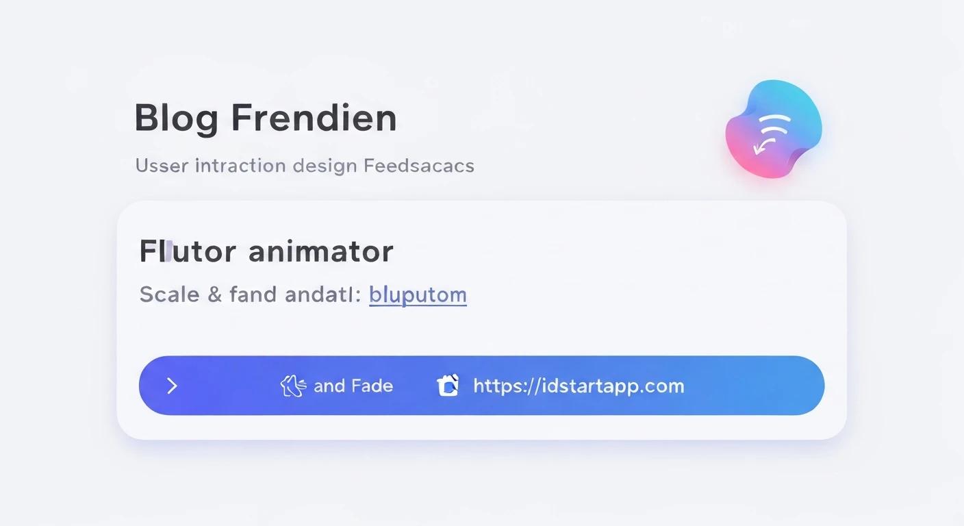

Enhancing User Experience: Flutter Scale & Fade Animations for Button Interaction Feedback
In the realm of modern application development, user experience (UX) reigns supreme. A crucial aspect of good UX is providing immediate and intuitive feedback for user interactions. When a user taps a button, a subtle visual cue can significantly enhance their perception of responsiveness and confirm that their action has been registered. Flutter, with its powerful and flexible animation framework, makes it remarkably easy to implement such engaging feedback mechanisms. This article will delve into creating a professional and appealing Scale & Fade animation for button interaction feedback in Flutter.
Why Scale & Fade for Button Feedback?
Among various animation techniques, a combination of scaling and fading stands out for button feedback due to its elegance and effectiveness:
- Subtle Confirmation: A slight scale-down and simultaneous fade provides a gentle, non-intrusive confirmation that the button has been pressed without being distracting.
- Visual Engagement: Animations add a layer of polish and dynamism, making the application feel more alive and responsive compared to static interactions.
- Intuitive Association: The action of pressing a physical button often involves a slight depression. A scale-down effect mimics this physical interaction, making it intuitive. The fade adds a touch of digital "reaction."
- Versatility: This animation style can be applied to almost any button design, from `ElevatedButton` to custom interactive widgets, without clashing with the overall UI aesthetics.
Implementing Scale & Fade Animation in Flutter
Flutter's animation system is robust, offering both implicit and explicit animation approaches. For custom and interactive feedback like this, an explicit animation driven by an AnimationController provides the most control and flexibility. We will create a custom widget that encapsulates this animation logic, making it reusable.
Our approach will involve:
- Utilizing an
AnimationControllerto manage the animation's progress. - Defining two
Tweenanimations: one for scaling and one for opacity. - Employing a
GestureDetectorto capture tap events (onTapDown,onTapUp,onTapCancel) to trigger the animation forward and reverse. - Using an
AnimatedBuilderto rebuild the UI with the updated animation values efficiently.
Here's a complete code example for an `InteractiveScaleFadeButton` widget:
import 'package:flutter/material.dart';

class InteractiveScaleFadeButton extends StatefulWidget {
  final Widget child;
  final VoidCallback? onPressed;
  final Duration animationDuration;
  final double scaleFactor;
  final double fadeFactor;

  const InteractiveScaleFadeButton({
    Key? key,
    required this.child,
    this.onPressed,
    this.animationDuration = const Duration(milliseconds: 150),
    this.scaleFactor = 0.95, // Button shrinks to 95% of its size
    this.fadeFactor = 0.7,   // Button fades to 70% opacity
  }) : super(key: key);

  @override
  _InteractiveScaleFadeButtonState createState() => _InteractiveScaleFadeButtonState();
}

class _InteractiveScaleFadeButtonState extends State
    with SingleTickerProviderStateMixin {
  late AnimationController _animationController;
  late Animation _scaleAnimation;
  late Animation _fadeAnimation;

  @override
  void initState() {
    super.initState();
    _animationController = AnimationController(
      vsync: this,
      duration: widget.animationDuration,
    );

    _scaleAnimation = Tween(begin: 1.0, end: widget.scaleFactor).animate(
      CurvedAnimation(
        parent: _animationController,
        curve: Curves.easeOut, // Quick ease out for press feedback
      ),
    );

    _fadeAnimation = Tween(begin: 1.0, end: widget.fadeFactor).animate(
      CurvedAnimation(
        parent: _animationController,
        curve: Curves.easeOut, // Quick ease out for press feedback
      ),
    );
  }

  @override
  void dispose() {
    _animationController.dispose();
    super.dispose();
  }

  void _handleTapDown(TapDownDetails details) {
    _animationController.forward();
  }

  void _handleTapUp(TapUpDetails details) {
    _animationController.reverse();
    widget.onPressed?.call();
  }

  void _handleTapCancel() {
    _animationController.reverse();
  }

  @override
  Widget build(BuildContext context) {
    return GestureDetector(
      onTapDown: _handleTapDown,
      onTapUp: _handleTapUp,
      onTapCancel: _handleTapCancel,
      onTap: widget.onPressed, // For general tap functionality
      child: AnimatedBuilder(
        animation: _animationController,
        builder: (context, child) {
          return Opacity(
            opacity: _fadeAnimation.value,
            child: Transform.scale(
              scale: _scaleAnimation.value,
              child: widget.child,
            ),
          );
        },
        child: widget.child, // The actual button content (e.g., a Text or Icon)
      ),
    );
  }
}

// Example of how to use the InteractiveScaleFadeButton:
class MyApp extends StatelessWidget {
  @override
  Widget build(BuildContext context) {
    return MaterialApp(
      home: Scaffold(
        appBar: AppBar(title: const Text('Interactive Button Demo')),
        body: Center(
          child: Column(
            mainAxisAlignment: MainAxisAlignment.center,
            children: [
              InteractiveScaleFadeButton(
                onPressed: () {
                  print('Elevated Button Pressed!');
                },
                child: ElevatedButton(
                  onPressed: null, // onPressed handled by InteractiveScaleFadeButton
                  style: ElevatedButton.styleFrom(
                    padding: const EdgeInsets.symmetric(horizontal: 40, vertical: 15),
                    textStyle: const TextStyle(fontSize: 20),
                  ),
                  child: const Text('Click Me'),
                ),
              ),
              const SizedBox(height: 30),
              InteractiveScaleFadeButton(
                onPressed: () {
                  print('Icon Button Pressed!');
                },
                child: Container(
                  padding: const EdgeInsets.all(12),
                  decoration: BoxDecoration(
                    color: Colors.blueAccent,
                    borderRadius: BorderRadius.circular(10),
                    boxShadow: [
                      BoxShadow(
                        color: Colors.blueAccent.withOpacity(0.3),
                        spreadRadius: 2,
                        blurRadius: 5,
                        offset: const Offset(0, 3),
                      ),
                    ],
                  ),
                  child: const Icon(Icons.star, color: Colors.white, size: 30),
                ),
              ),
              const SizedBox(height: 30),
              InteractiveScaleFadeButton(
                onPressed: () {
                  print('Custom Text Button Pressed!');
                },
                child: const Text(
                  'Custom Text Button',
                  style: TextStyle(
                    fontSize: 24,
                    fontWeight: FontWeight.bold,
                    color: Colors.deepPurple,
                  ),
                ),
              ),
            ],
          ),
        ),
      ),
    );
  }
}

void main() {
  runApp(MyApp());
}
Understanding the Code
InteractiveScaleFadeButtonWidget: ThisStatefulWidgettakes achild(the actual content of your button), an optionalonPressedcallback, and configurableanimationDuration,scaleFactor, andfadeFactor._InteractiveScaleFadeButtonState(State Class):SingleTickerProviderStateMixin: This mixin is essential forAnimationControllerto manage animations efficiently. It prevents unnecessary resource usage._animationController: Initialized ininitStatewith adurationand avsync(provided by theTickerProviderStateMixin). It drives the animation from start to end._scaleAnimation&_fadeAnimation: These areAnimation<double>objects created usingTween. ATweendefines a range (e.g.,1.0to0.95for scale). The.animate()method connects theTweento the_animationControllervia aCurvedAnimation, allowing us to specify an animation curve (Curves.easeOutis good for snappy feedback).dispose(): It's critical to dispose of the_animationControllerwhen the widget is removed from the widget tree to prevent memory leaks._handleTapDown(),_handleTapUp(),_handleTapCancel(): These methods are called by theGestureDetector._handleTapDown: When a tap starts,_animationController.forward()begins the animation (scale down, fade out)._handleTapUp: When the tap is released,_animationController.reverse()runs the animation backward (scale up, fade in). The `widget.onPressed?.call()` is invoked here, ensuring the button's action is triggered on release, which is standard behavior._handleTapCancel: If the tap is canceled (e.g., user drags finger off the button), the animation also reverses.
build()Method:GestureDetector: This widget detects raw touch gestures. We attach our `_handleTap...` methods to its callbacks.AnimatedBuilder: This widget is highly efficient for animations. It listens to the_animationControllerand calls itsbuilderfunction whenever the animation value changes. Crucially, it only rebuilds the animated part of the widget tree (theOpacityandTransform.scale), leaving the rest of the widget's subtree untouched, optimizing performance.Opacity&Transform.scale: Inside theAnimatedBuilder, we use these widgets. They apply the current_fadeAnimation.valueand_scaleAnimation.value, respectively, to the `widget.child`, creating the visual feedback.
Conclusion
Incorporating subtle visual feedback like the Scale & Fade animation for button interactions is a small detail that makes a significant difference in the perceived quality and responsiveness of a Flutter application. By leveraging Flutter's powerful and flexible animation framework, developers can easily create engaging and intuitive user experiences. The InteractiveScaleFadeButton widget presented here offers a reusable and customizable solution, empowering you to sprinkle delightful micro-interactions throughout your app with minimal effort, ultimately leading to a more polished and professional product.


