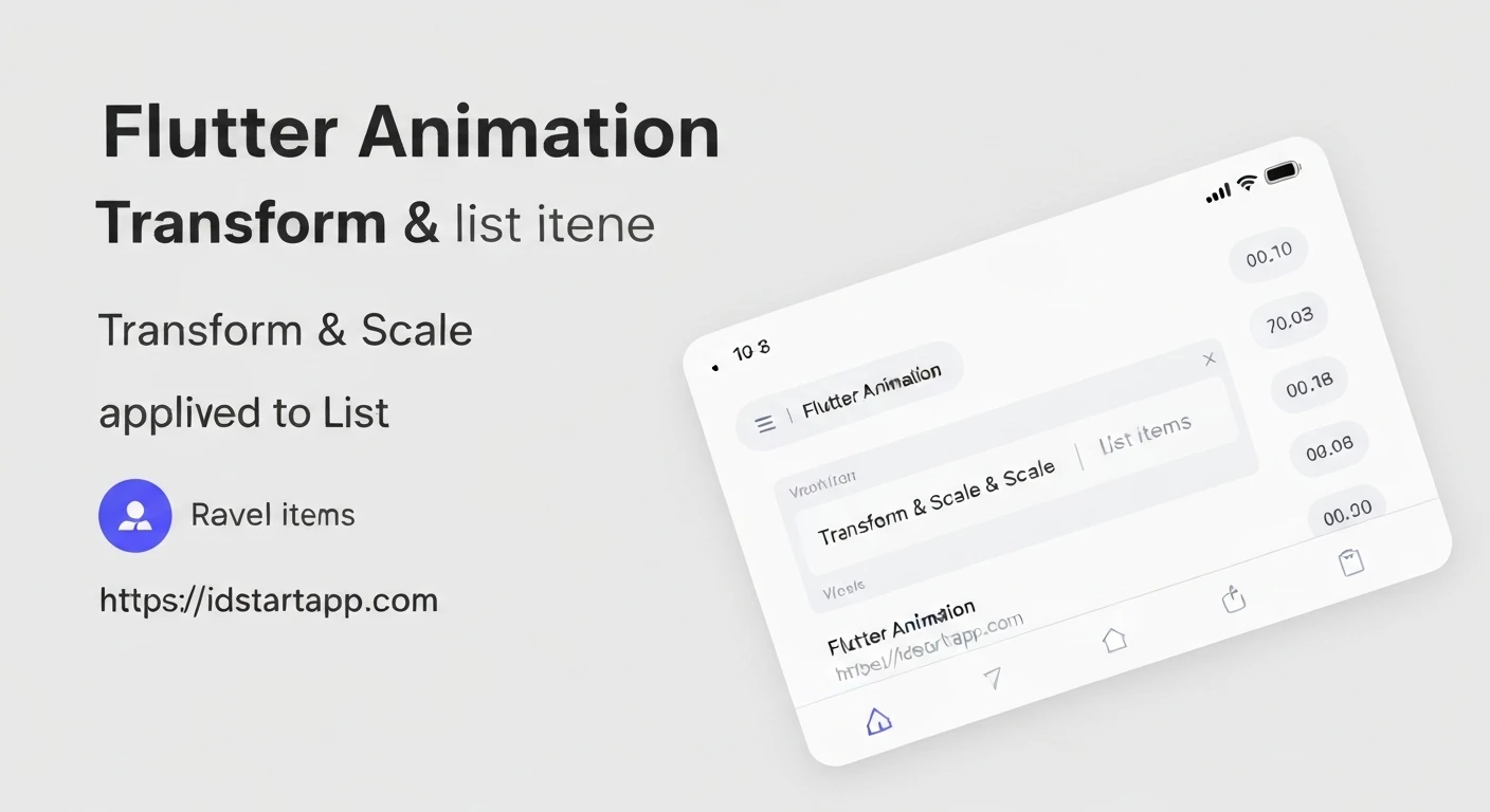

Elevating User Experience: Flutter Animation Transform Scale for List Items
In modern application development, user experience (UX) is paramount. Micro-interactions and subtle visual feedback can significantly enhance how users perceive and interact with an app. When dealing with lists, a common UI component, adding animations to individual list items can make the interface feel more dynamic and responsive. This article will delve into using Flutter's Transform.scale widget to create engaging scale animations for list items, providing users with instant visual cues upon interaction.
The Power of Transform.scale
Flutter's rendering engine provides robust capabilities for transformations. The Transform widget, specifically its Transform.scale constructor, allows you to change the size of its child widget along its X and Y axes. By animating the scale property of this widget, we can create smooth "pop" or "shrink" effects that are perfect for highlighting interactive list items.
Core Concepts for Animation
To implement a smooth scaling animation, we'll utilize several fundamental Flutter animation concepts:
AnimationController: This object drives the animation. It's responsible for generating new values whenever the animation needs to update, managing its duration, and controlling its playback (e.g., forward, reverse, repeat). It requires aTickerProvider(usually provided by mixingSingleTickerProviderStateMixinorTickerProviderStateMixininto yourStateclass).Tween<double>: ATween(short for "in-between") defines a range of values over which an animation should occur. For scaling, we'll use aTween<double>to specify the start and end scale values (e.g., from1.0to1.1).CurvedAnimation: While aTweendefines the range, aCurvedAnimationallows you to apply a non-linear curve to the animation's progress. This makes animations feel more natural and less robotic, with common curves likeCurves.easeOutCubicorCurves.bounceIn.AnimatedBuilder: This widget is an optimization tool. Instead of callingsetState()in anAnimationController's listener, which rebuilds the entire widget,AnimatedBuilderlistens to anAnimationand rebuilds only its own child (or the relevant part of the subtree) when the animation value changes. This improves performance by limiting unnecessary widget rebuilds.
Step-by-Step Implementation
Let's walk through creating a reusable list item widget that scales upon tap.
1. Create a Stateful Widget for the List Item
Our list item needs to manage its own animation state, so it will be a StatefulWidget. We'll mix in SingleTickerProviderStateMixin to provide a Ticker for the AnimationController.
import 'package:flutter/material.dart';

// Main application setup
void main() {
  runApp(const MyApp());
}

class MyApp extends StatelessWidget {
  const MyApp({super.key});

  @override
  Widget build(BuildContext context) {
    return MaterialApp(
      title: 'Flutter List Item Scale Animation',
      theme: ThemeData(
        primarySwatch: Colors.blue,
      ),
      home: const MyHomePage(),
    );
  }
}

class MyHomePage extends StatelessWidget {
  const MyHomePage({super.key});

  @override
  Widget build(BuildContext context) {
    return Scaffold(
      appBar: AppBar(
        title: const Text('Animated List Items'),
      ),
      body: ListView.builder(
        itemCount: 20,
        itemBuilder: (context, index) {
          return ScaleListItem(
            title: 'Item $index',
            subtitle: 'This is a description for item $index',
          );
        },
      ),
    );
  }
}

// The animated list item widget
class ScaleListItem extends StatefulWidget {
  final String title;
  final String subtitle;

  const ScaleListItem({
    super.key,
    required this.title,
    required this.subtitle,
  });

  @override
  State<ScaleListItem> createState() => _ScaleListItemState();
}

class _ScaleListItemState extends State<ScaleListItem>
    with SingleTickerProviderStateMixin {
  late AnimationController _controller;
  late Animation<double> _scaleAnimation;

  @override
  void initState() {
    super.initState();
    // Initialize AnimationController
    _controller = AnimationController(
      vsync: this,
      duration: const Duration(milliseconds: 200), // Animation duration
    );

    // Define the scale animation
    _scaleAnimation = Tween<double>(begin: 1.0, end: 1.05).animate(
      CurvedAnimation(
        parent: _controller,
        curve: Curves.easeOutCubic, // Smooth curve for scaling
      ),
    );
  }

  @override
  void dispose() {
    _controller.dispose(); // Dispose the controller to free up resources
    super.dispose();
  }

  // Method to trigger the animation
  void _onTapItem() {
    _controller.forward().then((_) => _controller.reverse());
  }

  @override
  Widget build(BuildContext context) {
    return GestureDetector(
      onTap: _onTapItem,
      child: AnimatedBuilder(
        animation: _scaleAnimation,
        builder: (context, child) {
          return Transform.scale(
            scale: _scaleAnimation.value, // Apply the animated scale value
            child: Card(
              margin: const EdgeInsets.symmetric(horizontal: 16, vertical: 8),
              elevation: 4,
              shape: RoundedRectangleBorder(
                borderRadius: BorderRadius.circular(10),
              ),
              child: Padding(
                padding: const EdgeInsets.all(16.0),
                child: Column(
                  crossAxisAlignment: CrossAxisAlignment.start,
                  children: [
                    Text(
                      widget.title,
                      style: const TextStyle(
                        fontSize: 18,
                        fontWeight: FontWeight.bold,
                      ),
                    ),
                    const SizedBox(height: 8),
                    Text(
                      widget.subtitle,
                      style: TextStyle(
                        fontSize: 14,
                        color: Colors.grey[600],
                      ),
                    ),
                  ],
                ),
              ),
            ),
          );
        },
      ),
    );
  }
}
Explanation of the Code
_ScaleListItemState with SingleTickerProviderStateMixin: This mixin provides thevsyncobject required byAnimationController. It ensures that animations only run when the widget is visible, optimizing resource usage._controller = AnimationController(...):vsync: this: Links the animation controller to the widget's lifecycle.duration: const Duration(milliseconds: 200): Sets the time it takes for the animation to complete one full cycle (forward or reverse).
_scaleAnimation = Tween<double>(begin: 1.0, end: 1.05).animate(...):Tween(begin: 1.0, end: 1.05): The animation will start at a normal scale (1.0) and grow to 105% of its size..animate(CurvedAnimation(parent: _controller, curve: Curves.easeOutCubic)): This connects theTweento theAnimationControllerand applies a cubic ease-out curve, making the scaling feel natural and smooth.
_onTapItem(): When the user taps the item,_controller.forward()starts the animation (scales up). The.then((_) => _controller.reverse())ensures that once the scale-up animation completes, it immediately reverses, scaling the item back to its original size.AnimatedBuilder:animation: _scaleAnimation: Specifies which animation this builder should listen to.builder: (context, child) { ... }: This function is called whenever_scaleAnimationnotifies its listeners. Only the widgets inside this builder (theTransform.scaleand its child) are rebuilt, not the entireScaleListItemwidget.
Transform.scale(scale: _scaleAnimation.value, child: ...): This is the core of the visual effect. Thescaleproperty is dynamically set to the current value of_scaleAnimation, causing theCardwidget (and its contents) to scale up or down during the animation.dispose(): It's crucial to dispose of theAnimationControllerwhen theStateis removed from the widget tree to prevent memory leaks.
Advanced Considerations
- Performance: For very long lists or complex list items, `AnimatedBuilder` significantly helps performance. For extreme cases with many simultaneous animations, consider using `RepaintBoundary` to isolate the painting of animated widgets.
- Other Transformations: `Transform` is versatile. You can combine scaling with other transformations like `Transform.translate` (moving), `Transform.rotate` (rotating), or `Transform.skew` (shearing) for more elaborate effects.
- Implicit Animations: For simpler animations where you only need to animate properties directly, widgets like `AnimatedContainer`, `AnimatedOpacity`, or `AnimatedPadding` provide a simpler API without needing an explicit `AnimationController`.
- Hero Animations: For smooth transitions of a widget (like a list item image) between different screens, Flutter offers powerful Hero animations.
- Gestures: Instead of `onTap`, you could trigger animations on hover (for desktop/web), long press, or even integrate them with drag gestures.
Conclusion
Implementing subtle scale animations on list items with Flutter's Transform.scale and its animation framework is a straightforward yet powerful way to enhance user experience. By providing immediate visual feedback, these micro-interactions make your application feel more polished, interactive, and enjoyable to use. Experiment with different durations, curves, and scale values to find the perfect feel for your app's unique style.


