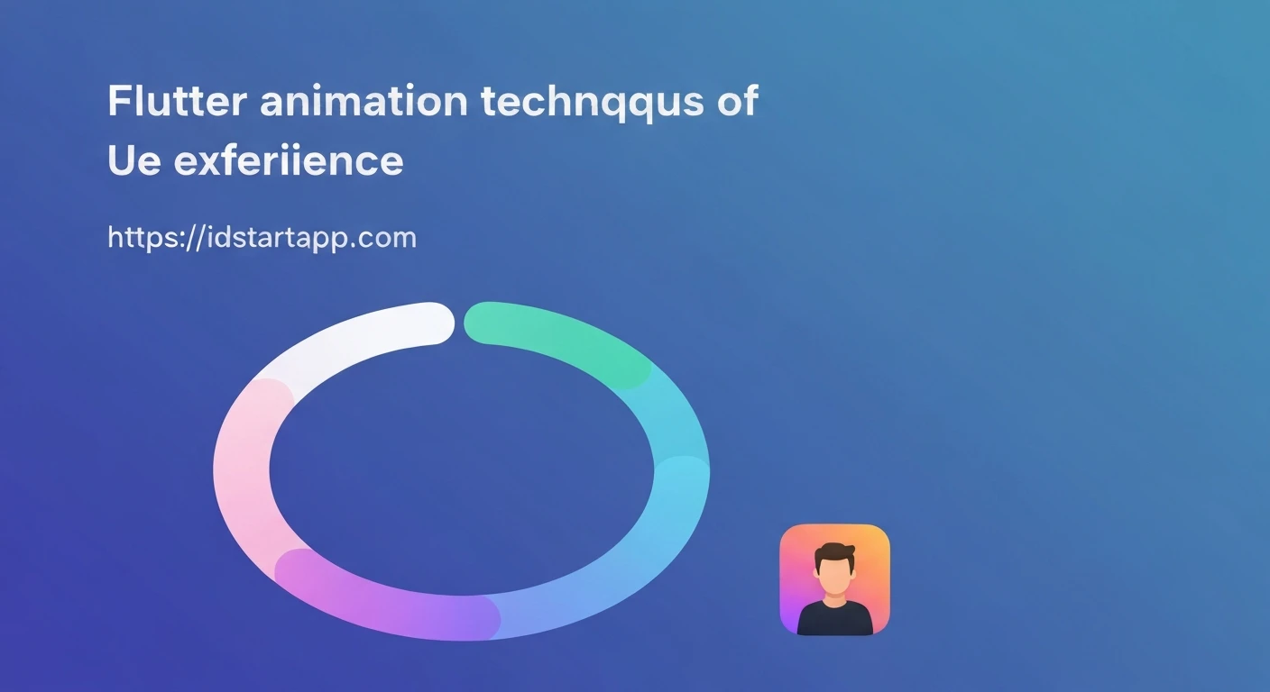

Dynamic Animated Progress Rings in Flutter for Level Apps
In the realm of mobile gaming and productivity applications, visual feedback on user progress is paramount. A beautifully animated progress ring can significantly enhance user experience, providing an intuitive and engaging way to display achievements, level progression, or task completion. Flutter, with its powerful declarative UI and rich animation framework, makes creating such dynamic and customizable progress rings remarkably straightforward.
This article delves into building a dynamic, animated progress ring in Flutter, specifically tailored for applications featuring user levels or experience points. We will leverage Flutter's `CustomPainter` for drawing the ring and its animation framework for smooth transitions.
Core Concepts: CustomPainter and AnimationController
At the heart of our animated progress ring lie two fundamental Flutter concepts:
CustomPainter: This widget allows us to take full control over drawing on a canvas. We can define paths, shapes, colors, and text with pixel-level precision, making it ideal for creating custom graphics like our progress ring.AnimationController: The core class for managing animations. It generates a value between 0.0 and 1.0 over a specified duration. Coupled with `Tween` objects, it can interpolate any value type (e.g., doubles, colors) between a start and end point, enabling smooth transitions.
Building the Custom Painter: The LevelProgressPainter
First, let's define our `CustomPainter` which will draw the static and animated parts of the progress ring. This painter will receive the current progress value (0.0 to 1.0), colors, and stroke width.
import 'dart:math' as math;
import 'package:flutter/material.dart';

class LevelProgressPainter extends CustomPainter {
  final double progress; // Value from 0.0 to 1.0
  final Color backgroundColor;
  final Color progressColor;
  final double strokeWidth;
  final String? centerText;
  final TextStyle? textStyle;

  LevelProgressPainter({
    required this.progress,
    required this.backgroundColor,
    required this.progressColor,
    required this.strokeWidth,
    this.centerText,
    this.textStyle,
  });

  @override
  void paint(Canvas canvas, Size size) {
    final center = Offset(size.width / 2, size.height / 2);
    final radius = math.min(size.width / 2, size.height / 2) - strokeWidth / 2;

    // Paint for background circle
    final backgroundPaint = Paint()
      ..color = backgroundColor
      ..strokeWidth = strokeWidth
      ..style = PaintingStyle.stroke;

    // Paint for progress arc
    final progressPaint = Paint()
      ..color = progressColor
      ..strokeWidth = strokeWidth
      ..style = PaintingStyle.stroke
      ..strokeCap = StrokeCap.round; // Rounded cap for better visual

    // Draw background circle
    canvas.drawCircle(center, radius, backgroundPaint);

    // Draw progress arc
    // The angle starts from -π/2 (top center) and goes clockwise
    final sweepAngle = 2 * math.pi * progress;
    canvas.drawArc(
      Rect.fromCircle(center: center, radius: radius),
      -math.pi / 2, // Start angle
      sweepAngle,   // Sweep angle
      false,        // Use center? No, for arc only
      progressPaint,
    );

    // Draw center text if provided
    if (centerText != null && textStyle != null) {
      final textSpan = TextSpan(
        text: centerText,
        style: textStyle,
      );
      final textPainter = TextPainter(
        text: textSpan,
        textDirection: TextDirection.ltr,
      );
      textPainter.layout(minWidth: 0, maxWidth: size.width);
      final textOffset = Offset(
        center.dx - textPainter.width / 2,
        center.dy - textPainter.height / 2,
      );
      textPainter.paint(canvas, textOffset);
    }
  }

  @override
  bool shouldRepaint(covariant LevelProgressPainter oldDelegate) {
    return oldDelegate.progress != progress ||
           oldDelegate.backgroundColor != backgroundColor ||
           oldDelegate.progressColor != progressColor ||
           oldDelegate.strokeWidth != strokeWidth ||
           oldDelegate.centerText != centerText ||
           oldDelegate.textStyle != textStyle;
  }
}
In this painter:
- We draw a full circle first for the background.
- Then, we draw an arc on top of it, whose `sweepAngle` is proportional to the `progress` value. The `startAngle` is set to `-math.pi / 2` to make the progress start from the top.
- Optionally, text can be drawn in the center to display the current level or percentage.
- `shouldRepaint` ensures that the canvas is redrawn only when relevant properties change, optimizing performance.
Implementing the Animation: The LevelProgressRing Widget
Next, we create a `StatefulWidget` that manages the animation. This widget will own an `AnimationController` and an `Animation` object that interpolates the progress value. When the input `targetProgress` changes, we'll animate the ring from its current state to the new `targetProgress`.
import 'package:flutter/material.dart';
// Assuming LevelProgressPainter is in the same file or imported
// import 'level_progress_painter.dart';

class LevelProgressRing extends StatefulWidget {
  final double targetProgress; // The desired progress (0.0 to 1.0)
  final double size;
  final Color backgroundColor;
  final Color progressColor;
  final double strokeWidth;
  final Duration animationDuration;
  final String? centerText;
  final TextStyle? textStyle;

  const LevelProgressRing({
    Key? key,
    required this.targetProgress,
    this.size = 100.0,
    this.backgroundColor = Colors.grey,
    this.progressColor = Colors.blue,
    this.strokeWidth = 10.0,
    this.animationDuration = const Duration(milliseconds: 700),
    this.centerText,
    this.textStyle,
  }) : assert(targetProgress >= 0.0 && targetProgress <= 1.0),
       super(key: key);

  @override
  _LevelProgressRingState createState() => _LevelProgressRingState();
}

class _LevelProgressRingState extends State with SingleTickerProviderStateMixin {
  late AnimationController _animationController;
  late Animation _progressAnimation;
  double _currentProgress = 0.0;

  @override
  void initState() {
    super.initState();
    _animationController = AnimationController(
      vsync: this,
      duration: widget.animationDuration,
    );

    // Initialize with current progress directly if it's the first build
    // Or if we want to snap to the initial target progress without animation
    _currentProgress = widget.targetProgress;
    _progressAnimation = Tween(begin: _currentProgress, end: widget.targetProgress)
        .animate(CurvedAnimation(parent: _animationController, curve: Curves.easeInOut));

    _animationController.forward(from: 0.0); // Start animation if any
  }

  @override
  void didUpdateWidget(covariant LevelProgressRing oldWidget) {
    super.didUpdateWidget(oldWidget);
    if (widget.targetProgress != oldWidget.targetProgress) {
      _currentProgress = _progressAnimation.value; // Store the progress where animation stopped/currently is
      _animationController.duration = widget.animationDuration; // Update duration if it changed
      _progressAnimation = Tween(begin: _currentProgress, end: widget.targetProgress)
          .animate(CurvedAnimation(parent: _animationController, curve: Curves.easeInOut));
      _animationController.reset();
      _animationController.forward();
    }
  }

  @override
  void dispose() {
    _animationController.dispose();
    super.dispose();
  }

  @override
  Widget build(BuildContext context) {
    return SizedBox(
      width: widget.size,
      height: widget.size,
      child: AnimatedBuilder(
        animation: _progressAnimation,
        builder: (context, child) {
          // If centerText shows percentage, format it here
          String? displayCenterText = widget.centerText;
          if (displayCenterText == null && widget.textStyle != null) {
            displayCenterText = '${(_progressAnimation.value * 100).toInt()}%';
          }

          return CustomPaint(
            painter: LevelProgressPainter(
              progress: _progressAnimation.value,
              backgroundColor: widget.backgroundColor,
              progressColor: widget.progressColor,
              strokeWidth: widget.strokeWidth,
              centerText: displayCenterText,
              textStyle: widget.textStyle ?? Theme.of(context).textTheme.headlineSmall?.copyWith(color: widget.progressColor),
            ),
          );
        },
      ),
    );
  }
}
Key aspects of the `_LevelProgressRingState`:
- The `SingleTickerProviderStateMixin` is used to provide a ticker for the `AnimationController`.
- `initState` initializes the `AnimationController` and sets up the initial `Tween`. We set `_currentProgress` directly to `widget.targetProgress` initially, so the first render shows the correct progress instantly or animates from 0 if `widget.targetProgress` is not 0.
- `didUpdateWidget` is crucial. When the parent widget rebuilds and provides a new `targetProgress`, this method is called. We capture the current animated value, create a new `Tween` from that value to the new `targetProgress`, reset the controller, and start the animation again. This ensures a smooth transition from the old progress to the new.
- `AnimatedBuilder` is used to rebuild only the `CustomPaint` widget whenever the `_progressAnimation` value changes, ensuring optimal performance.
- The `centerText` is optionally formatted to show a percentage based on the animation's current value.
Making it Dynamic for Level Apps
To integrate this into a level-based application, you'll typically have user data containing `currentExperience`, `experienceToNextLevel`, and `currentLevel`. You can derive the `targetProgress` as follows:
double calculateProgress({
  required int currentExperience,
  required int experienceToNextLevel,
}) {
  if (experienceToNextLevel == 0) return 0.0; // Avoid division by zero
  double progress = currentExperience / experienceToNextLevel;
  return progress.clamp(0.0, 1.0); // Ensure progress stays between 0 and 1
}

// Example usage:
// int userExp = 120;
// int expToLevelUp = 200;
// int userLevel = 5;
//
// double progress = calculateProgress(
//   currentExperience: userExp,
//   experienceToNextLevel: expToToLevelUp,
// );
//
// String levelText = 'Lv. $userLevel';
Example Usage in a Parent Widget
Here's how you might use the `LevelProgressRing` in a simple Flutter screen:
import 'package:flutter/material.dart';
// Assuming LevelProgressRing is in a file named level_progress_ring.dart
// import 'level_progress_ring.dart';

class LevelScreen extends StatefulWidget {
  const LevelScreen({Key? key}) : super(key: key);

  @override
  State createState() => _LevelScreenState();
}

class _LevelScreenState extends State {
  int _currentLevel = 1;
  int _currentExperience = 0;
  int _experienceToNextLevel = 100; // XP needed for level 2

  void _gainExperience(int amount) {
    setState(() {
      _currentExperience += amount;
      if (_currentExperience >= _experienceToNextLevel) {
        _currentExperience -= _experienceToNextLevel; // Carry over excess XP
        _currentLevel++;
        _experienceToNextLevel = _experienceToNextLevel + 50; // Next level requires more XP
      }
    });
  }

  @override
  Widget build(BuildContext context) {
    double progress = _currentExperience / _experienceToNextLevel;
    String centerText = 'Lv. $_currentLevel';

    return Scaffold(
      appBar: AppBar(
        title: const Text('Dynamic Level Progress'),
      ),
      body: Center(
        child: Column(
          mainAxisAlignment: MainAxisAlignment.center,
          children: [
            LevelProgressRing(
              targetProgress: progress.clamp(0.0, 1.0),
              size: 200,
              backgroundColor: Colors.blueGrey.shade700,
              progressColor: Colors.amber,
              strokeWidth: 15,
              centerText: centerText,
              textStyle: const TextStyle(
                fontSize: 32,
                fontWeight: FontWeight.bold,
                color: Colors.amber,
              ),
              animationDuration: const Duration(milliseconds: 1000),
            ),
            const SizedBox(height: 30),
            Text(
              'XP: $_currentExperience / $_experienceToNextLevel',
              style: const TextStyle(fontSize: 18),
            ),
            const SizedBox(height: 30),
            ElevatedButton(
              onPressed: () => _gainExperience(25),
              child: const Text('Gain 25 XP'),
            ),
          ],
        ),
      ),
    );
  }
}
In this example, pressing the "Gain XP" button updates the `_currentExperience` and `_experienceToNextLevel` values. Since `LevelProgressRing` watches its `targetProgress` prop in `didUpdateWidget`, it automatically animates to the new progress state.
Conclusion
Creating dynamic and animated progress rings in Flutter is an effective way to provide engaging visual feedback to users, particularly in level-based applications. By combining the precision of `CustomPainter` with the fluidity of Flutter's animation framework, we can build highly customizable and performant UI components. The approach outlined above ensures smooth transitions between progress states, significantly enhancing the overall user experience.
Further enhancements could include gradient colors for the progress arc, different animation curves, or even interactive elements within the ring. Flutter's flexibility makes these extensions straightforward to implement.


