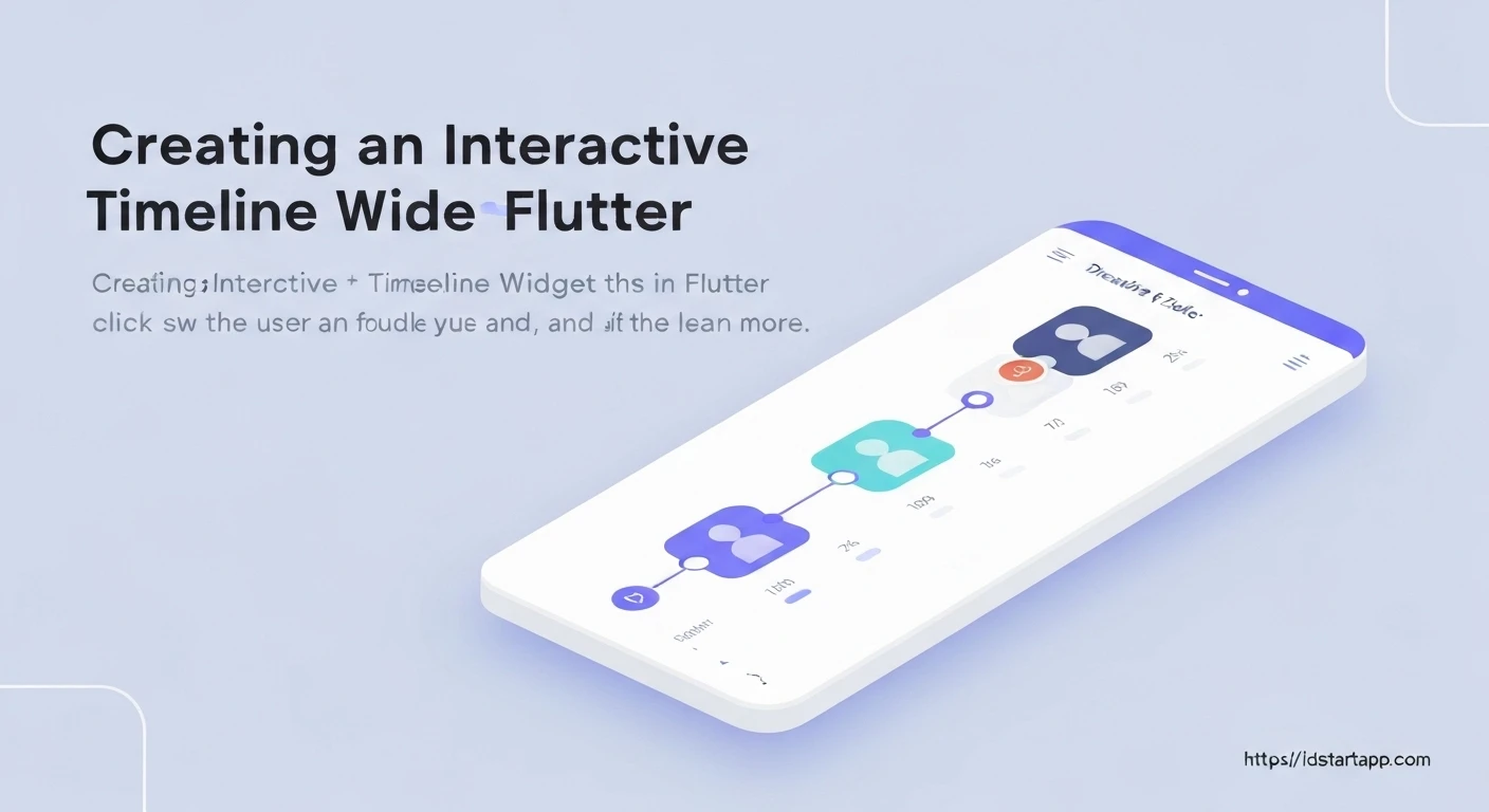
Creating Interactive Timeline Widgets in Flutter
Interactive timeline widgets are powerful tools for visualizing sequential events, historical data, or step-by-step processes within a mobile application. Flutter, with its expressive UI toolkit and robust animation framework, provides an excellent platform for building such dynamic and engaging components. This article will guide you through the process of creating a vertical, interactive timeline widget in Flutter, covering data modeling, custom painting for visual cues, list rendering, and adding user interaction like expanding event details.
1. Understanding the Core Components
To build an interactive timeline, we will leverage several key Flutter concepts:
- Data Model: A simple Dart class to represent each event in our timeline.
ListView.builder: For efficiently rendering a potentially long list of timeline events.CustomPaint & CustomPainter: To draw the distinct visual elements of the timeline, such as the connecting line and event markers (dots).GestureDetector: To capture user interactions, enabling features like expanding event details.- State Management: To handle the interactive state of individual timeline items.
We will structure each timeline event as a `Row` containing a visual timeline indicator (the line and dot) and an `Expanded` widget for the event's content card.
2. Defining the Data Model
First, let's create a simple Dart class to represent the data for each event in our timeline. This class will hold the title, description, and an optional timestamp.
// lib/models/timeline_event.dart
class TimelineEvent {
  final String title;
  final String description;
  final DateTime date;

  TimelineEvent({
    required this.title,
    required this.description,
    required this.date,
  });
}
3. Crafting the Timeline Indicator with CustomPainter
The visual backbone of our timeline is the vertical line and the dots marking each event. We'll use `CustomPainter` to draw these elements within a small container next to each event card. Each event's indicator will draw segments of the line and its own dot.
// lib/widgets/timeline_indicator_painter.dart
import 'package:flutter/material.dart';

class TimelineIndicatorPainter extends CustomPainter {
  final bool isFirst;
  final bool isLast;
  final Color lineColor;
  final Color dotColor;
  final double dotRadius;
  final double lineHeight;

  TimelineIndicatorPainter({
    this.isFirst = false,
    this.isLast = false,
    this.lineColor = Colors.blueGrey,
    this.dotColor = Colors.blue,
    this.dotRadius = 6.0,
    this.lineHeight = 40.0,
  });

  @override
  void paint(Canvas canvas, Size size) {
    final paint = Paint()
      ..color = lineColor
      ..strokeWidth = 2.0
      ..strokeCap = StrokeCap.round;

    final dotPaint = Paint()
      ..color = dotColor
      ..style = PaintingStyle.fill;

    final double startY = 0;
    final double endY = size.height;
    final double centerX = size.width / 2;

    // Draw the upper line segment
    if (!isFirst) {
      canvas.drawLine(Offset(centerX, startY), Offset(centerX, endY / 2 - dotRadius), paint);
    }

    // Draw the lower line segment
    if (!isLast) {
      canvas.drawLine(Offset(centerX, endY / 2 + dotRadius), Offset(centerX, endY), paint);
    }

    // Draw the dot
    canvas.drawCircle(Offset(centerX, endY / 2), dotRadius, dotPaint);
  }

  @override
  bool shouldRepaint(covariant CustomPainter oldDelegate) {
    return false; // Typically, a painter does not need to repaint unless its properties change.
  }
}
4. Designing Individual Event Cards
Each event in the timeline will be represented by a card that can expand to show more details. This widget will manage its own expanded state.
// lib/widgets/timeline_card.dart
import 'package:flutter/material.dart';
import 'package:intl/intl.dart'; // For date formatting

import '../models/timeline_event.dart';

class TimelineCard extends StatefulWidget {
  final TimelineEvent event;

  const TimelineCard({Key? key, required this.event}) : super(key: key);

  @override
  _TimelineCardState createState() => _TimelineCardState();
}

class _TimelineCardState extends State {
  bool _isExpanded = false;

  @override
  Widget build(BuildContext context) {
    return GestureDetector(
      onTap: () {
        setState(() {
          _isExpanded = !_isExpanded;
        });
      },
      child: Card(
        margin: const EdgeInsets.symmetric(vertical: 8.0, horizontal: 16.0),
        elevation: 4.0,
        shape: RoundedRectangleBorder(borderRadius: BorderRadius.circular(12.0)),
        child: Padding(
          padding: const EdgeInsets.all(16.0),
          child: Column(
            crossAxisAlignment: CrossAxisAlignment.start,
            children: [
              Text(
                DateFormat('MMM dd, yyyy').format(widget.event.date),
                style: TextStyle(
                  color: Colors.grey[600],
                  fontSize: 12.0,
                ),
              ),
              const SizedBox(height: 4.0),
              Text(
                widget.event.title,
                style: const TextStyle(
                  fontSize: 18.0,
                  fontWeight: FontWeight.bold,
                ),
              ),
              if (_isExpanded) ...[
                const SizedBox(height: 8.0),
                Text(
                  widget.event.description,
                  style: const TextStyle(fontSize: 14.0),
                ),
              ],
              Align(
                alignment: Alignment.bottomRight,
                child: Icon(
                  _isExpanded ? Icons.keyboard_arrow_up : Icons.keyboard_arrow_down,
                  color: Colors.blue,
                ),
              ),
            ],
          ),
        ),
      ),
    );
  }
}
You'll need to add the `intl` package to your `pubspec.yaml` for date formatting:
dependencies:
  flutter:
    sdk: flutter
  intl: ^0.18.0 # Use the latest version
5. Building the Main Timeline Widget
Now, we'll combine the `TimelineIndicatorPainter` and `TimelineCard` within a `ListView.builder` to construct the full interactive timeline.
// lib/screens/timeline_screen.dart
import 'package:flutter/material.dart';
import '../models/timeline_event.dart';
import '../widgets/timeline_card.dart';
import '../widgets/timeline_indicator_painter.dart';

class TimelineScreen extends StatelessWidget {
  final List<TimelineEvent> events;

  const TimelineScreen({Key? key, required this.events}) : super(key: key);

  @override
  Widget build(BuildContext context) {
    return Scaffold(
      appBar: AppBar(
        title: const Text('Interactive Timeline'),
        backgroundColor: Colors.blueAccent,
      ),
      body: ListView.builder(
        itemCount: events.length,
        itemBuilder: (context, index) {
          final event = events[index];
          final bool isFirst = index == 0;
          final bool isLast = index == events.length - 1;

          return IntrinsicHeight( // Ensures the height of the row matches the card
            child: Row(
              children: [
                // Timeline Indicator Column
                SizedBox(
                  width: 60, // Width for the timeline line and dot
                  child: Column(
                    children: [
                      // Space for the top line if not the first item
                      if (!isFirst)
                        Expanded(
                          child: CustomPaint(
                            painter: TimelineIndicatorPainter(
                              isFirst: false, // Only draw lower part of line from above
                              isLast: true,
                              dotRadius: 0, // No dot here, just line
                              lineHeight: 0, // Not used as it's expanded
                            ),
                          ),
                        ),
                      Container(
                        width: 60, // Fixed width for the dot container
                        height: 40, // Fixed height for the dot
                        child: CustomPaint(
                          painter: TimelineIndicatorPainter(
                            isFirst: isFirst,
                            isLast: isLast,
                          ),
                        ),
                      ),
                      // Space for the bottom line if not the last item
                      if (!isLast)
                        Expanded(
                          child: CustomPaint(
                            painter: TimelineIndicatorPainter(
                              isFirst: true, // Only draw upper part of line to below
                              isLast: false,
                              dotRadius: 0, // No dot here, just line
                              lineHeight: 0, // Not used as it's expanded
                            ),
                          ),
                        ),
                    ],
                  ),
                ),
                // Event Card
                Expanded(
                  child: TimelineCard(event: event),
                ),
              ],
            ),
          );
        },
      ),
    );
  }
}
A slight modification to `TimelineIndicatorPainter` is needed to handle drawing only parts of the line when expanded `CustomPaint` widgets are used:
// lib/widgets/timeline_indicator_painter.dart (Updated part in paint method)
  @override
  void paint(Canvas canvas, Size size) {
    final paint = Paint()
      ..color = lineColor
      ..strokeWidth = 2.0
      ..strokeCap = StrokeCap.round;

    final dotPaint = Paint()
      ..color = dotColor
      ..style = PaintingStyle.fill;

    final double startY = 0;
    final double endY = size.height;
    final double centerX = size.width / 2;

    // Draw the full line if this painter is just drawing a segment
    if (dotRadius == 0) { // This condition checks if it's a line segment painter
      canvas.drawLine(Offset(centerX, startY), Offset(centerX, endY), paint);
    } else {
      // Draw the upper line segment
      if (!isFirst) {
        canvas.drawLine(Offset(centerX, startY), Offset(centerX, endY / 2 - dotRadius), paint);
      }

      // Draw the lower line segment
      if (!isLast) {
        canvas.drawLine(Offset(centerX, endY / 2 + dotRadius), Offset(centerX, endY), paint);
      }

      // Draw the dot
      canvas.drawCircle(Offset(centerX, endY / 2), dotRadius, dotPaint);
    }
  }
The `IntrinsicHeight` and the logic within the `SizedBox` for the indicator are crucial to make the timeline line segments connect properly between event cards, regardless of the card's height.
6. Putting It All Together (main.dart)
Finally, set up your `main.dart` to run the `TimelineScreen` with some dummy data.
// main.dart
import 'package:flutter/material.dart';
import 'package:flutter_timeline_app/models/timeline_event.dart';
import 'package:flutter_timeline_app/screens/timeline_screen.dart';

void main() {
  runApp(const MyApp());
}

class MyApp extends StatelessWidget {
  const MyApp({Key? key}) : super(key: key);

  @override
  Widget build(BuildContext context) {
    final List<TimelineEvent> dummyEvents = [
      TimelineEvent(
        title: 'Project Kick-off',
        description: 'Initial meeting to discuss project scope and requirements.',
        date: DateTime(2023, 1, 15),
      ),
      TimelineEvent(
        title: 'Phase 1: Design & Prototyping',
        description: 'User interface design and interactive prototypes developed.',
        date: DateTime(2023, 2, 10),
      ),
      TimelineEvent(
        title: 'Phase 2: Development Start',
        description: 'Backend API and core frontend components development begins.',
        date: DateTime(2023, 3, 5),
      ),
      TimelineEvent(
        title: 'Mid-Project Review',
        description: 'Review of current progress with stakeholders and feedback incorporation.',
        date: DateTime(2023, 4, 1),
      ),
      TimelineEvent(
        title: 'Phase 3: Testing & QA',
        description: 'Extensive testing for bugs, performance, and user experience.',
        date: DateTime(2023, 5, 20),
      ),
      TimelineEvent(
        title: 'Final Release Candidate',
        description: 'Preparation for the official launch, including documentation.',
        date: DateTime(2023, 6, 10),
      ),
      TimelineEvent(
        title: 'Official Launch!',
        description: 'The product is officially live and available to users.',
        date: DateTime(2023, 6, 25),
      ),
    ];

    return MaterialApp(
      title: 'Flutter Interactive Timeline',
      theme: ThemeData(
        primarySwatch: Colors.blue,
        visualDensity: VisualDensity.adaptivePlatformDensity,
      ),
      home: TimelineScreen(events: dummyEvents),
      debugShowCheckedModeBanner: false,
    );
  }
}
Conclusion
You have now successfully created an interactive vertical timeline widget in Flutter. This timeline efficiently renders a list of events, visually marks each event with a custom-drawn indicator, and allows users to expand event cards for more details.
This foundation can be extended further:
- Animations: Add explicit animations for card expansion/collapse or timeline drawing.
- Horizontal Timeline: Adapt the layout for a horizontal scrolling timeline.
- Advanced State Management: For more complex applications, consider using Provider, Riverpod, or BLoC for managing the expanded state across multiple widgets.
- Dynamic Data Loading: Implement infinite scrolling to load more events as the user scrolls.
- Customization Options: Expose more parameters in the `TimelineIndicatorPainter` and `TimelineCard` to allow for extensive styling.
By combining Flutter's flexible layout widgets, custom painting capabilities, and gesture detection, you can build highly engaging and informative timeline experiences for your users.