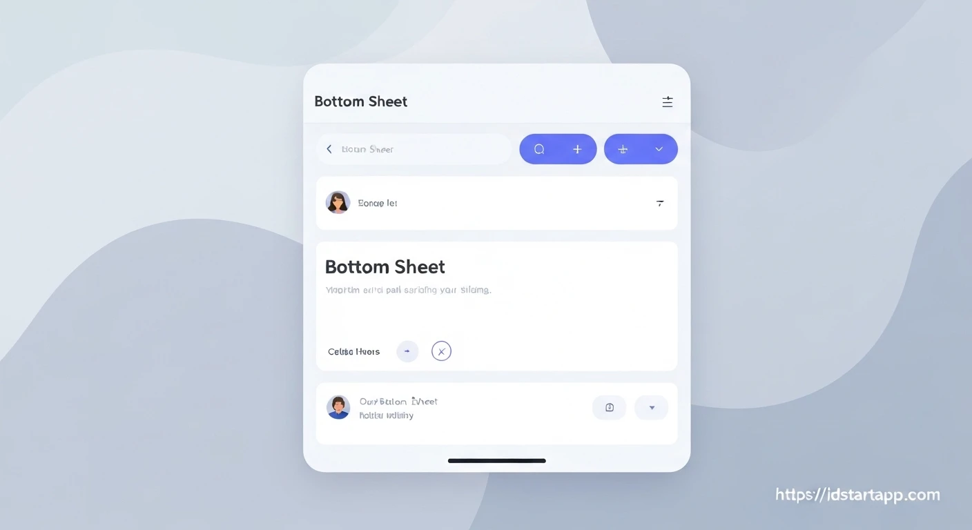

Creating Interactive Custom Bottom Sheet Widgets in Flutter
Flutter offers powerful tools for building rich and responsive user interfaces, and custom bottom sheets are a prime example of this flexibility. While a standard bottom sheet can fulfill basic needs, creating an interactive, custom-designed bottom sheet significantly enhances user experience by providing unique branding, dynamic content, and intuitive gesture-based controls. This article guides you through the process of building an interactive custom bottom sheet in Flutter, focusing on both appearance and dynamic behavior.
Understanding Bottom Sheets in Flutter
A bottom sheet is a modal panel that slides up from the bottom of the screen, typically displaying additional content or options related to the current context. Flutter provides a built-in function, showModalBottomSheet, for presenting a standard bottom sheet.
import 'package:flutter/material.dart';

void main() {
  runApp(const MyApp());
}

class MyApp extends StatelessWidget {
  const MyApp({super.key});

  @override
  Widget build(BuildContext context) {
    return MaterialApp(
      title: 'Flutter Bottom Sheet Demo',
      theme: ThemeData(
        primarySwatch: Colors.blue,
      ),
      home: const MyHomePage(),
    );
  }
}

class MyHomePage extends StatelessWidget {
  const MyHomePage({super.key});

  @override
  Widget build(BuildContext context) {
    return Scaffold(
      appBar: AppBar(
        title: const Text('Standard Bottom Sheet'),
      ),
      body: Center(
        child: ElevatedButton(
          onPressed: () {
            showModalBottomSheet(
              context: context,
              builder: (BuildContext context) {
                return SizedBox(
                  height: 200,
                  child: Center(
                    child: Column(
                      mainAxisAlignment: MainAxisAlignment.center,
                      children: [
                        const Text('This is a standard bottom sheet.'),
                        ElevatedButton(
                          onPressed: () => Navigator.pop(context),
                          child: const Text('Close Bottom Sheet'),
                        ),
                      ],
                    ),
                  ),
                );
              },
            );
          },
          child: const Text('Show Standard Bottom Sheet'),
        ),
      ),
    );
  }
}
This basic implementation is functional but offers limited customization for appearance and little intrinsic interactivity beyond being dismissed.
The Need for Customization and Interactivity
Customizing a bottom sheet allows you to match it with your app's design language, adding rounded corners, specific background colors, or a custom drag handle. Interactivity goes a step further, enabling features like:
- Draggable Resizing: Users can drag the sheet up or down to reveal more or less content, snapping to predefined sizes.
- Dynamic Content: The content within the bottom sheet can change based on user interaction or data updates.
- Scrollable Content: Allowing the bottom sheet to contain long lists or complex forms that can be scrolled independently.
- Custom Dismissal: Beyond tapping outside, implementing custom gestures or buttons for dismissal.
Building Blocks for a Custom Interactive Bottom Sheet
To achieve a truly interactive and custom bottom sheet, we'll combine several Flutter widgets and concepts:
1. Custom Content Widget
The content displayed inside your bottom sheet will typically be a StatefulWidget if it needs to manage its own state (e.g., forms, counters, dynamic lists). This allows for interactions within the sheet itself.
2. Leveraging showModalBottomSheet
We'll still use showModalBottomSheet as the primary function to present our custom sheet. However, we'll set isScrollControlled: true to allow the sheet to take up more than half the screen height, which is essential for draggable sheets.
3. Adding Draggable Behavior with DraggableScrollableSheet
The DraggableScrollableSheet widget is the cornerstone for creating interactive, draggable bottom sheets. It allows its child to be dragged and resized between specified `initialChildSize`, `minChildSize`, and `maxChildSize` values. Crucially, it manages its own scroll controller, making it perfect for sheets containing scrollable content.
Step-by-Step Implementation: An Interactive Custom Bottom Sheet
Let's create a custom bottom sheet that is draggable, has rounded corners, and displays interactive content (a simple counter).
1. Defining the Custom Bottom Sheet Content
First, we'll create a StatefulWidget that will house our bottom sheet's content. This widget will manage a simple counter.
import 'package:flutter/material.dart';

class _MyCustomBottomSheetContent extends StatefulWidget {
  const _MyCustomBottomSheetContent({Key? key}) : super(key: key);

  @override
  _MyCustomBottomSheetContentState createState() => _MyCustomBottomSheetContentState();
}

class _MyCustomBottomSheetContentState extends State<_MyCustomBottomSheetContent> {
  int _counter = 0;

  void _incrementCounter() {
    setState(() {
      _counter++;
    });
  }

  void _decrementCounter() {
    setState(() {
      _counter--;
    });
  }

  @override
  Widget build(BuildContext context) {
    return ClipRRect( // ClipRRect for custom rounded corners
      borderRadius: const BorderRadius.vertical(top: Radius.circular(25.0)),
      child: Container(
        decoration: BoxDecoration(
          color: Colors.white,
          borderRadius: const BorderRadius.vertical(top: Radius.circular(25.0)),
          boxShadow: [
            BoxShadow(
              color: Colors.black.withOpacity(0.1),
              spreadRadius: 5,
              blurRadius: 7,
              offset: const Offset(0, 3),
            ),
          ],
        ),
        child: Column(
          children: [
            // Custom drag handle
            Padding(
              padding: const EdgeInsets.symmetric(vertical: 10.0),
              child: Container(
                width: 40,
                height: 5,
                decoration: BoxDecoration(
                  color: Colors.grey[300],
                  borderRadius: BorderRadius.circular(10),
                ),
              ),
            ),
            Expanded(
              child: ListView( // Use ListView to handle potential overflow within the sheet
                padding: EdgeInsets.zero, // Remove default padding for ListView
                children: [
                  const Padding(
                    padding: EdgeInsets.all(16.0),
                    child: Text(
                      'Interactive Bottom Sheet Content',
                      style: TextStyle(fontSize: 20, fontWeight: FontWeight.bold),
                      textAlign: TextAlign.center,
                    ),
                  ),
                  Padding(
                    padding: const EdgeInsets.symmetric(horizontal: 16.0),
                    child: Row(
                      mainAxisAlignment: MainAxisAlignment.center,
                      children: [
                        IconButton(
                          icon: const Icon(Icons.remove_circle),
                          onPressed: _decrementCounter,
                        ),
                        Text(
                          'Counter: $_counter',
                          style: const TextStyle(fontSize: 24),
                        ),
                        IconButton(
                          icon: const Icon(Icons.add_circle),
                          onPressed: _incrementCounter,
                        ),
                      ],
                    ),
                  ),
                  // Add more content here to demonstrate scrolling
                  ...List.generate(
                    20,
                    (index) => ListTile(
                      title: Text('List Item ${index + 1}'),
                      leading: const Icon(Icons.info),
                    ),
                  ),
                  Padding(
                    padding: const EdgeInsets.all(16.0),
                    child: ElevatedButton(
                      onPressed: () => Navigator.pop(context),
                      child: const Text('Close Sheet'),
                    ),
                  ),
                ],
              ),
            ),
          ],
        ),
      ),
    );
  }
}
In this content widget:
ClipRRectwithBorderRadius.verticalgives the top corners a rounded shape.- A simple
Containeracts as a visual drag handle. - The counter logic demonstrates state management within the bottom sheet.
ListViewis used inside anExpandedwidget to allow the content to scroll if it exceeds the sheet's current height, which is essential forDraggableScrollableSheet.
2. Integrating DraggableScrollableSheet for Interactivity
Now, we'll wrap our custom content widget within a DraggableScrollableSheet. This will be the builder function for showModalBottomSheet.
// This function will be called by an onPressed event
void _showCustomBottomSheet(BuildContext context) {
  showModalBottomSheet(
    context: context,
    isScrollControlled: true, // Crucial for a full-height draggable sheet
    backgroundColor: Colors.transparent, // Make background transparent to show custom shape
    builder: (BuildContext context) {
      return DraggableScrollableSheet(
        initialChildSize: 0.5, // The sheet will initially take 50% of the screen height
        minChildSize: 0.25,  // Minimum height the sheet can be dragged to
        maxChildSize: 0.9,   // Maximum height the sheet can be dragged to
        expand: false,       // Set to false to allow the sheet to start at initialChildSize
        builder: (BuildContext context, ScrollController scrollController) {
          return _MyCustomBottomSheetContent(); // Our custom content widget
        },
      );
    },
  );
}
Key properties of DraggableScrollableSheet:
initialChildSize: The fraction of the screen height the sheet starts at.minChildSize,maxChildSize: The minimum and maximum fractions the sheet can be dragged to.expand: false: Allows the sheet to resize, rather than filling the entire available space.- The
builderfunction provides aScrollControllerthat *must* be passed to any scrollable widget (like ourListView) inside the sheet for the dragging to work correctly. However, in our current_MyCustomBottomSheetContent, theListViewdoesn't directly use this controller in its constructor. For direct integration of the scroll behavior, you'd pass it like `ListView(controller: scrollController, ...)`. The example above implies the sheet manages the scrolling through its child widget, which is okay for a simple list. If you want seamless drag-to-scroll, pass the controller to the child's scrollable.
3. Triggering the Custom Bottom Sheet
Finally, we need a way to open this bottom sheet, usually through a button press.
import 'package:flutter/material.dart';

void main() {
  runApp(const MyApp());
}

class MyApp extends StatelessWidget {
  const MyApp({super.key});

  @override
  Widget build(BuildContext context) {
    return MaterialApp(
      title: 'Interactive Custom Bottom Sheet',
      theme: ThemeData(
        primarySwatch: Colors.deepPurple,
      ),
      home: const MyHomePage(),
    );
  }
}

class MyHomePage extends StatelessWidget {
  const MyHomePage({super.key});

  // Function to show the custom bottom sheet
  void _showCustomBottomSheet(BuildContext context) {
    showModalBottomSheet(
      context: context,
      isScrollControlled: true, // Crucial for full-height and draggable
      backgroundColor: Colors.transparent, // Allows custom shape to show
      builder: (BuildContext context) {
        return DraggableScrollableSheet(
          initialChildSize: 0.5, // Starts at 50% of screen height
          minChildSize: 0.25,    // Minimum height
          maxChildSize: 0.9,     // Maximum height
          expand: false,         // Essential for initialChildSize to work
          builder: (BuildContext context, ScrollController scrollController) {
            // Pass the scrollController to the scrollable child if needed for seamless drag-to-scroll
            return _MyCustomBottomSheetContent(scrollController: scrollController);
          },
        );
      },
    );
  }

  @override
  Widget build(BuildContext context) {
    return Scaffold(
      appBar: AppBar(
        title: const Text('Interactive Custom Bottom Sheet'),
      ),
      body: Center(
        child: ElevatedButton(
          onPressed: () => _showCustomBottomSheet(context),
          child: const Text('Show Custom Bottom Sheet'),
        ),
      ),
    );
  }
}

// Update _MyCustomBottomSheetContent to accept a ScrollController
class _MyCustomBottomSheetContent extends StatefulWidget {
  final ScrollController scrollController; // Add this
  const _MyCustomBottomSheetContent({Key? key, required this.scrollController}) : super(key: key); // Update constructor

  @override
  _MyCustomBottomSheetContentState createState() => _MyCustomBottomSheetContentState();
}

class _MyCustomBottomSheetContentState extends State<_MyCustomBottomSheetContent> {
  int _counter = 0;

  void _incrementCounter() {
    setState(() {
      _counter++;
    });
  }

  void _decrementCounter() {
    setState(() {
      _counter--;
    });
  }

  @override
  Widget build(BuildContext context) {
    return ClipRRect(
      borderRadius: const BorderRadius.vertical(top: Radius.circular(25.0)),
      child: Container(
        decoration: BoxDecoration(
          color: Colors.white,
          borderRadius: const BorderRadius.vertical(top: Radius.circular(25.0)),
          boxShadow: [
            BoxShadow(
              color: Colors.black.withOpacity(0.1),
              spreadRadius: 5,
              blurRadius: 7,
              offset: const Offset(0, 3),
            ),
          ],
        ),
        child: Column(
          children: [
            Padding(
              padding: const EdgeInsets.symmetric(vertical: 10.0),
              child: Container(
                width: 40,
                height: 5,
                decoration: BoxDecoration(
                  color: Colors.grey[300],
                  borderRadius: BorderRadius.circular(10),
                ),
              ),
            ),
            Expanded(
              child: ListView(
                controller: widget.scrollController, // Pass the controller here
                padding: EdgeInsets.zero,
                children: [
                  const Padding(
                    padding: EdgeInsets.all(16.0),
                    child: Text(
                      'Interactive Bottom Sheet Content',
                      style: TextStyle(fontSize: 20, fontWeight: FontWeight.bold),
                      textAlign: TextAlign.center,
                    ),
                  ),
                  Padding(
                    padding: const EdgeInsets.symmetric(horizontal: 16.0),
                    child: Row(
                      mainAxisAlignment: MainAxisAlignment.center,
                      children: [
                        IconButton(
                          icon: const Icon(Icons.remove_circle),
                          onPressed: _decrementCounter,
                        ),
                        Text(
                          'Counter: $_counter',
                          style: const TextStyle(fontSize: 24),
                        ),
                        IconButton(
                          icon: const Icon(Icons.add_circle),
                          onPressed: _incrementCounter,
                        ),
                      ],
                    ),
                  ),
                  ...List.generate(
                    20,
                    (index) => ListTile(
                      title: Text('List Item ${index + 1}'),
                      leading: const Icon(Icons.info),
                    ),
                  ),
                  Padding(
                    padding: const EdgeInsets.all(16.0),
                    child: ElevatedButton(
                      onPressed: () => Navigator.pop(context),
                      child: const Text('Close Sheet'),
                    ),
                  ),
                ],
              ),
            ),
          ],
        ),
      ),
    );
  }
}
Conclusion
By combining showModalBottomSheet with DraggableScrollableSheet and a custom StatefulWidget for its content, you can create highly interactive and visually appealing bottom sheets in Flutter. This approach offers fine-grained control over sizing, draggability, and appearance, allowing you to build richer user experiences that align perfectly with your application's design language. Experiment with different initialChildSize, minChildSize, and maxChildSize values, as well as the content within your custom widget, to create the perfect interactive bottom sheet for your Flutter application.


