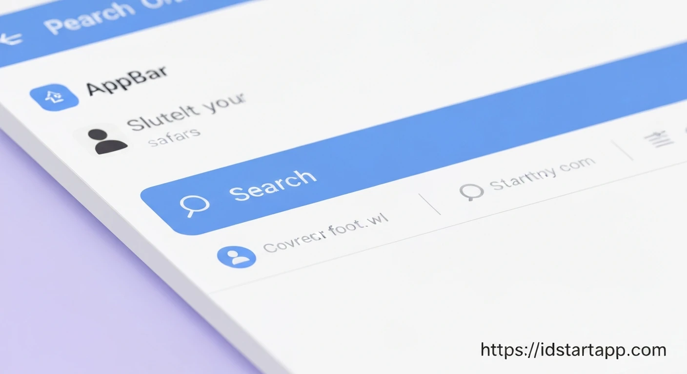

Creating a Custom AppBar Widget with Search and Profile Menu in Flutter
The AppBar is a fundamental component in most Flutter applications, providing structure and navigation at the top of a screen. While Flutter's standard AppBar widget offers great flexibility, there are often scenarios where you need more advanced customization, such as integrating dynamic search functionality or a personalized profile menu directly into the AppBar itself. This article will guide you through creating a custom AppBar widget that incorporates both a search bar and a profile menu, enhancing user experience and application aesthetics.
Why Custom AppBars?
Default AppBars are excellent for standard titles and action buttons. However, when your design calls for:
- A search bar that can toggle between a title and an input field.
- A profile icon that either navigates to a profile screen or displays a dropdown menu.
- Complex layouts or dynamic content within the AppBar.
- Reusability of a specific AppBar design across multiple screens.
Creating a custom AppBar widget becomes essential. Flutter facilitates this through the PreferredSizeWidget interface.
Understanding PreferredSizeWidget
To create a custom widget that can act as an AppBar in a Scaffold, it must implement the PreferredSizeWidget interface. This interface requires you to define a preferredSize getter, which tells the Scaffold how much vertical space your custom AppBar will occupy.
import 'package:flutter/material.dart';

class CustomAppBar extends StatefulWidget implements PreferredSizeWidget {
  final String title;
  final Function(String)? onSearchChanged;
  final VoidCallback? onProfilePressed; // Or handle profile menu selection internally

  CustomAppBar({
    Key? key,
    required this.title,
    this.onSearchChanged,
    this.onProfilePressed,
  }) : super(key: key);

  @override
  Size get preferredSize => const Size.fromHeight(kToolbarHeight); // Standard AppBar height

  @override
  _CustomAppBarState createState() => _CustomAppBarState();
}

class _CustomAppBarState extends State {
  // State variables and methods will go here
  @override
  Widget build(BuildContext context) {
    // Build the AppBar content here
    return AppBar(
      title: Text(widget.title),
      // ... actions, leading, etc.
    );
  }
}
Step 1: Basic Custom AppBar Structure
Let's start by setting up our CustomAppBar as a StatefulWidget, as the search functionality will require managing internal state.
import 'package:flutter/material.dart';

class CustomSearchProfileAppBar extends StatefulWidget implements PreferredSizeWidget {
  final String title;
  final ValueChanged<String>? onSearchChanged;

  CustomSearchProfileAppBar({
    Key? key,
    required this.title,
    this.onSearchChanged,
  }) : super(key: key);

  @override
  Size get preferredSize => const Size.fromHeight(kToolbarHeight); // Default AppBar height

  @override
  _CustomSearchProfileAppBarState createState() => _CustomSearchProfileAppBarState();
}

class _CustomSearchProfileAppBarState extends State<CustomSearchProfileAppBar> {
  bool _isSearching = false;
  final TextEditingController _searchController = TextEditingController();

  @override
  void dispose() {
    _searchController.dispose();
    super.dispose();
  }

  @override
  Widget build(BuildContext context) {
    return AppBar(
      title: _isSearching
          ? TextField(
              controller: _searchController,
              decoration: InputDecoration(
                hintText: 'Search...',
                border: InputBorder.none,
                hintStyle: TextStyle(color: Colors.white70),
              ),
              style: TextStyle(color: Colors.white, fontSize: 18),
              onChanged: widget.onSearchChanged,
              autofocus: true,
            )
          : Text(widget.title),
      actions: <Widget>[
        // Search Icon/Close Search Button (will be added here)
        // Profile Menu Button (will be added here)
      ],
    );
  }
}
Step 2: Implementing Search Functionality
We'll add a search icon that, when tapped, transforms the AppBar's title into a search input field. A close icon will appear to revert to the title. We use a boolean _isSearching to manage this state.
// ... (inside _CustomSearchProfileAppBarState build method)

    return AppBar(
      leading: _isSearching
          ? IconButton(
              icon: Icon(Icons.arrow_back),
              onPressed: () {
                setState(() {
                  _isSearching = false;
                  _searchController.clear();
                  if (widget.onSearchChanged != null) {
                    widget.onSearchChanged!(''); // Clear search results
                  }
                });
              },
            )
          : null, // No leading widget when not searching
      title: _isSearching
          ? TextField(
              controller: _searchController,
              decoration: InputDecoration(
                hintText: 'Search...',
                border: InputBorder.none,
                hintStyle: TextStyle(color: Colors.white70),
              ),
              style: TextStyle(color: Colors.white, fontSize: 18),
              onChanged: widget.onSearchChanged,
              autofocus: true,
            )
          : Text(widget.title),
      actions: <Widget>[
        if (_isSearching)
          IconButton(
            icon: Icon(Icons.close),
            onPressed: () {
              setState(() {
                _isSearching = false;
                _searchController.clear();
                if (widget.onSearchChanged != null) {
                  widget.onSearchChanged!(''); // Clear search results
                }
              });
            },
          )
        else
          IconButton(
            icon: Icon(Icons.search),
            onPressed: () {
              setState(() {
                _isSearching = true;
              });
            },
          ),
        // Profile Menu Button (will be added next)
      ],
    );
Step 3: Integrating Profile Menu
For the profile menu, we'll use a PopupMenuButton, which is ideal for showing a list of options (e.g., "Profile", "Settings", "Logout"). This button will be permanently visible in the AppBar's actions list.
// ... (inside _CustomSearchProfileAppBarState build method, after search buttons)

        // Profile Menu Button
        PopupMenuButton<String>(
          onSelected: (String result) {
            // Handle menu item selection
            switch (result) {
              case 'profile':
                print('Profile selected');
                // Navigator.push(context, MaterialPageRoute(builder: (context) => ProfileScreen()));
                break;
              case 'settings':
                print('Settings selected');
                // Handle navigation to settings
                break;
              case 'logout':
                print('Logout selected');
                // Handle logout logic
                break;
            }
          },
          itemBuilder: (BuildContext context) => <PopupMenuEntry<String>>[
            const PopupMenuItem<String>(
              value: 'profile',
              child: Text('Profile'),
            ),
            const PopupMenuItem<String>(
              value: 'settings',
              child: Text('Settings'),
            ),
            const PopupMenuItem<String>(
              value: 'logout',
              child: Text('Logout'),
            ),
          ],
          icon: Icon(Icons.account_circle),
          tooltip: 'Profile Menu',
        ),
      ], // End of actions list
    );
Putting it All Together: The Complete Custom AppBar Widget
Here's the complete code for our CustomSearchProfileAppBar widget:
import 'package:flutter/material.dart';

class CustomSearchProfileAppBar extends StatefulWidget implements PreferredSizeWidget {
  final String title;
  final ValueChanged<String>? onSearchChanged;

  CustomSearchProfileAppBar({
    Key? key,
    required this.title,
    this.onSearchChanged,
  }) : super(key: key);

  @override
  Size get preferredSize => const Size.fromHeight(kToolbarHeight); // Default AppBar height

  @override
  _CustomSearchProfileAppBarState createState() => _CustomSearchProfileAppBarState();
}

class _CustomSearchProfileAppBarState extends State<CustomSearchProfileAppBar> {
  bool _isSearching = false;
  final TextEditingController _searchController = TextEditingController();

  @override
  void dispose() {
    _searchController.dispose();
    super.dispose();
  }

  void _toggleSearch() {
    setState(() {
      _isSearching = !_isSearching;
      if (!_isSearching) {
        _searchController.clear();
        if (widget.onSearchChanged != null) {
          widget.onSearchChanged!(''); // Notify parent to clear search results
        }
      }
    });
  }

  @override
  Widget build(BuildContext context) {
    return AppBar(
      leading: _isSearching
          ? IconButton(
              icon: Icon(Icons.arrow_back),
              onPressed: _toggleSearch, // Close search and clear
            )
          : null, // No leading widget when not searching
      title: _isSearching
          ? TextField(
              controller: _searchController,
              decoration: InputDecoration(
                hintText: 'Search...',
                border: InputBorder.none,
                hintStyle: TextStyle(color: Colors.white70),
              ),
              style: TextStyle(color: Colors.white, fontSize: 18),
              onChanged: widget.onSearchChanged,
              autofocus: true,
            )
          : Text(widget.title),
      actions: <Widget>[
        if (_isSearching)
          IconButton(
            icon: Icon(Icons.close),
            onPressed: _toggleSearch, // Close search and clear
          )
        else
          IconButton(
            icon: Icon(Icons.search),
            onPressed: _toggleSearch, // Open search
          ),
        // Profile Menu Button
        PopupMenuButton<String>(
          onSelected: (String result) {
            // Handle menu item selection
            switch (result) {
              case 'profile':
                ScaffoldMessenger.of(context).showSnackBar(
                  SnackBar(content: Text('Navigating to Profile...')),
                );
                // Example: Navigator.push(context, MaterialPageRoute(builder: (context) => ProfileScreen()));
                break;
              case 'settings':
                ScaffoldMessenger.of(context).showSnackBar(
                  SnackBar(content: Text('Navigating to Settings...')),
                );
                // Example: Handle navigation to settings
                break;
              case 'logout':
                ScaffoldMessenger.of(context).showSnackBar(
                  SnackBar(content: Text('Logging out...')),
                );
                // Example: Handle logout logic
                break;
            }
          },
          itemBuilder: (BuildContext context) => <PopupMenuEntry<String>>[
            const PopupMenuItem<String>(
              value: 'profile',
              child: Text('Profile'),
            ),
            const PopupMenuItem<String>(
              value: 'settings',
              child: Text('Settings'),
            ),
            const PopupMenuItem<String>(
              value: 'logout',
              child: Text('Logout'),
            ),
          ],
          icon: Icon(Icons.account_circle),
          tooltip: 'Profile Menu',
        ),
      ],
    );
  }
}
Using the Custom AppBar
To use this custom AppBar, simply place it in the appBar property of your Scaffold. You can pass the desired title and a callback for handling search changes.
import 'package:flutter/material.dart';
// Import your CustomSearchProfileAppBar widget

class HomeScreen extends StatefulWidget {
  @override
  _HomeScreenState createState() => _HomeScreenState();
}

class _HomeScreenState extends State<HomeScreen> {
  String _currentSearchQuery = '';

  void _handleSearchChanged(String query) {
    setState(() {
      _currentSearchQuery = query;
      // In a real app, you would filter your data here based on the query
      print('Search query: $_currentSearchQuery');
    });
  }

  @override
  Widget build(BuildContext context) {
    return Scaffold(
      appBar: CustomSearchProfileAppBar(
        title: 'My Awesome App',
        onSearchChanged: _handleSearchChanged,
      ),
      body: Center(
        child: Column(
          mainAxisAlignment: MainAxisAlignment.center,
          children: <Widget>[
            Text(
              'Welcome to the Home Screen!',
              style: TextStyle(fontSize: 24),
            ),
            SizedBox(height: 20),
            Text(
              'Current Search Query: "$_currentSearchQuery"',
              style: TextStyle(fontSize: 18),
            ),
          ],
        ),
      ),
      drawer: Drawer(
        child: ListView(
          padding: EdgeInsets.zero,
          children: <Widget>[
            DrawerHeader(
              decoration: BoxDecoration(
                color: Colors.blue,
              ),
              child: Text(
                'Drawer Header',
                style: TextStyle(
                  color: Colors.white,
                  fontSize: 24,
                ),
              ),
            ),
            ListTile(
              leading: Icon(Icons.home),
              title: Text('Home'),
              onTap: () {
                Navigator.pop(context);
              },
            ),
            ListTile(
              leading: Icon(Icons.settings),
              title: Text('Settings'),
              onTap: () {
                Navigator.pop(context);
                // Handle navigation to settings
              },
            ),
          ],
        ),
      ),
    );
  }
}

void main() {
  runApp(MaterialApp(
    title: 'Custom AppBar Demo',
    theme: ThemeData(
      primarySwatch: Colors.blue,
      visualDensity: VisualDensity.adaptivePlatformDensity,
    ),
    home: HomeScreen(),
  ));
}
Conclusion
By implementing PreferredSizeWidget, you gain immense control over your AppBar's appearance and functionality in Flutter. The CustomSearchProfileAppBar demonstrated here provides a robust foundation for integrating dynamic search and a customizable profile menu. This approach promotes code reusability and keeps your UI logic encapsulated within its dedicated widget, leading to cleaner and more maintainable Flutter applications.


