

Custom AppBar with Search & Profile Menu in Flutter
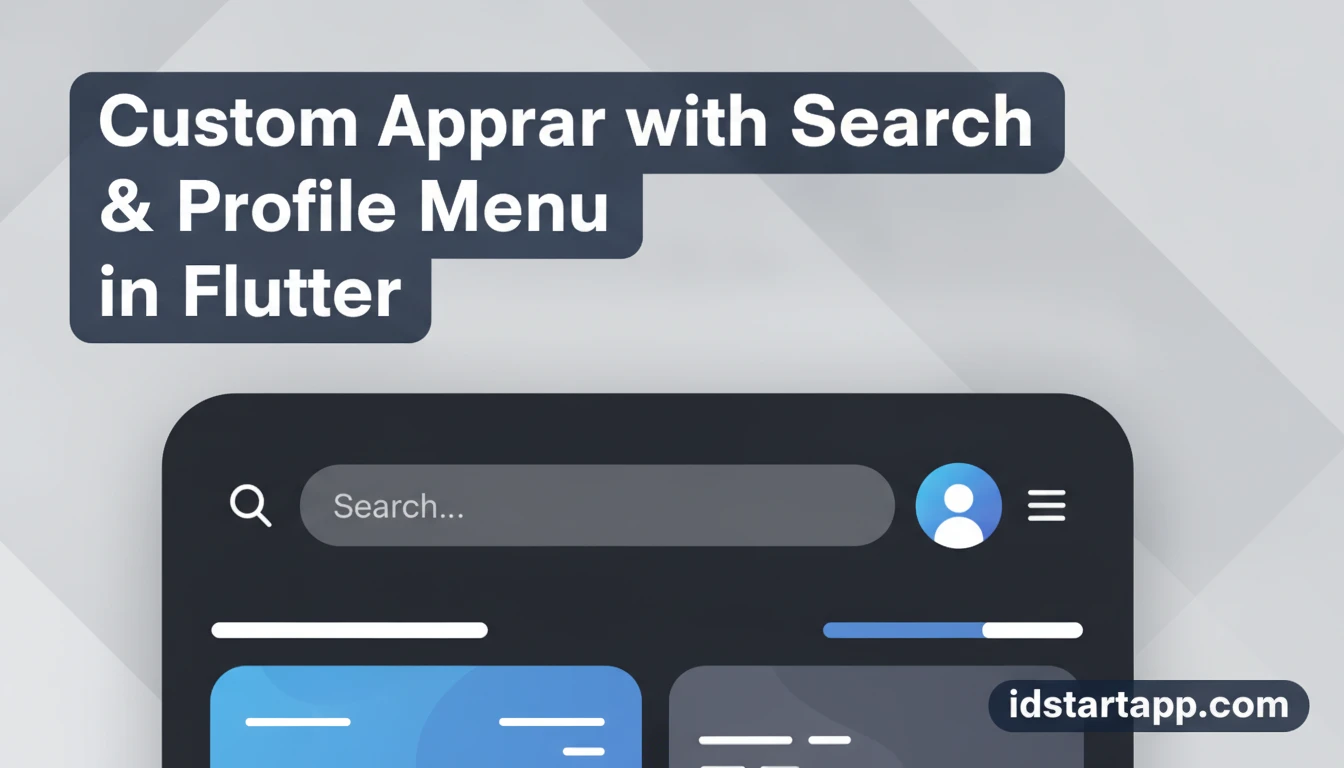
The default AppBar in Flutter provides essential navigation and branding, but many applications require more sophisticated features like integrated search capabilities or a prominent user profile menu. Customizing the AppBar allows you to tailor the user interface to your app's specific needs, significantly enhancing the user experience and making your application more intuitive and powerful. This article will guide you through creating a custom Flutter AppBar widget that seamlessly incorporates both a search bar and a profile menu, complete with practical code examples and best practices.
Why Customize Your AppBar?
While Flutter's standard AppBar is functional, it often falls short for applications with complex navigation or interactive elements. Here's why you might opt for a custom solution:
- Enhanced User Experience: Direct access to search and profile options improves usability, reducing the number of taps or screens a user needs to navigate.
- Brand Consistency: A custom
AppBarallows for precise control over styling, ensuring it perfectly aligns with your app's overall design language and branding. - Feature Integration: Easily embed interactive elements like search fields, notification icons, or user avatars that aren't readily available with the default
AppBar. - Dynamic Behavior: Implement state-driven changes, such as toggling between a title and a search field, or displaying different menu options based on user authentication status.
Prerequisites
Before diving into the implementation, ensure you have a basic understanding of:
- Flutter Development: Familiarity with widgets, state management (
StatefulWidget), and basic UI layouts. - Dart Language: Knowledge of classes, functions, and asynchronous programming concepts.
- Flutter SDK: Installed and configured on your development machine.
Designing the Custom AppBar Layout
Our custom AppBar will be a PreferredSizeWidget, allowing it to fit perfectly into the Scaffold's appBar property. It will dynamically switch between displaying a title and a search field. It will also feature a profile icon that, when tapped, reveals a menu.
Basic AppBar Structure
We'll start by defining a custom widget that extends PreferredSizeWidget. This requires implementing the preferredSize getter, which tells the Scaffold how much vertical space the AppBar needs.
Integrating the Search Bar
The search bar will involve a TextField that appears when a search icon is tapped. We'll manage its visibility using a boolean state variable. When the search bar is active, the app bar title will be hidden, and a back/close button will appear to dismiss the search.
Implementing the Profile Menu
The profile menu can be a simple IconButton that navigates to a profile screen, or more interactively, a PopupMenuButton that displays a list of options (e.g.,