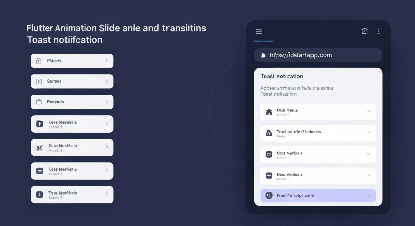

Creating Engaging Toast Notifications: Flutter Slide & Fade Animations
Toast notifications are small, non-intrusive messages that pop up temporarily on a screen to provide feedback or information to the user. While their primary function is utilitarian, the way they appear and disappear can significantly impact user experience. A well-executed animation makes a toast notification feel polished, professional, and more engaging than a simple static appearance.
In Flutter, building custom and fluid animations is a core strength. This article will guide you through creating a sophisticated slide and fade animation for your toast notifications, combining motion and transparency to deliver a delightful user experience.
The Power of Flutter Animations
Flutter's animation system is incredibly robust and flexible, built upon the concept of AnimationController and Tweens. An AnimationController manages the state of an animation (starting, stopping, reversing, duration), while Tweens define the range of values an animation can interpolate between (e.g., from 0.0 to 1.0 for opacity, or a starting Offset to an ending Offset for position).
By combining these with Transition widgets like FadeTransition and SlideTransition, we can easily create complex and visually appealing effects with minimal code. These transition widgets take an Animation as input and apply transformations to their child widget based on the animation's current value.
Building the Animated Toast Component
To achieve our slide and fade effect, we will create a custom widget that encapsulates the AnimationController, the individual Tweens for slide and fade, and the Transition widgets that apply these effects to our toast content.
1. Core Structure and Animation Controller
Our toast widget will be a StatefulWidget to manage the animation lifecycle. We'll need an AnimationController and two Animation objects: one for opacity and one for position (slide).
import 'dart:async';
import 'package:flutter/material.dart';

class AnimatedToast extends StatefulWidget {
  final Widget content;
  final Duration duration;
  final VoidCallback onDismissed;

  const AnimatedToast({
    Key? key,
    required this.content,
    this.duration = const Duration(seconds: 3),
    required this.onDismissed,
  }) : super(key: key);

  @override
  _AnimatedToastState createState() => _AnimatedToastState();
}

class _AnimatedToastState extends State with SingleTickerProviderStateMixin {
  late AnimationController _controller;
  late Animation _slideAnimation;
  late Animation _fadeAnimation;
  Timer? _dismissTimer;

  @override
  void initState() {
    super.initState();
    _controller = AnimationController(
      vsync: this,
      duration: const Duration(milliseconds: 300), // Animation duration
    );

    _slideAnimation = Tween(
      begin: const Offset(0, 1), // Starts off-screen below
      end: Offset.zero, // Slides to its original position
    ).animate(CurvedAnimation(
      parent: _controller,
      curve: Curves.easeOutBack, // A nice bounce effect
    ));

    _fadeAnimation = Tween(
      begin: 0.0, // Starts fully transparent
      end: 1.0, // Fades to fully opaque
    ).animate(CurvedAnimation(
      parent: _controller,
      curve: Curves.easeIn,
    ));

    _controller.forward(); // Start the entry animation

    _dismissTimer = Timer(widget.duration, () {
      _controller.reverse().whenComplete(() {
        widget.onDismissed();
      });
    });
  }

  @override
  void dispose() {
    _dismissTimer?.cancel();
    _controller.dispose();
    super.dispose();
  }

  @override
  Widget build(BuildContext context) {
    return FadeTransition(
      opacity: _fadeAnimation,
      child: SlideTransition(
        position: _slideAnimation,
        child: Material( // Wrap content in Material for elevation/shape
          color: Colors.transparent,
          child: widget.content,
        ),
      ),
    );
  }
}
2. Orchestrating Toast Display and Dismissal
To display this toast, we'll typically use an OverlayEntry which allows us to render widgets on top of everything else in the application, independent of the widget tree. A ToastService or similar helper class can manage these entries.
class ToastService {
  static OverlayEntry? _currentToastEntry;

  static void show(BuildContext context, String message, {
    Duration duration = const Duration(seconds: 3),
  }) {
    if (_currentToastEntry != null) {
      _currentToastEntry?.remove(); // Dismiss any existing toast first
      _currentToastEntry = null;
    }

    _currentToastEntry = OverlayEntry(
      builder: (context) => Positioned(
        bottom: 50.0, // Position the toast from the bottom
        left: 20.0,
        right: 20.0,
        child: Center(
          child: AnimatedToast(
            onDismissed: () {
              _currentToastEntry?.remove();
              _currentToastEntry = null;
            },
            duration: duration,
            content: Container(
              padding: const EdgeInsets.symmetric(horizontal: 24.0, vertical: 12.0),
              decoration: BoxDecoration(
                color: Colors.black.withOpacity(0.7),
                borderRadius: BorderRadius.circular(25.0),
              ),
              child: Text(
                message,
                style: const TextStyle(color: Colors.white, fontSize: 16.0),
                textAlign: TextAlign.center,
              ),
            ),
          ),
        ),
      ),
    );

    Overlay.of(context).insert(_currentToastEntry!);
  }
}
3. Integrating into Your Application
Finally, to use this ToastService, you simply call its show method from any part of your widget tree where a BuildContext is available.
import 'package:flutter/material.dart';
// Assuming AnimatedToast and ToastService are in toast_notification.dart
// You might put them in a separate file, e.g., lib/utils/toast_notification.dart
import 'package:your_app_name/utils/toast_notification.dart'; // Adjust path accordingly

void main() {
  runApp(const MyApp());
}

class MyApp extends StatelessWidget {
  const MyApp({Key? key}) : super(key: key);

  @override
  Widget build(BuildContext context) {
    return MaterialApp(
      title: 'Flutter Toast Demo',
      theme: ThemeData(
        primarySwatch: Colors.blue,
      ),
      home: const MyHomePage(),
    );
  }
}

class MyHomePage extends StatelessWidget {
  const MyHomePage({Key? key}) : super(key: key);

  @override
  Widget build(BuildContext context) {
    return Scaffold(
      appBar: AppBar(
        title: const Text('Toast Notification Demo'),
      ),
      body: Center(
        child: Column(
          mainAxisAlignment: MainAxisAlignment.center,
          children: [
            ElevatedButton(
              onPressed: () {
                ToastService.show(context, "Item added to cart successfully!");
              },
              child: const Text('Show Success Toast'),
            ),
            const SizedBox(height: 20),
            ElevatedButton(
              onPressed: () {
                ToastService.show(
                  context,
                  "Please check your internet connection.",
                  duration: const Duration(seconds: 5),
                );
              },
              child: const Text('Show Long Error Toast'),
            ),
          ],
        ),
      ),
    );
  }
}
Conclusion
By leveraging Flutter's powerful animation framework, we've created a custom toast notification that not only informs but also engages the user with smooth slide and fade transitions. This approach provides a significant upgrade over basic, static pop-ups, enhancing the overall polish and user experience of your application. Feel free to experiment with different Curves, animation durations, and positioning to perfectly match your app's aesthetic.


