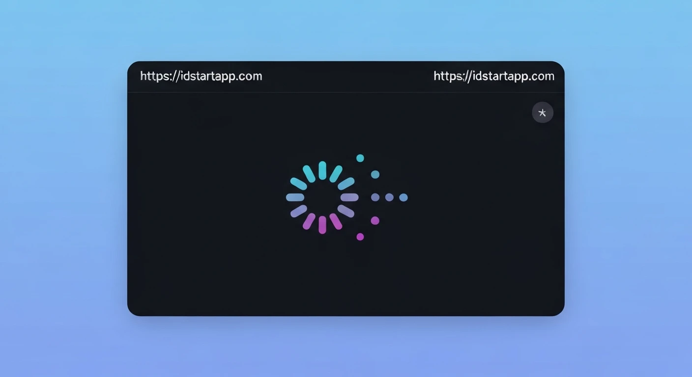

Creating an Engaging Flutter Loading Indicator: Dotted Circle with Bounce Effect
Loading indicators are crucial for user experience, providing visual feedback during asynchronous operations. While Flutter offers default indicators like CircularProgressIndicator, custom animations can significantly enhance engagement and brand identity. This article will guide you through building a captivating "Dotted Circle Loading Indicator" with a unique bounce effect in Flutter, elevating your application's UI.
Understanding the Animation Components
To achieve our desired loading indicator, we'll break down the animation into three core components:
- The Dotted Circle: A series of small, equally spaced "dots" arranged in a circular formation.
- Continuous Rotation: The entire dotted circle will rotate continuously, signaling ongoing activity.
- Bounce Effect: Each dot will perform a subtle radial "bounce" (moving slightly inward and outward) in a staggered manner, adding a dynamic and playful element to the indicator.
Flutter Implementation Steps
We will create a custom StatefulWidget to manage the animation state. Let's dive into the code.
1. Project Setup (Brief)
Ensure you have a basic Flutter project set up. We'll be creating a new widget within your lib folder.
2. Defining the Dotted Circle Loading Indicator Widget
Start by creating a new StatefulWidget. This widget will manage our animations.
import 'package:flutter/material.dart';
import 'dart:math' as math;

class DottedCircleLoadingIndicator extends StatefulWidget {
  final Color dotColor;
  final double dotSize;
  final double circleRadius;
  final int numberOfDots;
  final Duration animationDuration;

  const DottedCircleLoadingIndicator({
    Key? key,
    this.dotColor = Colors.blue,
    this.dotSize = 8.0,
    this.circleRadius = 40.0,
    this.numberOfDots = 8,
    this.animationDuration = const Duration(milliseconds: 2000),
  }) : super(key: key);

  @override
  _DottedCircleLoadingIndicatorState createState() =>
      _DottedCircleLoadingIndicatorState();
}

class _DottedCircleLoadingIndicatorState extends State
    with SingleTickerProviderStateMixin {
  late AnimationController _controller;
  late Animation _rotationAnimation;
  List> _dotBounceAnimations = [];

  @override
  void initState() {
    super.initState();
    _controller = AnimationController(
      duration: widget.animationDuration,
      vsync: this,
    )..repeat(); // Repeat the animation indefinitely

    // Overall rotation animation
    _rotationAnimation = Tween(begin: 0, end: 2 * math.pi).animate(
      CurvedAnimation(parent: _controller, curve: Curves.linear),
    );

    // Individual dot bounce animations
    for (int i = 0; i < widget.numberOfDots; i++) {
      final delay = (i / widget.numberOfDots); // Staggered delay for each dot
      // The interval wraps around to create a continuous staggered effect
      final interval = Interval(
        delay,
        (delay + 0.5) % 1.0, // Ensures animation cycles within the full duration
        curve: Curves.easeOutCubic, // A nice bounce-like curve
      );

      _dotBounceAnimations.add(
        Tween(begin: 0.0, end: 1.0).animate(
          CurvedAnimation(
            parent: _controller,
            curve: interval,
          ),
        ),
      );
    }
  }

  @override
  void dispose() {
    _controller.dispose();
    super.dispose();
  }

  Widget _buildDot(Color color) {
    return Container(
      width: widget.dotSize,
      height: widget.dotSize,
      decoration: BoxDecoration(
        color: color,
        shape: BoxShape.circle,
      ),
    );
  }

  // ... build method will go here
}
3. Building the Dotted Circle with Rotation and Bounce
Inside the _DottedCircleLoadingIndicatorState's build method, we'll use an AnimatedBuilder to re-render our widget whenever the animation controller ticks. The `Transform.rotate` widget will handle the overall rotation, and individual `Transform.translate` widgets will apply the bounce effect to each dot.
  @override
  Widget build(BuildContext context) {
    return AnimatedBuilder(
      animation: _controller,
      builder: (context, child) {
        return Transform.rotate(
          angle: _rotationAnimation.value,
          child: SizedBox(
            width: widget.circleRadius * 2,
            height: widget.circleRadius * 2,
            child: Stack(
              children: List.generate(widget.numberOfDots, (index) {
                // Calculate the base position for each dot on the circle
                final angle = (2 * math.pi / widget.numberOfDots) * index;
                final x = widget.circleRadius * math.cos(angle);
                final y = widget.circleRadius * math.sin(angle);

                // Apply bounce effect to each dot
                final bounceValue = _dotBounceAnimations[index].value;
                // We'll make the dot move radially outward and inward slightly.
                // A sin curve maps 0.0->0, 0.5->1, 1.0->0, creating a smooth "pulse".
                // We apply a negative offset to move it slightly inwards at the peak of the animation.
                final radialOffset = -widget.dotSize * 0.5 * math.sin(bounceValue * math.pi);


                return Positioned(
                  left: widget.circleRadius + x - (widget.dotSize / 2),
                  top: widget.circleRadius + y - (widget.dotSize / 2),
                  child: Transform.translate(
                    offset: Offset(
                      // Scale the offset direction by its original position on the circle
                      x / widget.circleRadius * radialOffset,
                      y / widget.circleRadius * radialOffset,
                    ),
                    child: Opacity(
                        opacity: 1.0 - (bounceValue * 0.3), // Subtle fade for bounce
                        child: _buildDot(widget.dotColor),
                    ),
                  ),
                );
              }),
            ),
          ),
        );
      },
    );
  }
4. Explanation of Key Code Sections
SingleTickerProviderStateMixin: Essential for `AnimationController` to prevent animations from consuming unnecessary resources when off-screen._controller.repeat(): Ensures the animation cycles indefinitely._rotationAnimation: A `Tween` from 0 to2 * math.pi(360 degrees) with a `Curves.linear` for constant rotation speed._dotBounceAnimations: A list of `Animation` objects, one for each dot. Each animation has a staggered `Interval` to make the dots bounce sequentially rather than all at once. The Curves.easeOutCubicprovides a quick start and slow end, mimicking a bounce.AnimatedBuilder: This widget listens to the animation controller and rebuilds its child subtree (our loading indicator) whenever the animation's value changes, making the UI animate smoothly.Transform.rotate: Applies the overall rotation to the `Stack` containing all dots.Positioned& `Transform.translate`: Each dot is positioned mathematically around the circle. TheTransform.translatewraps the dot, applying the radial bounce effect based onradialOffset, which is calculated from the individual dot's bounce animation value. Theopacityalso subtly fades the dot during its "bounce" peak, enhancing the visual effect._buildDot: A simple helper widget for creating the circular dot.
How to Use the Indicator
You can integrate this custom loading indicator into your application like any other widget:
import 'package:flutter/material.dart';
// Make sure to import your DottedCircleLoadingIndicator widget file
// import 'path/to/dotted_circle_loading_indicator.dart';

void main() {
  runApp(MyApp());
}

class MyApp extends StatelessWidget {
  @override
  Widget build(BuildContext context) {
    return MaterialApp(
      home: Scaffold(
        appBar: AppBar(
          title: const Text('Custom Loading Indicator'),
        ),
        body: Center(
          child: DottedCircleLoadingIndicator(
            dotColor: Colors.deepPurple,
            circleRadius: 60.0,
            dotSize: 10.0,
            numberOfDots: 10,
            animationDuration: const Duration(milliseconds: 2500),
          ),
        ),
      ),
    );
  }
}
Conclusion
By creating custom loading indicators like the "Dotted Circle with Bounce Effect," you can significantly enhance your Flutter application's user experience. This approach provides a more engaging and visually appealing way to inform users that content is loading, making waiting times feel shorter and more pleasant. Feel free to experiment with different curves, colors, sizes, and additional transformations to create your unique loading animations!


