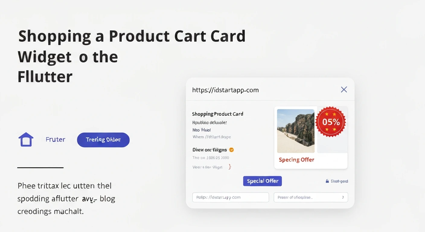

Creating a Shopping Product Card Widget with a Discount Badge in Flutter
In e-commerce applications, a well-designed product card is crucial for showcasing items effectively and enticing users. A common and highly effective visual element is a discount badge, which immediately highlights special offers and can significantly boost conversion rates. This article will guide you through creating a professional and reusable Flutter widget for a shopping product card, complete with an eye-catching discount badge.
Understanding the Core Components
A typical product card consists of several key elements. For our widget, we'll focus on:
- Product Image: The primary visual representation of the product.
- Product Title/Description: A concise summary of the product.
- Price Display: Showing both the original and discounted prices, with the original often struck through.
- Discount Badge: A prominent indicator of the percentage discount.
- Call-to-Action (e.g., Add to Cart button): While we won't fully implement the button's logic, we'll include its visual representation.
Step-by-Step Implementation
Let's break down the creation process into manageable steps.
1. Define the Product Data Model
First, we need a simple data model to represent our product's information. This makes our widget more generic and easier to populate with dynamic data.
class Product {
  final String id;
  final String name;
  final String imageUrl;
  final double originalPrice;
  final double? discountedPrice; // Optional, if no discount
  final String description;

  Product({
    required this.id,
    required this.name,
    required this.imageUrl,
    required this.originalPrice,
    this.discountedPrice,
    this.description = '',
  });

  // Calculate discount percentage
  double get discountPercentage {
    if (discountedPrice == null || discountedPrice! >= originalPrice) {
      return 0.0;
    }
    return ((originalPrice - discountedPrice!) / originalPrice) * 100;
  }
}
2. Create the Discount Badge Widget
The discount badge is a self-contained component that can be placed on top of the product image. We'll use a `Positioned` widget within a `Stack` to achieve this.
import 'package:flutter/material.dart';

class DiscountBadge extends StatelessWidget {
  final double discountPercentage;
  final Color backgroundColor;
  final Color textColor;

  const DiscountBadge({
    Key? key,
    required this.discountPercentage,
    this.backgroundColor = Colors.red,
    this.textColor = Colors.white,
  }) : super(key: key);

  @override
  Widget build(BuildContext context) {
    if (discountPercentage <= 0) {
      return const SizedBox.shrink(); // Don't show if no discount
    }

    return Container(
      padding: const EdgeInsets.symmetric(horizontal: 8, vertical: 4),
      decoration: BoxDecoration(
        color: backgroundColor,
        borderRadius: BorderRadius.circular(4),
      ),
      child: Text(
        '${discountPercentage.toStringAsFixed(0)}% OFF',
        style: TextStyle(
          color: textColor,
          fontWeight: FontWeight.bold,
          fontSize: 12,
        ),
      ),
    );
  }
}
3. Build the Product Card Widget
Now, let's assemble the main `ProductCard` widget. We'll use a `Card` for the overall structure, `Column` for vertical arrangement of details, and `Stack` to layer the image and badge.
import 'package:flutter/material.dart';
// Assuming Product and DiscountBadge are in the same project or imported correctly
// import 'product_model.dart';
// import 'discount_badge.dart';

class ProductCard extends StatelessWidget {
  final Product product;
  final Function(Product)? onAddToCart;

  const ProductCard({
    Key? key,
    required this.product,
    this.onAddToCart,
  }) : super(key: key);

  @override
  Widget build(BuildContext context) {
    return Card(
      elevation: 4,
      shape: RoundedRectangleBorder(borderRadius: BorderRadius.circular(12)),
      margin: const EdgeInsets.all(8),
      child: InkWell(
        onTap: () {
          // Handle product tap (e.g., navigate to product detail page)
          ScaffoldMessenger.of(context).showSnackBar(
            SnackBar(content: Text('Tapped on ${product.name}')),
          );
        },
        borderRadius: BorderRadius.circular(12),
        child: Column(
          crossAxisAlignment: CrossAxisAlignment.start,
          children: [
            _buildProductImage(),
            _buildProductDetails(),
          ],
        ),
      ),
    );
  }

  Widget _buildProductImage() {
    return Stack(
      children: [
        ClipRRect(
          borderRadius: const BorderRadius.vertical(top: Radius.circular(12)),
          child: Image.network(
            product.imageUrl,
            height: 150,
            width: double.infinity,
            fit: BoxFit.cover,
            errorBuilder: (context, error, stackTrace) => Container(
              height: 150,
              width: double.infinity,
              color: Colors.grey[200],
              child: Icon(Icons.broken_image, color: Colors.grey[400]),
            ),
          ),
        ),
        if (product.discountPercentage > 0)
          Positioned(
            top: 8,
            right: 8,
            child: DiscountBadge(
              discountPercentage: product.discountPercentage,
            ),
          ),
      ],
    );
  }

  Widget _buildProductDetails() {
    return Padding(
      padding: const EdgeInsets.all(12.0),
      child: Column(
        crossAxisAlignment: CrossAxisAlignment.start,
        children: [
          Text(
            product.name,
            style: const TextStyle(
              fontSize: 16,
              fontWeight: FontWeight.bold,
            ),
            maxLines: 2,
            overflow: TextOverflow.ellipsis,
          ),
          const SizedBox(height: 4),
          Text(
            product.description,
            style: TextStyle(
              fontSize: 12,
              color: Colors.grey[600],
            ),
            maxLines: 1,
            overflow: TextOverflow.ellipsis,
          ),
          const SizedBox(height: 8),
          _buildPriceSection(),
          const SizedBox(height: 8),
          Align(
            alignment: Alignment.centerRight,
            child: ElevatedButton.icon(
              onPressed: onAddToCart != null ? () => onAddToCart!(product) : null,
              icon: const Icon(Icons.add_shopping_cart, size: 18),
              label: const Text('Add to Cart'),
              style: ElevatedButton.styleFrom(
                primary: Theme.of(context).primaryColor,
                onPrimary: Colors.white,
                shape: RoundedRectangleBorder(
                  borderRadius: BorderRadius.circular(8),
                ),
                padding: const EdgeInsets.symmetric(horizontal: 12, vertical: 8),
              ),
            ),
          ),
        ],
      ),
    );
  }

  Widget _buildPriceSection() {
    return Row(
      children: [
        if (product.discountedPrice != null && product.discountedPrice! < product.originalPrice)
          Text(
            '\$${product.originalPrice.toStringAsFixed(2)}',
            style: const TextStyle(
              fontSize: 14,
              color: Colors.grey,
              decoration: TextDecoration.lineThrough,
            ),
          ),
        if (product.discountedPrice != null && product.discountedPrice! < product.originalPrice)
          const SizedBox(width: 8),
        Text(
          '\$${(product.discountedPrice ?? product.originalPrice).toStringAsFixed(2)}',
          style: TextStyle(
            fontSize: (product.discountedPrice != null && product.discountedPrice! < product.originalPrice) ? 18 : 16,
            fontWeight: FontWeight.bold,
            color: (product.discountedPrice != null && product.discountedPrice! < product.originalPrice) ? Colors.green : Colors.black,
          ),
        ),
      ],
    );
  }
}
4. Usage Example
To demonstrate how to use our new `ProductCard` widget, we can place it within a `ListView` or `GridView` on a sample screen.
import 'package:flutter/material.h';
// import 'product_card.dart'; // Ensure these are imported from your files
// import 'product_model.dart';
// import 'discount_badge.dart';

void main() {
  runApp(const MyApp());
}

class MyApp extends StatelessWidget {
  const MyApp({Key? key}) : super(key: key);

  @override
  Widget build(BuildContext context) {
    return MaterialApp(
      title: 'Shopping App',
      theme: ThemeData(
        primarySwatch: Colors.blue,
        visualDensity: VisualDensity.adaptivePlatformDensity,
      ),
      home: ProductListingScreen(),
    );
  }
}

class ProductListingScreen extends StatelessWidget {
  final List products = [
    Product(
      id: 'p1',
      name: 'Stylish Men\'s T-Shirt',
      imageUrl: 'https://via.placeholder.com/150/FF5733/FFFFFF?text=T-Shirt',
      originalPrice: 25.00,
      discountedPrice: 19.99,
      description: 'Comfortable cotton blend, perfect for casual wear.',
    ),
    Product(
      id: 'p2',
      name: 'Wireless Bluetooth Headphones with Noise Cancelling',
      imageUrl: 'https://via.placeholder.com/150/33FF57/FFFFFF?text=Headphones',
      originalPrice: 99.99,
      discountedPrice: 74.99,
      description: 'Immersive sound experience with long-lasting battery.',
    ),
    Product(
      id: 'p3',
      name: 'Smartwatch Fitness Tracker',
      imageUrl: 'https://via.placeholder.com/150/3366FF/FFFFFF?text=Smartwatch',
      originalPrice: 120.00,
      description: 'Track your steps, heart rate, and notifications.', // No discount
    ),
    Product(
      id: 'p4',
      name: 'Ergonomic Office Chair',
      imageUrl: 'https://via.placeholder.com/150/FF33FF/FFFFFF?text=Chair',
      originalPrice: 250.00,
      discountedPrice: 150.00,
      description: 'Adjustable lumbar support for maximum comfort.',
    ),
  ];

  ProductListingScreen({Key? key}) : super(key: key);

  void _onAddToCart(Product product) {
    // Implement your add to cart logic here
    print('Added ${product.name} to cart!');
  }

  @override
  Widget build(BuildContext context) {
    return Scaffold(
      appBar: AppBar(
        title: const Text('Product Listing'),
      ),
      body: GridView.builder(
        padding: const EdgeInsets.all(8),
        gridDelegate: const SliverGridDelegateWithFixedCrossAxisCount(
          crossAxisCount: 2, // Two cards per row
          childAspectRatio: 0.7, // Adjust as needed
          crossAxisSpacing: 8,
          mainAxisSpacing: 8,
        ),
        itemCount: products.length,
        itemBuilder: (context, index) {
          return ProductCard(
            product: products[index],
            onAddToCart: _onAddToCart,
          );
        },
      ),
    );
  }
}
Conclusion
By following these steps, you've successfully created a reusable and aesthetically pleasing shopping product card widget in Flutter, complete with a dynamic discount badge. This modular approach makes your code cleaner, easier to maintain, and highly adaptable for various e-commerce interfaces. You can further enhance this widget by adding features like favorite buttons, rating stars, or more sophisticated animations.


