

Building a Feature-Rich Flutter Product Detail Page
The Product Detail Page (PDP) is the most critical component of any e-commerce application. It is where the conversion happens. A well-designed PDP does more than display information; it guides the user through the decision-making process by highlighting value, providing social proof, and simplifying the purchase flow. In this guide, we will explore how to build a professional-grade PDP in Flutter using modular widgets.
Designing the Product Detail Page Architecture
When building a complex PDP, avoid creating a single, massive file. Instead, adopt a component-based architecture. Using a CustomScrollView with Sliver widgets is the most efficient way to handle long, scrollable pages that contain diverse content types like images, text, and grids.
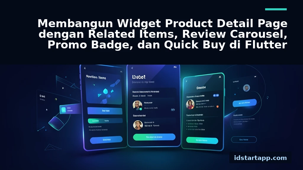
By breaking the page into smaller widgets—such as PromoBadgeWidget, ReviewCarousel, and RelatedItemsGrid—you improve maintainability and make testing much easier. For state management, consider using Riverpod or Bloc to handle user interactions like adding items to a cart or toggling favorites.
Implementing the Promo Badge and Header
The promo badge serves as an immediate visual cue for discounts or limited-time offers. Using a Stack widget allows you to overlay the badge onto the product image effortlessly.
class PromoBadge extends StatelessWidget {
  final String label;
  const PromoBadge({required this.label});

  @override
  Widget build(BuildContext context) {
    return Container(
      padding: EdgeInsets.symmetric(horizontal: 8, vertical: 4),
      decoration: BoxDecoration(
        color: Colors.redAccent,
        borderRadius: BorderRadius.circular(4),
      ),
      child: Text(label, style: TextStyle(color: Colors.white, fontSize: 12)),
    );
  }
}
Position this widget within a Stack alongside your product image. Ensure the badge is placed in a corner that doesn't obscure vital product details, typically the top-left or top-right.
Building the Interactive Review Carousel
Social proof is a key driver of sales. A horizontal CarouselSlider or a simple ListView.builder with scrollDirection: Axis.horizontal works perfectly for displaying customer reviews. Keep the review cards concise, showing the rating, a snippet of the feedback, and the reviewer's name.
Widget buildReviewCarousel(List<Review> reviews) {
  return SizedBox(
    height: 150,
    child: ListView.builder(
      scrollDirection: Axis.horizontal,
      itemCount: reviews.length,
      itemBuilder: (context, index) => ReviewCard(review: reviews[index]),
    ),
  );
}
Integrating Related Items and Quick Buy
Related items help increase the Average Order Value (AOV) by suggesting complementary products. Use a GridView with SliverGridDelegateWithFixedCrossAxisCount to ensure a responsive layout that adapts to different screen widths.
The Quick Buy functionality should be accessible at all times. A BottomAppBar or a PersistentBottomSheet is ideal here. It keeps the "Add to Cart" or "Buy Now" button fixed at the bottom of the screen, ensuring it remains visible even as the user scrolls through long descriptions or reviews.
bottomNavigationBar: BottomAppBar(
  child: ElevatedButton(
    onPressed: () => addToCart(productId),
    child: Text('Quick Buy'),
  ),
),
Best Practices for Performance and UX
- Image Caching: Always use
cached_network_imageto prevent flickering and reduce bandwidth usage. - Skeleton Loaders: Use shimmer effects while data is fetching to provide immediate visual feedback.
- Optimized Scrolling: Use
SliverListandSliverGridto ensure that only the widgets currently on screen are rendered. - Accessibility: Ensure all buttons have sufficient touch targets (at least 48x48 pixels) and use semantic labels for screen readers.
Conclusion
Building a high-converting PDP in Flutter requires a balance between aesthetic appeal and functional performance. By modularizing your widgets, leveraging Sliver components for efficient scrolling, and placing critical actions like "Quick Buy" where they are easily accessible, you create a seamless shopping experience. Start with these building blocks, then iterate based on user feedback and A/B testing to maximize your conversion rates.
Frequently Asked Questions
How do I handle state changes in the Quick Buy button?
Use a state management solution like Riverpod or Bloc to update the cart count globally when the Quick Buy button is pressed, ensuring the UI reflects the change immediately.
Can I use a PageView for the product images?
Yes, PageView is an excellent choice for product image galleries, allowing users to swipe through multiple high-quality photos of the item.
How do I ensure the PDP remains responsive?
Use LayoutBuilder or MediaQuery to adjust the number of columns in your GridView or the padding of your widgets based on the device width.
Should I use a SliverAppBar for the product title?
Using a SliverAppBar with flexibleSpace is a great way to show the product title and price as the user scrolls, keeping the most important information in view.