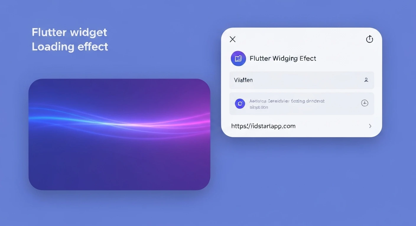

Creating a Shimmer Loading Widget in Flutter
Introduction
In modern mobile applications, user experience is paramount. One common challenge is gracefully handling data fetching, which can sometimes introduce delays. Instead of displaying a blank screen or a simple progress indicator, a shimmer loading effect provides a more engaging and visually appealing way to inform users that content is being loaded. This article will guide you through creating a beautiful shimmer loading widget in your Flutter applications.
What is a Shimmer Loading Effect?
A shimmer loading effect, often seen in apps like Facebook, LinkedIn, and YouTube, is a pulsating animation over a placeholder UI. It mimics the structure of the content that is about to load, giving users a sense of the layout and reducing perceived loading times. The animation typically involves a gradient "shimmer" moving across the placeholder, creating an illusion of content being rendered.
Why Use Shimmer?
- Improved User Experience: It’s more visually appealing than a blank screen or a static spinner.
- Reduced Perceived Waiting Time: By showing content structure early, users feel like the app is working actively.
- Enhanced Aesthetics: Adds a touch of professionalism and modernity to your app's loading states.
- Better Communication: Clearly indicates that data is being fetched and the UI will soon be populated.
Implementation Steps
Step 1: Add Dependencies
First, you need to add the shimmer package to your pubspec.yaml file. This package simplifies the process of creating shimmer effects.
dependencies:
  flutter:
    sdk: flutter
  shimmer: ^3.0.0 # Use the latest version or preferred version
After adding the dependency, run flutter pub get in your terminal.
Step 2: Create the Shimmer Placeholder
Before applying the shimmer effect, design the placeholder UI that will animate. This placeholder should resemble the actual content you expect to load. For instance, if you're loading a list of items with an avatar, title, and subtitle, create a widget that represents that structure.
import 'package:flutter/material.dart';

class ShimmerItemPlaceholder extends StatelessWidget {
  const ShimmerItemPlaceholder({Key? key}) : super(key: key);

  @override
  Widget build(BuildContext context) {
    return Padding(
      padding: const EdgeInsets.symmetric(horizontal: 16.0, vertical: 8.0),
      child: Row(
        crossAxisAlignment: CrossAxisAlignment.start,
        children: [
          Container(
            width: 48.0,
            height: 48.0,
            decoration: BoxDecoration(
              color: Colors.white, // Placeholder color for the avatar
              borderRadius: BorderRadius.circular(8.0),
            ),
          ),
          const SizedBox(width: 8.0),
          Expanded(
            child: Column(
              crossAxisAlignment: CrossAxisAlignment.start,
              children: [
                Container(
                  width: double.infinity,
                  height: 12.0,
                  color: Colors.white, // Placeholder color for the title
                ),
                const SizedBox(height: 8.0),
                Container(
                  width: MediaQuery.of(context).size.width * 0.7,
                  height: 12.0,
                  color: Colors.white, // Placeholder color for the subtitle
                ),
              ],
            ),
          )
        ],
      ),
    );
  }
}
Step 3: Integrate the Shimmer Effect
Now, wrap your placeholder widget with the Shimmer.fromColors widget from the shimmer package. This widget requires two colors: baseColor and highlightColor, which define the gradient of the shimmer effect.
import 'package:flutter/material.dart';
import 'package:shimmer/shimmer.dart'; // Import the shimmer package

// Assuming ShimmerItemPlaceholder from Step 2 is defined in a separate file or above

class ShimmerLoadingList extends StatelessWidget {
  final int itemCount;

  const ShimmerLoadingList({Key? key, this.itemCount = 5}) : super(key: key);

  @override
  Widget build(BuildContext context) {
    return Shimmer.fromColors(
      baseColor: Colors.grey.shade300,
      highlightColor: Colors.grey.shade100,
      enabled: true, // Set to false to stop the animation
      child: ListView.builder(
        itemCount: itemCount,
        itemBuilder: (context, index) {
          return const ShimmerItemPlaceholder();
        },
      ),
    );
  }
}
You can also use Shimmer.fromGradient for more complex gradient effects.
Step 4: Use it in a List/Complex UI
Typically, you'll display the shimmer effect conditionally, based on whether your data has loaded. Here's an example of how you might integrate it into a screen that fetches data.
import 'package:flutter/material.dart';
// Assuming ShimmerLoadingList and ShimmerItemPlaceholder from previous steps
// are accessible (e.g., imported from other files or defined in the same file).

class MyDataScreen extends StatefulWidget {
  const MyDataScreen({Key? key}) : super(key: key);

  @override
  _MyDataScreenState createState() => _MyDataScreenState();
}

class _MyDataScreenState extends State {
  bool _isLoading = true;
  List _data = [];

  @override
  void initState() {
    super.initState();
    _fetchData();
  }

  Future _fetchData() async {
    // Simulate a network request
    await Future.delayed(const Duration(seconds: 3));
    setState(() {
      _data = List.generate(10, (index) => 'Item number ${index + 1}');
      _isLoading = false;
    });
  }

  @override
  Widget build(BuildContext context) {
    return Scaffold(
      appBar: AppBar(
        title: const Text('Shimmer Loading Example'),
      ),
      body: _isLoading
          ? const ShimmerLoadingList(itemCount: 10) // Display shimmer while loading
          : ListView.builder(
              itemCount: _data.length,
              itemBuilder: (context, index) {
                return Card(
                  margin: const EdgeInsets.symmetric(horizontal: 16.0, vertical: 4.0),
                  child: Padding(
                    padding: const EdgeInsets.all(16.0),
                    child: Text(_data[index]),
                  ),
                );
              },
            ),
    );
  }
}

// To run this example, you would typically use it in your main.dart file:
// void main() {
//   runApp(MaterialApp(
//     home: MyDataScreen(),
//   ));
// }
Customization and Best Practices
- Match Placeholder to Content: Ensure your shimmer placeholder closely resembles the final loaded content in terms of shape and layout. This reduces visual jarring when the content loads.
- Color Choice: Use subtle
baseColorandhighlightColorvalues. Typically, variations of grey work best, but you can experiment to match your app's theme. - Animation Duration & Direction: The
shimmerpackage allows customization of animation duration and direction. Adjust these to find a natural flow. - Performance: While shimmer effects are generally performant, avoid excessively complex placeholders or animating too many items simultaneously, especially on lower-end devices.
- Conditional Rendering: Always use a boolean flag (e.g.,
_isLoading) to toggle between the shimmer effect and the actual content.
Conclusion
Implementing a shimmer loading effect in your Flutter application is a straightforward way to significantly enhance user experience during data loading. By providing a clear and aesthetically pleasing visual cue, you can keep users engaged and reduce the perceived waiting time. With the shimmer package, creating these sophisticated loading states is both simple and highly customizable, allowing you to seamlessly integrate them into any part of your app.


