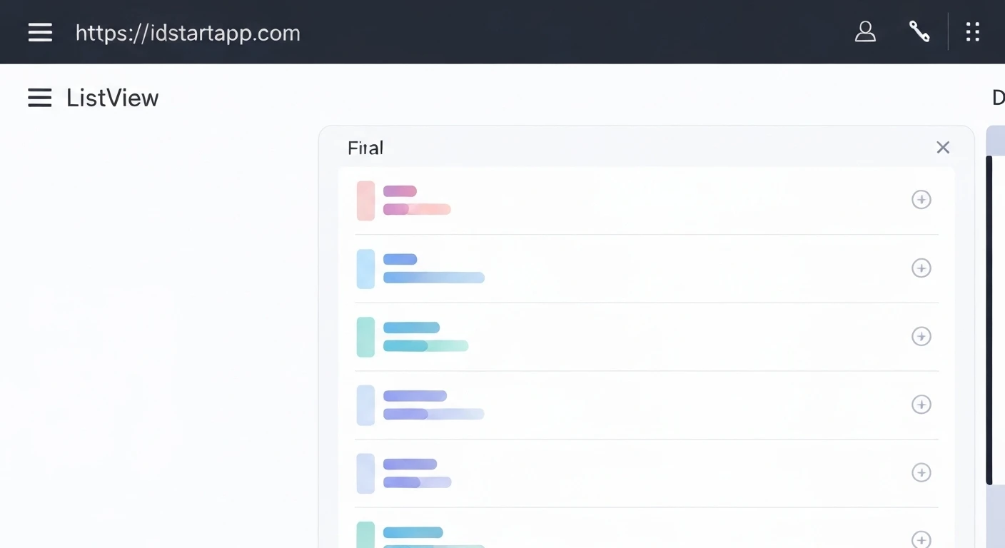

Creating a Loading Skeleton Widget for ListView in Flutter
In modern application development, user experience (UX) is paramount. When dealing with asynchronous data loading, simply displaying a spinning progress indicator can sometimes lead to a feeling of sluggishness or uncertainty for the user. A more engaging and perceptually faster approach is to use a "loading skeleton" — a minimalistic placeholder of the UI that will eventually be displayed, gradually filling in with actual content as data arrives.
This article will guide you through creating a professional and animated loading skeleton widget specifically designed for a ListView in Flutter, enhancing your application's perceived performance and user satisfaction.
Why Use a Loading Skeleton?
- Improved Perceived Performance: Skeletons give users a sense of progress and anticipation, making the loading time feel shorter than it actually is.
- Reduced Cognitive Load: By showing the layout of the upcoming content, users can anticipate the structure of the information, rather than staring at an abstract spinner.
- Seamless Transition: The transition from a skeleton to actual content can be much smoother and less jarring than a sudden appearance of content after a spinner disappears.
Core Components of Our Skeleton Widget
Our loading skeleton will consist of a few key elements:
- Placeholder Shapes: Simple rectangles or circles that mimic the size and position of actual text, images, or other UI elements.
- Neutral Color Palette: Typically shades of gray to indicate a temporary, uninitialized state.
- Animation (Shimmer Effect): A subtle, continuous animation that draws the user's eye and indicates an active loading state without being distracting. For this, we'll leverage the popular
shimmerpackage.
Step 1: Create an Individual Skeleton Item
First, let's design a single skeleton item that represents how each item in your ListView will look while loading. For this example, we'll create a layout with a circular avatar placeholder and two lines of text, mimicking a typical list item.
import 'package:flutter/material.dart';

class SkeletonItem extends StatelessWidget {
  const SkeletonItem({Key? key}) : super(key: key);

  @override
  Widget build(BuildContext context) {
    return Padding(
      padding: const EdgeInsets.symmetric(horizontal: 16.0, vertical: 8.0),
      child: Row(
        crossAxisAlignment: CrossAxisAlignment.start,
        children: [
          // Placeholder for an avatar/image
          Container(
            width: 48.0,
            height: 48.0,
            decoration: BoxDecoration(
              color: Colors.grey[300], // Light grey background
              shape: BoxShape.circle,
            ),
          ),
          const SizedBox(width: 16.0), // Spacer
          Expanded(
            child: Column(
              crossAxisAlignment: CrossAxisAlignment.start,
              children: [
                // Placeholder for the main title text
                Container(
                  width: double.infinity, // Takes full available width
                  height: 12.0,
                  decoration: BoxDecoration(
                    color: Colors.grey[300],
                    borderRadius: BorderRadius.circular(4.0),
                  ),
                ),
                const SizedBox(height: 8.0), // Spacer
                // Placeholder for the subtitle text
                Container(
                  width: MediaQuery.of(context).size.width * 0.5, // Simulate a shorter second line
                  height: 12.0,
                  decoration: BoxDecoration(
                    color: Colors.grey[300],
                    borderRadius: BorderRadius.circular(4.0),
                  ),
                ),
              ],
            ),
          ),
        ],
      ),
    );
  }
}
Step 2: Implement the Animated Skeleton ListView
Next, we'll create a ListView that populates with multiple instances of our SkeletonItem. To add the shimmering effect, we'll use the shimmer package. First, add it to your pubspec.yaml file:
dependencies:
  flutter:
    sdk: flutter
  shimmer: ^3.0.0 # Add this line
Then, create the SkeletonListView widget:
import 'package:flutter/material.dart';
import 'package:shimmer/shimmer.dart'; // Import the shimmer package

// Assuming SkeletonItem is defined in the same file or imported from 'skeleton_item.dart'

class SkeletonListView extends StatelessWidget {
  final int itemCount;

  const SkeletonListView({Key? key, this.itemCount = 5}) : super(key: key);

  @override
  Widget build(BuildContext context) {
    return Shimmer.fromColors(
      baseColor: Colors.grey[300]!, // Base color of the skeleton
      highlightColor: Colors.grey[100]!, // Highlight color for the shimmer effect
      child: ListView.builder(
        itemCount: itemCount,
        itemBuilder: (context, index) {
          return const SkeletonItem(); // Display our individual skeleton item
        },
      ),
    );
  }
}
Step 3: Integrate with Your Data Loading Logic
Finally, we integrate the SkeletonListView into our main UI. We'll use a simple boolean flag (_isLoading) to toggle between displaying the skeleton and the actual data. For a real-world scenario, you might fetch data from an API or a local database.
import 'package:flutter/material.dart';
// Assuming SkeletonItem and SkeletonListView are in separate files
// import 'skeleton_item.dart';
// import 'skeleton_list_view.dart';

class MyDataScreen extends StatefulWidget {
  const MyDataScreen({Key? key}) : super(key: key);

  @override
  _MyDataScreenState createState() => _MyDataScreenState();
}

class _MyDataScreenState extends State {
  bool _isLoading = true; // State to control loading display
  List _data = []; // Placeholder for actual data

  @override
  void initState() {
    super.initState();
    _loadData(); // Trigger data loading when the screen initializes
  }

  // Simulate an asynchronous data loading process
  Future _loadData() async {
    // Simulate a network delay
    await Future.delayed(const Duration(seconds: 3));
    setState(() {
      _data = List.generate(10, (index) => 'Actual Item ${index + 1}'); // Populate with dummy data
      _isLoading = false; // Set loading to false once data is ready
    });
  }

  @override
  Widget build(BuildContext context) {
    return Scaffold(
      appBar: AppBar(
        title: const Text('Data List with Skeleton'),
      ),
      body: _isLoading
          ? const SkeletonListView(itemCount: 7) // Display skeleton while loading
          : ListView.builder(
              itemCount: _data.length,
              itemBuilder: (context, index) {
                // Display actual data items
                return Card(
                  margin: const EdgeInsets.symmetric(horizontal: 16.0, vertical: 8.0),
                  elevation: 2,
                  child: ListTile(
                    leading: CircleAvatar(
                      backgroundColor: Colors.blueAccent,
                      child: Text('${index + 1}', style: const TextStyle(color: Colors.white)),
                    ),
                    title: Text(_data[index]),
                    subtitle: Text('This is the subtitle for ${_data[index]}'),
                    trailing: const Icon(Icons.arrow_forward_ios, size: 16.0),
                  ),
                );
              },
            ),
    );
  }
}

// Example main function to run the app
void main() {
  runApp(const MyApp());
}

class MyApp extends StatelessWidget {
  const MyApp({Key? key}) : super(key: key);

  @override
  Widget build(BuildContext context) {
    return MaterialApp(
      title: 'Flutter Skeleton Demo',
      theme: ThemeData(
        primarySwatch: Colors.blue,
        visualDensity: VisualDensity.adaptivePlatformDensity,
      ),
      home: const MyDataScreen(),
    );
  }
}
Conclusion
By implementing a loading skeleton, you can significantly improve the user experience of your Flutter applications, especially when dealing with data fetching. This approach makes loading times feel shorter, provides visual context, and creates a more polished and professional interface. The flexibility of Flutter allows you to customize your skeleton widgets to match the exact layout of your content, ensuring a seamless and visually appealing transition from loading state to loaded data.


