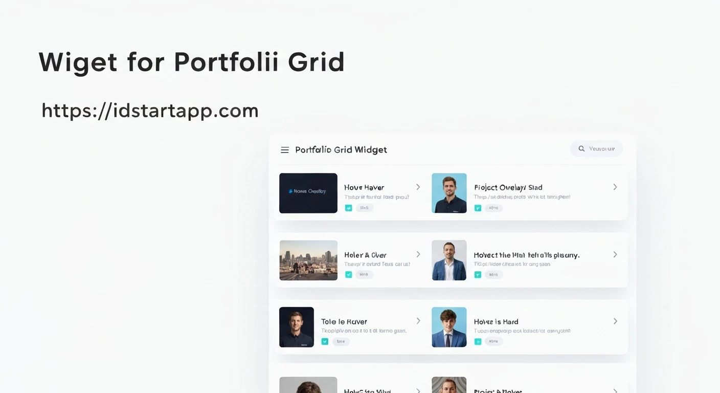

Creating a Portfolio Grid Widget with Hover Overlay in Flutter
A portfolio grid is a fundamental component for showcasing work, projects, or products in a visually appealing and organized manner. Enhancing this with a hover overlay effect adds a layer of interactivity and elegance, allowing users to quickly see more details or actions upon interaction. In Flutter, achieving this effect involves combining several core widgets and concepts, primarily
GridViewStackAnimatedOpacityMouseRegionCore Concepts
To build our portfolio grid with a hover overlay, we'll leverage the following Flutter concepts:
: Efficiently builds a scrollable, 2D array of widgets. Ideal for displaying a collection of portfolio items.GridView.builder
: Allows widgets to be layered on top of each other. This is crucial for placing the overlay on top of the portfolio item's image.Stack
: A widget that implicitly animates its child's opacity. We'll use this to fade the overlay in and out.AnimatedOpacity
: Detects mouse pointer events, such as entry and exit. This is essential for triggering the hover effect on web and desktop platforms. For mobile, aMouseRegion
with anGestureDetector
oronTap
could serve a similar purpose, but for a true "hover" experience,onLongPress
is preferred.MouseRegion- State Management: A simple
variable will manage the hover state, triggeringbool
to rebuild the widget with the updated opacity.setState
Data Model
First, let's define a simple data model for our portfolio items:
class PortfolioItem {
  final String title;
  final String imageUrl;
  final String description;

  PortfolioItem({
    required this.title,
    required this.imageUrl,
    required this.description,
  });
}
The Portfolio Item Widget with Hover Effect
This is the core widget that displays an individual portfolio item and manages its hover state and overlay. We'll use a
StatefulWidget
import 'package:flutter/material.dart';

class PortfolioGridItem extends StatefulWidget {
  final PortfolioItem item;

  const PortfolioGridItem({Key? key, required this.item}) : super(key: key);

  @override
  _PortfolioGridItemState createState() => _PortfolioGridItemState();
}

class _PortfolioGridItemState extends State {
  bool _isHovering = false;

  @override
  Widget build(BuildContext context) {
    return MouseRegion(
      onEnter: (_) => _mouseEnter(true),
      onExit: (_) => _mouseEnter(false),
      child: GestureDetector( // Added for mobile tap interaction
        onTap: () {
          // Handle tap action, e.g., navigate to detail page
          print('Tapped on ${widget.item.title}');
        },
        child: Container(
          decoration: BoxDecoration(
            borderRadius: BorderRadius.circular(8.0),
            boxShadow: [
              BoxShadow(
                color: Colors.black.withOpacity(0.1),
                spreadRadius: 2,
                blurRadius: 5,
                offset: const Offset(0, 3),
              ),
            ],
          ),
          clipBehavior: Clip.antiAlias, // Ensures content respects border radius
          child: Stack(
            children: [
              // Background Image
              Positioned.fill(
                child: Image.network(
                  widget.item.imageUrl,
                  fit: BoxFit.cover,
                  errorBuilder: (context, error, stackTrace) {
                    return Container(
                      color: Colors.grey[300],
                      child: const Icon(Icons.broken_image, size: 50, color: Colors.grey),
                    );
                  },
                ),
              ),

              // Hover Overlay
              AnimatedOpacity(
                opacity: _isHovering ? 1.0 : 0.0,
                duration: const Duration(milliseconds: 300),
                child: Container(
                  color: Colors.black.withOpacity(0.6),
                  child: Center(
                    child: Padding(
                      padding: const EdgeInsets.all(16.0),
                      child: Column(
                        mainAxisAlignment: MainAxisAlignment.center,
                        children: [
                          Text(
                            widget.item.title,
                            style: const TextStyle(
                              color: Colors.white,
                              fontSize: 20,
                              fontWeight: FontWeight.bold,
                            ),
                            textAlign: TextAlign.center,
                          ),
                          const SizedBox(height: 8),
                          Text(
                            widget.item.description,
                            style: TextStyle(
                              color: Colors.white.withOpacity(0.8),
                              fontSize: 14,
                            ),
                            textAlign: TextAlign.center,
                            maxLines: 2,
                            overflow: TextOverflow.ellipsis,
                          ),
                          const SizedBox(height: 12),
                          ElevatedButton(
                            onPressed: () {
                              // Action when button inside overlay is pressed
                              print('View project: ${widget.item.title}');
                            },
                            style: ElevatedButton.styleFrom(
                              backgroundColor: Colors.blueAccent,
                              shape: RoundedRectangleBorder(
                                borderRadius: BorderRadius.circular(20),
                              ),
                              padding: const EdgeInsets.symmetric(horizontal: 20, vertical: 10),
                            ),
                            child: const Text('View Project', style: TextStyle(color: Colors.white)),
                          ),
                        ],
                      ),
                    ),
                  ),
                ),
              ),
            ],
          ),
        ),
      ),
    );
  }

  void _mouseEnter(bool hover) {
    setState(() {
      _isHovering = hover;
    });
  }
}
In this widget:
- The
detects when the mouse pointer enters (MouseRegion
) or exits (onEnter
) the widget's area, updating theonExit
state._isHovering - A
is wrapped around theGestureDetector
to handle tap events for mobile users.Container - The
layers anStack
(for the portfolio item's image) and anImage.network
widget.AnimatedOpacity - The
'sAnimatedOpacity
property is bound toopacity
, making the overlay visible (opacity 1.0) or hidden (opacity 0.0) with a smooth transition._isHovering - The overlay itself is a
with a semi-transparent black background, centered content (title, description, and a button).Container
The Portfolio Grid Widget
Now, let's create the main grid widget that will display a collection of these portfolio items.
import 'package:flutter/material.dart';
// Assuming PortfolioItem and PortfolioGridItem are in the same or accessible file
// import 'portfolio_item_data.dart'; // if data model is in separate file
// import 'portfolio_grid_item.dart'; // if item widget is in separate file

class PortfolioGrid extends StatelessWidget {
  final List items;
  final int crossAxisCount;
  final double childAspectRatio;
  final double spacing;

  const PortfolioGrid({
    Key? key,
    required this.items,
    this.crossAxisCount = 3,
    this.childAspectRatio = 1.0,
    this.spacing = 16.0,
  }) : super(key: key);

  @override
  Widget build(BuildContext context) {
    return GridView.builder(
      shrinkWrap: true, // Important for nested scroll views or fixed height grids
      physics: const NeverScrollableScrollPhysics(), // If used within another scroll view
      gridDelegate: SliverGridDelegateWithFixedCrossAxisCount(
        crossAxisCount: crossAxisCount,
        crossAxisSpacing: spacing,
        mainAxisSpacing: spacing,
        childAspectRatio: childAspectRatio,
      ),
      itemCount: items.length,
      itemBuilder: (context, index) {
        return PortfolioGridItem(item: items[index]);
      },
    );
  }
}
The
PortfolioGridGridView.buildercrossAxisCountchildAspectRatiospacingPutting It All Together (Example Usage)
Finally, here's how you can integrate these widgets into a Flutter application:
import 'package:flutter/material.dart';
// Import your PortfolioItem and PortfolioGrid widgets
// import 'portfolio_widgets.dart'; // If all are in one file

void main() {
  runApp(const MyApp());
}

class MyApp extends StatelessWidget {
  const MyApp({Key? key}) : super(key: key);

  @override
  Widget build(BuildContext context) {
    return MaterialApp(
      title: 'Portfolio Demo',
      theme: ThemeData(
        primarySwatch: Colors.blue,
        visualDensity: VisualDensity.adaptivePlatformDensity,
      ),
      home: const PortfolioPage(),
    );
  }
}

class PortfolioPage extends StatelessWidget {
  const PortfolioPage({Key? key}) : super(key: key);

  List _generatePortfolioItems() {
    return List.generate(
      12,
      (index) => PortfolioItem(
        title: 'Project ${index + 1}',
        imageUrl: 'https://picsum.photos/id/${100 + index}/400/300', // Example image
        description: 'A brief description of project ${index + 1}. Showcasing Flutter capabilities.',
      ),
    );
  }

  @override
  Widget build(BuildContext context) {
    final List portfolioItems = _generatePortfolioItems();

    return Scaffold(
      appBar: AppBar(
        title: const Text('My Portfolio'),
        centerTitle: true,
      ),
      body: SingleChildScrollView(
        padding: const EdgeInsets.all(24.0),
        child: Center(
          child: ConstrainedBox(
            constraints: const BoxConstraints(maxWidth: 1200), // Max width for responsiveness
            child: Column(
              crossAxisAlignment: CrossAxisAlignment.start,
              children: [
                const Text(
                  'Explore My Work',
                  style: TextStyle(
                    fontSize: 32,
                    fontWeight: FontWeight.bold,
                    color: Colors.blueGrey,
                  ),
                ),
                const SizedBox(height: 24),
                PortfolioGrid(
                  items: portfolioItems,
                  crossAxisCount: MediaQuery.of(context).size.width > 900
                      ? 4 // 4 columns on large screens
                      : MediaQuery.of(context).size.width > 600
                          ? 3 // 3 columns on medium screens
                          : 2, // 2 columns on small screens
                  childAspectRatio: 1.2, // Slightly wider than tall
                  spacing: 20.0,
                ),
                const SizedBox(height: 40),
                // Add more sections if needed
              ],
            ),
          ),
        ),
      ),
    );
  }
}
In the example above:
- We create a list of dummy
objects.PortfolioItem - The
widget is placed inside aPortfolioGrid
andSingleChildScrollView
/Center
for basic responsiveness and layout.ConstrainedBox - The
is dynamically adjusted based on screen width usingcrossAxisCount
to provide a better experience across different devices.MediaQuery
Conclusion
By combining
GridViewStackAnimatedOpacityMouseRegionGestureDetector


