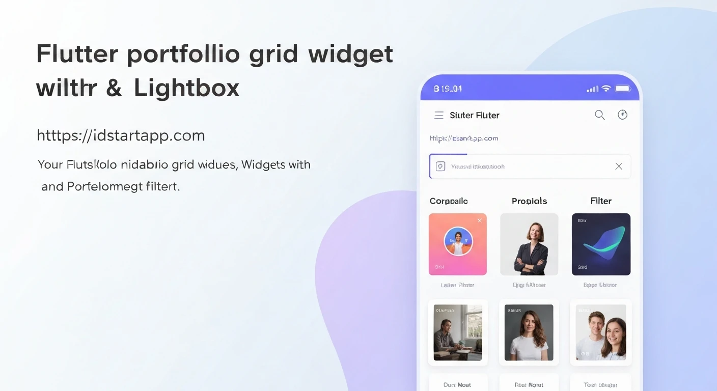

Creating a Portfolio Grid Widget with Filters and Lightbox in Flutter
A portfolio is a crucial element for showcasing work, be it for a design agency, a freelancer, or an individual. In mobile applications, presenting a collection of projects in an organized, interactive, and visually appealing manner is key to engaging users. This article details the process of building a dynamic portfolio grid widget in Flutter, complete with category-based filtering and an interactive lightbox for viewing project details or larger images.
Our goal is to create a robust and reusable Flutter widget that:
- Displays portfolio items in a responsive grid layout.
- Allows users to filter items by category.
- Provides a lightbox view for individual items, showing a larger image or more details upon selection.
1. Project Setup and Dependencies
Start by creating a new Flutter project. For this implementation, we won't strictly require external packages for the core filtering and lightbox functionality, but for better image handling (like caching) and more advanced lightbox features (like pinch-to-zoom), you might consider adding:
cached_network_image: For efficient loading and caching of network images.photo_view: For advanced image viewing, including zoom, pan, and rotation.
For this tutorial, we will focus on core Flutter capabilities to demonstrate the underlying principles. If you decide to add them, include them in your pubspec.yaml:
dependencies:
  flutter:
    sdk: flutter
  # cached_network_image: ^3.3.1 # Uncomment if you need image caching
  # photo_view: ^0.14.0 # Uncomment if you need advanced image viewing
2. Defining the Data Model
First, let's define a data model for our portfolio items. Each item will need a title, a category, an image URL, and potentially a description.
// lib/models/portfolio_item.dart
class PortfolioItem {
  final String id;
  final String title;
  final String category;
  final String imageUrl;
  final String description; // Optional: for lightbox details

  PortfolioItem({
    required this.id,
    required this.title,
    required this.category,
    required this.imageUrl,
    this.description = '',
  });
}
Next, let's create some sample data to populate our portfolio grid. In a real application, this data would typically come from an API or a local database.
// lib/data/portfolio_data.dart
import '../models/portfolio_item.dart';

final List<PortfolioItem> allPortfolioItems = [
  PortfolioItem(
    id: '1',
    title: 'Modern Apartment Design',
    category: 'Architecture',
    imageUrl: 'https://picsum.photos/id/1018/300/300',
    description: 'A sleek and modern apartment design focusing on minimalist aesthetics and functional spaces.',
  ),
  PortfolioItem(
    id: '2',
    title: 'Website Redesign Project',
    category: 'Web Development',
    imageUrl: 'https://picsum.photos/id/10/300/300',
    description: 'Complete overhaul of an e-commerce website for improved user experience and mobile responsiveness.',
  ),
  PortfolioItem(
    id: '3',
    title: 'Branding for a Startup',
    category: 'Graphic Design',
    imageUrl: 'https://picsum.photos/id/1025/300/300',
    description: 'Developed a comprehensive brand identity, including logo, color palette, and typography.',
  ),
  PortfolioItem(
    id: '4',
    title: 'Mobile App UI/UX',
    category: 'Mobile Development',
    imageUrl: 'https://picsum.photos/id/1000/300/300',
    description: 'Designed an intuitive user interface for a new social media application, focusing on engagement.',
  ),
  PortfolioItem(
    id: '5',
    title: 'Abstract Art Piece',
    category: 'Graphic Design',
    imageUrl: 'https://picsum.photos/id/1003/300/300',
    description: 'Exploration of geometric shapes and vibrant colors in a digital art canvas.',
  ),
  PortfolioItem(
    id: '6',
    title: 'Office Building Renovation',
    category: 'Architecture',
    imageUrl: 'https://picsum.photos/id/1015/300/300',
    description: 'Transformed an outdated office space into a collaborative and productive environment.',
  ),
  PortfolioItem(
    id: '7',
    title: 'Landing Page Development',
    category: 'Web Development',
    imageUrl: 'https://picsum.photos/id/1016/300/300',
    description: 'Developed high-converting landing pages for various marketing campaigns.',
  ),
  PortfolioItem(
    id: '8',
    title: 'E-commerce App Frontend',
    category: 'Mobile Development',
    imageUrl: 'https://picsum.photos/id/1019/300/300',
    description: 'Built the front-end user interface for a multi-vendor e-commerce mobile application.',
  ),
];

final List<String> portfolioCategories =
    ['All'] + allPortfolioItems.map((item) => item.category).toSet().toList();
3. Building the Portfolio Grid Widget
Now, let's create the main widget that will house our portfolio grid, filter buttons, and lightbox logic.
// lib/widgets/portfolio_grid_widget.dart
import 'package:flutter/material.dart';
import '../data/portfolio_data.dart';
import '../models/portfolio_item.dart';

class PortfolioGridWidget extends StatefulWidget {
  const PortfolioGridWidget({super.key});

  @override
  State<PortfolioGridWidget> createState() => _PortfolioGridWidgetState();
}

class _PortfolioGridWidgetState extends State<PortfolioGridWidget> {
  String _selectedCategory = 'All';
  late List<PortfolioItem> _filteredItems;

  @override
  void initState() {
    super.initState();
    _filteredItems = allPortfolioItems;
  }

  void _filterItems(String category) {
    setState(() {
      _selectedCategory = category;
      if (category == 'All') {
        _filteredItems = allPortfolioItems;
      } else {
        _filteredItems = allPortfolioItems
            .where((item) => item.category == category)
            .toList();
      }
    });
  }

  void _showLightbox(BuildContext context, PortfolioItem item) {
    showDialog(
      context: context,
      builder: (BuildContext dialogContext) {
        return Dialog(
          backgroundColor: Colors.black.withOpacity(0.8),
          child: Stack(
            children: [
              Column(
                mainAxisSize: MainAxisSize.min,
                children: [
                  Expanded(
                    child: Padding(
                      padding: const EdgeInsets.all(8.0),
                      child: Image.network(
                        item.imageUrl,
                        fit: BoxFit.contain,
                        loadingBuilder: (context, child, loadingProgress) {
                          if (loadingProgress == null) return child;
                          return Center(
                            child: CircularProgressIndicator(
                              value: loadingProgress.expectedTotalBytes != null
                                  ? loadingProgress.cumulativeBytesLoaded /
                                      loadingProgress.expectedTotalBytes!
                                  : null,
                            ),
                          );
                        },
                      ),
                    ),
                  ),
                  Padding(
                    padding: const EdgeInsets.all(16.0),
                    child: Column(
                      children: [
                        Text(
                          item.title,
                          style: const TextStyle(
                            fontSize: 24,
                            fontWeight: FontWeight.bold,
                            color: Colors.white,
                          ),
                          textAlign: TextAlign.center,
                        ),
                        const SizedBox(height: 8),
                        Text(
                          item.description,
                          style: const TextStyle(fontSize: 16, color: Colors.white70),
                          textAlign: TextAlign.center,
                        ),
                      ],
                    ),
                  ),
                ],
              ),
              Positioned(
                top: 0,
                right: 0,
                child: IconButton(
                  icon: const Icon(Icons.close, color: Colors.white),
                  onPressed: () {
                    Navigator.of(dialogContext).pop();
                  },
                ),
              ),
            ],
          ),
        );
      },
    );
  }

  @override
  Widget build(BuildContext context) {
    return Column(
      children: [
        // Filter Buttons
        SingleChildScrollView(
          scrollDirection: Axis.horizontal,
          padding: const EdgeInsets.symmetric(horizontal: 16.0, vertical: 8.0),
          child: Row(
            children: portfolioCategories.map((category) {
              return Padding(
                padding: const EdgeInsets.symmetric(horizontal: 4.0),
                child: ChoiceChip(
                  label: Text(category),
                  selected: _selectedCategory == category,
                  onSelected: (selected) {
                    if (selected) {
                      _filterItems(category);
                    }
                  },
                  selectedColor: Theme.of(context).primaryColor,
                  labelStyle: TextStyle(
                    color: _selectedCategory == category ? Colors.white : Colors.black87,
                  ),
                ),
              );
            }).toList(),
          ),
        ),
        const SizedBox(height: 16),
        // Portfolio Grid
        Expanded(
          child: GridView.builder(
            padding: const EdgeInsets.all(16.0),
            gridDelegate: const SliverGridDelegateWithMaxCrossAxisExtent(
              maxCrossAxisExtent: 200, // Maximum width of each item
              crossAxisSpacing: 16,
              mainAxisSpacing: 16,
              childAspectRatio: 3 / 4, // Adjust ratio as needed
            ),
            itemCount: _filteredItems.length,
            itemBuilder: (context, index) {
              final item = _filteredItems[index];
              return GestureDetector(
                onTap: () => _showLightbox(context, item),
                child: Card(
                  elevation: 4,
                  shape: RoundedRectangleBorder(
                    borderRadius: BorderRadius.circular(8),
                  ),
                  clipBehavior: Clip.antiAlias,
                  child: Column(
                    crossAxisAlignment: CrossAxisAlignment.start,
                    children: [
                      Expanded(
                        child: Image.network(
                          item.imageUrl,
                          fit: BoxFit.cover,
                          width: double.infinity,
                          loadingBuilder: (context, child, loadingProgress) {
                            if (loadingProgress == null) return child;
                            return Center(
                              child: CircularProgressIndicator(
                                value: loadingProgress.expectedTotalBytes != null
                                    ? loadingProgress.cumulativeBytesLoaded /
                                        loadingProgress.expectedTotalBytes!
                                    : null,
                              ),
                            );
                          },
                          errorBuilder: (context, error, stackTrace) => const Center(child: Icon(Icons.error)),
                        ),
                      ),
                      Padding(
                        padding: const EdgeInsets.all(8.0),
                        child: Text(
                          item.title,
                          style: const TextStyle(
                            fontWeight: FontWeight.bold,
                            fontSize: 16,
                          ),
                          maxLines: 1,
                          overflow: TextOverflow.ellipsis,
                        ),
                      ),
                      Padding(
                        padding: const EdgeInsets.symmetric(horizontal: 8.0, vertical: 4.0),
                        child: Text(
                          item.category,
                          style: TextStyle(
                            fontSize: 12,
                            color: Colors.grey[600],
                          ),
                        ),
                      ),
                    ],
                  ),
                ),
              );
            },
          ),
        ),
      ],
    );
  }
}
4. Integrating into Your Application
Finally, integrate the PortfolioGridWidget into your main application structure. For example, in your main.dart file:
// lib/main.dart
import 'package:flutter/material.dart';
import 'widgets/portfolio_grid_widget.dart';

void main() {
  runApp(const MyApp());
}

class MyApp extends StatelessWidget {
  const MyApp({super.key});

  @override
  Widget build(BuildContext context) {
    return MaterialApp(
      title: 'Flutter Portfolio Grid',
      theme: ThemeData(
        primarySwatch: Colors.blue,
        visualDensity: VisualDensity.adaptivePlatformDensity,
      ),
      home: Scaffold(
        appBar: AppBar(
          title: const Text('My Portfolio'),
          centerTitle: true,
        ),
        body: const PortfolioGridWidget(),
      ),
    );
  }
}
Explanation of Key Components:
PortfolioItemData Model: A simple Dart class to structure our portfolio data, making it easy to manage and display._PortfolioGridWidgetState:_selectedCategory: Manages the currently active filter._filteredItems: The list of items displayed in the grid, updated based on the selected category._filterItems(String category): This method updates the_selectedCategoryand rebuilds_filteredItems, triggering a UI update viasetState()._showLightbox(BuildContext context, PortfolioItem item): This function usesshowDialogto present a full-screen modal. Inside the dialog, we display the large image, title, and description. A close button is provided for easy dismissal.
- Filter Buttons:
- A
SingleChildScrollViewwith aRowofChoiceChipwidgets allows for horizontal scrolling of categories if there are many. - Each
ChoiceChiprepresents a category. Itsselectedstate changes based on_selectedCategory. onSelectedcallback triggers the_filterItemsmethod when a chip is tapped.
- A
- Portfolio Grid:
Expandedwidget ensures the grid takes up the remaining available vertical space.GridView.builderis used for efficient rendering of a scrollable grid.SliverGridDelegateWithMaxCrossAxisExtentmakes the grid responsive by trying to fit as many items as possible within a maximum width (maxCrossAxisExtent) on each row.- Each grid item is a
GestureDetectorwrapping aCard. Tapping it invokes_showLightbox. Image.networkwithloadingBuilderprovides a visual indicator while images are loading.
Conclusion
By following these steps, you can create a professional-grade portfolio grid widget in Flutter with dynamic filtering and a responsive lightbox feature. This modular approach ensures reusability and maintainability, allowing you to easily integrate it into various parts of your application or extend its functionality.
Further enhancements could include:
- Animations: Adding transition animations for opening/closing the lightbox or filtering items.
- Pagination/Load More: For very large portfolios, implementing infinite scrolling to load items on demand.
- Advanced Lightbox: Utilizing a package like
photo_viewfor pinch-to-zoom, swipe navigation between items in the lightbox, and a more polished UI. - Backend Integration: Replacing static data with data fetched from an API.
- Deep Linking: Allowing specific portfolio items to be opened directly via URL.
This foundation provides a solid starting point for building engaging and feature-rich portfolio experiences in your Flutter applications.


