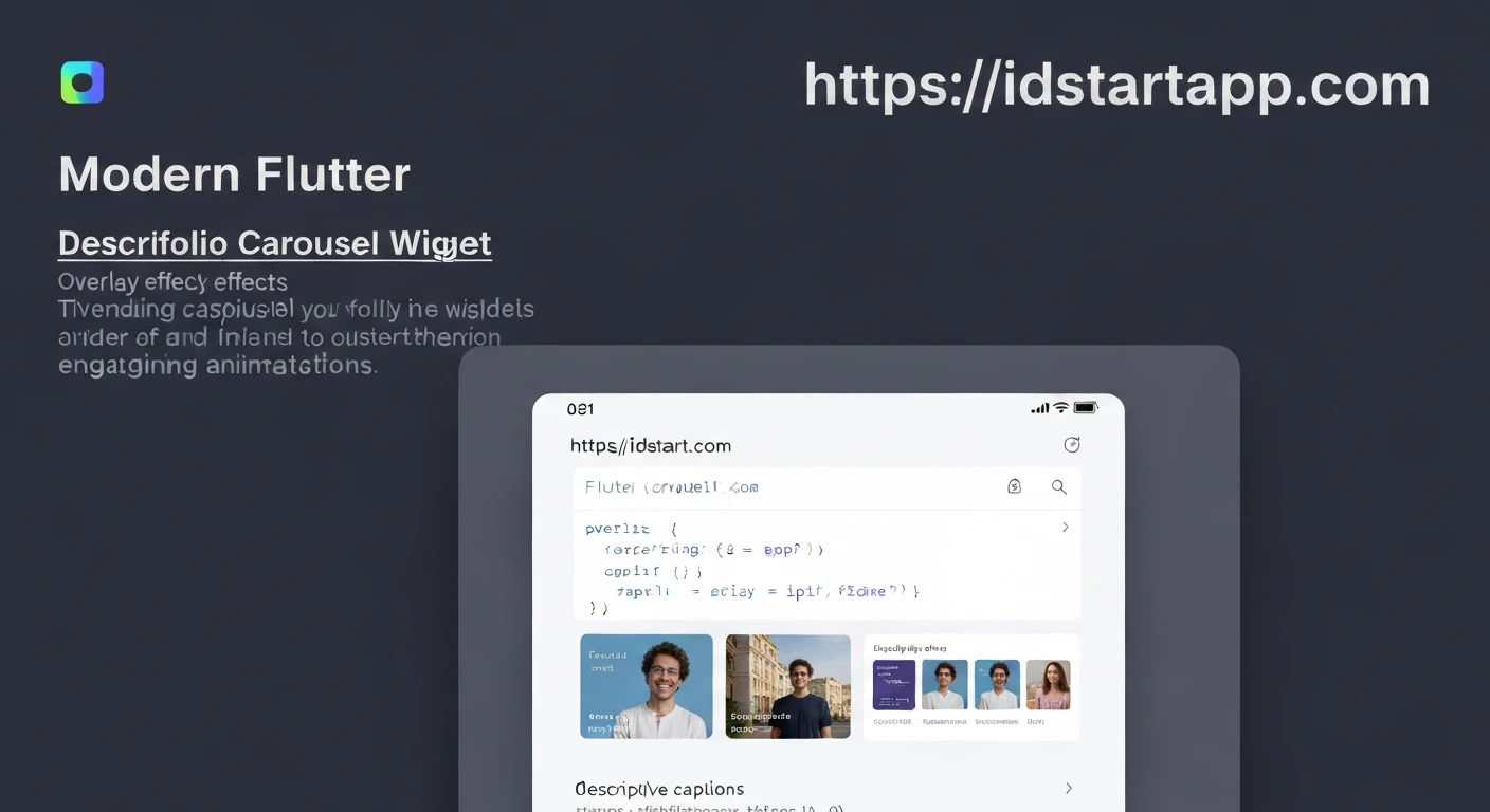

Building a Portfolio Carousel Widget with Overlay, Caption, and Animation in Flutter
Creating an engaging portfolio is crucial for showcasing your work. In Flutter, a portfolio carousel widget can effectively display multiple projects with visual flair. This article guides you through building a dynamic carousel featuring images, an overlay, descriptive captions, and smooth animations, making your portfolio interactive and professional.
1. Defining the Portfolio Item Data Model
First, let's define a simple data model for our portfolio items. Each item will have an image, a title, and a description.
class PortfolioItem {
  final String imageAsset;
  final String title;
  final String description;

  PortfolioItem({
    required this.imageAsset,
    required this.title,
    required this.description,
  });
}
2. Designing the Portfolio Carousel Widget
We'll use Flutter's PageView widget to create the carousel functionality. This allows for smooth horizontal scrolling between items. We'll make our carousel stateful to manage the current page and apply animation effects.
import 'package:flutter/material.dart';

class PortfolioCarousel extends StatefulWidget {
  final List<PortfolioItem> items;

  const PortfolioCarousel({Key? key, required this.items}) : super(key: key);

  @override
  _PortfolioCarouselState createState() => _PortfolioCarouselState();
}

class _PortfolioCarouselState extends State<PortfolioCarousel> {
  late PageController _pageController;
  int _currentPage = 0; // Tracks the current active page
  static const double _viewportFraction = 0.8; // How much of the page is visible

  @override
  void initState() {
    super.initState();
    _pageController = PageController(
      viewportFraction: _viewportFraction,
      initialPage: _currentPage,
    );
    _pageController.addListener(_pageListener);
  }

  void _pageListener() {
    // This listener helps in rebuilding the widget to apply scale/opacity effects
    // based on the page scroll position.
    setState(() {
      // _currentPage is implicitly updated by PageView, but we can store it
      // if we need it for indicators or other explicit logic.
    });
  }

  @override
  void dispose() {
    _pageController.removeListener(_pageListener);
    _pageController.dispose();
    super.dispose();
  }

  @override
  Widget build(BuildContext context) {
    return SizedBox(
      height: 300, // Fixed height for the carousel
      child: PageView.builder(
        controller: _pageController,
        itemCount: widget.items.length,
        itemBuilder: (context, index) {
          // Calculate the scale and opacity based on the current scroll position
          double scale = 1.0;
          double opacity = 1.0;
          if (_pageController.position.haveDimensions) {
            final page = _pageController.page ?? 0;
            final distance = (page - index).abs();
            // Reduce scale and opacity for items further away from the center
            scale = 1.0 - (distance * 0.2); // Adjust 0.2 for desired effect
            opacity = 1.0 - (distance * 0.4); // Adjust 0.4 for desired effect
            if (scale < 0.8) scale = 0.8; // Minimum scale
            if (opacity < 0.4) opacity = 0.4; // Minimum opacity
          }

          return AnimatedBuilder(
            animation: _pageController,
            builder: (context, child) {
              return Transform.scale(
                scale: scale,
                child: Opacity(
                  opacity: opacity,
                  child: _buildPortfolioItem(widget.items[index]),
                ),
              );
            },
          );
        },
      ),
    );
  }

  Widget _buildPortfolioItem(PortfolioItem item) {
    return Padding(
      padding: const EdgeInsets.symmetric(horizontal: 8.0), // Spacing between items
      child: Card(
        clipBehavior: Clip.antiAlias,
        shape: RoundedRectangleBorder(borderRadius: BorderRadius.circular(12)),
        elevation: 5,
        child: Stack(
          fit: StackFit.expand,
          children: [
            // 1. Background Image
            Image.asset(
              item.imageAsset,
              fit: BoxFit.cover,
            ),
            // 2. Overlay
            Container(
              decoration: BoxDecoration(
                gradient: LinearGradient(
                  begin: Alignment.topCenter,
                  end: Alignment.bottomCenter,
                  colors: [Colors.transparent, Colors.black.withOpacity(0.7)],
                ),
              ),
            ),
            // 3. Caption
            Positioned(
              bottom: 16,
              left: 16,
              right: 16,
              child: Column(
                crossAxisAlignment: CrossAxisAlignment.start,
                children: [
                  Text(
                    item.title,
                    style: const TextStyle(
                      color: Colors.white,
                      fontSize: 20,
                      fontWeight: FontWeight.bold,
                    ),
                    maxLines: 1,
                    overflow: TextOverflow.ellipsis,
                  ),
                  const SizedBox(height: 4),
                  Text(
                    item.description,
                    style: TextStyle(
                      color: Colors.white.withOpacity(0.8),
                      fontSize: 14,
                    ),
                    maxLines: 2,
                    overflow: TextOverflow.ellipsis,
                  ),
                ],
              ),
            ),
          ],
        ),
      ),
    );
  }
}
3. Explaining Key Components and Animations
-
PageView.builder: This widget is the core of our carousel.viewportFractioncontrols how much of the adjacent pages are visible, giving a peek of what's coming next. -
PageController: Manages the scroll position of thePageView. We add a listener to it to trigger rebuilds whenever the page scrolls, allowing us to apply custom transformations. -
AnimatedBuilder: This widget is crucial for performance. It rebuilds only the child subtree that depends on the animation (in this case, the scale and opacity of each portfolio item) without rebuilding the entirePortfolioCarouselState. -
Transform.scale&Opacity: These widgets are used to apply the animation effects. Items closer to the center (the active page) will have a scale of 1.0 and full opacity, while items further away will be scaled down and become more transparent. The calculation1.0 - (distance * factor)dynamically adjusts these properties based on how far an item is from the current page. -
Stack: Each portfolio item uses aStackto layer its components:- Image: The primary visual representation of the project.
-
Overlay: A
Containerwith aLinearGradientprovides a semi-transparent dark overlay. This improves text readability by creating contrast with the background image. The gradient ensures a smoother visual transition. -
Caption:
Positionedat the bottom, it contains theTextwidgets for the title and description, styled for clarity against the overlay.maxLinesandoverfloware used to handle long captions gracefully.
-
CardwithclipBehaviorandshape: Gives each item a distinct, rounded card-like appearance and handles clipping for the image.
4. Usage Example
To use this PortfolioCarousel widget, simply provide it with a list of PortfolioItem objects. You can place it anywhere in your Flutter application.
import 'package:flutter/material.dart';
// Assuming PortfolioCarousel and PortfolioItem are defined in 'portfolio_carousel.dart'
import 'package:your_app_name/portfolio_carousel.dart';

void main() {
  runApp(const MyApp());
}

class MyApp extends StatelessWidget {
  const MyApp({Key? key}) : super(key: key);

  @override
  Widget build(BuildContext context) {
    return MaterialApp(
      title: 'Portfolio Carousel Demo',
      theme: ThemeData(
        primarySwatch: Colors.blue,
      ),
      home: const PortfolioScreen(),
    );
  }
}

class PortfolioScreen extends StatelessWidget {
  const PortfolioScreen({Key? key}) : super(key: key);

  @override
  Widget build(BuildContext context) {
    final List<PortfolioItem> portfolioItems = [
      PortfolioItem(
        imageAsset: 'assets/project1.jpg',
        title: 'E-commerce App Design',
        description: 'A modern UI/UX design for a mobile e-commerce application with secure payment integration.',
      ),
      PortfolioItem(
        imageAsset: 'assets/project2.jpg',
        title: 'Social Media Dashboard',
        description: 'Developed a responsive web dashboard for managing social media campaigns and analytics.',
      ),
      PortfolioItem(
        imageAsset: 'assets/project3.jpg',
        title: 'Health & Fitness Tracker',
        description: 'Cross-platform mobile application to track daily fitness activities and health metrics.',
      ),
      PortfolioItem(
        imageAsset: 'assets/project4.jpg',
        title: 'AI Chatbot Integration',
        description: 'Integrated a custom AI chatbot into a customer service platform to enhance user support.',
      ),
    ];

    return Scaffold(
      appBar: AppBar(
        title: const Text('My Portfolio'),
        centerTitle: true,
      ),
      body: Center(
        child: Column(
          mainAxisAlignment: MainAxisAlignment.center,
          children: [
            const Text(
              'Featured Projects',
              style: TextStyle(fontSize: 24, fontWeight: FontWeight.bold),
            ),
            const SizedBox(height: 20),
            PortfolioCarousel(items: portfolioItems),
            const SizedBox(height: 20),
            // You can add indicators here if desired
          ],
        ),
      ),
    );
  }
}
Remember to add your image assets to your pubspec.yaml file under the assets section and create the assets/ folder in your project root.
flutter:
  uses-material-design: true

  assets:
    - assets/project1.jpg
    - assets/project2.jpg
    - assets/project3.jpg
    - assets/project4.jpg
Conclusion
By following these steps, you've created a sophisticated portfolio carousel widget in Flutter that effectively showcases your projects. The combination of a responsive PageView, a clear overlay, informative captions, and subtle animations provides an engaging user experience, making your portfolio stand out. This pattern can be adapted and extended for various other carousel requirements in your Flutter applications.


