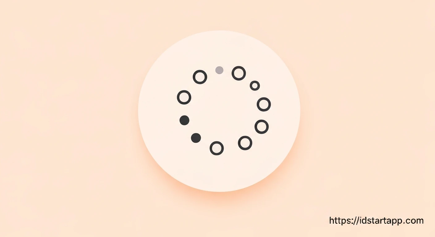

Creating a Flutter Loading Indicator with Dotted Circle, Rotation, and Bounce Effect
Loading indicators are crucial for enhancing user experience by providing visual feedback during asynchronous operations. A well-designed loading animation can reduce perceived waiting times and make an application feel more responsive. This article will guide you through building a professional and engaging custom Flutter loading indicator featuring a dotted circle, continuous rotation, and a subtle bounce effect.
Core Concepts
To achieve this animated loading indicator, we will leverage several fundamental Flutter concepts:
StatefulWidget: To manage the lifecycle of our animation controllers.AnimationController: To control the progress of our animations over a specified duration.Tween: To define the range of values an animation interpolates between (e.g., angles for rotation, scales for bounce).AnimatedBuilder: An optimized widget for listening to anAnimationorListenableand rebuilding its child whenever the animation's value changes, avoiding unnecessary full widget tree rebuilds.CustomPainter: To draw the dynamic dotted circle shape.Transform.rotateandTransform.scale: To apply rotation and scaling effects efficiently.
Implementation Steps
1. Define the Dotted Loading Indicator Widget
We start by creating a StatefulWidget to house our animation logic and display the indicator.
import 'dart:math' as math;
import 'package:flutter/material.dart';

class DottedLoadingIndicator extends StatefulWidget {
  final Color dotColor;
  final double dotRadius;
  final int numberOfDots;
  final double mainCircleRadius;
  final Duration rotationDuration;
  final Duration bounceDuration;

  const DottedLoadingIndicator({
    Key? key,
    this.dotColor = Colors.blue,
    this.dotRadius = 3.0,
    this.numberOfDots = 8,
    this.mainCircleRadius = 30.0,
    this.rotationDuration = const Duration(seconds: 2),
    this.bounceDuration = const Duration(milliseconds: 500),
  }) : super(key: key);

  @override
  _DottedLoadingIndicatorState createState() => _DottedLoadingIndicatorState();
}

class _DottedLoadingIndicatorState extends State<DottedLoadingIndicator> with TickerProviderStateMixin {
  late AnimationController _rotationController;
  late Animation<double> _rotationAnimation;
  late AnimationController _bounceController;
  late Animation<double> _bounceAnimation;

  @override
  void initState() {
    super.initState();

    // Rotation Animation
    _rotationController = AnimationController(
      vsync: this,
      duration: widget.rotationDuration,
    )..repeat();
    _rotationAnimation = Tween<double>(begin: 0, end: 2 * math.pi).animate(
      _rotationController,
    );

    // Bounce Animation
    _bounceController = AnimationController(
      vsync: this,
      duration: widget.bounceDuration,
    )..repeat(reverse: true);
    _bounceAnimation = Tween<double>(begin: 1.0, end: 1.2).animate(
      CurvedAnimation(
        parent: _bounceController,
        curve: Curves.easeInOut,
      ),
    );
  }

  @override
  void dispose() {
    _rotationController.dispose();
    _bounceController.dispose();
    super.dispose();
  }

  @override
  Widget build(BuildContext context) {
    return AnimatedBuilder(
      animation: Listenable.merge([_rotationAnimation, _bounceAnimation]),
      builder: (context, child) {
        return Transform.scale(
          scale: _bounceAnimation.value,
          child: Transform.rotate(
            angle: _rotationAnimation.value,
            child: CustomPaint(
              painter: DottedCirclePainter(
                dotColor: widget.dotColor,
                dotRadius: widget.dotRadius,
                numberOfDots: widget.numberOfDots,
                mainCircleRadius: widget.mainCircleRadius,
              ),
              size: Size.fromRadius(widget.mainCircleRadius + widget.dotRadius),
            ),
          ),
        );
      },
    );
  }
}
In the initState, we initialize two AnimationControllers. One for continuous rotation (`_rotationController`) and another for the bounce effect (`_bounceController`) which repeats in reverse to create a smooth scale-up and scale-down. The `_rotationAnimation` interpolates from 0 to `2 * math.pi` (a full circle), while `_bounceAnimation` interpolates the scale from `1.0` to `1.2`. Both use `repeat()` on their controllers, with `_bounceController` also setting `reverse: true`. The `dispose` method is crucial for releasing resources.
The `build` method uses a single `AnimatedBuilder` that listens to both animations. This ensures that the widget rebuilds efficiently whenever either animation value changes. Inside, we nest `Transform.scale` and `Transform.rotate` to apply the effects, wrapping our `CustomPaint` widget.
2. Create the Dotted Circle Painter
The CustomPainter is responsible for drawing the individual dots that form the circle.
class DottedCirclePainter extends CustomPainter {
  final Color dotColor;
  final double dotRadius;
  final int numberOfDots;
  final double mainCircleRadius;

  DottedCirclePainter({
    required this.dotColor,
    required this.dotRadius,
    required this.numberOfDots,
    required this.mainCircleRadius,
  });

  @override
  void paint(Canvas canvas, Size size) {
    final Paint dotPaint = Paint()
      ..color = dotColor
      ..style = PaintingStyle.fill;

    final Offset center = Offset(size.width / 2, size.height / 2);

    for (int i = 0; i < numberOfDots; i++) {
      final double angle = 2 * math.pi * (i / numberOfDots);
      final double x = center.dx + mainCircleRadius * math.cos(angle);
      final double y = center.dy + mainCircleRadius * math.sin(angle);
      canvas.drawCircle(Offset(x, y), dotRadius, dotPaint);
    }
  }

  @override
  bool shouldRepaint(covariant DottedCirclePainter oldDelegate) {
    return oldDelegate.dotColor != dotColor ||
           oldDelegate.dotRadius != dotRadius ||
           oldDelegate.numberOfDots != numberOfDots ||
           oldDelegate.mainCircleRadius != mainCircleRadius;
  }
}
The DottedCirclePainter takes properties like dot color, radius, and the number of dots. In the paint method, it iterates numberOfDots times, calculating the position for each dot along a circular path using basic trigonometry (`math.cos` and `math.sin`). Each dot is then drawn using `canvas.drawCircle`. The `shouldRepaint` method ensures that the painter only repaints when its properties actually change, optimizing performance.
3. Using the Indicator
To use your new animated loading indicator, simply place it within your widget tree:
class MyHomePage extends StatelessWidget {
  const MyHomePage({Key? key}) : super(key: key);

  @override
  Widget build(BuildContext context) {
    return Scaffold(
      appBar: AppBar(
        title: const Text('Custom Loading Indicator'),
      ),
      body: Center(
        child: DottedLoadingIndicator(
          dotColor: Colors.deepPurple,
          dotRadius: 4.0,
          numberOfDots: 10,
          mainCircleRadius: 40.0,
          rotationDuration: const Duration(seconds: 3),
          bounceDuration: const Duration(milliseconds: 600),
        ),
      ),
    );
  }
}
You can customize the appearance and animation speeds by adjusting the parameters passed to the DottedLoadingIndicator widget.
Conclusion
By combining Flutter's animation framework with CustomPainter, we've successfully created a visually appealing and performant loading indicator. This approach provides a high degree of flexibility, allowing you to fine-tune every aspect of the animation – from the number and size of dots to the speed and intensity of the rotation and bounce effects. Custom loading indicators like this can significantly enhance the perceived quality and user experience of your Flutter applications.


