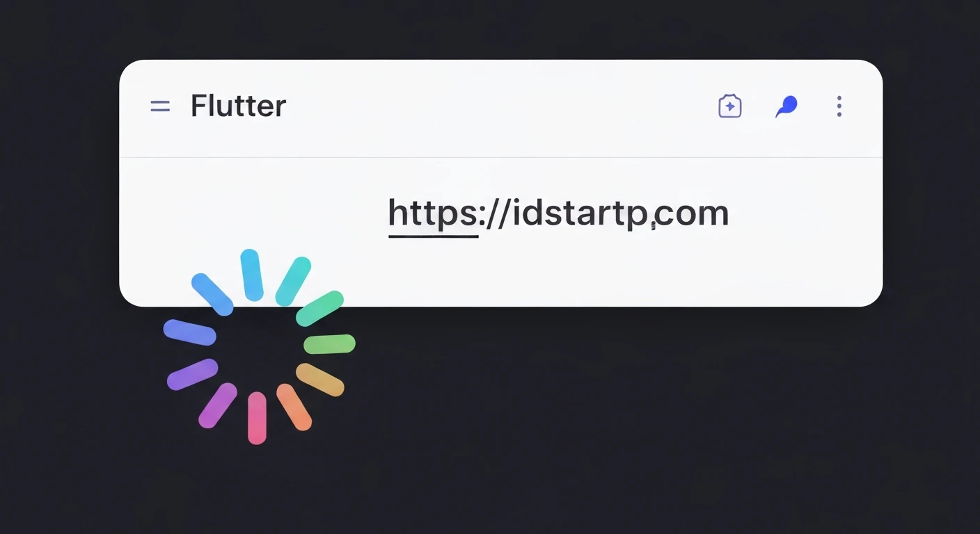

Creating a Dotted Circle Loading Indicator Animation in Flutter
Loading indicators are crucial for enhancing user experience in mobile applications. They provide visual feedback, assuring users that an operation is in progress and preventing frustration from unresponsive UIs. While Flutter offers default loading indicators like CircularProgressIndicator, custom animations can significantly improve an app's aesthetic appeal and brand identity. This article will guide you through building a custom, animated dotted circle loading indicator using Flutter's powerful animation framework and CustomPainter.
Understanding the Core Components
To create our dotted circle animation, we'll primarily leverage three core Flutter features:
AnimationController: Manages the animation's state, including starting, stopping, and reversing. It produces values between 0.0 and 1.0 over a specified duration.Tween: Defines a range of values (e.g., colors, sizes, angles) and interpolates between them over the animation's duration. We'll use it implicitly viaAnimationController's value range.CustomPainter: Provides a canvas to draw custom shapes and paths. This is where we will draw our dots along a circular path.
Step-by-Step Implementation
Let's break down the creation of our animated dotted circle loading indicator.
1. Setting up the Animation Controller
First, we need a StatefulWidget to manage our animation. We'll initialize an AnimationController and dispose of it properly.
import 'package:flutter/material.dart';
import 'dart:math' as math;

class DottedCircleLoader extends StatefulWidget {
  final double radius;
  final int numberOfDots;
  final double dotRadius;
  final Color dotColor;
  final Duration animationDuration;

  const DottedCircleLoader({
    Key? key,
    this.radius = 50.0,
    this.numberOfDots = 12,
    this.dotRadius = 3.0,
    this.dotColor = Colors.blue,
    this.animationDuration = const Duration(seconds: 1),
  }) : super(key: key);

  @override
  _DottedCircleLoaderState createState() => _DottedCircleLoaderState();
}

class _DottedCircleLoaderState extends State
    with SingleTickerProviderStateMixin {
  late AnimationController _controller;

  @override
  void initState() {
    super.initState();
    _controller = AnimationController(
      vsync: this,
      duration: widget.animationDuration,
    )..repeat(); // Makes the animation repeat indefinitely
  }

  @override
  void dispose() {
    _controller.dispose();
    super.dispose();
  }

  @override
  Widget build(BuildContext context) {
    // We'll build this part later
    return Container();
  }
}
2. Creating the DottedCirclePainter
This is where the magic happens. We'll create a custom painter that draws dots around a circle, with one dot highlighted based on the animation's current value.
class DottedCirclePainter extends CustomPainter {
  final double animationValue;
  final double radius;
  final int numberOfDots;
  final double dotRadius;
  final Color dotColor;

  DottedCirclePainter({
    required this.animationValue,
    required this.radius,
    required this.numberOfDots,
    required this.dotRadius,
    required this.dotColor,
  });

  @override
  void paint(Canvas canvas, Size size) {
    final center = Offset(size.width / 2, size.height / 2);
    final paint = Paint(); // Color will be set per dot

    for (int i = 0; i < numberOfDots; i++) {
      final double angle = 2 * math.pi * (i / numberOfDots);

      // Calculate the position for each dot on the circle
      final double x = center.dx + radius * math.cos(angle);
      final double y = center.dy + radius * math.sin(angle);

      // Determine which dot should be highlighted and adjust its properties
      final int currentDotIndex = (animationValue * numberOfDots).floor();

      // Calculate the 'distance' from the leading dot, considering wrap-around
      int distance = (i - currentDotIndex + numberOfDots) % numberOfDots;

      double opacity = 0.2; // Base opacity
      double currentDotRadius = dotRadius;

      if (distance == 0) { // The 'current' leading dot
        opacity = 1.0;
        currentDotRadius = dotRadius * 1.5;
      } else if (distance == 1) { // The dot immediately behind
        opacity = 0.7;
        currentDotRadius = dotRadius * 1.2;
      } else if (distance == 2) { // The dot two steps behind
        opacity = 0.4;
        currentDotRadius = dotRadius * 1.0;
      } else if (distance == 3) { // The dot three steps behind
        opacity = 0.25;
        currentDotRadius = dotRadius * 0.8;
      }

      canvas.drawCircle(
        Offset(x, y),
        currentDotRadius,
        paint.copyWith(color: dotColor.withOpacity(opacity)),
      );
    }
  }

  @override
  bool shouldRepaint(covariant DottedCirclePainter oldDelegate) {
    return oldDelegate.animationValue != animationValue;
  }
}
3. Integrating into the Widget Tree with AnimatedBuilder
Now, back in our _DottedCircleLoaderState, we'll use an AnimatedBuilder to rebuild our CustomPaint widget whenever the _controller's value changes.
// ... inside _DottedCircleLoaderState class ...

  @override
  Widget build(BuildContext context) {
    return Center(
      child: AnimatedBuilder(
        animation: _controller,
        builder: (context, child) {
          return CustomPaint(
            size: Size(widget.radius * 2, widget.radius * 2),
            painter: DottedCirclePainter(
              animationValue: _controller.value,
              radius: widget.radius,
              numberOfDots: widget.numberOfDots,
              dotRadius: widget.dotRadius,
              dotColor: widget.dotColor,
            ),
          );
        },
      ),
    );
  }
}
Complete Example
Here's the full code for the DottedCircleLoader widget, ready to be dropped into your Flutter application:
import 'package:flutter/material.dart';
import 'dart:math' as math;

class DottedCircleLoader extends StatefulWidget {
  final double radius;
  final int numberOfDots;
  final double dotRadius;
  final Color dotColor;
  final Duration animationDuration;

  const DottedCircleLoader({
    Key? key,
    this.radius = 50.0,
    this.numberOfDots = 12,
    this.dotRadius = 3.0,
    this.dotColor = Colors.blue,
    this.animationDuration = const Duration(seconds: 1),
  }) : super(key: key);

  @override
  _DottedCircleLoaderState createState() => _DottedCircleLoaderState();
}

class _DottedCircleLoaderState extends State
    with SingleTickerProviderStateMixin {
  late AnimationController _controller;

  @override
  void initState() {
    super.initState();
    _controller = AnimationController(
      vsync: this,
      duration: widget.animationDuration,
    )..repeat();
  }

  @override
  void dispose() {
    _controller.dispose();
    super.dispose();
  }

  @override
  Widget build(BuildContext context) {
    return Center(
      child: AnimatedBuilder(
        animation: _controller,
        builder: (context, child) {
          return CustomPaint(
            size: Size(widget.radius * 2, widget.radius * 2),
            painter: DottedCirclePainter(
              animationValue: _controller.value,
              radius: widget.radius,
              numberOfDots: widget.numberOfDots,
              dotRadius: widget.dotRadius,
              dotColor: widget.dotColor,
            ),
          );
        },
      ),
    );
  }
}

class DottedCirclePainter extends CustomPainter {
  final double animationValue;
  final double radius;
  final int numberOfDots;
  final double dotRadius;
  final Color dotColor;

  DottedCirclePainter({
    required this.animationValue,
    required this.radius,
    required this.numberOfDots,
    required this.dotRadius,
    required this.dotColor,
  });

  @override
  void paint(Canvas canvas, Size size) {
    final center = Offset(size.width / 2, size.height / 2);
    final paint = Paint(); // Color will be set per dot

    for (int i = 0; i < numberOfDots; i++) {
      final double angle = 2 * math.pi * (i / numberOfDots);

      final double x = center.dx + radius * math.cos(angle);
      final double y = center.dy + radius * math.sin(angle);

      // Determine which dot should be highlighted and adjust its properties
      final int currentDotIndex = (animationValue * numberOfDots).floor();

      // Calculate the 'distance' from the leading dot, considering wrap-around
      int distance = (i - currentDotIndex + numberOfDots) % numberOfDots;

      double opacity = 0.2; // Base opacity
      double currentDotRadius = dotRadius;

      if (distance == 0) { // The 'current' leading dot
        opacity = 1.0;
        currentDotRadius = dotRadius * 1.5;
      } else if (distance == 1) { // The dot immediately behind
        opacity = 0.7;
        currentDotRadius = dotRadius * 1.2;
      } else if (distance == 2) { // The dot two steps behind
        opacity = 0.4;
        currentDotRadius = dotRadius * 1.0;
      } else if (distance == 3) { // The dot three steps behind
        opacity = 0.25;
        currentDotRadius = dotRadius * 0.8;
      }


      canvas.drawCircle(
        Offset(x, y),
        currentDotRadius,
        paint.copyWith(color: dotColor.withOpacity(opacity)),
      );
    }
  }

  @override
  bool shouldRepaint(covariant DottedCirclePainter oldDelegate) {
    return oldDelegate.animationValue != animationValue;
  }
}
Explanation of Key Code Sections
SingleTickerProviderStateMixin: This mixin provides thevsyncobject required byAnimationControllerto ensure animations only consume resources when visible on screen._controller.repeat(): This method makes the animation loop indefinitely, perfect for a loading indicator.paintmethod logic:- It iterates
numberOfDotstimes to draw each dot. angle = 2 * math.pi * (i / numberOfDots)calculates the angular position for each dot around the circle (a full circle is2 * piradians).- Trigonometry (
math.cos,math.sin) is used to convert the angle and radius into(x, y)coordinates relative to the circle's center. currentDotIndex = (animationValue * numberOfDots).floor()determines which dot is currently "active" or leading based on the animation's progress (0.0 to 1.0).- The
distancecalculation with modulo operator handles the wrap-around effect, allowing dots to fade in/out smoothly as they "follow" the leading dot. - Opacity and radius are adjusted based on this
distanceto create a visual trailing effect.
- It iterates
AnimatedBuilder: This widget listens to the_controllerand rebuilds itsbuilderfunction whenever the animation value changes. This ensures ourCustomPaintis redrawn with the updatedanimationValue.shouldRepaint: This method inCustomPainteris crucial for performance. It tells Flutter whether the painter needs to redraw. We returntrueifanimationValuehas changed, ensuring repaints only occur when necessary.
Customization and Enhancements
The provided code offers several parameters for customization:
radius: Controls the radius of the circle on which the dots are placed.numberOfDots: Adjusts the density of the dots.dotRadius: Changes the base size of the individual dots.dotColor: Sets the color of the dots.animationDuration: Controls how fast the animation loops.
You can further enhance this by:
- Adding more sophisticated easing curves to the animation.
- Varying the dot size or color more dynamically based on its position.
- Implementing a gradient for the dots.
Conclusion
Building custom loading indicators in Flutter using CustomPainter and the animation framework provides immense flexibility and allows developers to create unique and engaging user experiences. This dotted circle loader example demonstrates how to combine these powerful tools to produce a smooth, visually appealing animation that can significantly elevate the professional feel of your Flutter applications. Experiment with the parameters and logic to create your own distinctive loading indicators!


