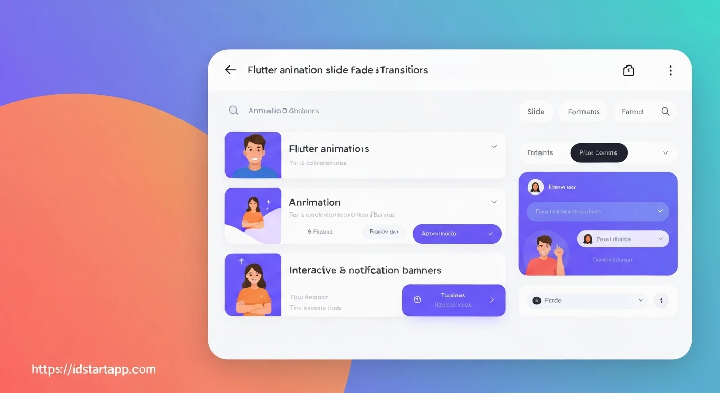

Crafting Engaging Interactive Notification Banners in Flutter with Slide & Fade Animations
In modern mobile applications, effective user communication is paramount. Interactive notification banners, often appearing at the top or bottom of the screen, provide crucial real-time feedback or alerts without disrupting the user's flow. While static banners convey information, adding subtle yet polished animations like slide and fade transitions can significantly enhance the user experience, making these banners feel intuitive, less intrusive, and more engaging. This article explores how to implement such dynamic notification banners in Flutter, leveraging its powerful animation framework.
Understanding Flutter's Animation Fundamentals
Flutter's animation system is built upon a few core components:
AnimationController: This drives the animation forward or backward. It requires aTickerProviderStateMixin(typically implemented by theStatefulWidget's state) to synchronize with the screen refresh rate.Animation<T>: An object that holds an animated value.AnimationControlleris a specific type ofAnimation<double>.Tween<T>: Defines a range of values (beginandend) that an animation can interpolate between. It can be applied to anAnimationControllerto produce anAnimation<T>.CurvedAnimation: Used to apply non-linear curves (e.g.,Curves.easeOut,Curves.fastOutSlowIn) to an animation, making its movement feel more natural.- Animated Widgets (
SlideTransition,FadeTransition,ScaleTransition,AnimatedBuilder): Widgets specifically designed to respond to animation changes and rebuild their children accordingly.AnimatedBuilderis a versatile option for custom animations, whileSlideTransitionandFadeTransitionare perfect for our use case.
Implementing the Slide & Fade Effect
Let's walk through the steps to create a notification banner that slides in from the top and fades into view, then reverses the animation to disappear.
1. Setup TickerProviderStateMixin
Your StatefulWidget that manages the banner's visibility and animation needs to provide a Ticker.
import 'package:flutter/material.dart';

class NotificationBannerManager extends StatefulWidget {
  const NotificationBannerManager({Key? key}) : super(key: key);

  @override
  _NotificationBannerManagerState createState() => _NotificationBannerManagerState();
}

class _NotificationBannerManagerState extends State
    with TickerProviderStateMixin { // Add TickerProviderStateMixin

  // ... rest of the state
}
2. Initialize AnimationController and Tweens
We'll need an AnimationController to drive the animation duration and state, and two Tweens (one for slide, one for fade) to define the specific animated properties.
  late AnimationController _animationController;
  late Animation _slideAnimation;
  late Animation _fadeAnimation;

  @override
  void initState() {
    super.initState();
    _animationController = AnimationController(
      vsync: this,
      duration: const Duration(milliseconds: 500), // Animation duration
    );

    // Slide animation: from top (-1.0) to visible (0.0)
    _slideAnimation = Tween(
      begin: const Offset(0, -1.0), // Start above the screen
      end: Offset.zero,             // End at its natural position
    ).animate(CurvedAnimation(
      parent: _animationController,
      curve: Curves.easeOutCubic, // A smooth easing curve
    ));

    // Fade animation: from invisible (0.0) to fully opaque (1.0)
    _fadeAnimation = Tween(
      begin: 0.0, // Start invisible
      end: 1.0,   // End fully visible
    ).animate(CurvedAnimation(
      parent: _animationController,
      curve: Curves.easeIn, // Fade in with ease
    ));
  }

  @override
  void dispose() {
    _animationController.dispose();
    super.dispose();
  }
3. Build the Animated Notification Banner Widget
Combine SlideTransition and FadeTransition to achieve the desired effect. Wrap your notification content within these transition widgets.
  bool _isBannerVisible = false;
  String _bannerMessage = "";

  void _showBanner(String message) {
    setState(() {
      _bannerMessage = message;
      _isBannerVisible = true;
    });
    _animationController.forward().then((_) {
      // Optionally hide after a delay
      Future.delayed(const Duration(seconds: 3), () {
        if (_isBannerVisible) { // Check if still visible before hiding
          _hideBanner();
        }
      });
    });
  }

  void _hideBanner() {
    _animationController.reverse().then((_) {
      setState(() {
        _isBannerVisible = false;
      });
    });
  }

  @override
  Widget build(BuildContext context) {
    return Stack(
      children: [
        // Your main application content goes here
        Center(
          child: ElevatedButton(
            onPressed: () => _showBanner("New message received!"),
            child: const Text("Show Notification"),
          ),
        ),

        // The animated notification banner
        if (_isBannerVisible)
          Positioned(
            top: 0,
            left: 0,
            right: 0,
            child: SlideTransition(
              position: _slideAnimation,
              child: FadeTransition(
                opacity: _fadeAnimation,
                child: GestureDetector(
                  onTap: () {
                    // Make it interactive: tap to dismiss
                    _hideBanner();
                  },
                  child: Material(
                    elevation: 4.0,
                    color: Colors.blueAccent,
                    child: Padding(
                      padding: const EdgeInsets.all(16.0),
                      child: Row(
                        children: [
                          const Icon(Icons.info_outline, color: Colors.white),
                          const SizedBox(width: 10),
                          Expanded(
                            child: Text(
                              _bannerMessage,
                              style: const TextStyle(color: Colors.white, fontSize: 16),
                            ),
                          ),
                          InkWell(
                            onTap: _hideBanner, // Add a close button
                            child: const Icon(Icons.close, color: Colors.white),
                          ),
                        ],
                      ),
                    ),
                  ),
                ),
              ),
            ),
          ),
      ],
    );
  }
4. Triggering the Animations and Interactivity
As shown in the previous step, _animationController.forward() makes the banner appear, and _animationController.reverse() makes it disappear. We've also added a GestureDetector to allow tapping the banner to dismiss it, and a close button InkWell.
Refinements and Best Practices
- Dismissal Timer: Automatically hide the banner after a few seconds, but ensure user interaction (like tapping it) cancels or overrides this timer.
- Swipe to Dismiss: Implement
Dismissiblewidget or a customGestureDetectorto allow swiping the banner away. - Multiple Banners: For scenarios requiring multiple notifications, consider a queue system or a custom overlay manager to display them sequentially.
- Accessibility: Ensure the banner's content is readable and that its dismissal mechanism is clear.
- Context: Determine if the banner should be application-wide (using
OverlayorScaffoldMessenger) or specific to a screen. The example above usesStackwithin a specific widget, which is suitable for screen-specific banners. For app-wide banners,ScaffoldMessenger.of(context).showSnackBarwith custom content or anOverlayEntrywould be more appropriate.
Conclusion
By combining Flutter's AnimationController, Tweens, CurvedAnimation, and dedicated transition widgets like SlideTransition and FadeTransition, developers can craft highly engaging and interactive notification banners. These animations not only enhance the visual appeal of an application but also contribute to a smoother, more intuitive user experience by providing clear visual cues for transient information. Mastering these animation techniques opens up a world of possibilities for creating dynamic and delightful UIs in your Flutter applications.


