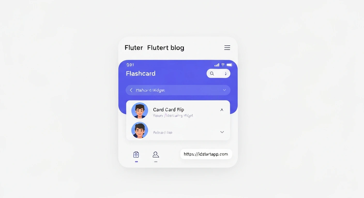

Crafting a Card Flip Widget for Flashcard Apps in Flutter
Flashcard applications are an excellent tool for learning and memorization. A key interactive element in such apps is the ability to "flip" a card to reveal its answer. In Flutter, we can achieve this engaging 3D card flip effect using a combination of widgets and animation controllers. This article will guide you through creating a reusable FlipCard widget for your Flutter flashcard application.
Core Concepts
To build our card flip widget, we'll leverage several fundamental Flutter concepts:
StatefulWidget: To manage the state of our card (e.g., whether it's showing the front or back).AnimationController: Controls the progress of an animation.Tween: Defines a range of values that an animation can interpolate between. For our flip, this will be an angle (0 to π radians).AnimatedBuilder: Rebuilds its child widget whenever the animation changes, avoiding the need to callsetStatemanually during animation.Transform: Allows us to apply 2D and 3D transformations to its child, crucial for the rotation effect. Specifically, we'll useMatrix4.rotationY.GestureDetector: Detects user interactions, such as a tap, to trigger the card flip.Stack: To layer the front and back of the card, allowing us to control their visibility during the flip.
Step-by-Step Implementation
1. Create the FlipCard Widget Structure
We'll start by defining a StatefulWidget called FlipCard that accepts two child widgets: one for the front of the card and one for the back.
import 'package:flutter/material.dart';
import 'dart:math' show pi;

class FlipCard extends StatefulWidget {
  final Widget front;
  final Widget back;

  const FlipCard({
    Key? key,
    required this.front,
    required this.back,
  }) : super(key: key);

  @override
  _FlipCardState createState() => _FlipCardState();
}

class _FlipCardState extends State<FlipCard> with SingleTickerProviderStateMixin {
  late AnimationController _controller;
  late Animation<double> _animation;
  bool _isFront = true;

  @override
  void initState() {
    super.initState();
    _controller = AnimationController(
      vsync: this,
      duration: const Duration(milliseconds: 500),
    );
    _animation = Tween<double>(begin: 0, end: pi).animate(CurvedAnimation(
      parent: _controller,
      curve: Curves.easeInOut,
    ));
  }

  @override
  void dispose() {
    _controller.dispose();
    super.dispose();
  }

  void _doFlip() {
    if (_isFront) {
      _controller.forward();
    } else {
      _controller.reverse();
    }
    _isFront = !_isFront;
  }

  @override
  Widget build(BuildContext context) {
    // Implementation to follow
    return Container();
  }
}
2. Set Up Animation Controller and Tween
In the initState method, we initialize our AnimationController and define the Tween. The Tween will animate from 0 radians (front) to π radians (back of the flip). We also use a CurvedAnimation for a smoother, more natural flip effect.
3. Implement the Flip Logic with AnimatedBuilder and Transform
Inside the build method, we'll use an AnimatedBuilder to listen to our animation. Within its builder, we apply a Transform widget with Matrix4.rotationY to achieve the 3D rotation. We'll use a Stack to overlay the front and back cards, controlling their visibility and rotation to simulate a continuous flip.
  @override
  Widget build(BuildContext context) {
    return GestureDetector(
      onTap: _doFlip,
      child: AnimatedBuilder(
        animation: _animation,
        builder: (context, child) {
          final isFrontVisible = _animation.value < pi / 2;
          final currentRotation = _animation.value;
          final transform = Matrix4.identity()
            ..setEntry(3, 2, 0.001) // Perspective effect
            ..rotateY(currentRotation);

          return Transform(
            transform: transform,
            alignment: Alignment.center,
            child: Stack(
              children: [
                // Front card
                Visibility(
                  visible: isFrontVisible,
                  child: Transform(
                    alignment: Alignment.center,
                    transform: Matrix4.identity(), // No additional rotation for front
                    child: widget.front,
                  ),
                ),
                // Back card (starts rotated 180 degrees)
                Visibility(
                  visible: !isFrontVisible,
                  child: Transform(
                    alignment: Alignment.center,
                    transform: Matrix4.identity()..rotateY(pi), // Start rotated 180 for back
                    child: widget.back,
                  ),
                ),
              ],
            ),
          );
        },
      ),
    );
  }
A more robust approach for the back card's rotation involves animating its own rotation from `pi` down to `0` as the main animation goes from `pi/2` to `pi`. The logic above simplifies by making the back card visible only when `_animation.value` crosses `pi/2` and applying an initial `pi` rotation to it. The `isFrontVisible` boolean manages which card content is displayed, while the main `Transform` rotates the entire `Stack`.
A better flip would ensure the back card is also rotating dynamically with `_animation.value`. Let's refine the `AnimatedBuilder` to handle front and back transformations independently, making the flip smoother and correctly applying the 3D effect to both sides.
  @override
  Widget build(BuildContext context) {
    return GestureDetector(
      onTap: _doFlip,
      child: AnimatedBuilder(
        animation: _animation,
        builder: (context, child) {
          final rotationValue = _animation.value;
          final isFront = rotationValue < pi / 2;

          return Transform(
            alignment: Alignment.center,
            transform: Matrix4.identity()
              ..setEntry(3, 2, 0.001) // Apply perspective
              ..rotateY(rotationValue), // Main rotation for the whole container
            child: Container(
              // You might want to add decoration here, e.g., BoxDecoration
              child: isFront
                  ? widget.front // Show front if less than 90 degrees
                  : Transform(
                      alignment: Alignment.center,
                      transform: Matrix4.identity()..rotateY(pi), // Rotate back content 180 degrees to face forward
                      child: widget.back,
                    ),
            ),
          );
        },
      ),
    );
  }
This revised approach for the AnimatedBuilder applies the full flip rotation to the container holding either the front or back content. When switching from front to back (at `pi/2`), the back content itself is rotated by an additional `pi` radians to ensure it faces the user correctly after the container has flipped. The `setEntry(3, 2, 0.001)` adds a subtle perspective effect, making the 3D flip more pronounced.
4. Example Usage
To use your new FlipCard widget, simply place it in your widget tree and provide the front and back widgets. For instance, in your main.dart file:
import 'package:flutter/material.dart';
// Assuming flip_card.dart is where your FlipCard widget is defined
import 'package:your_app_name/flip_card.dart';

void main() {
  runApp(const MyApp());
}

class MyApp extends StatelessWidget {
  const MyApp({Key? key}) : super(key: key);

  @override
  Widget build(BuildContext context) {
    return MaterialApp(
      title: 'Flashcard App',
      theme: ThemeData(
        primarySwatch: Colors.blue,
      ),
      home: Scaffold(
        appBar: AppBar(title: const Text('Flashcards')),
        body: Center(
          child: SizedBox(
            width: 300,
            height: 200,
            child: FlipCard(
              front: Card(
                elevation: 4,
                color: Colors.white,
                child: Center(
                  child: Text(
                    'Question: What is Flutter?',
                    style: TextStyle(fontSize: 24, fontWeight: FontWeight.bold),
                    textAlign: TextAlign.center,
                  ),
                ),
              ),
              back: Card(
                elevation: 4,
                color: Colors.lightBlue[100],
                child: Center(
                  child: Padding(
                    padding: const EdgeInsets.all(8.0),
                    child: Text(
                      'Answer: Flutter is a UI toolkit for building natively compiled applications for mobile, web, and desktop from a single codebase.',
                      style: TextStyle(fontSize: 18),
                      textAlign: TextAlign.center,
                    ),
                  ),
                ),
              ),
            ),
          ),
        ),
      ),
    );
  }
}
Conclusion
You've successfully created a dynamic and engaging FlipCard widget for your Flutter flashcard application. This widget provides a smooth 3D flip animation, enhancing the user experience. You can further customize this widget by adding more animations (e.g., scaling or fading), different flip axes (e.g., rotateX), or more complex state management for multiple cards within a flashcard deck.


