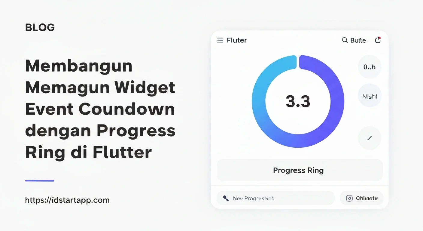

Building an Event Countdown Widget with Progress Ring in Flutter
Introduction
Creating engaging user interfaces often involves dynamic elements that provide real-time information. An event countdown widget is a prime example, commonly used for product launches, special events, or holiday anticipation. By integrating a progress ring, we can add a visual dimension that intuitively shows the elapsed time relative to the total duration, making the countdown more informative and visually appealing. This article will guide you through building such a widget in Flutter, combining state management, custom painting, and timer logic.
Prerequisites
To follow along with this tutorial, you should have:
- Flutter SDK installed and configured.
- A basic understanding of Flutter widgets (StatefulWidget, StatelessWidget).
- Familiarity with Dart programming language.
Project Setup
First, let's create a new Flutter project. Open your terminal or command prompt and run:
flutter create event_countdown_app
cd event_countdown_app
Next, open the project in your preferred IDE (like VS Code or Android Studio).
Designing the `CountdownProgressRing` Widget
Our countdown widget will be a `StatefulWidget` because it needs to manage its internal state (the remaining time) and update the UI periodically. We'll also define a `CustomPainter` to draw the progress ring.
`ProgressRingPainter` Implementation
The `ProgressRingPainter` will be responsible for drawing the background circle and the progress arc. It needs to know the current progress percentage and various styling parameters.
import 'dart:math';
import 'package:flutter/material.dart';

class ProgressRingPainter extends CustomPainter {
  final double progress; // Value from 0.0 to 1.0
  final Color backgroundColor;
  final Color progressColor;
  final double strokeWidth;

  ProgressRingPainter({
    required this.progress,
    this.backgroundColor = Colors.grey,
    this.progressColor = Colors.blue,
    this.strokeWidth = 10.0,
  });

  @override
  void paint(Canvas canvas, Size size) {
    Paint backgroundPaint = Paint()
      ..color = backgroundColor
      ..style = PaintingStyle.stroke
      ..strokeWidth = strokeWidth
      ..strokeCap = StrokeCap.round;

    Paint progressPaint = Paint()
      ..color = progressColor
      ..style = PaintingStyle.stroke
      ..strokeWidth = strokeWidth
      ..strokeCap = StrokeCap.round;

    Offset center = Offset(size.width / 2, size.height / 2);
    double radius = min(size.width / 2, size.height / 2) - strokeWidth / 2;

    // Draw background circle
    canvas.drawCircle(center, radius, backgroundPaint);

    // Draw progress arc
    double sweepAngle = 2 * pi * progress;
    canvas.drawArc(
      Rect.fromCircle(center: center, radius: radius),
      -pi / 2, // Start from the top
      sweepAngle,
      false,
      progressPaint,
    );
  }

  @override
  bool shouldRepaint(covariant ProgressRingPainter oldDelegate) {
    return oldDelegate.progress != progress ||
           oldDelegate.backgroundColor != backgroundColor ||
           oldDelegate.progressColor != progressColor ||
           oldDelegate.strokeWidth != strokeWidth;
  }
}
`CountdownProgressRing` Widget Implementation
This widget will manage the timer, calculate the remaining time, determine the progress, and display everything.
import 'dart:async';
import 'package:flutter/material.dart';
import 'package:event_countdown_app/progress_ring_painter.dart'; // Assuming you save the painter in a separate file

class CountdownProgressRing extends StatefulWidget {
  final DateTime targetDate;
  final Color ringBackgroundColor;
  final Color ringProgressColor;
  final double ringStrokeWidth;
  final TextStyle textStyle;
  final VoidCallback? onFinished;

  const CountdownProgressRing({
    Key? key,
    required this.targetDate,
    this.ringBackgroundColor = Colors.grey,
    this.ringProgressColor = Colors.blue,
    this.ringStrokeWidth = 10.0,
    this.textStyle = const TextStyle(fontSize: 24, fontWeight: FontWeight.bold, color: Colors.black),
    this.onFinished,
  }) : super(key: key);

  @override
  _CountdownProgressRingState createState() => _CountdownProgressRingState();
}

class _CountdownProgressRingState extends State {
  late Duration _timeRemaining;
  late Timer _timer;
  late Duration _totalDuration; // Total duration from now to target date

  @override
  void initState() {
    super.initState();
    _totalDuration = widget.targetDate.isAfter(DateTime.now())
        ? widget.targetDate.difference(DateTime.now())
        : Duration.zero;
    _timeRemaining = widget.targetDate.difference(DateTime.now());
    _startTimer();
  }

  void _startTimer() {
    _timer = Timer.periodic(const Duration(seconds: 1), (timer) {
      if (!mounted) {
        timer.cancel();
        return;
      }
      setState(() {
        _timeRemaining = widget.targetDate.difference(DateTime.now());
        if (_timeRemaining.isNegative) {
          _timeRemaining = Duration.zero;
          _timer.cancel();
          widget.onFinished?.call();
        }
      });
    });
  }

  @override
  void dispose() {
    _timer.cancel();
    super.dispose();
  }

  String _formatDuration(Duration duration) {
    String twoDigits(int n) => n.toString().padLeft(2, "0");
    String days = duration.inDays.toString();
    String hours = twoDigits(duration.inHours.remainder(24));
    String minutes = twoDigits(duration.inMinutes.remainder(60));
    String seconds = twoDigits(duration.inSeconds.remainder(60));

    if (duration.inDays > 0) {
      return "${days}d ${hours}h ${minutes}m ${seconds}s";
    } else if (duration.inHours > 0) {
      return "${hours}h ${minutes}m ${seconds}s";
    } else if (duration.inMinutes > 0) {
      return "${minutes}m ${seconds}s";
    } else {
      return "${seconds}s";
    }
  }

  @override
  Widget build(BuildContext context) {
    double progress = _totalDuration.inSeconds > 0
        ? 1.0 - (_timeRemaining.inSeconds / _totalDuration.inSeconds)
        : 1.0;

    if (_timeRemaining == Duration.zero) {
      progress = 1.0; // Ensure progress is full when time is up
    } else if (_timeRemaining.isNegative && _totalDuration.inSeconds <= 0) {
      // Handle cases where targetDate is already in the past from the start
      progress = 1.0;
    } else if (_totalDuration.inSeconds <= 0) {
       // If the target date was in the past when the widget was initialized,
       // or it's a very short duration that becomes 0 quickly.
       progress = 1.0;
    }


    return SizedBox(
      width: 200,
      height: 200,
      child: Stack(
        alignment: Alignment.center,
        children: [
          CustomPaint(
            painter: ProgressRingPainter(
              progress: progress,
              backgroundColor: widget.ringBackgroundColor,
              progressColor: widget.ringProgressColor,
              strokeWidth: widget.ringStrokeWidth,
            ),
            child: Container(),
          ),
          Column(
            mainAxisAlignment: MainAxisAlignment.center,
            children: [
              Text(
                _timeRemaining == Duration.zero ? "Event Started!" : "Remaining:",
                style: widget.textStyle.copyWith(fontSize: widget.textStyle.fontSize! * 0.7),
                textAlign: TextAlign.center,
              ),
              const SizedBox(height: 5),
              Text(
                _timeRemaining == Duration.zero ? "" : _formatDuration(_timeRemaining),
                style: widget.textStyle,
                textAlign: TextAlign.center,
              ),
            ],
          ),
        ],
      ),
    );
  }
}
Integrating into `main.dart`
Now, let's use our `CountdownProgressRing` widget in the main application file.
import 'package:flutter/material.dart';
import 'package:event_countdown_app/countdown_progress_ring.dart'; // Assuming your widget is in this file

void main() {
  runApp(const MyApp());
}

class MyApp extends StatelessWidget {
  const MyApp({Key? key}) : super(key: key);

  @override
  Widget build(BuildContext context) {
    return MaterialApp(
      title: 'Event Countdown',
      theme: ThemeData(
        primarySwatch: Colors.blue,
      ),
      home: const MyHomePage(),
    );
  }
}

class MyHomePage extends StatefulWidget {
  const MyHomePage({Key? key}) : super(key: key);

  @override
  State createState() => _MyHomePageState();
}

class _MyHomePageState extends State {
  // Example target date: 7 days from now
  // For testing, you can set a date in the near future, e.g., 30 seconds from now
  final DateTime _eventTargetDate = DateTime.now().add(const Duration(days: 7, hours: 10, minutes: 30, seconds: 0));
  // final DateTime _eventTargetDate = DateTime.now().add(const Duration(seconds: 30));


  void _onCountdownFinished() {
    ScaffoldMessenger.of(context).showSnackBar(
      const SnackBar(content: Text('Countdown Finished! Event Has Started!')),
    );
    print("Countdown finished!");
  }

  @override
  Widget build(BuildContext context) {
    return Scaffold(
      appBar: AppBar(
        title: const Text('Event Countdown'),
      ),
      body: Center(
        child: Column(
          mainAxisAlignment: MainAxisAlignment.center,
          children: [
            const Text(
              'Upcoming Product Launch:',
              style: TextStyle(fontSize: 22, fontWeight: FontWeight.w600),
            ),
            const SizedBox(height: 30),
            CountdownProgressRing(
              targetDate: _eventTargetDate,
              ringBackgroundColor: Colors.grey[300]!,
              ringProgressColor: Colors.deepPurple,
              ringStrokeWidth: 12.0,
              textStyle: const TextStyle(
                fontSize: 28,
                fontWeight: FontWeight.bold,
                color: Colors.deepPurple,
              ),
              onFinished: _onCountdownFinished,
            ),
            const SizedBox(height: 30),
            ElevatedButton(
              onPressed: () {
                // You can add functionality here, e.g., navigate to event details
                ScaffoldMessenger.of(context).showSnackBar(
                  const SnackBar(content: Text('View Event Details')),
                );
              },
              child: const Text('View Event Details'),
            ),
          ],
        ),
      ),
    );
  }
}
Full Code Example (`progress_ring_painter.dart`)
import 'dart:math';
import 'package:flutter/material.dart';

class ProgressRingPainter extends CustomPainter {
  final double progress; // Value from 0.0 to 1.0
  final Color backgroundColor;
  final Color progressColor;
  final double strokeWidth;

  ProgressRingPainter({
    required this.progress,
    this.backgroundColor = Colors.grey,
    this.progressColor = Colors.blue,
    this.strokeWidth = 10.0,
  });

  @override
  void paint(Canvas canvas, Size size) {
    Paint backgroundPaint = Paint()
      ..color = backgroundColor
      ..style = PaintingStyle.stroke
      ..strokeWidth = strokeWidth
      ..strokeCap = StrokeCap.round;

    Paint progressPaint = Paint()
      ..color = progressColor
      ..style = PaintingStyle.stroke
      ..strokeWidth = strokeWidth
      ..strokeCap = StrokeCap.round;

    Offset center = Offset(size.width / 2, size.height / 2);
    double radius = min(size.width / 2, size.height / 2) - strokeWidth / 2;

    // Draw background circle
    canvas.drawCircle(center, radius, backgroundPaint);

    // Draw progress arc
    double sweepAngle = 2 * pi * progress;
    canvas.drawArc(
      Rect.fromCircle(center: center, radius: radius),
      -pi / 2, // Start from the top
      sweepAngle,
      false,
      progressPaint,
    );
  }

  @override
  bool shouldRepaint(covariant ProgressRingPainter oldDelegate) {
    return oldDelegate.progress != progress ||
           oldDelegate.backgroundColor != backgroundColor ||
           oldDelegate.progressColor != progressColor ||
           oldDelegate.strokeWidth != strokeWidth;
  }
}
Full Code Example (`countdown_progress_ring.dart`)
import 'dart:async';
import 'package:flutter/material.dart';
import 'package:event_countdown_app/progress_ring_painter.dart'; // Ensure correct path

class CountdownProgressRing extends StatefulWidget {
  final DateTime targetDate;
  final Color ringBackgroundColor;
  final Color ringProgressColor;
  final double ringStrokeWidth;
  final TextStyle textStyle;
  final VoidCallback? onFinished;

  const CountdownProgressRing({
    Key? key,
    required this.targetDate,
    this.ringBackgroundColor = Colors.grey,
    this.ringProgressColor = Colors.blue,
    this.ringStrokeWidth = 10.0,
    this.textStyle = const TextStyle(fontSize: 24, fontWeight: FontWeight.bold, color: Colors.black),
    this.onFinished,
  }) : super(key: key);

  @override
  _CountdownProgressRingState createState() => _CountdownProgressRingState();
}

class _CountdownProgressRingState extends State {
  late Duration _timeRemaining;
  late Timer _timer;
  late Duration _initialDuration; // Duration from widget creation to target date

  @override
  void initState() {
    super.initState();
    _initialDuration = widget.targetDate.isAfter(DateTime.now())
        ? widget.targetDate.difference(DateTime.now())
        : Duration.zero;
    _timeRemaining = widget.targetDate.difference(DateTime.now());
    _startTimer();
  }

  void _startTimer() {
    _timer = Timer.periodic(const Duration(seconds: 1), (timer) {
      if (!mounted) {
        timer.cancel();
        return;
      }
      setState(() {
        _timeRemaining = widget.targetDate.difference(DateTime.now());
        if (_timeRemaining.isNegative) {
          _timeRemaining = Duration.zero;
          _timer.cancel();
          widget.onFinished?.call();
        }
      });
    });
  }

  @override
  void dispose() {
    _timer.cancel();
    super.dispose();
  }

  String _formatDuration(Duration duration) {
    String twoDigits(int n) => n.toString().padLeft(2, "0");
    String days = duration.inDays.toString();
    String hours = twoDigits(duration.inHours.remainder(24));
    String minutes = twoDigits(duration.inMinutes.remainder(60));
    String seconds = twoDigits(duration.inSeconds.remainder(60));

    if (duration.inDays > 0) {
      return "${days}d ${hours}h ${minutes}m ${seconds}s";
    } else if (duration.inHours > 0) {
      return "${hours}h ${minutes}m ${seconds}s";
    } else if (duration.inMinutes > 0) {
      return "${minutes}m ${seconds}s";
    } else {
      return "${seconds}s";
    }
  }

  @override
  Widget build(BuildContext context) {
    double progress = _initialDuration.inSeconds > 0
        ? 1.0 - (_timeRemaining.inSeconds / _initialDuration.inSeconds)
        : 1.0;

    // Clamp progress to ensure it's between 0.0 and 1.0
    progress = progress.clamp(0.0, 1.0);

    return SizedBox(
      width: 200,
      height: 200,
      child: Stack(
        alignment: Alignment.center,
        children: [
          CustomPaint(
            painter: ProgressRingPainter(
              progress: progress,
              backgroundColor: widget.ringBackgroundColor,
              progressColor: widget.ringProgressColor,
              strokeWidth: widget.ringStrokeWidth,
            ),
            child: Container(),
          ),
          Column(
            mainAxisAlignment: MainAxisAlignment.center,
            children: [
              Text(
                _timeRemaining == Duration.zero ? "Event Started!" : "Remaining:",
                style: widget.textStyle.copyWith(fontSize: widget.textStyle.fontSize! * 0.7),
                textAlign: TextAlign.center,
              ),
              const SizedBox(height: 5),
              Text(
                _timeRemaining == Duration.zero ? "" : _formatDuration(_timeRemaining),
                style: widget.textStyle,
                textAlign: TextAlign.center,
              ),
            ],
          ),
        ],
      ),
    );
  }
}
Customization and Enhancements
The widget provided is a solid foundation, but you can enhance it further:
- Animation: Animate the progress ring smoothly when the progress updates using `TweenAnimationBuilder` or `AnimationController`.
- Custom Text: Allow more granular control over the displayed text format (e.g., show only days and hours, or a custom message for finished events).
- Multiple Event Support: Create a list of countdown widgets for different events.
- Responsive Sizing: Make the widget more flexible to different screen sizes.
- Theming: Integrate with a global theme for consistent styling.
Conclusion
You have successfully built a dynamic event countdown widget with a visual progress ring in Flutter. This combines `StatefulWidget` for managing time updates, `CustomPainter` for drawing the unique UI, and `Timer` for real-time changes. This widget is not only functional but also highly customizable, allowing you to create visually appealing countdowns for various applications.


