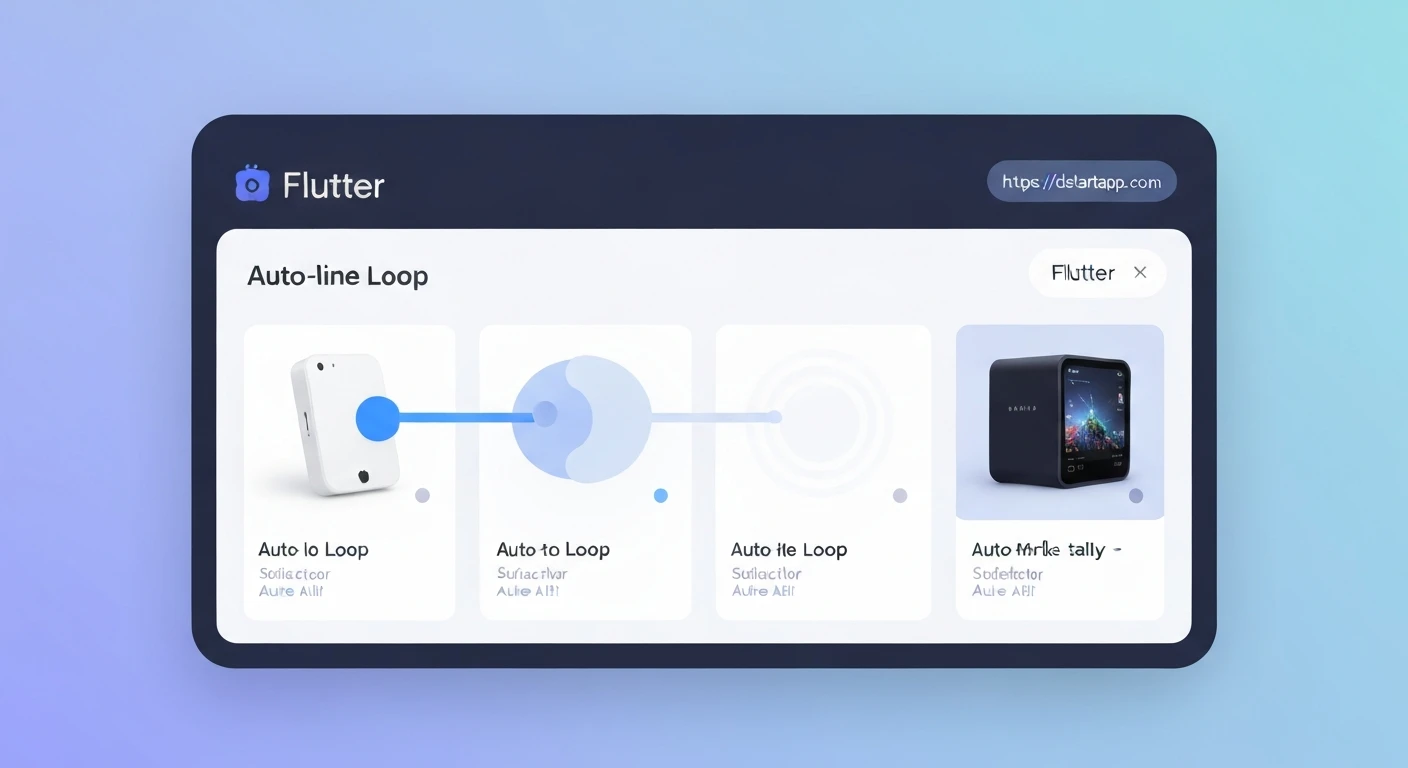

Building an Auto-Looping Product Slider with Indicators in Flutter
Product sliders are a common UI element in e-commerce applications, showcasing multiple products or promotional banners in a visually appealing and space-efficient manner. This article will guide you through creating a dynamic product slider in Flutter, complete with auto-looping functionality and clear page indicators, enhancing the user experience.
Prerequisites:
- Basic understanding of Flutter and Dart.
- A Flutter development environment set up.
Core Components:
PageView: The primary widget for displaying a scrollable list of pages, ideal for sliders.PageController: Used to control thePageView, allowing programmatic scrolling and listening to page changes.Timer: Fromdart:async, essential for implementing the auto-looping feature.- Indicators: Visual cues (usually dots) to show the current page position within the slider. We'll implement custom dots.
- Product Data Model: A simple class to represent product information (e.g., image URL, name).
Step-by-Step Implementation:
1. Define the Product Data Model
First, let's create a simple Dart class to hold our product data.
class Product {
  final String imageUrl;
  final String name;

  Product({required this.imageUrl, required this.name});
}
2. Create the Product Slider Widget
We'll create a StatefulWidget named ProductSlider to manage the slider's state, including the current page and the auto-scroll timer.
import 'dart:async';
import 'package:flutter/material.dart';

class Product {
  final String imageUrl;
  final String name;

  Product({required this.imageUrl, required this.name});
}

class ProductSlider extends StatefulWidget {
  final List products;
  final Duration autoScrollDuration;

  ProductSlider({
    required this.products,
    this.autoScrollDuration = const Duration(seconds: 3),
  });

  @override
  _ProductSliderState createState() => _ProductSliderState();
}

class _ProductSliderState extends State {
  late PageController _pageController;
  int _currentPage = 0;
  Timer? _timer;

  @override
  void initState() {
    super.initState();
    _pageController = PageController(initialPage: _currentPage);
    _pageController.addListener(() {
      setState(() {
        _currentPage = _pageController.page!.round();
      });
    });
    _startAutoScroll();
  }

  @override
  void dispose() {
    _pageController.dispose();
    _timer?.cancel();
    super.dispose();
  }

  void _startAutoScroll() {
    _timer = Timer.periodic(widget.autoScrollDuration, (timer) {
      if (_pageController.hasClients) {
        int nextPage = (_currentPage + 1) % widget.products.length;
        _pageController.animateToPage(
          nextPage,
          duration: const Duration(milliseconds: 400),
          curve: Curves.easeInOut,
        );
      }
    });
  }

  Widget _buildProductPage(Product product) {
    return Container(
      margin: const EdgeInsets.symmetric(horizontal: 8.0),
      decoration: BoxDecoration(
        color: Colors.grey[200],
        borderRadius: BorderRadius.circular(12.0),
        image: DecorationImage(
          image: NetworkImage(product.imageUrl),
          fit: BoxFit.cover,
        ),
      ),
      alignment: Alignment.bottomLeft,
      child: Padding(
        padding: const EdgeInsets.all(16.0),
        child: Text(
          product.name,
          style: const TextStyle(
            color: Colors.white,
            fontSize: 20.0,
            fontWeight: FontWeight.bold,
            shadows: [
              Shadow(
                blurRadius: 3.0,
                color: Colors.black,
                offset: Offset(1.0, 1.0),
              ),
            ],
          ),
        ),
      ),
    );
  }

  Widget _buildIndicators() {
    return Row(
      mainAxisAlignment: MainAxisAlignment.center,
      children: List.generate(widget.products.length, (index) {
        return Container(
          width: 8.0,
          height: 8.0,
          margin: const EdgeInsets.symmetric(horizontal: 4.0),
          decoration: BoxDecoration(
            shape: BoxShape.circle,
            color: _currentPage == index ? Colors.blue : Colors.grey,
          ),
        );
      }),
    );
  }

  @override
  Widget build(BuildContext context) {
    if (widget.products.isEmpty) {
      return const Center(child: Text("No products to display."));
    }

    return Column(
      children: [
        Expanded(
          child: PageView.builder(
            controller: _pageController,
            itemCount: widget.products.length,
            itemBuilder: (context, index) {
              return _buildProductPage(widget.products[index]);
            },
          ),
        ),
        const SizedBox(height: 16.0),
        _buildIndicators(),
        const SizedBox(height: 16.0),
      ],
    );
  }
}
Explanation of Key Parts:
initState()anddispose():_pageControlleris initialized to controlPageView.- A listener is added to
_pageControllerto update_currentPagewhenever the page changes, which in turn rebuilds the widget (specifically the indicators). _startAutoScroll()is called to begin the automatic sliding.- In
dispose(), it's crucial to dispose_pageControllerand cancel_timerto prevent memory leaks.
_startAutoScroll():- Uses
Timer.periodicto trigger a function repeatedly after a specifiedautoScrollDuration. - Inside the timer callback, it calculates the
nextPageusing the modulo operator (%) to ensure it loops back to the first page after reaching the last. _pageController.animateToPage()smoothly transitions to thenextPage.
- Uses
_buildProductPage(Product product):- A simple
Containerstyled to display the product image and name. NetworkImageis used, so ensure you have internet permissions if testing on a real device or a robust network for local images.- Includes some styling for text readability over the image.
- A simple
_buildIndicators():- Creates a
Rowof small circularContainerwidgets. - The color of each circle changes based on whether its
indexmatches the_currentPage, providing visual feedback to the user.
- Creates a
build(BuildContext context):- Returns a
Columncontaining thePageView.builderand the_buildIndicators()widget. PageView.builderefficiently builds pages only when they are visible.Expandedwraps thePageViewto give it available vertical space.
- Returns a
3. Integrating the Product Slider into Your App
To use this slider, you can simply place ProductSlider in your Scaffold's body. Here's an example:
import 'package:flutter/material.dart';
import 'product_slider.dart'; // Assuming ProductSlider is in product_slider.dart

void main() {
  runApp(MyApp());
}

class MyApp extends StatelessWidget {
  @override
  Widget build(BuildContext context) {
    return MaterialApp(
      title: 'Product Slider Demo',
      theme: ThemeData(
        primarySwatch: Colors.blue,
      ),
      home: ProductSliderDemoScreen(),
    );
  }
}

class ProductSliderDemoScreen extends StatelessWidget {
  final List dummyProducts = [
    Product(
      imageUrl: 'https://via.placeholder.com/600/FF0000/FFFFFF?text=Product+A',
      name: 'Super Gadget A',
    ),
    Product(
      imageUrl: 'https://via.placeholder.com/600/00FF00/FFFFFF?text=Product+B',
      name: 'Awesome Widget B',
    ),
    Product(
      imageUrl: 'https://via.placeholder.com/600/0000FF/FFFFFF?text=Product+C',
      name: 'Cool Item C',
    ),
    Product(
      imageUrl: 'https://via.placeholder.com/600/FFFF00/000000?text=Product+D',
      name: 'Best Seller D',
    ),
  ];

  @override
  Widget build(BuildContext context) {
    return Scaffold(
      appBar: AppBar(
        title: const Text('Flutter Product Slider'),
      ),
      body: Center(
        child: SizedBox(
          height: 300, // Define a height for your slider
          child: ProductSlider(
            products: dummyProducts,
            autoScrollDuration: const Duration(seconds: 4), // Optional: customize scroll speed
          ),
        ),
      ),
    );
  }
}
Conclusion:
You've successfully built a versatile product slider in Flutter with auto-looping capabilities and clear page indicators. This component is highly customizable, allowing you to tailor the appearance, animation curves, and auto-scroll duration to fit your application's design language. By mastering PageView, PageController, and Timer, you can create engaging and interactive UI elements that significantly enhance user experience in your Flutter applications.


