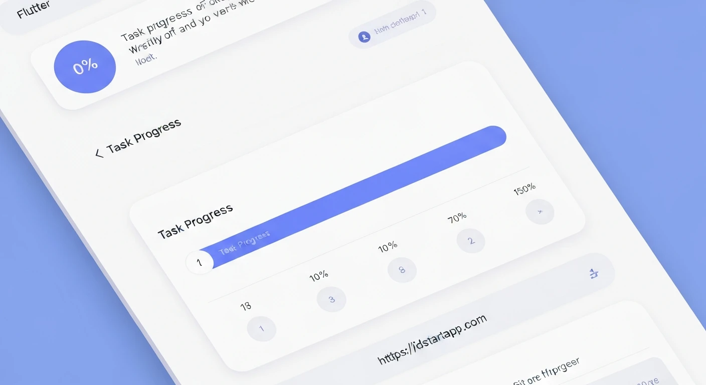

Building a Task Progress Tracker Widget with a Percentage Bar in Flutter
In modern applications, providing clear visual feedback on task progression is crucial for user experience. A task progress tracker with a percentage bar not only informs users about the current status but also enhances engagement and reduces perceived wait times. This article will guide you through creating a reusable and customizable task progress tracker widget in Flutter, complete with a dynamic percentage bar.
Why a Task Progress Tracker?
- Enhanced User Experience: Users stay informed about long-running operations.
- Reduced Anxiety: Eliminates guesswork regarding task completion.
- Improved Engagement: Visual progress can make an application feel more responsive.
- Clarity: Instantly conveys the state of multiple tasks at a glance.
Prerequisites
Before we begin, ensure you have Flutter installed and set up. A basic understanding of Flutter widgets, state management, and layout principles will be beneficial.
Project Setup
You can start with a new Flutter project or integrate this widget into an existing one.
flutter create task_progress_app
cd task_progress_app
Open lib/main.dart and clear its contents, replacing it with a basic MaterialApp and Scaffold setup.
Designing the TaskProgressTracker Widget
Our TaskProgressTracker will be a StatelessWidget. Since we want to display dynamic progress, it's best to handle the progress value as a property passed from a parent widget. The parent will manage the state of the progress, making our tracker itself a simple and reusable presentational widget.
Widget Structure
The widget will display the task name, the current progress as a percentage, and a visual progress bar. We'll use a Column to stack these elements vertically, and a combination of Container and Stack for the percentage bar itself to allow for text overlay.
Step 1: Create the task_progress_tracker.dart File
Create a new file named lib/widgets/task_progress_tracker.dart (or directly in lib/main.dart for a simple example).
import 'package:flutter/material.dart';

class TaskProgressTracker extends StatelessWidget {
  final String taskName;
  final double currentProgress; // e.g., 0.5 for 50%
  final double totalProgress; // e.g., 1.0 for 100%

  final Color backgroundColor;
  final Color progressColor;
  final Color textColor;
  final double height;
  final double borderRadius;

  const TaskProgressTracker({
    Key? key,
    required this.taskName,
    required this.currentProgress,
    this.totalProgress = 1.0, // Default to 1.0 for percentage calculation
    this.backgroundColor = Colors.grey,
    this.progressColor = Colors.blue,
    this.textColor = Colors.white,
    this.height = 20.0,
    this.borderRadius = 10.0,
  }) : assert(currentProgress >= 0 && currentProgress <= totalProgress,
            'currentProgress must be between 0 and totalProgress'),
       super(key: key);

  @override
  Widget build(BuildContext context) {
    final double percentage = currentProgress / totalProgress;

    return Padding(
      padding: const EdgeInsets.symmetric(vertical: 8.0, horizontal: 16.0),
      child: Column(
        crossAxisAlignment: CrossAxisAlignment.start,
        children: [
          Text(
            taskName,
            style: TextStyle(
              fontSize: 16.0,
              fontWeight: FontWeight.bold,
              color: Colors.black87,
            ),
          ),
          SizedBox(height: 8.0),
          LayoutBuilder(
            builder: (context, constraints) {
              return Container(
                width: constraints.maxWidth,
                height: height,
                decoration: BoxDecoration(
                  color: backgroundColor.withOpacity(0.3), // Lighter background
                  borderRadius: BorderRadius.circular(borderRadius),
                ),
                child: Stack(
                  children: [
                    // Progress Bar Fill
                    Positioned.fill(
                      child: FractionallySizedBox(
                        alignment: Alignment.centerLeft,
                        widthFactor: percentage,
                        child: Container(
                          decoration: BoxDecoration(
                            color: progressColor,
                            borderRadius: BorderRadius.circular(borderRadius),
                          ),
                        ),
                      ),
                    ),
                    // Percentage Text Overlay
                    Center(
                      child: Text(
                        '${(percentage * 100).toStringAsFixed(0)}%',
                        style: TextStyle(
                          color: textColor,
                          fontWeight: FontWeight.bold,
                          fontSize: height * 0.7, // Scale font size with height
                        ),
                      ),
                    ),
                  ],
                ),
              );
            },
          ),
        ],
      ),
    );
  }
}
Code Explanation:
- Properties: We define
taskName,currentProgress, andtotalProgressas required parameters. Customization options likebackgroundColor,progressColor,textColor,height, andborderRadiusare also provided. Anassertensures valid progress values. LayoutBuilder: This widget is crucial for obtaining the maximum available width for our progress bar, allowing it to span the full width of its parent.- Background Container: The outer
Containersets the overall shape and background of the progress bar track. Stack: We use aStackto overlay the progress fill and the percentage text.- Progress Bar Fill:
Positioned.fillensures the child fills the parentStackcompletely, thenFractionallySizedBoxcontrols its width.FractionallySizedBoxwithwidthFactor: percentagedynamically adjusts the width of the progress bar based on the calculated percentage.alignment: Alignment.centerLeftmakes it grow from left to right.- The inner
ContainerwithprogressColordefines the filled portion's appearance.
- Percentage Text: A
Centerwidget is used to place the formatted percentage text (e.g., "75%") directly on top of the progress bar, with its color and size customizable. The font size is scaled relative to the bar's height for better responsiveness.
Step 2: Using the TaskProgressTracker in main.dart
Now, let's integrate our new widget into the main application. We'll use a StatefulWidget to manage the progress state dynamically, simulating updates.
import 'package:flutter/material.dart';
import 'package:task_progress_app/widgets/task_progress_tracker.dart'; // Adjust path if needed

void main() {
  runApp(const MyApp());
}

class MyApp extends StatelessWidget {
  const MyApp({Key? key}) : super(key: key);

  @override
  Widget build(BuildContext context) {
    return MaterialApp(
      title: 'Task Progress Tracker Demo',
      theme: ThemeData(
        primarySwatch: Colors.deepPurple,
      ),
      home: const HomeScreen(),
    );
  }
}

class HomeScreen extends StatefulWidget {
  const HomeScreen({Key? key}) : super(key: key);

  @override
  State createState() => _HomeScreenState();
}

class _HomeScreenState extends State {
  double _uploadProgress = 0.0;
  double _downloadProgress = 0.0;
  double _processingProgress = 0.0;

  @override
  void initState() {
    super.initState();
    // Simulate progress updates
    _startProgressSimulation();
  }

  void _startProgressSimulation() {
    Future.delayed(const Duration(milliseconds: 100), () {
      if (!mounted) return; // Check if the widget is still mounted
      setState(() {
        _uploadProgress += 0.05;
        _downloadProgress += 0.03;
        _processingProgress += 0.01;

        if (_uploadProgress > 1.0) _uploadProgress = 1.0;
        if (_downloadProgress > 1.0) _downloadProgress = 1.0;
        if (_processingProgress > 1.0) _processingProgress = 1.0;
      });
      if (_uploadProgress < 1.0 || _downloadProgress < 1.0 || _processingProgress < 1.0) {
        _startProgressSimulation(); // Continue simulation
      }
    });
  }

  @override
  Widget build(BuildContext context) {
    return Scaffold(
      appBar: AppBar(
        title: const Text('Task Progress Tracker'),
      ),
      body: SingleChildScrollView(
        child: Column(
          children: [
            TaskProgressTracker(
              taskName: 'File Upload',
              currentProgress: _uploadProgress,
              progressColor: Colors.green,
            ),
            TaskProgressTracker(
              taskName: 'Data Download',
              currentProgress: _downloadProgress,
              progressColor: Colors.orange,
              backgroundColor: Colors.orangeAccent.withOpacity(0.2),
              textColor: Colors.black, // Example of changing text color
            ),
            TaskProgressTracker(
              taskName: 'Image Processing',
              currentProgress: _processingProgress,
              progressColor: Colors.deepPurple,
              height: 30.0, // Example of changing height
              borderRadius: 15.0,
            ),
            // Example with a different totalProgress (e.g., 3 out of 5 items)
            TaskProgressTracker(
              taskName: 'Batch Operations (3/5 completed)',
              currentProgress: 3,
              totalProgress: 5,
              progressColor: Colors.red,
              textColor: Colors.white,
            ),
            // Reset button
            Padding(
              padding: const EdgeInsets.all(16.0),
              child: ElevatedButton(
                onPressed: () {
                  setState(() {
                    _uploadProgress = 0.0;
                    _downloadProgress = 0.0;
                    _processingProgress = 0.0;
                    _startProgressSimulation(); // Restart simulation
                  });
                },
                child: const Text('Reset Progress'),
              ),
            ),
          ],
        ),
      ),
    );
  }
}
Enhancements and Customization
- Animation: Use
AnimatedContainerfor the progress fill or anAnimationControllerto smoothly animate progress updates, providing a more fluid user experience. - Custom Painters: For more complex designs (e.g., circular progress bars, unique shapes, multi-segment bars), consider using
CustomPainter. - Gestures: Add tap detection to the widget for additional interactions, such as viewing detailed task information.
- Error States: Implement visual cues (e.g., changing colors to red) for tasks that fail or encounter errors.
- Accessibility: Ensure proper semantic labels and hints for screen readers to assist users with disabilities.
- Theming: Integrate the widget with Flutter's theming system for consistent design across your application.
Conclusion
You have successfully built a flexible and reusable TaskProgressTracker widget in Flutter, capable of displaying task status with a clear percentage bar. This widget can be easily integrated into various parts of your application, significantly improving the user experience by providing immediate and understandable feedback on ongoing processes. Experiment with the customization options and enhancements to tailor it to your specific application needs.


