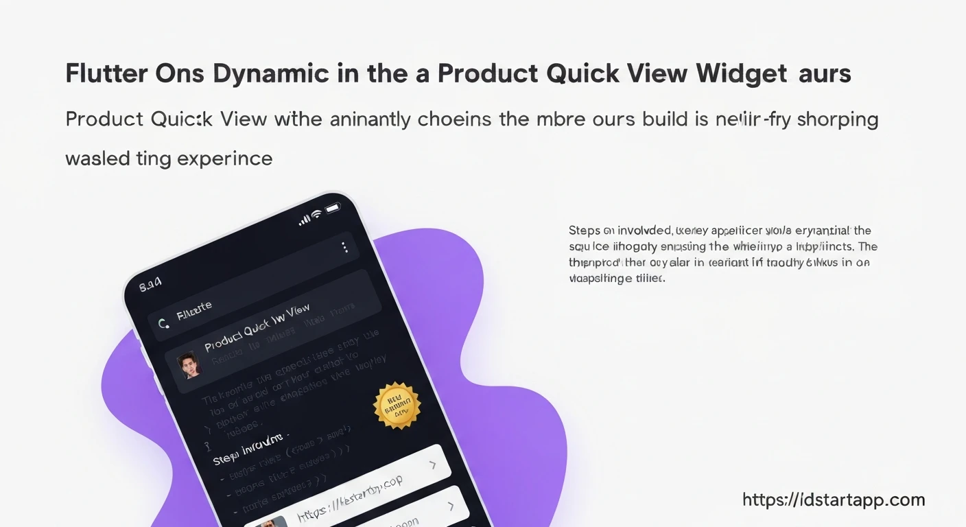

Building a Product Quick View Widget with Animation, Related Items, and Promo Badge in Flutter
In modern e-commerce applications, user experience is paramount. A "Product Quick View" feature significantly enhances this by allowing users to get essential product information, see related items, and spot promotions without navigating away from the current product listing page. This minimizes clicks and streamlines the shopping process, often leading to better conversion rates. In Flutter, we can create a sophisticated Quick View widget with animations and rich content.
This article will guide you through building such a widget, incorporating a smooth slide-up animation, displaying related products, and highlighting promotions with a badge.
1. Core Structure of the Quick View Widget
We'll implement the Quick View as a modal bottom sheet, which slides up from the bottom of the screen. This is a common and user-friendly pattern in mobile applications. The content within this bottom sheet will be a custom Flutter widget.
import 'package:flutter/material.dart';

// Dummy Product Model
class Product {
  final String id;
  final String name;
  final String imageUrl;
  final double price;
  final double? salePrice;
  final String description;
  final List relatedProductIds;

  Product({
    required this.id,
    required this.name,
    required this.imageUrl,
    required this.price,
    this.salePrice,
    required this.description,
    this.relatedProductIds = const [],
  });

  bool get isOnSale => salePrice != null && salePrice! < price;
}

// Dummy Data Service
class ProductService {
  static final List _products = [
    Product(
      id: 'p1',
      name: 'Stylish Running Shoes',
      imageUrl: 'https://picsum.photos/id/20/400/400',
      price: 99.99,
      salePrice: 79.99,
      description: 'Comfortable and stylish running shoes for your daily run.',
      relatedProductIds: ['p2', 'p3'],
    ),
    Product(
      id: 'p2',
      name: 'Ergonomic Backpack',
      imageUrl: 'https://picsum.photos/id/30/400/400',
      price: 59.99,
      description: 'Durable backpack with ergonomic design for everyday use.',
      relatedProductIds: ['p1', 'p4'],
    ),
    Product(
      id: 'p3',
      name: 'Water Bottle (500ml)',
      imageUrl: 'https://picsum.photos/id/40/400/400',
      price: 19.99,
      salePrice: 14.99,
      description: 'Leak-proof water bottle, perfect for sports and travel.',
      relatedProductIds: ['p1', 'p2'],
    ),
    Product(
      id: 'p4',
      name: 'Wireless Earbuds',
      imageUrl: 'https://picsum.photos/id/50/400/400',
      price: 129.99,
      description: 'High-quality wireless earbuds with noise cancellation.',
      relatedProductIds: ['p2', 'p3'],
    ),
  ];

  static Product? getProductById(String id) {
    return _products.firstWhere((p) => p.id == id, orElse: () => throw Exception('Product not found'));
  }

  static List getRelatedProducts(List ids) {
    return ids.map((id) => getProductById(id)!).toList();
  }

  static List getAllProducts() {
    return _products;
  }
}

// The main widget to display a list of products
class ProductListingScreen extends StatelessWidget {
  const ProductListingScreen({super.key});

  void _showQuickView(BuildContext context, Product product) {
    showModalBottomSheet(
      context: context,
      isScrollControlled: true, // Allow the sheet to be full height if needed
      backgroundColor: Colors.transparent, // To show rounded corners on content
      builder: (ctx) {
        return ProductQuickView(product: product);
      },
    );
  }

  @override
  Widget build(BuildContext context) {
    final products = ProductService.getAllProducts();
    return Scaffold(
      appBar: AppBar(title: const Text('Product Listings')),
      body: ListView.builder(
        itemCount: products.length,
        itemBuilder: (context, index) {
          final product = products[index];
          return Card(
            margin: const EdgeInsets.all(8.0),
            child: ListTile(
              leading: Image.network(product.imageUrl, width: 50, height: 50, fit: BoxFit.cover),
              title: Text(product.name),
              subtitle: Text('\$${product.price.toStringAsFixed(2)}'),
              trailing: ElevatedButton(
                onPressed: () => _showQuickView(context, product),
                child: const Text('Quick View'),
              ),
            ),
          );
        },
      ),
    );
  }
}
2. Implementing Animation (Slide-Up/Fade-In)
For a smooth user experience, we'll add a slide-up animation to the Quick View content as it appears. We'll use an AnimationController and a SlideTransition widget.
import 'package:flutter/material.dart';

// (Product and ProductService models from previous section)
// ...

class ProductQuickView extends StatefulWidget {
  final Product product;

  const ProductQuickView({super.key, required this.product});

  @override
  State createState() => _ProductQuickViewState();
}

class _ProductQuickViewState extends State
    with SingleTickerProviderStateMixin {
  late AnimationController _animationController;
  late Animation _slideAnimation;
  late Animation _fadeAnimation;

  @override
  void initState() {
    super.initState();
    _animationController = AnimationController(
      vsync: this,
      duration: const Duration(milliseconds: 300),
    );

    _slideAnimation = Tween(
      begin: const Offset(0, 1), // Start from below the screen
      end: Offset.zero, // End at its normal position
    ).animate(CurvedAnimation(
      parent: _animationController,
      curve: Curves.easeOutCubic,
    ));

    _fadeAnimation = Tween(begin: 0.0, end: 1.0).animate(
      CurvedAnimation(
        parent: _animationController,
        curve: Curves.easeIn,
      ),
    );

    _animationController.forward(); // Start the animation when the widget loads
  }

  @override
  void dispose() {
    _animationController.dispose();
    super.dispose();
  }

  @override
  Widget build(BuildContext context) {
    return SlideTransition(
      position: _slideAnimation,
      child: FadeTransition(
        opacity: _fadeAnimation,
        child: Container(
          decoration: const BoxDecoration(
            color: Colors.white,
            borderRadius: BorderRadius.vertical(top: Radius.circular(16)),
          ),
          // We'll add the content here in the next steps
          child: Column(
            mainAxisSize: MainAxisSize.min, // Essential for bottom sheet
            children: [
              // Drag handle
              Container(
                height: 4,
                width: 40,
                margin: const EdgeInsets.symmetric(vertical: 10),
                decoration: BoxDecoration(
                  color: Colors.grey[300],
                  borderRadius: BorderRadius.circular(2),
                ),
              ),
              // Rest of the content will go here
              const Padding(
                padding: EdgeInsets.all(16.0),
                child: Text('Product Quick View Content'),
              ),
              SizedBox(height: MediaQuery.of(context).padding.bottom), // safe area for bottom sheet
            ],
          ),
        ),
      ),
    );
  }
}
3. Displaying Product Details and Promo Badge
Now, let's populate the Quick View with the product's image, name, price, and a special badge for promotional offers.
import 'package:flutter/material.dart';

// (Product and ProductService models from previous section)
// ...

class ProductQuickView extends StatefulWidget {
  final Product product;

  const ProductQuickView({super.key, required this.product});

  @override
  State createState() => _ProductQuickViewState();
}

class _ProductQuickViewState extends State
    with SingleTickerProviderStateMixin {
  late AnimationController _animationController;
  late Animation _slideAnimation;
  late Animation _fadeAnimation;

  @override
  void initState() {
    super.initState();
    _animationController = AnimationController(
      vsync: this,
      duration: const Duration(milliseconds: 300),
    );

    _slideAnimation = Tween(
      begin: const Offset(0, 1),
      end: Offset.zero,
    ).animate(CurvedAnimation(
      parent: _animationController,
      curve: Curves.easeOutCubic,
    ));

    _fadeAnimation = Tween(begin: 0.0, end: 1.0).animate(
      CurvedAnimation(
        parent: _animationController,
        curve: Curves.easeIn,
      ),
    );

    _animationController.forward();
  }

  @override
  void dispose() {
    _animationController.dispose();
    super.dispose();
  }

  @override
  Widget build(BuildContext context) {
    return SlideTransition(
      position: _slideAnimation,
      child: FadeTransition(
        opacity: _fadeAnimation,
        child: Container(
          decoration: const BoxDecoration(
            color: Colors.white,
            borderRadius: BorderRadius.vertical(top: Radius.circular(16)),
          ),
          child: Column(
            mainAxisSize: MainAxisSize.min,
            crossAxisAlignment: CrossAxisAlignment.start,
            children: [
              // Drag handle
              Center(
                child: Container(
                  height: 4,
                  width: 40,
                  margin: const EdgeInsets.symmetric(vertical: 10),
                  decoration: BoxDecoration(
                    color: Colors.grey[300],
                    borderRadius: BorderRadius.circular(2),
                  ),
                ),
              ),
              // Product Image and Promo Badge
              Stack(
                alignment: Alignment.topRight,
                children: [
                  ClipRRect(
                    borderRadius: const BorderRadius.vertical(top: Radius.circular(16)),
                    child: Image.network(
                      widget.product.imageUrl,
                      height: 200,
                      width: double.infinity,
                      fit: BoxFit.cover,
                    ),
                  ),
                  if (widget.product.isOnSale)
                    Positioned(
                      top: 10,
                      right: 10,
                      child: Container(
                        padding: const EdgeInsets.symmetric(horizontal: 8, vertical: 4),
                        decoration: BoxDecoration(
                          color: Colors.redAccent,
                          borderRadius: BorderRadius.circular(5),
                        ),
                        child: Text(
                          '-${(((widget.product.price - widget.product.salePrice!) / widget.product.price) * 100).toStringAsFixed(0)}%',
                          style: const TextStyle(
                            color: Colors.white,
                            fontWeight: FontWeight.bold,
                          ),
                        ),
                      ),
                    ),
                ],
              ),
              // Product Details
              Padding(
                padding: const EdgeInsets.all(16.0),
                child: Column(
                  crossAxisAlignment: CrossAxisAlignment.start,
                  children: [
                    Text(
                      widget.product.name,
                      style: const TextStyle(
                        fontSize: 22,
                        fontWeight: FontWeight.bold,
                      ),
                    ),
                    const SizedBox(height: 8),
                    Row(
                      children: [
                        Text(
                          '\$${widget.product.salePrice?.toStringAsFixed(2) ?? widget.product.price.toStringAsFixed(2)}',
                          style: TextStyle(
                            fontSize: 18,
                            fontWeight: FontWeight.bold,
                            color: widget.product.isOnSale ? Colors.red : Colors.green,
                          ),
                        ),
                        if (widget.product.isOnSale)
                          Padding(
                            padding: const EdgeInsets.only(left: 8.0),
                            child: Text(
                              '\$${widget.product.price.toStringAsFixed(2)}',
                              style: const TextStyle(
                                fontSize: 16,
                                color: Colors.grey,
                                decoration: TextDecoration.lineThrough,
                              ),
                            ),
                          ),
                      ],
                    ),
                    const SizedBox(height: 12),
                    Text(
                      widget.product.description,
                      maxLines: 3,
                      overflow: TextOverflow.ellipsis,
                      style: const TextStyle(fontSize: 14, color: Colors.grey),
                    ),
                    const SizedBox(height: 16),
                    SizedBox(
                      width: double.infinity,
                      child: ElevatedButton.icon(
                        onPressed: () {
                          // Handle add to cart or view full details
                          Navigator.of(context).pop(); // Close quick view
                          ScaffoldMessenger.of(context).showSnackBar(
                            SnackBar(content: Text('${widget.product.name} added to cart!')),
                          );
                        },
                        icon: const Icon(Icons.shopping_cart),
                        label: const Text('Add to Cart'),
                        style: ElevatedButton.styleFrom(
                          padding: const EdgeInsets.symmetric(vertical: 12),
                          shape: RoundedRectangleBorder(
                            borderRadius: BorderRadius.circular(8),
                          ),
                        ),
                      ),
                    ),
                  ],
                ),
              ),
              // Related Items will be added here
              SizedBox(height: MediaQuery.of(context).padding.bottom),
            ],
          ),
        ),
      ),
    );
  }
}
4. Adding Related Items
To encourage further exploration, we'll add a horizontal scrollable list of related products at the bottom of the Quick View. This will make use of our ProductService to fetch related items.
import 'package:flutter/material.dart';
// (Product and ProductService models from previous section)
// ...
class ProductQuickView extends StatefulWidget {
final Product product;
const ProductQuickView({super.key, required this.product});
@override
State createState() => _ProductQuickViewState();
}
class _ProductQuickViewState extends State
with SingleTickerProviderStateMixin {
late AnimationController _animationController;
late Animation _slideAnimation;
late Animation _fadeAnimation;
List _relatedProducts = [];
@override
void initState() {
super.initState();
_animationController = AnimationController(
vsync: this,
duration: const Duration(milliseconds: 300),
);
_slideAnimation = Tween(
begin: const Offset(0, 1),
end: Offset.zero,
).animate(CurvedAnimation(
parent: _animationController,
curve: Curves.easeOutCubic,
));
_fadeAnimation = Tween(begin: 0.0, end: 1.0).animate(
CurvedAnimation(
parent: _animationController,
curve: Curves.easeIn,
),
);
_animationController.forward();
_fetchRelatedProducts();
}
void _fetchRelatedProducts() {
setState(() {
_relatedProducts = ProductService.getRelatedProducts(widget.product.relatedProductIds);
});
}
@override
void dispose() {
_animationController.dispose();
super.dispose();
}
@override
Widget build(BuildContext context) {
return SlideTransition(
position: _slideAnimation,
child: FadeTransition(
opacity: _fadeAnimation,
child: Container(
decoration: const BoxDecoration(
color: Colors.white,
borderRadius: BorderRadius.vertical(top: Radius.circular(16)),
),
child: Column(
mainAxisSize: MainAxisSize.min,
crossAxisAlignment: CrossAxisAlignment.start,
children: [
// Drag handle
Center(
child: Container(
height: 4,
width: 40,
margin: const EdgeInsets.symmetric(vertical: 10),
decoration: BoxDecoration(
color: Colors.grey[300],
borderRadius: BorderRadius.circular(2),
),
),
),
// Product Image and Promo Badge
Stack(
alignment: Alignment.topRight,
children: [
ClipRRect(
borderRadius: const BorderRadius.vertical(top: Radius.circular(16)),
child: Image.network(
widget.product.imageUrl,
height: 200,
width: double.infinity,
fit: BoxFit.cover,
),
),
if (widget.product.isOnSale)
Positioned(
top: 10,
right: 10,
child: Container(
padding: const EdgeInsets.symmetric(horizontal: 8, vertical: 4),
decoration: BoxDecoration(
color: Colors.redAccent,
borderRadius: BorderRadius.circular(5),
),
child: Text(
'-${(((widget.product.price - widget.product.salePrice!) / widget.product.price) * 100).toStringAsFixed(0)}%',
style: const TextStyle(
color: Colors.white,
fontWeight: FontWeight.bold,
),
),
),
),
],
),
// Product Details
Padding(
padding: const EdgeInsets.all(16.0),
child: Column(
crossAxisAlignment: CrossAxisAlignment.start,
children: [
Text(
widget.product.name,
style: const TextStyle(
fontSize: 22,
fontWeight: FontWeight.bold,
),
),
const SizedBox(height: 8),
Row(
children: [
Text(
'\$${widget.product.salePrice?.toStringAsFixed(2) ?? widget.product.price.toStringAsFixed(2)}',
style: TextStyle(
fontSize: 18,
fontWeight: FontWeight.bold,
color: widget.product.isOnSale ? Colors.red : Colors.green,
),
),
if (widget.product.isOnSale)
Padding(
padding: const EdgeInsets.only(left: 8.0),
child: Text(
'\$${widget.product.price.toStringAsFixed(2)}',
style: const TextStyle(
fontSize: 16,
color: Colors.grey,
decoration: TextDecoration.lineThrough,
),
),
),
],
),
const SizedBox(height: 12),
Text(
widget.product.description,
maxLines: 3,
overflow: TextOverflow.ellipsis,
style: const TextStyle(fontSize: 14, color: Colors.grey),
),
const SizedBox(height: 16),
SizedBox(
width: double.infinity,
child: ElevatedButton.icon(
onPressed: () {
Navigator.of(context).pop();
ScaffoldMessenger.of(context).showSnackBar(
SnackBar(content: Text('${widget.product.name} added to cart!')),
);
},
icon: const Icon(Icons.shopping_cart),
label: const Text('Add to Cart'),
style: ElevatedButton.styleFrom(
padding: const EdgeInsets.symmetric(vertical: 12),
shape: RoundedRectangleBorder(
borderRadius: BorderRadius.circular(8),
),
),
),
),
],
),
),
// Related Items Section
if (_relatedProducts.isNotEmpty)
Padding(
padding: const EdgeInsets.symmetric(vertical: 8.0),
child: Column(
crossAxisAlignment: CrossAxisAlignment.start,
children: [
const Padding(
padding: EdgeInsets.symmetric(horizontal: 16.0, vertical: 8.0),
child: Text(
'Related Items',
style: TextStyle(
fontSize: 18,
fontWeight: FontWeight.bold,
),
),
),
SizedBox(
height: 160, // Height for the horizontal list
child: ListView.builder(
scrollDirection: Axis.horizontal,
padding: const EdgeInsets.symmetric(horizontal: 16.0),
itemCount: _relatedProducts.length,
itemBuilder: (context, index) {
final relatedProduct = _relatedProducts[index];
return GestureDetector(
onTap: () {
// Close current quick view and open new one for related product
Navigator.of(context).pop();
showModalBottomSheet(
context: context,
isScrollControlled: true,
backgroundColor: Colors.transparent,
builder: (ctx) {
return ProductQuickView(product: relatedProduct);
},
);
},
child: Container(
width: 120,
margin: const EdgeInsets.only(right: 12),
decoration: BoxDecoration(
color: Colors.grey[100],
borderRadius: BorderRadius.circular(8),
),
child: Column(
crossAxisAlignment: CrossAxisAlignment.start,
children: [
ClipRRect(
borderRadius: const BorderRadius.vertical(
top: Radius.circular(8),
),
child: Image.network(
relatedProduct.imageUrl,
height: 80,
width: double.infinity,
fit: BoxFit.cover,
),
),
Padding(
padding: const EdgeInsets.all(8.0),
child: Column(
crossAxisAlignment: CrossAxisAlignment.start,
children: [
Text(
relatedProduct.name,
maxLines: 2,
overflow: TextOverflow.ellipsis,
style: const TextStyle(
fontSize: 12,
fontWeight: FontWeight.w600,
),
),
const SizedBox(height: 4),
Text(
'\$${relatedProduct.salePrice?.toStringAsFixed(2) ?? relatedProduct.price.toStringAsFixed(2)}',
style: TextStyle(
fontSize: 12,
fontWeight: FontWeight.bold,
color: relatedProduct.isOnSale ? Colors.red : Colors.green,
),
),
],
),
),
],
),
),
);
},
),
),
],
),
),
SizedBox(height: MediaQuery.of(context).padding.bottom),
],
),
),
),
);
}
}
Conclusion
A well-designed Product Quick View widget significantly enhances the user experience in e-commerce applications. By incorporating smooth animations, clear product details, appealing promo badges, and convenient access to related items, you can provide users with a rich and efficient shopping journey without constant page navigations.
This article demonstrated how to build such a widget in Flutter, utilizing showModalBottomSheet for its structure, AnimationController and SlideTransition for a polished entry animation, a Stack and Positioned for the promo badge, and a horizontal ListView.builder for displaying related products. Remember to tailor the styling and interaction to match your application's specific design guidelines.


