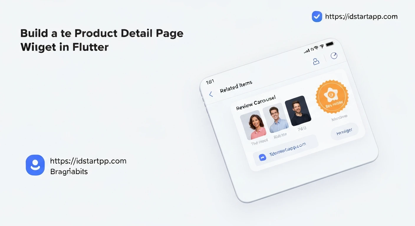

Building a Product Detail Page Widget in Flutter with Related Items, Review Carousel, and Promo Badges
A well-crafted Product Detail Page (PDP) is crucial for any e-commerce application. It's where users find comprehensive information about a product, evaluate it, and decide whether to make a purchase. In Flutter, creating a rich and interactive PDP involves combining several widgets to display product details, highlight promotions, showcase customer feedback, and suggest related items.
This article will guide you through building a robust Product Detail Page widget in Flutter, incorporating essential features like an image gallery, promo badges, a review carousel, and a section for related products. We'll focus on structuring the UI and using appropriate widgets to achieve a professional look and feel.
1. Core Product Display Structure
The foundation of our PDP will be a Scaffold containing an AppBar and a SingleChildScrollView to ensure all content is scrollable. Inside the scroll view, we'll use a Column to stack the various sections of the page.
First, let's define simple data models for our Product and Review to make our examples clearer:
// models/product.dart
class Product {
  final String id;
  final String name;
  final String description;
  final double price;
  final List<String> imageUrls;
  final double? rating;
  final String? promoBadge;

  Product({
    required this.id,
    required this.name,
    required this.description,
    required this.price,
    required this.imageUrls,
    this.rating,
    this.promoBadge,
  });
}

// models/review.dart
class Review {
  final String userId;
  final String userName;
  final double rating;
  final String comment;
  final DateTime date;

  Review({
    required this.userId,
    required this.userName,
    required this.rating,
    required this.comment,
    required this.date,
  });
}
Now, the basic PDP structure:
import 'package:flutter/material.dart';
import 'package:your_app_name/models/product.dart';
import 'package:your_app_name/models/review.dart'; // We'll use this later

class ProductDetailPage extends StatefulWidget {
  final String productId;

  const ProductDetailPage({Key? key, required this.productId}) : super(key: key);

  @override
  State<ProductDetailPage> createState() => _ProductDetailPageState();
}

class _ProductDetailPageState extends State<ProductDetailPage> {
  late Future<Product> _productFuture;

  @override
  void initState() {
    super.initState();
    _productFuture = _fetchProductDetails(widget.productId);
  }

  // Mock data fetching
  Future<Product> _fetchProductDetails(String productId) async {
    await Future.delayed(const Duration(seconds: 1)); // Simulate network delay
    return Product(
      id: productId,
      name: 'Premium Wireless Headphones',
      description: 'Experience crystal-clear audio with these comfortable over-ear headphones. '
                   'Featuring noise-cancellation and a long-lasting battery.',
      price: 199.99,
      imageUrls: [
        'https://via.placeholder.com/600x400/FF5733/FFFFFF?text=Product+Image+1',
        'https://via.placeholder.com/600x400/33FF57/FFFFFF?text=Product+Image+2',
        'https://via.placeholder.com/600x400/3357FF/FFFFFF?text=Product+Image+3',
      ],
      rating: 4.5,
      promoBadge: '20% OFF',
    );
  }

  @override
  Widget build(BuildContext context) {
    return Scaffold(
      appBar: AppBar(
        title: const Text('Product Details'),
      ),
      body: FutureBuilder<Product>(
        future: _productFuture,
        builder: (context, snapshot) {
          if (snapshot.connectionState == ConnectionState.waiting) {
            return const Center(child: CircularProgressIndicator());
          } else if (snapshot.hasError) {
            return Center(child: Text('Error: ${snapshot.error}'));
          } else if (snapshot.hasData) {
            final product = snapshot.data!;
            return SingleChildScrollView(
              child: Column(
                crossAxisAlignment: CrossAxisAlignment.start,
                children: [
                  // Product Image Gallery with Promo Badge
                  _buildProductImages(product),

                  // Product Basic Info
                  Padding(
                    padding: const EdgeInsets.all(16.0),
                    child: Column(
                      crossAxisAlignment: CrossAxisAlignment.start,
                      children: [
                        Text(
                          product.name,
                          style: Theme.of(context).textTheme.headlineSmall,
                        ),
                        const SizedBox(height: 8),
                        Text(
                          '\$${product.price.toStringAsFixed(2)}',
                          style: Theme.of(context).textTheme.headlineMedium!.copyWith(
                            fontWeight: FontWeight.bold,
                            color: Colors.deepPurple,
                          ),
                        ),
                        const SizedBox(height: 12),
                        Text(
                          product.description,
                          style: Theme.of(context).textTheme.bodyLarge,
                        ),
                        const SizedBox(height: 24),
                        SizedBox(
                          width: double.infinity,
                          child: ElevatedButton(
                            onPressed: () {
                              // Handle add to cart
                              ScaffoldMessenger.of(context).showSnackBar(
                                const SnackBar(content: Text('Added to cart!')),
                              );
                            },
                            style: ElevatedButton.styleFrom(
                              padding: const EdgeInsets.symmetric(vertical: 16),
                            ),
                            child: const Text(
                              'Add to Cart',
                              style: TextStyle(fontSize: 18),
                            ),
                          ),
                        ),
                      ],
                    ),
                  ),

                  // Placeholder for Review Carousel
                  const Padding(
                    padding: EdgeInsets.symmetric(horizontal: 16.0, vertical: 8.0),
                    child: Text(
                      'Customer Reviews',
                      style: TextStyle(fontSize: 20, fontWeight: FontWeight.bold),
                    ),
                  ),
                  _buildReviewCarousel(product), // We'll implement this next

                  // Placeholder for Related Items
                  const Padding(
                    padding: EdgeInsets.symmetric(horizontal: 16.0, vertical: 8.0),
                    child: Text(
                      'Related Products',
                      style: TextStyle(fontSize: 20, fontWeight: FontWeight.bold),
                    ),
                  ),
                  _buildRelatedItems(product), // We'll implement this later
                ],
              ),
            );
          }
          return const Center(child: Text('No product data.'));
        },
      ),
    );
  }

  // Helper method for product images with badge
  Widget _buildProductImages(Product product) {
    return Stack(
      children: [
        SizedBox(
          height: 300,
          width: double.infinity,
          child: PageView.builder(
            itemCount: product.imageUrls.length,
            itemBuilder: (context, index) {
              return Image.network(
                product.imageUrls[index],
                fit: BoxFit.cover,
                loadingBuilder: (context, child, loadingProgress) {
                  if (loadingProgress == null) return child;
                  return Center(
                    child: CircularProgressIndicator(
                      value: loadingProgress.progress,
                    ),
                  );
                },
                errorBuilder: (context, error, stackTrace) => const Icon(Icons.error),
              );
            },
          ),
        ),
        if (product.promoBadge != null && product.promoBadge!.isNotEmpty)
          Positioned(
            top: 16,
            left: 16,
            child: Container(
              padding: const EdgeInsets.symmetric(horizontal: 10, vertical: 5),
              decoration: BoxDecoration(
                color: Colors.redAccent,
                borderRadius: BorderRadius.circular(5),
              ),
              child: Text(
                product.promoBadge!,
                style: const TextStyle(
                  color: Colors.white,
                  fontWeight: FontWeight.bold,
                ),
              ),
            ),
          ),
      ],
    );
  }

  // Placeholder methods for later implementation
  Widget _buildReviewCarousel(Product product) {
    return const SizedBox(height: 200, child: Center(child: Text('Review Carousel goes here')));
  }

  Widget _buildRelatedItems(Product product) {
    return const SizedBox(height: 200, child: Center(child: Text('Related Items go here')));
  }
}
In this initial setup, we have:
- A
FutureBuilderto simulate data loading for the product. - A
PageView.builderfor product images, allowing users to swipe through multiple photos. - A
StackandPositionedwidget to overlay a promo badge on top of the image gallery. - Basic product information like name, price, and description.
- An "Add to Cart" button.
2. Implementing Promo Badges
Promo badges are essential for highlighting special offers, new arrivals, or other important product attributes. As demonstrated in the _buildProductImages method above, we use a Stack widget to place the badge on top of the product image.
// Inside _buildProductImages method:
Stack(
  children: [
    SizedBox(
      height: 300,
      width: double.infinity,
      child: PageView.builder(
        itemCount: product.imageUrls.length,
        itemBuilder: (context, index) {
          return Image.network(
            product.imageUrls[index],
            fit: BoxFit.cover,
            // ... loading and error builders
          );
        },
      ),
    ),
    if (product.promoBadge != null && product.promoBadge!.isNotEmpty)
      Positioned(
        top: 16, // Distance from the top
        left: 16, // Distance from the left
        child: Container(
          padding: const EdgeInsets.symmetric(horizontal: 10, vertical: 5),
          decoration: BoxDecoration(
            color: Colors.redAccent, // Badge background color
            borderRadius: BorderRadius.circular(5),
          ),
          child: Text(
            product.promoBadge!,
            style: const TextStyle(
              color: Colors.white,
              fontWeight: FontWeight.bold,
              fontSize: 12,
            ),
          ),
        ),
      ),
  ],
);
The Positioned widget allows precise placement of the badge within the Stack. You can customize its position (top, bottom, left, right), color, and styling to match your app's design.
3. Integrating the Review Carousel
Customer reviews build trust and provide valuable insights. A horizontally scrollable carousel is a great way to display multiple reviews without taking up too much vertical space. We'll use ListView.builder with a fixed height SizedBox for this.
First, let's update our _ProductDetailPageState to fetch mock reviews:
// Inside _ProductDetailPageState
class _ProductDetailPageState extends State<ProductDetailPage> {
  late Future<Product> _productFuture;
  late Future<List<Review>> _reviewsFuture; // New future for reviews
  late Future<List<Product>> _relatedProductsFuture; // New future for related products

  @override
  void initState() {
    super.initState();
    _productFuture = _fetchProductDetails(widget.productId);
    _reviewsFuture = _fetchProductReviews(widget.productId); // Fetch reviews
    _relatedProductsFuture = _fetchRelatedProducts(widget.productId); // Fetch related products
  }

  // Mock review fetching
  Future<List<Review>> _fetchProductReviews(String productId) async {
    await Future.delayed(const Duration(seconds: 0));
    return [
      Review(userId: 'u1', userName: 'Alice J.', rating: 5.0, comment: 'Absolutely love these headphones! The sound quality is superb and they are so comfortable.', date: DateTime(2023, 10, 26)),
      Review(userId: 'u2', userName: 'Bob K.', rating: 4.0, comment: 'Good value for money. Noise cancellation works well, but battery life could be better.', date: DateTime(2023, 10, 25)),
      Review(userId: 'u3', userName: 'Charlie L.', rating: 5.0, comment: 'My favorite headphones by far. Great for commuting and working from home.', date: DateTime(2023, 10, 24)),
      Review(userId: 'u4', userName: 'Diana M.', rating: 3.5, comment: 'Decent headphones, but a bit bulky. Sound is clear.', date: DateTime(2023, 10, 23)),
    ];
  }

  // Mock related products fetching (add this later)
  Future<List<Product>> _fetchRelatedProducts(String productId) async {
    await Future.delayed(const Duration(seconds: 0));
    return [
      Product(id: 'rp1', name: 'Bluetooth Speaker', description: 'Portable speaker', price: 79.99, imageUrls: ['https://via.placeholder.com/150/FFC0CB/000000?text=Speaker'], rating: 4.2),
      Product(id: 'rp2', name: 'Gaming Mouse', description: 'Ergonomic mouse', price: 49.99, imageUrls: ['https://via.placeholder.com/150/ADD8E6/000000?text=Mouse'], rating: 4.7),
      Product(id: 'rp3', name: 'USB-C Hub', description: 'Multi-port hub', price: 39.99, imageUrls: ['https://via.placeholder.com/150/90EE90/000000?text=Hub'], rating: 4.0),
    ];
  }

  // ... rest of the state
}
Now, let's implement the _buildReviewCarousel method:
// Inside _ProductDetailPageState class
Widget _buildReviewCarousel(Product product) {
  return FutureBuilder<List<Review>>(
    future: _reviewsFuture,
    builder: (context, snapshot) {
      if (snapshot.connectionState == ConnectionState.waiting) {
        return const Center(child: CircularProgressIndicator());
      } else if (snapshot.hasError) {
        return Center(child: Text('Error loading reviews: ${snapshot.error}'));
      } else if (snapshot.hasData && snapshot.data!.isNotEmpty) {
        final reviews = snapshot.data!;
        return SizedBox(
          height: 180, // Fixed height for the carousel
          child: ListView.builder(
            scrollDirection: Axis.horizontal,
            itemCount: reviews.length,
            padding: const EdgeInsets.symmetric(horizontal: 16.0),
            itemBuilder: (context, index) {
              final review = reviews[index];
              return Card(
                margin: const EdgeInsets.only(right: 12),
                elevation: 2,
                shape: RoundedRectangleBorder(borderRadius: BorderRadius.circular(10)),
                child: Container(
                  width: MediaQuery.of(context).size.width * 0.75, // Each review card width
                  padding: const EdgeInsets.all(12),
                  child: Column(
                    crossAxisAlignment: CrossAxisAlignment.start,
                    children: [
                      Row(
                        children: [
                          Icon(Icons.person_outline, size: 20, color: Colors.grey[700]),
                          const SizedBox(width: 4),
                          Text(
                            review.userName,
                            style: const TextStyle(fontWeight: FontWeight.bold),
                          ),
                          const Spacer(),
                          _buildStarRating(review.rating),
                        ],
                      ),
                      const SizedBox(height: 8),
                      Expanded(
                        child: Text(
                          review.comment,
                          style: const TextStyle(fontSize: 14),
                          maxLines: 3,
                          overflow: TextOverflow.ellipsis,
                        ),
                      ),
                      const SizedBox(height: 8),
                      Text(
                        '${review.date.day}/${review.date.month}/${review.date.year}',
                        style: const TextStyle(fontSize: 12, color: Colors.grey),
                      ),
                    ],
                  ),
                ),
              );
            },
          ),
        );
      }
      return const Padding(
        padding: EdgeInsets.symmetric(horizontal: 16.0),
        child: Text('No reviews yet. Be the first to review!'),
      );
    },
  );
}

// Helper for star rating display
Widget _buildStarRating(double rating) {
  List<Widget> stars = [];
  for (int i = 0; i < 5; i++) {
    if (i < rating.floor()) {
      stars.add(const Icon(Icons.star, color: Colors.amber, size: 16));
    } else if (i < rating && rating % 1 != 0) { // Half star
      stars.add(const Icon(Icons.star_half, color: Colors.amber, size: 16));
    } else {
      stars.add(const Icon(Icons.star_border, color: Colors.amber, size: 16));
    }
  }
  return Row(children: stars);
}
This carousel features:
- A
FutureBuilderto handle asynchronous loading of reviews. SizedBoxwith a fixed height to contain the horizontalListView.builder.Cardwidgets for each review, providing a clean visual separation.- A helper method
_buildStarRatingto display star icons based on the review rating.
4. Displaying Related Items
Suggesting related products helps in cross-selling and improving user engagement. This section will also use a horizontal ListView.builder, similar to the review carousel, but displaying product cards with a thumbnail, name, and price.
We've already added _relatedProductsFuture to our state. Now, let's implement the _buildRelatedItems method:
// Inside _ProductDetailPageState class
Widget _buildRelatedItems(Product currentProduct) {
  return FutureBuilder<List<Product>>(
    future: _relatedProductsFuture,
    builder: (context, snapshot) {
      if (snapshot.connectionState == ConnectionState.waiting) {
        return const Center(child: CircularProgressIndicator());
      } else if (snapshot.hasError) {
        return Center(child: Text('Error loading related products: ${snapshot.error}'));
      } else if (snapshot.hasData && snapshot.data!.isNotEmpty) {
        final relatedProducts = snapshot.data!;
        return SizedBox(
          height: 220, // Fixed height for related items carousel
          child: ListView.builder(
            scrollDirection: Axis.horizontal,
            itemCount: relatedProducts.length,
            padding: const EdgeInsets.symmetric(horizontal: 16.0),
            itemBuilder: (context, index) {
              final product = relatedProducts[index];
              return GestureDetector(
                onTap: () {
                  // Navigate to the detail page of the related product
                  Navigator.push(
                    context,
                    MaterialPageRoute(
                      builder: (context) => ProductDetailPage(productId: product.id),
                    ),
                  );
                },
                child: Card(
                  margin: const EdgeInsets.only(right: 12),
                  elevation: 2,
                  shape: RoundedRectangleBorder(borderRadius: BorderRadius.circular(10)),
                  child: Container(
                    width: 150, // Fixed width for each related product card
                    padding: const EdgeInsets.all(8),
                    child: Column(
                      crossAxisAlignment: CrossAxisAlignment.start,
                      children: [
                        Expanded(
                          child: ClipRRect(
                            borderRadius: BorderRadius.circular(8),
                            child: Image.network(
                              product.imageUrls.first,
                              fit: BoxFit.cover,
                              width: double.infinity,
                              loadingBuilder: (context, child, loadingProgress) {
                                if (loadingProgress == null) return child;
                                return Center(
                                  child: CircularProgressIndicator(
                                    value: loadingProgress.progress,
                                  ),
                                );
                              },
                              errorBuilder: (context, error, stackTrace) => const Icon(Icons.broken_image, size: 50),
                            ),
                          ),
                        ),
                        const SizedBox(height: 8),
                        Text(
                          product.name,
                          style: const TextStyle(fontWeight: FontWeight.bold, fontSize: 14),
                          maxLines: 2,
                          overflow: TextOverflow.ellipsis,
                        ),
                        const SizedBox(height: 4),
                        Text(
                          '\$${product.price.toStringAsFixed(2)}',
                          style: const TextStyle(color: Colors.deepPurple, fontWeight: FontWeight.bold, fontSize: 13),
                        ),
                      ],
                    ),
                  ),
                ),
              );
            },
          ),
        );
      }
      return const SizedBox.shrink(); // Hide if no related products
    },
  );
}
In the related items section:
- Another
FutureBuilderhandles loading related products. - A horizontally scrolling
ListView.builderdisplays individual product cards. - Each card includes an image thumbnail, product name, and price.
GestureDetectorwraps each card to allow navigation to the related product's detail page.
Conclusion
By combining SingleChildScrollView, Column, Stack with Positioned, PageView.builder, ListView.builder, and other basic Flutter widgets, we can construct a feature-rich and engaging Product Detail Page. Handling data loading with FutureBuilder ensures a smooth user experience, while thoughtful UI components like promo badges, review carousels, and related item sections enhance the page's functionality and appeal. This modular approach allows for easy expansion and customization, making your e-commerce app truly stand out.


