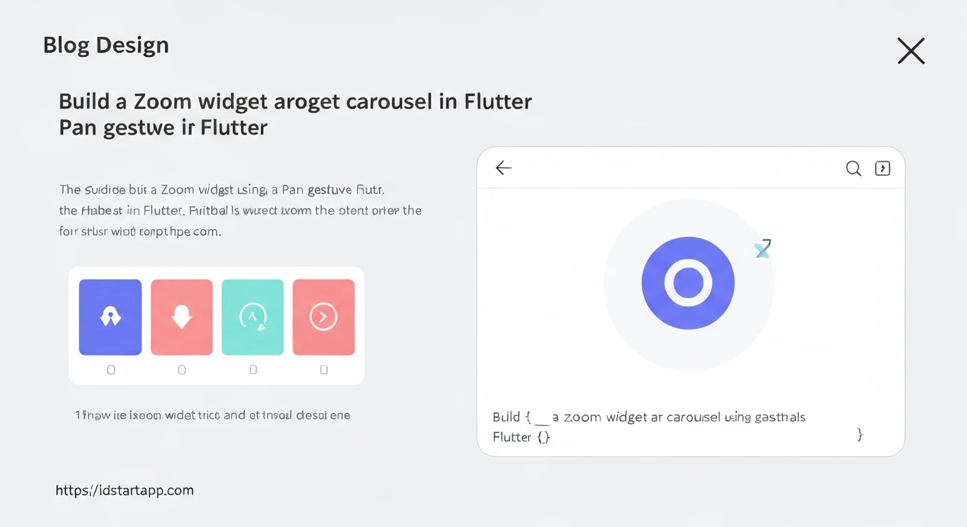

Building a Feature-Rich Carousel Widget with Zoom, Pan, and Captions in Flutter
In modern mobile applications, displaying a collection of images or content in an engaging and interactive manner is crucial for user experience. A simple image carousel might suffice for some, but often, users demand more control, such as the ability to zoom into details or pan across large images, all while understanding the context provided by a caption. Flutter, with its powerful widget tree and declarative UI, offers excellent tools to craft such a sophisticated widget.
This article will guide you through creating a versatile carousel widget in Flutter that not only allows users to swipe through items but also provides intuitive zoom and pan gestures for each item, coupled with a descriptive caption. This is particularly useful for image galleries, product showcases, or detailed information displays where visual fidelity and contextual information are paramount.
Core Flutter Components
To achieve our goal, we will primarily leverage three key Flutter widgets:
1. PageView
The PageView widget is ideal for creating a scrollable list of pages, where each page occupies the full viewport. It's the backbone of our carousel, enabling horizontal swiping between different items.
2. InteractiveViewer
This powerful widget allows its child to be scaled and panned. It automatically handles all the complex gesture detection for zooming (pinch-to-zoom) and panning, making it perfect for enabling detailed inspection of our carousel items, especially images.
3. Text and Stack
While not a core interactive component, the Text widget will be used for displaying captions. We'll use a Stack widget to overlay the caption neatly on top of the image and the InteractiveViewer.
Step-by-Step Implementation
1. Data Model
First, let's define a simple data model to hold the image path (or URL) and its corresponding caption.
class CarouselItem {
  final String imageUrl;
  final String caption;

  CarouselItem({required this.imageUrl, required this.caption});
}
2. The Main Widget Structure
We'll create a StatefulWidget to manage the current page index and to hold our list of carousel items. This widget will primarily contain a PageView.
import 'package:flutter/material.dart';

class CarouselItem {
  final String imageUrl;
  final String caption;

  CarouselItem({required this.imageUrl, required this.caption});
}

class ZoomableCarousel extends StatefulWidget {
  final List items;

  ZoomableCarousel({required this.items});

  @override
  _ZoomableCarouselState createState() => _ZoomableCarouselState();
}

class _ZoomableCarouselState extends State {
  late PageController _pageController;
  int _currentPage = 0;

  @override
  void initState() {
    super.initState();
    _pageController = PageController();
  }

  @override
  void dispose() {
    _pageController.dispose();
    super.dispose();
  }

  @override
  Widget build(BuildContext context) {
    return Column(
      children: [
        Expanded(
          child: PageView.builder(
            controller: _pageController,
            itemCount: widget.items.length,
            onPageChanged: (index) {
              setState(() {
                _currentPage = index;
              });
            },
            itemBuilder: (context, index) {
              return _buildCarouselPage(widget.items[index]);
            },
          ),
        ),
        // Indicator or other controls can go here
        Padding(
          padding: const EdgeInsets.all(8.0),
          child: Text(
            '${_currentPage + 1} / ${widget.items.length}',
            style: TextStyle(fontSize: 16, fontWeight: FontWeight.bold),
          ),
        ),
      ],
    );
  }

  Widget _buildCarouselPage(CarouselItem item) {
    // Implementation for each page goes here
    return Stack(
      children: [
        InteractiveViewer(
          boundaryMargin: EdgeInsets.all(20.0),
          minScale: 0.1,
          maxScale: 4.0,
          child: Image.network(
            item.imageUrl,
            fit: BoxFit.contain, // Ensure the image is contained within its bounds
            loadingBuilder: (context, child, loadingProgress) {
              if (loadingProgress == null) return child;
              return Center(child: CircularProgressIndicator(
                value: loadingProgress.expectedTotalBytes != null
                    ? loadingProgress.cumulativeBytesLoaded / loadingProgress.expectedTotalBytes!
                    : null,
              ));
            },
            errorBuilder: (context, error, stackTrace) => Center(child: Icon(Icons.error)),
          ),
        ),
        Positioned(
          bottom: 0,
          left: 0,
          right: 0,
          child: Container(
            padding: EdgeInsets.symmetric(vertical: 8.0, horizontal: 16.0),
            color: Colors.black.withOpacity(0.6),
            child: Text(
              item.caption,
              style: TextStyle(color: Colors.white, fontSize: 16),
              textAlign: TextAlign.center,
            ),
          ),
        ),
      ],
    );
  }
}
3. Integrating InteractiveViewer and Captions
The _buildCarouselPage method is where the magic happens. Each page of the PageView will contain a Stack. The primary child of the Stack will be our image wrapped in an InteractiveViewer, allowing for zoom and pan. A Positioned widget within the Stack will then place the caption at the bottom.
InteractiveViewer Configuration:
boundaryMargin: Defines how much empty space the user can pan into beyond the child's original dimensions.minScaleandmaxScale: Set the minimum and maximum zoom levels.child: This is where ourImage.network(orImage.asset) goes. We useBoxFit.containto ensure the entire image is visible before zooming.
Caption Overlay:
A Positioned widget is used to place the caption at the bottom of the screen. We wrap the Text widget in a Container to give it a semi-transparent black background, ensuring readability against various image backgrounds.
4. Usage Example
To use this widget, simply provide a list of CarouselItem objects.
import 'package:flutter/material.dart';
// Import your ZoomableCarousel and CarouselItem classes from the same file or a separate file.

void main() {
  runApp(MyApp());
}

class MyApp extends StatelessWidget {
  @override
  Widget build(BuildContext context) {
    return MaterialApp(
      title: 'Zoomable Carousel Demo',
      theme: ThemeData(
        primarySwatch: Colors.blue,
      ),
      home: Scaffold(
        appBar: AppBar(
          title: Text('Zoomable Carousel'),
        ),
        body: Center(
          child: ZoomableCarousel(
            items: [
              CarouselItem(
                imageUrl: 'https://via.placeholder.com/600x400/FF0000/FFFFFF?text=Image+One',
                caption: 'This is the first image with a red background. Try zooming!',
              ),
              CarouselItem(
                imageUrl: 'https://via.placeholder.com/600x400/00FF00/000000?text=Image+Two',
                caption: 'The second image, green and beautiful. Pan around!',
              ),
              CarouselItem(
                imageUrl: 'https://via.placeholder.com/600x400/0000FF/FFFFFF?text=Image+Three',
                caption: 'A captivating blue image, zoom in for details.',
              ),
            ],
          ),
        ),
      ),
    );
  }
}
Explanation and Best Practices
- Performance: For a large number of images, consider using a lazy loading mechanism for images not currently in view, especially if they are high-resolution. The
Image.networkwidget already provides some level of caching. - Accessibility: Ensure your captions are clear and descriptive. Consider adding semantic labels for screen readers.
- Image Aspect Ratio: The
InteractiveViewerworks best when the image can fully occupy its space.BoxFit.containensures the image fits initially. If you have images with drastically different aspect ratios, you might need to adjust the layout or provide placeholder backgrounds. - Reset Zoom: When a user swipes to a new page, the previous page's zoom state is implicitly reset because the
InteractiveViewerfor that page is typically rebuilt. This behavior is generally desired for a carousel experience, ensuring each new image starts at its default scale. - Customization: The appearance of the caption container (color, padding, text style) can be fully customized. You can also add more controls, like dots indicators for the current page, by extending the main
Columnwidget.
Conclusion
By combining Flutter's PageView for navigation, InteractiveViewer for intuitive zoom and pan gestures, and simple layout widgets like Stack and Positioned for captions, we've successfully built a sophisticated and user-friendly image carousel. This robust widget enhances the visual experience for users, allowing them to fully engage with your content. Flutter's declarative nature makes such complex interactions surprisingly straightforward to implement, empowering developers to create stunning and highly interactive applications.


