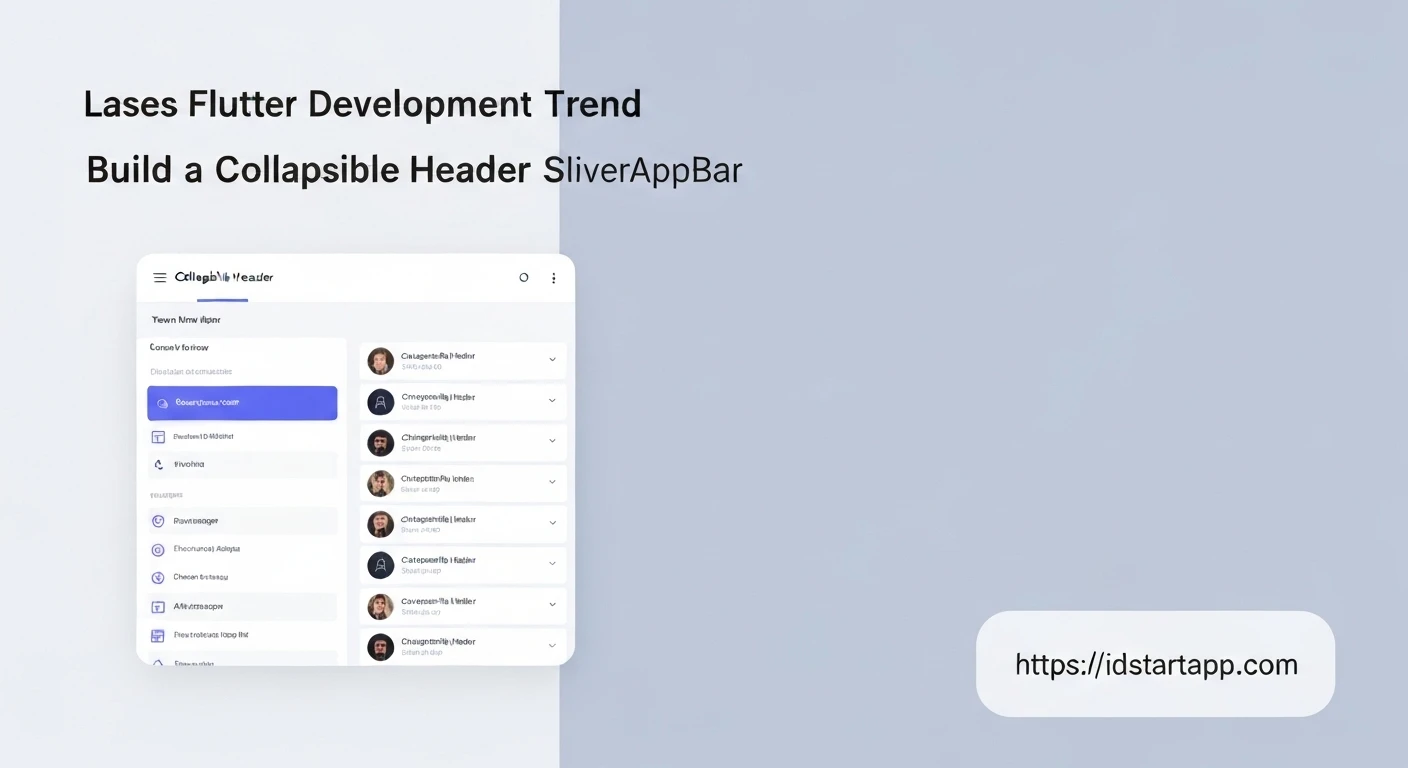

Building a Collapsible Header Widget with SliverAppBar in Flutter
In Flutter, creating dynamic and responsive UIs is key to delivering a great user experience. A common pattern for improving navigation and visual appeal is the "collapsible header" – an app bar that expands and collapses as the user scrolls through content. This article will guide you through building such a widget using Flutter's powerful SliverAppBar, a flexible component designed specifically for scrollable effects.
Understanding Slivers and CustomScrollView
Before diving into SliverAppBar, it's essential to grasp the concept of "slivers." Slivers are scrollable portions of a scroll view. Unlike traditional widgets that are aware of their full size, slivers only render the visible portion, making them highly performant for long lists. To combine multiple slivers (like an app bar and a list), Flutter provides the CustomScrollView widget.
CustomScrollView takes a list of slivers as its children, allowing you to create complex scrolling effects where different parts of the scroll view behave independently.
Implementing the Collapsible Header with SliverAppBar
The SliverAppBar is a specialized app bar that integrates seamlessly into a CustomScrollView. It allows for a rich variety of collapsing and expanding behaviors. Let's start with a basic setup.
Basic Structure
Every collapsible header setup begins with a CustomScrollView containing a SliverAppBar and at least one other scrollable sliver (like SliverList or SliverGrid) to provide content to scroll against.
import 'package:flutter/material.dart';

void main() {
  runApp(const MyApp());
}

class MyApp extends StatelessWidget {
  const MyApp({super.key});

  @override
  Widget build(BuildContext context) {
    return MaterialApp(
      title: 'Collapsible Header Demo',
      theme: ThemeData(
        primarySwatch: Colors.blue,
      ),
      home: const CollapsibleHeaderPage(),
    );
  }
}

class CollapsibleHeaderPage extends StatelessWidget {
  const CollapsibleHeaderPage({super.key});

  @override
  Widget build(BuildContext context) {
    return Scaffold(
      body: CustomScrollView(
        slivers: <Widget>[
          SliverAppBar(
            expandedHeight: 200.0, // The height of the app bar when it's fully expanded.
            flexibleSpace: FlexibleSpaceBar(
              title: const Text('Collapsible Header'),
              background: Image.network(
                'https://picsum.photos/id/1084/400/300', // Example image
                fit: BoxFit.cover,
              ),
            ),
            pinned: true, // The app bar stays at the top when scrolled up.
          ),
          SliverList(
            delegate: SliverChildBuilderDelegate(
              (BuildContext context, int index) {
                return Container(
                  color: index.isOdd ? Colors.white : Colors.blueGrey[50],
                  height: 100.0,
                  child: Center(
                    child: Text('Item $index', style: const TextStyle(fontSize: 20)),
                  ),
                );
              },
              childCount: 50, // Number of list items
            ),
          ),
        ],
      ),
    );
  }
}
Key SliverAppBar Properties
Let's break down the essential properties of SliverAppBar:
expandedHeight: This required property defines the height of the app bar when it's fully expanded. When the user scrolls, the app bar will collapse from this height down to itstoolbarHeight(which defaults to 56.0).flexibleSpace: This widget is placed behind the toolbar and can be animated as the app bar expands and collapses. It's typically where you'd put large images, titles, or other decorative elements using aFlexibleSpaceBar.pinned: If set totrue, the app bar will remain visible at the top of the screen (at itstoolbarHeight) even after it has fully collapsed. Iffalse, it will scroll completely off-screen.floating: Whentrue, the app bar will immediately reappear when the user scrolls down, even if they haven't scrolled all the way to the top of the content.snap: This property works in conjunction withfloating: true. Iftrue, the app bar will snap fully open or fully closed when the user stops scrolling, rather than stopping halfway.bottom: APreferredSizeWidgetthat appears at the bottom of the app bar. Useful for adding tabs (e.g.,TabBar) that should collapse with the app bar.
Enhancing FlexibleSpace with FlexibleSpaceBar
The FlexibleSpaceBar is designed to be used within SliverAppBar's flexibleSpace property. It provides built-in behaviors for animating its child widgets, such as parallax effects for its background and fading/scaling for its title.
FlexibleSpaceBar(
  title: const Text('My Awesome Header'),
  centerTitle: true,
  background: Image.network(
    'https://picsum.photos/id/1005/800/600',
    fit: BoxFit.cover,
  ),
  collapseMode: CollapseMode.parallax, // Adds a parallax effect to the background
),
Adding Different Scrollable Content
Beyond SliverList, you can use other slivers for your main content:
SliverGrid: For displaying items in a grid layout.SliverToBoxAdapter: To adapt a single non-sliver widget (like aColumnorContainer) into a sliver. This is useful for placing static content that doesn't need to be scrollable within theCustomScrollView.
Example with floating and snap
To illustrate the effect of floating and snap, modify the SliverAppBar as follows:
SliverAppBar(
  expandedHeight: 200.0,
  flexibleSpace: FlexibleSpaceBar(
    title: const Text('Floating & Snapping'),
    background: Image.network(
      'https://picsum.photos/id/1018/400/300',
      fit: BoxFit.cover,
    ),
  ),
  pinned: false,   // It will scroll off-screen completely
  floating: true,  // Immediately reappears on scroll down
  snap: true,      // Snaps open/closed
),
Complete Example
Here's a full runnable example demonstrating a typical collapsible header setup with an image background, a title, and a scrollable list.
import 'package:flutter/material.dart';

void main() {
  runApp(const MyApp());
}

class MyApp extends StatelessWidget {
  const MyApp({super.key});

  @override
  Widget build(BuildContext context) {
    return MaterialApp(
      title: 'Collapsible Header Demo',
      theme: ThemeData(
        primarySwatch: Colors.teal,
      ),
      home: const CollapsibleHeaderPage(),
    );
  }
}

class CollapsibleHeaderPage extends StatelessWidget {
  const CollapsibleHeaderPage({super.key});

  @override
  Widget build(BuildContext context) {
    return Scaffold(
      body: CustomScrollView(
        slivers: <Widget>[
          SliverAppBar(
            expandedHeight: 250.0,
            floating: false,
            pinned: true,
            flexibleSpace: FlexibleSpaceBar(
              centerTitle: true,
              title: const Text('My Awesome Collapsible Header',
                  style: TextStyle(
                    color: Colors.white,
                    fontSize: 20.0,
                    fontWeight: FontWeight.bold,
                  )),
              background: Image.network(
                'https://picsum.photos/id/1060/800/600',
                fit: BoxFit.cover,
              ),
            ),
          ),
          SliverToBoxAdapter(
            child: Padding(
              padding: const EdgeInsets.all(16.0),
              child: Card(
                elevation: 4,
                child: Padding(
                  padding: const EdgeInsets.all(16.0),
                  child: Text(
                    'Welcome to our collapsible header example! Scroll down to see the magic happen.',
                    style: TextStyle(fontSize: 18),
                  ),
                ),
              ),
            ),
          ),
          SliverList(
            delegate: SliverChildBuilderDelegate(
              (BuildContext context, int index) {
                return Container(
                  height: 80.0,
                  color: index.isOdd ? Colors.white : Colors.teal[50],
                  alignment: Alignment.center,
                  child: Text(
                    'List Item ${index + 1}',
                    style: const TextStyle(fontSize: 18),
                  ),
                );
              },
              childCount: 40,
            ),
          ),
        ],
      ),
    );
  }
}
Conclusion
The SliverAppBar in Flutter, when combined with CustomScrollView, offers a powerful and flexible way to create engaging collapsible headers. By mastering properties like expandedHeight, flexibleSpace, pinned, floating, and snap, you can design highly interactive and visually appealing app bars that enhance the user experience. Experiment with different combinations to achieve the precise scrolling effects your application needs.


