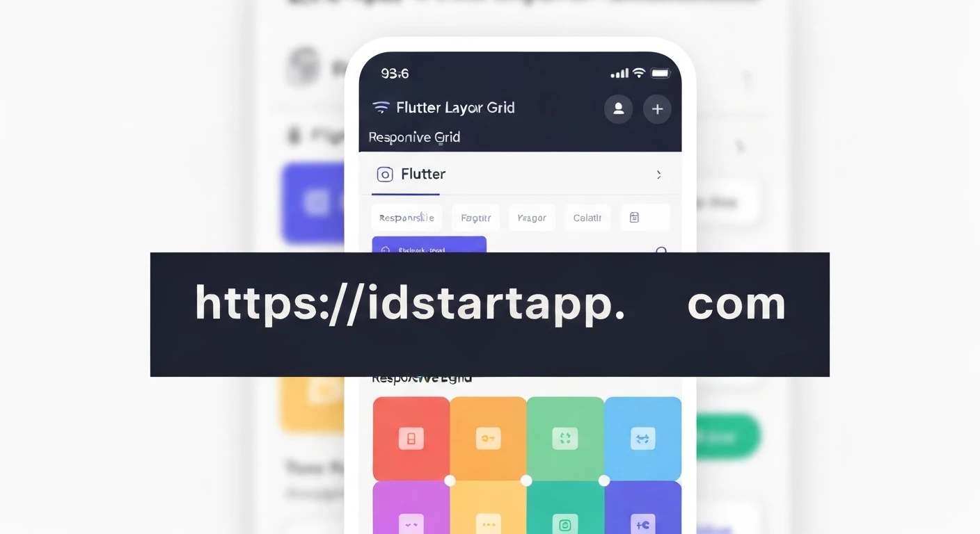

Flutter Layout Grid: Crafting Responsive UIs
Developing applications for a diverse ecosystem of devices with varying screen sizes and orientations presents a significant challenge for UI/UX designers and developers alike. Achieving a truly responsive layout, one that adapts seamlessly to any screen, is crucial for delivering a consistent and engaging user experience. While Flutter provides powerful widgets like Row, Column, and Expanded, building complex, grid-based responsive designs can sometimes become verbose and difficult to maintain. This is where the flutter_layout_grid package shines, offering a declarative and robust solution for creating sophisticated grid layouts that gracefully adjust to their environment.
What is Flutter Layout Grid?
The flutter_layout_grid package provides a highly customizable grid system inspired by CSS Grid Layout. It enables developers to define complex 2D layouts by specifying tracks (rows and columns) and then placing individual widgets within those tracks. Unlike traditional linear layout widgets, LayoutGrid offers a more explicit way to manage spatial relationships, making it ideal for designs that require precise alignment and adaptable sizing.
Why Use Layout Grid for Responsiveness?
The core strength of flutter_layout_grid in the context of responsive design lies in its ability to define flexible track sizes and leverage semantic area naming. This allows for:
- Predictable Structure: Clearly define the layout structure upfront, making it easier to visualize and manage how elements will behave.
- Adaptive Sizing: Utilize fractional units (
fr), fixed sizes, andminmaxfunctions to create tracks that grow, shrink, or maintain specific dimensions based on available space. - Semantic Placement: Name grid areas and place widgets into these areas, decoupling widget order from visual order and simplifying layout adjustments for different screen sizes.
- Simplified Media Queries: Combine
LayoutGridwith Flutter'sMediaQueryto dynamically adjust grid properties (like the number of columns, track sizes, or even area definitions) based on screen width, height, or orientation.
Getting Started with Flutter Layout Grid
First, add the flutter_layout_grid package to your pubspec.yaml file:
dependencies:
  flutter:
    sdk: flutter
  flutter_layout_grid: ^2.0.0
Then, run flutter pub get.
A basic LayoutGrid is constructed by defining columnSizes and rowSizes, and then placing children within it:
import 'package:flutter/material.dart';
import 'package:flutter_layout_grid/flutter_layout_grid.dart'; // import the package

class BasicGridLayout extends StatelessWidget {
  @override
  Widget build(BuildContext context) {
    return LayoutGrid(
      columnSizes: [200.px, 1.fr, 1.fr], // Three columns: 200px, 1 fractional unit, 1 fractional unit
      rowSizes: [auto, 100.px, 1.fr],    // Three rows: auto height, 100px, 1 fractional unit
      children: [
        // Grid items will be placed automatically in order,
        // or explicitly using gridColumn and gridRow properties.
        Container(color: Colors.red, child: Center(child: Text('Item 1'))),
        Container(color: Colors.green, child: Center(child: Text('Item 2'))),
        Container(color: Colors.blue, child: Center(child: Text('Item 3'))),
        Container(color: Colors.yellow, child: Center(child: Text('Item 4'))),
        Container(color: Colors.purple, child: Center(child: Text('Item 5'))),
      ],
    );
  }
}
Key Concepts for Responsive Design with Layout Grid
Track Sizing: Fixed, Flexible (fr), and minmax
flutter_layout_grid provides several ways to define the size of your columns and rows:
FixedTrackSize(double size)or shorthandsize.px: Defines a track with a fixed pixel size.FlexibleTrackSize(double flex)or shorthandflex.fr: Defines a track that takes up a fraction of the available space. For example,1.frmeans one part of the available space.IntrinsicTrackSize.auto()or shorthandauto: Sizes the track based on its children's intrinsic content size.MinMaxTrackSize(TrackSize min, TrackSize max): Defines a track that is no smaller thanminand no larger thanmax. This is incredibly powerful for responsiveness, allowing tracks to shrink down to a minimum but grow up to a maximum or a flexible fraction.
Example using minmax for a responsive column:
columnSizes: [minmax(100.px, 1.fr), auto, 150.px],
This defines a column that will be at least 100 pixels wide but can grow to take up 1 fractional unit of space, ensuring it's never too small but also utilizes available space.
Grid Areas for Semantic Placement
Grid areas allow you to assign names to regions of your grid. You can then place widgets into these named areas, making your layout highly readable and easy to reconfigure for different screen sizes without changing the widget tree order.
  // Define grid areas
  areas: [
    'header header header',
    'nav    content sidebar',
    'footer footer footer',
  ],

  children: [
    Container(color: Colors.grey, child: Center(child: Text('Header'))).inGridArea('header'),
    Container(color: Colors.yellow, child: Center(child: Text('Navigation'))).inGridArea('nav'),
    Container(color: Colors.blue, child: Center(child: Text('Main Content'))).inGridArea('content'),
    Container(color: Colors.green, child: Center(child: Text('Sidebar'))).inGridArea('sidebar'),
    Container(color: Colors.red, child: Center(child: Text('Footer'))).inGridArea('footer'),
  ],
If you need to change the layout for a smaller screen, you could define a different set of areas where the sidebar might move below the content, all without touching the individual Container widgets.
Example: A Responsive Dashboard Layout
Let's create a simple dashboard layout that adjusts its column structure based on the screen orientation.
import 'package:flutter/material.dart';
import 'package:flutter_layout_grid/flutter_layout_grid.dart';

class ResponsiveDashboard extends StatelessWidget {
  @override
  Widget build(BuildContext context) {
    final bool isPortrait = MediaQuery.of(context).orientation == Orientation.portrait;

    // Define column and row sizes based on orientation
    final List columnSizes = isPortrait
        ? [1.fr, 1.fr] // Two equal columns in portrait
        : [1.fr, 2.fr, 1.fr]; // Three columns (1:2:1 ratio) in landscape

    final List rowSizes = isPortrait
        ? [auto, auto, auto, auto] // Four rows for portrait layout
        : [auto, auto]; // Two rows for landscape layout

    // Define areas based on orientation
    final List areas = isPortrait
        ? [
            'header header',
            'card1  card2',
            'card3  card4',
            'chart  chart',
          ]
        : [
            'header header header',
            'card1  chart  card2',
            'card3  chart  card4', // Chart spans two rows in landscape
          ];

    return Scaffold(
      appBar: AppBar(title: Text('Responsive Dashboard')),
      body: Padding(
        padding: const EdgeInsets.all(16.0),
        child: LayoutGrid(
          columnSizes: columnSizes,
          rowSizes: rowSizes,
          areas: areas,
          columnGap: 16, // Spacing between columns
          rowGap: 16,    // Spacing between rows
          children: [
            // Header
            Container(
              alignment: Alignment.center,
              color: Colors.indigo.shade100,
              padding: EdgeInsets.all(8),
              child: Text('Dashboard Header', style: TextStyle(fontSize: 20)),
            ).inGridArea('header'),

            // Cards
            _buildDashboardCard('Card 1', Colors.lightBlue.shade100).inGridArea('card1'),
            _buildDashboardCard('Card 2', Colors.lightGreen.shade100).inGridArea('card2'),
            _buildDashboardCard('Card 3', Colors.orange.shade100).inGridArea('card3'),
            _buildDashboardCard('Card 4', Colors.purple.shade100).inGridArea('card4'),

            // Chart
            Container(
              color: Colors.grey.shade300,
              padding: EdgeInsets.all(16),
              child: Center(
                child: Text(
                  'Chart Area\n(Spans multiple cells)',
                  textAlign: TextAlign.center,
                  style: TextStyle(fontSize: 18),
                ),
              ),
            ).inGridArea('chart'),
          ],
        ),
      ),
    );
  }

  Widget _buildDashboardCard(String title, Color color) {
    return Container(
      decoration: BoxDecoration(
        color: color,
        borderRadius: BorderRadius.circular(8),
      ),
      padding: EdgeInsets.all(16),
      child: Column(
        mainAxisAlignment: MainAxisAlignment.center,
        children: [
          Icon(Icons.analytics, size: 40),
          SizedBox(height: 8),
          Text(title, style: TextStyle(fontSize: 16, fontWeight: FontWeight.bold)),
          Text('Data summary here'),
        ],
      ),
    );
  }
}
In this example, we dynamically set the columnSizes, rowSizes, and areas based on MediaQuery.of(context).orientation. In portrait mode, the layout is a 2x2 grid for cards with the chart below. In landscape mode, the layout transforms into three columns, with the chart centrally placed and spanning two rows, providing a more horizontal view suitable for wider screens.
Advanced Responsiveness with MediaQuery and LayoutGrid
Beyond orientation, you can use MediaQuery.of(context).size.width to create breakpoints and apply different grid configurations for different screen widths. This mimics the concept of media queries in web development.
  // Inside a StatelessWidget or StatefulWidget's build method:
  final double screenWidth = MediaQuery.of(context).size.width;

  // Define breakpoints
  final bool isLargeScreen = screenWidth > 800;
  final bool isMediumScreen = screenWidth > 600 && screenWidth <= 800;
  final bool isSmallScreen = screenWidth <= 600;

  List columnSizes;
  List areas;

  if (isLargeScreen) {
    columnSizes = [200.px, 1.fr, 1.fr, 200.px];
    areas = [
      'nav    content content sidebar',
      'nav    footer  footer  sidebar',
    ];
  } else if (isMediumScreen) {
    columnSizes = [1.fr, 1.fr];
    areas = [
      'nav    nav',
      'content content',
      'sidebar sidebar',
      'footer  footer',
    ];
  } else { // Small screen
    columnSizes = [1.fr];
    areas = [
      'nav',
      'content',
      'sidebar',
      'footer',
    ];
  }

  return LayoutGrid(
    columnSizes: columnSizes,
    // ... other properties and children ...
  );
By leveraging MediaQuery to dynamically adjust the grid definition, you can achieve highly sophisticated responsive behaviors without resorting to complex nested Row and Column structures, keeping your layout code clean and maintainable.
Conclusion
The flutter_layout_grid package provides a powerful and intuitive way to build complex, responsive user interfaces in Flutter. By adopting a declarative grid system with flexible track sizing, minmax functions, and semantic grid areas, developers can create layouts that adapt gracefully to various screen sizes and orientations. This approach simplifies responsive design, leading to more robust, maintainable, and visually appealing applications across the vast range of devices in the Flutter ecosystem.


