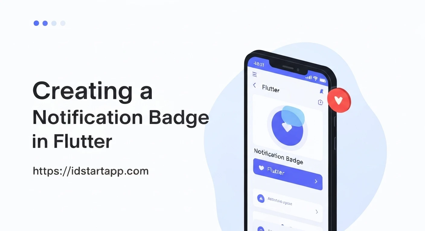

Implementing Notification Badges in Flutter
Notification badges are a crucial UI element used to visually communicate new or unread items, alerts, or pending actions within an application. They enhance the user experience by drawing attention to important updates without being overly intrusive. In Flutter, creating these badges is straightforward and highly customizable, leveraging the powerful layout widgets available in the framework.
The Core Concept: Stack and Positioned Widgets
The primary widgets for building notification badges in Flutter are Stack and Positioned. This combination allows you to place multiple widgets on top of each other, precisely controlling their location:
Stack: A widget that allows you to layer multiple children widgets on top of each other. Its children are rendered from bottom to top, meaning the last child in the list will appear on top.Positioned: A widget used exclusively within aStack. It allows you to control the exact position of its child within the stack by specifying offsets from the top, bottom, left, and right edges.
By placing your main icon or widget as the first child of a Stack and the badge as a Positioned second child, you can achieve the desired overlay effect.
Step-by-Step Implementation
1. The Base Widget
First, identify the widget you want to adorn with a badge. This is typically an Icon, a Container, or a CircleAvatar.
Icon(
  Icons.notifications,
  size: 30.0,
  color: Colors.blueGrey,
)
2. Wrapping with a Stack
Wrap your base widget with a Stack. The badge widget will be another child of this Stack.
Stack(
  children: <Widget>[
    Icon(
      Icons.notifications,
      size: 30.0,
      color: Colors.blueGrey,
    ),
    // Badge will be placed here
  ],
)
3. Creating the Badge Widget
The badge itself is often a small, circular or rounded Container holding a number or a dot. You'll define its size, background color, and the text style for the count.
Container(
  padding: EdgeInsets.all(2),
  decoration: BoxDecoration(
    color: Colors.red,
    borderRadius: BorderRadius.circular(6), // Makes it circular
  ),
  constraints: BoxConstraints(
    minWidth: 12,
    minHeight: 12,
  ),
  child: Text(
    '3', // The notification count
    style: TextStyle(
      color: Colors.white,
      fontSize: 8,
    ),
    textAlign: TextAlign.center,
  ),
)
4. Positioning the Badge
Now, use the Positioned widget to place the badge precisely over your base widget. Common positions are the top-right corner.
Stack(
  children: <Widget>[
    Icon(
      Icons.notifications,
      size: 30.0,
      color: Colors.blueGrey,
    ),
    Positioned(
      right: 0,
      top: 0,
      child: Container(
        padding: EdgeInsets.all(2),
        decoration: BoxDecoration(
          color: Colors.red,
          borderRadius: BorderRadius.circular(6),
        ),
        constraints: BoxConstraints(
          minWidth: 12,
          minHeight: 12,
        ),
        child: Text(
          '3',
          style: TextStyle(
            color: Colors.white,
            fontSize: 8,
          ),
          textAlign: TextAlign.center,
        ),
      ),
    )
  ],
)
5. Making it Dynamic (Visibility)
Notification badges should only appear when there are actual notifications. You can achieve this by conditionally rendering the Positioned badge based on a notification count.
int notificationCount = 3; // This would come from your app's state

Stack(
  children: <Widget>[
    Icon(
      Icons.notifications,
      size: 30.0,
      color: Colors.blueGrey,
    ),
    if (notificationCount > 0)
      Positioned(
        right: 0,
        top: 0,
        child: Container(
          padding: EdgeInsets.all(2),
          decoration: BoxDecoration(
            color: Colors.red,
            borderRadius: BorderRadius.circular(6),
          ),
          constraints: BoxConstraints(
            minWidth: 12,
            minHeight: 12,
          ),
          child: Text(
            notificationCount.toString(),
            style: TextStyle(
              color: Colors.white,
              fontSize: 8,
            ),
            textAlign: TextAlign.center,
          ),
        ),
      )
  ],
)
Full Example Implementation
To make this reusable and manageable, it's best to encapsulate this logic into a custom widget. Below is a complete example demonstrating a BadgeIcon widget that updates dynamically.
import 'package:flutter/material.dart';

void main() {
  runApp(MyApp());
}

class MyApp extends StatelessWidget {
  @override
  Widget build(BuildContext context) {
    return MaterialApp(
      title: 'Flutter Notification Badge',
      theme: ThemeData(
        primarySwatch: Colors.blue,
      ),
      home: HomePage(),
    );
  }
}

class HomePage extends StatefulWidget {
  @override
  _HomePageState createState() => _HomePageState();
}

class _HomePageState extends State<HomePage> {
  int _notificationCount = 0;

  void _incrementNotifications() {
    setState(() {
      _notificationCount++;
    });
  }

  void _resetNotifications() {
    setState(() {
      _notificationCount = 0;
    });
  }

  @override
  Widget build(BuildContext context) {
    return Scaffold(
      appBar: AppBar(
        title: Text('Notification Badge Demo'),
        actions: <Widget>[
          Padding(
            padding: const EdgeInsets.only(right: 16.0),
            child: BadgeIcon(
              icon: Icons.notifications,
              badgeCount: _notificationCount,
              badgeColor: Colors.red,
              iconColor: Colors.white,
            ),
          ),
        ],
      ),
      body: Center(
        child: Column(
          mainAxisAlignment: MainAxisAlignment.center,
          children: <Widget>[
            Text(
              'Notifications: $_notificationCount',
              style: TextStyle(fontSize: 24),
            ),
            SizedBox(height: 20),
            ElevatedButton(
              onPressed: _incrementNotifications,
              child: Text('Increment Notifications'),
            ),
            SizedBox(height: 10),
            ElevatedButton(
              onPressed: _resetNotifications,
              child: Text('Reset Notifications'),
            ),
          ],
        ),
      ),
    );
  }
}

class BadgeIcon extends StatelessWidget {
  final IconData icon;
  final int badgeCount;
  final Color badgeColor;
  final Color iconColor;
  final double iconSize;

  BadgeIcon({
    required this.icon,
    this.badgeCount = 0,
    this.badgeColor = Colors.red,
    this.iconColor = Colors.blueGrey,
    this.iconSize = 30.0,
  });

  @override
  Widget build(BuildContext context) {
    return Stack(
      children: <Widget>[
        Icon(
          icon,
          size: iconSize,
          color: iconColor,
        ),
        if (badgeCount > 0)
          Positioned(
            right: 0,
            top: 0,
            child: Container(
              padding: EdgeInsets.all(2),
              decoration: BoxDecoration(
                color: badgeColor,
                borderRadius: BorderRadius.circular(6),
              ),
              constraints: BoxConstraints(
                minWidth: 12,
                minHeight: 12,
              ),
              child: Text(
                '$badgeCount',
                style: TextStyle(
                  color: Colors.white,
                  fontSize: 8,
                ),
                textAlign: TextAlign.center,
              ),
            ),
          ),
      ],
    );
  }
}
Customization and Best Practices
- Badge Size and Shape: Adjust
Container'spadding,minWidth,minHeight, andborderRadiusto get the desired size and shape. For a perfect circle, ensureminWidthandminHeightare equal andborderRadiusis half of that dimension. - Large Counts: For very large counts (e.g., >99), consider displaying "99+" instead of the exact number to maintain readability and prevent the badge from growing too large.
- Accessibility: For users with screen readers, consider adding an accessibility label to the badge or the parent widget to describe the notification count.
- Reusability: Always encapsulate your badge logic into a separate, reusable widget (like the
BadgeIconin the example) to keep your code clean and maintainable. - State Management: The notification count will typically come from your app's state management solution (e.g., Provider, BLoC, Riverpod). Ensure the UI rebuilds when the count changes.
Conclusion
Implementing notification badges in Flutter is a straightforward process thanks to the flexibility of Stack and Positioned widgets. By following these steps and encapsulating the logic into a reusable component, you can effectively enhance your application's user interface and keep your users informed about important updates.


