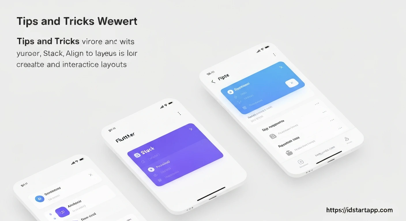

Flutter Layout Tips: Unleashing Creative UI with Stack, Positioned, and Align
Flutter's declarative UI framework offers immense flexibility in building beautiful and responsive user interfaces. While fundamental widgets like Row, Column, and Container are excellent for sequential and box-model layouts, creating more intricate designs often requires placing widgets on top of each other, similar to layers in a graphics editor. This is where Stack, Positioned, and Align become indispensable tools in a Flutter developer's arsenal.
Understanding the Core: The Stack Widget
The Stack widget in Flutter allows you to place multiple children widgets on top of each other along the Z-axis. Think of it as a canvas where you can layer elements, with the last child in the list appearing on the very top. This is incredibly useful for overlaying text on images, displaying badges, or creating complex backgrounds.
By default, Stack attempts to size itself to the largest of its non-positioned children. If all children are positioned, it will try to be as big as possible within its parent constraints.
Basic Stack Usage Example:
import 'package:flutter/material.dart';

void main() {
  runApp(const MyApp());
}

class MyApp extends StatelessWidget {
  const MyApp({super.key});

  @override
  Widget build(BuildContext context) {
    return MaterialApp(
      home: Scaffold(
        appBar: AppBar(title: const Text('Stack Example')),
        body: Center(
          child: Stack(
            children: [
              // Background Image
              Container(
                width: 300,
                height: 200,
                color: Colors.blueGrey[200],
                child: Image.network(
                  'https://picsum.photos/id/237/300/200',
                  fit: BoxFit.cover,
                ),
              ),
              // Text Overlay
              Container(
                width: 300,
                height: 200,
                alignment: Alignment.bottomLeft,
                padding: const EdgeInsets.all(16.0),
                child: const Text(
                  'Beautiful Scenery',
                  style: TextStyle(
                    color: Colors.white,
                    fontSize: 24,
                    fontWeight: FontWeight.bold,
                    shadows: [
                      Shadow(
                        blurRadius: 4.0,
                        color: Colors.black,
                        offset: Offset(2.0, 2.0),
                      ),
                    ],
                  ),
                ),
              ),
            ],
          ),
        ),
      ),
    );
  }
}
Precision Placement: The Positioned Widget
While Stack arranges children in layers, Positioned provides precise control over *where* a child is placed within that Stack. It's crucial to understand that Positioned widgets only work as direct children of a Stack. When used outside a Stack, they will typically throw an error.
Positioned allows you to specify exact distances from the Stack's edges using properties like top, bottom, left, and right. You can also define an explicit width and height.
Using Positioned with Stack:
import 'package:flutter/material.dart';

class PositionedExample extends StatelessWidget {
  const PositionedExample({super.key});

  @override
  Widget build(BuildContext context) {
    return Scaffold(
      appBar: AppBar(title: const Text('Positioned Example')),
      body: Center(
        child: Stack(
          alignment: Alignment.center, // Aligns unpositioned children
          children: [
            // Base Container
            Container(
              width: 300,
              height: 300,
              color: Colors.blueGrey[100],
              child: const Center(child: Text('Base Content')),
            ),
            // Positioned at top-left
            Positioned(
              top: 10,
              left: 10,
              child: Container(
                width: 80,
                height: 80,
                color: Colors.redAccent,
                child: const Center(
                  child: Text('TL', style: TextStyle(color: Colors.white)),
                ),
              ),
            ),
            // Positioned at bottom-right
            Positioned(
              bottom: 20,
              right: 20,
              child: Container(
                width: 100,
                height: 50,
                color: Colors.green,
                child: const Center(
                  child: Text('BR', style: TextStyle(color: Colors.white)),
                ),
              ),
            ),
            // Positioned spanning width
            Positioned(
              bottom: 0,
              left: 0,
              right: 0,
              height: 40,
              child: Container(
                color: Colors.blue,
                child: const Center(
                  child: Text('Full Width Footer',
                      style: TextStyle(color: Colors.white)),
                ),
              ),
            ),
          ],
        ),
      ),
    );
  }
}

void main() {
  runApp(const MaterialApp(home: PositionedExample()));
}
Relative Positioning: The Align Widget
The Align widget is used to position its single child within itself. When used as a child of a Stack, it positions its child relative to the Stack's bounds. Unlike Positioned, Align doesn't use absolute pixel offsets but rather a fractional alignment value (e.g., Alignment.topLeft, Alignment.center, Alignment(0.5, 0.5) for half-way between center and right-center horizontally, and center vertically).
Align is excellent for ensuring a widget stays at a particular corner or edge, regardless of the Stack's size, making it more responsive than fixed Positioned values.
Using Align with Stack:
import 'package:flutter/material.dart';

class AlignExample extends StatelessWidget {
  const AlignExample({super.key});

  @override
  Widget build(BuildContext context) {
    return Scaffold(
      appBar: AppBar(title: const Text('Align Example')),
      body: Center(
        child: Stack(
          children: [
            // Base Container filling the stack
            Container(
              width: 300,
              height: 200,
              color: Colors.indigo[100],
              child: const Center(child: Text('Stack Base')),
            ),
            // Align to bottom-right
            Align(
              alignment: Alignment.bottomRight,
              child: Container(
                width: 80,
                height: 40,
                color: Colors.purple,
                child: const Center(
                  child: Text('BR', style: TextStyle(color: Colors.white)),
                ),
              ),
            ),
            // Align to top-center
            Align(
              alignment: Alignment.topCenter,
              child: Container(
                width: 120,
                height: 30,
                color: Colors.teal,
                child: const Center(
                  child: Text('Top Center', style: TextStyle(color: Colors.white)),
                ),
              ),
            ),
            // Align with custom fractional values (e.g., 25% from left, 75% from top)
            Align(
              alignment: const Alignment(-0.5, 0.5), // x=-0.5 (25% from left), y=0.5 (75% from top)
              child: Container(
                width: 60,
                height: 60,
                color: Colors.orange,
                child: const Center(
                  child: Text('Custom', style: TextStyle(fontSize: 12, color: Colors.white)),
                ),
              ),
            ),
          ],
        ),
      ),
    );
  }
}

void main() {
  runApp(const MaterialApp(home: AlignExample()));
}
Creative Combinations and Practical Examples
The true power of these widgets emerges when you combine them. Here are a few common scenarios:
1. Card with an Overlay Badge/Label
Imagine a product card with a "New" or "Sale" badge positioned at a corner.
import 'package:flutter/material.dart';

class ProductCardExample extends StatelessWidget {
  const ProductCardExample({super.key});

  @override
  Widget build(BuildContext context) {
    return Scaffold(
      appBar: AppBar(title: const Text('Product Card')),
      body: Center(
        child: Card(
          elevation: 5,
          child: SizedBox(
            width: 250,
            height: 200,
            child: Stack(
              children: [
                // Product Image
                Positioned.fill( // Fills the entire stack
                  child: Image.network(
                    'https://picsum.photos/id/240/250/200',
                    fit: BoxFit.cover,
                  ),
                ),
                // Product Name/Description
                Align(
                  alignment: Alignment.bottomLeft,
                  child: Container(
                    padding: const EdgeInsets.all(8.0),
                    color: Colors.black.withOpacity(0.6),
                    width: double.infinity,
                    child: const Text(
                      'Stylish Product',
                      style: TextStyle(color: Colors.white, fontSize: 18),
                    ),
                  ),
                ),
                // "New" Badge using Positioned
                Positioned(
                  top: 10,
                  right: 10,
                  child: Container(
                    padding: const EdgeInsets.symmetric(horizontal: 8, vertical: 4),
                    decoration: BoxDecoration(
                      color: Colors.red,
                      borderRadius: BorderRadius.circular(5),
                    ),
                    child: const Text(
                      'NEW',
                      style: TextStyle(
                          color: Colors.white,
                          fontWeight: FontWeight.bold,
                          fontSize: 12),
                    ),
                  ),
                ),
              ],
            ),
          ),
        ),
      ),
    );
  }
}

void main() {
  runApp(const MaterialApp(home: ProductCardExample()));
}
2. Hero Image with Text and Button Overlays
A common UI pattern involves a large hero image with textual content and actionable buttons overlaid on it.
import 'package:flutter/material.dart';

class HeroImageExample extends StatelessWidget {
  const HeroImageExample({super.key});

  @override
  Widget build(BuildContext context) {
    return Scaffold(
      body: Stack(
        children: [
          // Background Image
          Positioned.fill(
            child: Image.network(
              'https://picsum.photos/id/1084/600/800',
              fit: BoxFit.cover,
              colorBlendMode: BlendMode.darken,
              color: Colors.black.withOpacity(0.4), // Dark overlay
            ),
          ),
          // Title and Subtitle
          Align(
            alignment: Alignment.bottomLeft,
            child: Padding(
              padding: const EdgeInsets.all(24.0),
              child: Column(
                mainAxisSize: MainAxisSize.min,
                crossAxisAlignment: CrossAxisAlignment.start,
                children: const [
                  Text(
                    'Explore New Horizons',
                    style: TextStyle(
                      color: Colors.white,
                      fontSize: 32,
                      fontWeight: FontWeight.bold,
                    ),
                  ),
                  SizedBox(height: 8),
                  Text(
                    'Discover breathtaking landscapes and untold stories.',
                    style: TextStyle(color: Colors.white70, fontSize: 18),
                  ),
                ],
              ),
            ),
          ),
          // Floating Action Button
          Positioned(
            bottom: 24,
            right: 24,
            child: FloatingActionButton(
              onPressed: () {
                // Handle button press
              },
              backgroundColor: Colors.orange,
              child: const Icon(Icons.arrow_forward),
            ),
          ),
          // Back Button (Top-Left)
          Positioned(
            top: 40, // Adjust for status bar
            left: 10,
            child: IconButton(
              icon: const Icon(Icons.arrow_back, color: Colors.white, size: 30),
              onPressed: () {
                Navigator.of(context).pop();
              },
            ),
          ),
        ],
      ),
    );
  }
}

void main() {
  runApp(const MaterialApp(home: HeroImageExample()));
}
Best Practices and Tips
- Minimize Overuse: While powerful, don't use
Stackfor layouts that can be achieved withRow,Column, orContainer. Simpler layouts are usually more performant and easier to maintain. - Order Matters: Remember that widgets declared later in the
Stack's children list will appear on top of those declared earlier. Positioned.fill: UsePositioned.fill(child: ...)when you want a child widget to take up all available space within theStack. This is equivalent toPositioned(top: 0, bottom: 0, left: 0, right: 0, child: ...).- Responsiveness with
Positioned: Be cautious with fixed pixel values inPositionedfor highly responsive designs.Alignoften offers better responsiveness for relative placement. For truly complex responsive positioning, consider usingLayoutBuilderto get parent constraints. - Clipping: By default,
Stackwill clip its children if they overflow its bounds. You can control this with theoverflowproperty (e.g.,overflow: Overflow.visible). Stack.fit: Thefitproperty controls how non-positioned children (those without aPositionedorAlignparent) fill the available space.StackFit.looseis the default (children size themselves), whileStackFit.expandmakes them expand to fill the stack.
Conclusion
Stack, Positioned, and Align are fundamental widgets for crafting sophisticated and visually appealing UIs in Flutter. By understanding how they interact and employing them judiciously, you can move beyond basic linear layouts and create dynamic, layered designs that truly stand out. Experiment with their properties and combinations to unlock the full creative potential of Flutter's layout engine.


