
Flutter Layout Tips: Leveraging Stack, Positioned, and Align for Creative UIs
Flutter offers a powerful and flexible declarative UI toolkit, enabling developers to build beautiful and performant applications across various platforms. While widgets like Row and Column are fundamental for linear layouts, creating more intricate and layered designs often requires a different approach. This article delves into three essential layout widgets – Stack, Positioned, and Align – demonstrating how they can be combined to achieve highly creative and dynamic user interfaces.
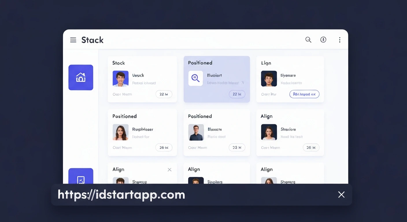
Understanding the Stack Widget
The Stack widget in Flutter is akin to a painter's canvas, allowing you to layer multiple widgets on top of each other along the z-axis. Unlike Row or Column, which arrange children sequentially, Stack places its children one after another, with the last child in the list appearing on top. This makes it ideal for overlays, badges, or placing text over images.
By default, children within a Stack are aligned at the top-left corner. Let's look at a basic example:
import 'package:flutter/material.dart';

void main() {
  runApp(const MyApp());
}

class MyApp extends StatelessWidget {
  const MyApp({super.key});

  @override
  Widget build(BuildContext context) {
    return MaterialApp(
      home: Scaffold(
        appBar: AppBar(title: const Text('Stack Example')),
        body: Center(
          child: Stack(
            children: [
              Container(
                width: 200,
                height: 200,
                color: Colors.blue,
                child: const Center(child: Text('Base Layer', style: TextStyle(color: Colors.white))),
              ),
              Container(
                width: 100,
                height: 100,
                color: Colors.red,
                child: const Center(child: Text('Top Layer', style: TextStyle(color: Colors.white))),
              ),
            ],
          ),
        ),
      ),
    );
  }
}
Unleashing Positioned for Precise Control
While Stack allows layering, its children by default are aligned to the top-left. To gain fine-grained control over the exact placement of individual children within a Stack, we use the Positioned widget. Positioned is a special widget that only works as a child of a Stack. It allows you to specify precise coordinates (top, bottom, left, right) and even dimensions (width, height) for its child relative to the Stack's boundaries.
import 'package:flutter/material.dart';

void main() {
  runApp(const MyApp());
}

class MyApp extends StatelessWidget {
  const MyApp({super.key});

  @override
  Widget build(BuildContext context) {
    return MaterialApp(
      home: Scaffold(
        appBar: AppBar(title: const Text('Positioned Example')),
        body: Center(
          child: Stack(
            alignment: Alignment.center, // Align Stack children to center by default if not positioned
            children: [
              Container(
                width: 250,
                height: 250,
                color: Colors.grey[300],
              ),
              Positioned(
                top: 20,
                left: 20,
                child: Container(
                  width: 100,
                  height: 100,
                  color: Colors.blue,
                  child: const Center(child: Text('Top-Left', style: TextStyle(color: Colors.white))),
                ),
              ),
              Positioned(
                bottom: 20,
                right: 20,
                child: Container(
                  width: 100,
                  height: 100,
                  color: Colors.red,
                  child: const Center(child: Text('Bottom-Right', style: TextStyle(color: Colors.white))),
                ),
              ),
              Positioned(
                top: 0,
                bottom: 0,
                left: 0,
                right: 0,
                child: Center(
                  child: Container(
                    width: 50,
                    height: 50,
                    color: Colors.green,
                    child: const Center(child: Text('Center', style: TextStyle(color: Colors.white, fontSize: 10))),
                  ),
                ),
              ),
            ],
          ),
        ),
      ),
    );
  }
}
Mastering Align for Relative Placement
While Positioned provides absolute pixel-based control, Align offers a more relative approach to positioning a single child within its parent. It takes an alignment property, which is an AlignmentGeometry, allowing you to place its child at specific points within its own bounds or within the bounds of a larger parent if it's constrained (e.g., inside a Container with fixed dimensions, or within a Stack). An Align widget will try to be as big as possible if its parent allows it.
import 'package:flutter/material.dart';

void main() {
  runApp(const MyApp());
}

class MyApp extends StatelessWidget {
  const MyApp({super.key});

  @override
  Widget build(BuildContext context) {
    return MaterialApp(
      home: Scaffold(
        appBar: AppBar(title: const Text('Align Example')),
        body: Center(
          child: Container(
            width: 300,
            height: 300,
            color: Colors.grey[300],
            child: Align(
              alignment: Alignment.bottomRight,
              child: Container(
                width: 100,
                height: 100,
                color: Colors.purple,
                child: const Center(child: Text('Bottom Right', style: TextStyle(color: Colors.white))),
              ),
            ),
          ),
        ),
      ),
    );
  }
}
When used within a Stack, Align can position a child relative to the Stack's boundaries without needing to know specific pixel values. This can be particularly useful for responsive designs.
import 'package:flutter/material.dart';

void main() {
  runApp(const MyApp());
}

class MyApp extends StatelessWidget {
  const MyApp({super.key});

  @override
  Widget build(BuildContext context) {
    return MaterialApp(
      home: Scaffold(
        appBar: AppBar(title: const Text('Align in Stack Example')),
        body: Center(
          child: Stack(
            children: [
              Container(
                width: 300,
                height: 300,
                color: Colors.orange[100],
                child: const Center(child: Text('Stack Base', style: TextStyle(fontSize: 20))),
              ),
              Align(
                alignment: Alignment.topLeft,
                child: Container(
                  width: 80,
                  height: 80,
                  color: Colors.green,
                  child: const Center(child: Text('TL', style: TextStyle(color: Colors.white))),
                ),
              ),
              Align(
                alignment: Alignment.bottomCenter,
                child: Container(
                  width: 120,
                  height: 50,
                  color: Colors.blue,
                  child: const Center(child: Text('Bottom Center', style: TextStyle(color: Colors.white))),
                ),
              ),
            ],
          ),
        ),
      ),
    );
  }
}
Combining Stack, Positioned, and Align for Creative UIs
The true power of these widgets emerges when you use them in concert. Imagine a user profile card with an avatar, a small online status badge, and some text overlaying a background image. This kind of layout is a perfect candidate for Stack, enhanced by Positioned and Align.
import 'package:flutter/material.dart';

void main() {
  runApp(const MyApp());
}

class MyApp extends StatelessWidget {
  const MyApp({super.key});

  @override
  Widget build(BuildContext context) {
    return MaterialApp(
      home: Scaffold(
        appBar: AppBar(title: const Text('Creative UI Example')),
        body: Center(
          child: Card(
            elevation: 8,
            shape: RoundedRectangleBorder(borderRadius: BorderRadius.circular(15)),
            child: SizedBox(
              width: 300,
              height: 200,
              child: Stack(
                children: [
                  // Background Image
                  ClipRRect(
                    borderRadius: BorderRadius.circular(15),
                    child: Image.network(
                      'https://picsum.photos/300/200?random=1',
                      fit: BoxFit.cover,
                      width: double.infinity,
                      height: double.infinity,
                    ),
                  ),
                  // Gradient Overlay for Text Readability
                  Align(
                    alignment: Alignment.bottomCenter,
                    child: Container(
                      height: 80,
                      decoration: BoxDecoration(
                        gradient: LinearGradient(
                          begin: Alignment.topCenter,
                          end: Alignment.bottomCenter,
                          colors: [Colors.transparent, Colors.black.withOpacity(0.7)],
                        ),
                        borderRadius: const BorderRadius.vertical(bottom: Radius.circular(15)),
                      ),
                    ),
                  ),
                  // User Name Text
                  Positioned(
                    bottom: 10,
                    left: 10,
                    right: 10,
                    child: Column(
                      crossAxisAlignment: CrossAxisAlignment.start,
                      children: const [
                        Text(
                          'Jane Doe',
                          style: TextStyle(
                            color: Colors.white,
                            fontSize: 24,
                            fontWeight: FontWeight.bold,
                          ),
                        ),
                        Text(
                          'Flutter Developer',
                          style: TextStyle(
                            color: Colors.white70,
                            fontSize: 16,
                          ),
                        ),
                      ],
                    ),
                  ),
                  // Avatar Image
                  Positioned(
                    top: 20,
                    right: 20,
                    child: CircleAvatar(
                      radius: 35,
                      backgroundColor: Colors.white,
                      child: CircleAvatar(
                        radius: 32,
                        backgroundImage: NetworkImage('https://picsum.photos/id/237/200/200'),
                      ),
                    ),
                  ),
                  // Online Status Badge (positioned relative to avatar)
                  Positioned(
                    top: 65,
                    right: 20, // Adjust based on avatar size
                    child: Container(
                      width: 18,
                      height: 18,
                      decoration: BoxDecoration(
                        color: Colors.greenAccent[400],
                        shape: BoxShape.circle,
                        border: Border.all(color: Colors.white, width: 2),
                      ),
                    ),
                  ),
                ],
              ),
            ),
          ),
        ),
      ),
    );
  }
}
In this example:
- A
Stackholds all layers of the card. - The background image is the first child.
- An
Alignwidget is used to place a gradient overlay at the bottom, ensuring text readability without fixed pixel values. Positionedwidgets are used for the user's name and title, placing them precisely at the bottom-left.- Another
Positionedwidget places the avatar at the top-right. - A final
Positionedwidget creates the online status badge, precisely offsetting it from the avatar's position to make it appear as a small overlay.
Conclusion
Stack, Positioned, and Align are indispensable tools in a Flutter developer's arsenal for crafting sophisticated and visually appealing user interfaces. While Stack provides the layering capability, Positioned gives you absolute control over child placement, and Align offers flexible relative positioning. By understanding their individual strengths and, more importantly, how to combine them effectively, you can break free from linear layouts and create truly unique and dynamic designs that stand out.
Experiment with these widgets in your projects to unlock new possibilities for UI creativity!


