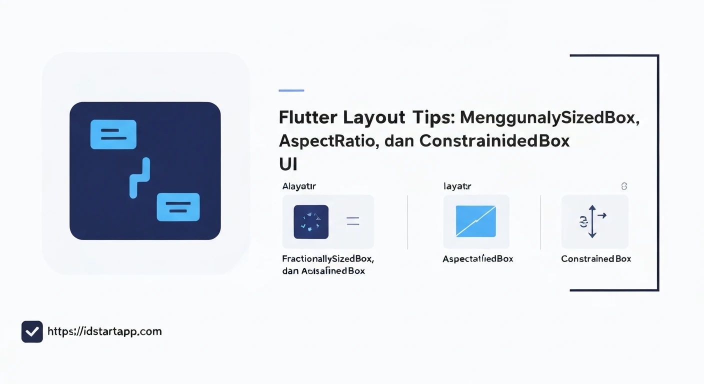

Flutter Layout Tips: Mastering FractionallySizedBox, AspectRatio, and ConstrainedBox for Adaptive UI
Building applications that look and function beautifully across a myriad of devices and screen sizes is a hallmark of a robust user experience. In Flutter, achieving an adaptive UI is paramount, and thankfully, the framework provides powerful, composable widgets to tackle this challenge. Among the most essential layout tools are FractionallySizedBox, AspectRatio, and ConstrainedBox. Understanding how to effectively utilize these widgets can significantly enhance the responsiveness and maintainability of your Flutter UIs.
FractionallySizedBox: Sizing Relative to Parent
FractionallySizedBox is a widget that sizes its child to a fraction of the total available space. Instead of fixed pixel values, you define dimensions as a ratio of the parent's size. This is incredibly useful for creating layouts that scale proportionally with the screen or its parent container.
How it Works
You can specify widthFactor and heightFactor properties, which are doubles between 0.0 and 1.0. For instance, a widthFactor of 0.5 means the child will take up 50% of the parent's available width.
Use Case
Ideal for components that need to occupy a certain percentage of their container, such as responsive banners, content sections, or grid items that always maintain a proportional size.
Example
import 'package:flutter/material.dart';

class FractionallySizedBoxExample extends StatelessWidget {
  @override
  Widget build(BuildContext context) {
    return Scaffold(
      appBar: AppBar(title: Text('FractionallySizedBox Example')),
      body: Center(
        child: Container(
          color: Colors.blueGrey[100],
          width: 300, // Parent container width for demonstration
          height: 300, // Parent container height for demonstration
          child: FractionallySizedBox(
            widthFactor: 0.75, // Takes 75% of parent width
            heightFactor: 0.5,  // Takes 50% of parent height
            alignment: Alignment.center,
            child: Container(
              color: Colors.teal,
              child: Center(
                child: Text(
                  '75% Width, 50% Height',
                  style: TextStyle(color: Colors.white, fontSize: 16),
                  textAlign: TextAlign.center,
                ),
              ),
            ),
          ),
        ),
      ),
    );
  }
}
AspectRatio: Maintaining Proportions
The AspectRatio widget attempts to size the child to a specific aspect ratio. An aspect ratio is the proportional relationship between its width and its height, commonly expressed as two numbers separated by a colon (e.g., 16:9 or 4:3).
How it Works
You provide a aspectRatio property (a double), which is calculated as width / height. The widget then tries to satisfy this ratio by adjusting its size while respecting the incoming constraints from its parent.
Use Case
Crucial for maintaining the visual integrity of images, video players, cards, or any element where proportions are critical, regardless of the available screen space. This prevents content from looking stretched or squashed.
Example
import 'package:flutter/material.dart';

class AspectRatioExample extends StatelessWidget {
  @override
  Widget build(BuildContext context) {
    return Scaffold(
      appBar: AppBar(title: Text('AspectRatio Example')),
      body: Center(
        child: Container(
          color: Colors.blueGrey[100],
          width: double.infinity, // Parent can be as wide as available
          height: 200, // Fixed height for parent, AspectRatio will adjust width
          padding: EdgeInsets.all(20),
          child: AspectRatio(
            aspectRatio: 16 / 9, // Common video aspect ratio
            child: Container(
              color: Colors.deepPurple,
              child: Center(
                child: Text(
                  '16:9 Aspect Ratio',
                  style: TextStyle(color: Colors.white, fontSize: 18),
                ),
              ),
            ),
          ),
        ),
      ),
    );
  }
}
ConstrainedBox: Imposing Minimum and Maximum Sizes
ConstrainedBox is a fundamental layout widget that imposes additional constraints on its child. It's used to set minimum and maximum dimensions, ensuring that a widget never becomes too small or too large, regardless of its intrinsic size or the parent's constraints.
How it Works
It takes a BoxConstraints object, which can specify minWidth, maxWidth, minHeight, and maxHeight. The child's size will then be chosen to satisfy both the parent's constraints and the ConstrainedBox's constraints.
Use Case
Essential for controlling the bounds of flexible elements. For example, ensuring text fields have a minimum width for readability or preventing an image from expanding beyond a maximum size on large screens, or setting a maximum height for a scrollable area.
Example
import 'package:flutter/material.dart';

class ConstrainedBoxExample extends StatelessWidget {
  @override
  Widget build(BuildContext context) {
    return Scaffold(
      appBar: AppBar(title: Text('ConstrainedBox Example')),
      body: Center(
        child: Column(
          mainAxisAlignment: MainAxisAlignment.center,
          children: [
            ConstrainedBox(
              constraints: BoxConstraints(
                minWidth: 100,
                maxWidth: 250,
                minHeight: 50,
                maxHeight: 150,
              ),
              child: Container(
                color: Colors.pinkAccent,
                child: Padding(
                  padding: const EdgeInsets.all(8.0),
                  child: Text(
                    'This text box will be between 100-250 width and 50-150 height.',
                    textAlign: TextAlign.center,
                    style: TextStyle(color: Colors.white),
                  ),
                ),
              ),
            ),
            SizedBox(height: 20),
            ConstrainedBox(
              constraints: BoxConstraints.tightFor(width: 150, height: 75), // Exactly 150x75
              child: Container(
                color: Colors.lightBlue,
                child: Center(
                  child: Text(
                    'Fixed Size (tightFor)',
                    style: TextStyle(color: Colors.white),
                  ),
                ),
              ),
            ),
          ],
        ),
      ),
    );
  }
}
Combining Them for Powerful Adaptive UIs
The true power of these widgets shines when you combine them. By composing them, you can create highly sophisticated and adaptive layout behaviors.
Scenario: A Responsive Card
Imagine a card widget that needs to:
- Occupies 80% of the available screen width.
- Maintains a 16:9 aspect ratio.
- Never shrinks below a minimum width of 300 pixels.
import 'package:flutter/material.dart';

class CombinedLayoutExample extends StatelessWidget {
  @override
  Widget build(BuildContext context) {
    return Scaffold(
      appBar: AppBar(title: Text('Combined Layout Example')),
      body: Center(
        child: FractionallySizedBox(
          widthFactor: 0.8, // Take 80% of parent width (screen width in this case)
          child: ConstrainedBox(
            constraints: BoxConstraints(
              minWidth: 300, // But never less than 300 pixels wide
            ),
            child: AspectRatio(
              aspectRatio: 16 / 9, // Maintain a 16:9 aspect ratio
              child: Card(
                elevation: 5,
                color: Colors.indigo,
                child: Center(
                  child: Text(
                    'Adaptive Card: 80% width, min 300px, 16:9 Aspect Ratio',
                    textAlign: TextAlign.center,
                    style: TextStyle(color: Colors.white, fontSize: 18),
                  ),
                ),
              ),
            ),
          ),
        ),
      ),
    );
  }
}
In this example, FractionallySizedBox first gives the card its initial flexible width. Then, ConstrainedBox ensures it doesn't become too small on narrow screens. Finally, AspectRatio guarantees the visual proportions are always correct, adjusting the height based on the constrained width.
Conclusion
FractionallySizedBox, AspectRatio, and ConstrainedBox are indispensable tools in a Flutter developer's arsenal for crafting adaptive UIs. By understanding their individual strengths and how to combine them effectively, you can build layouts that are not only aesthetically pleasing but also robust and consistent across all devices. Mastering these widgets is a significant step towards creating truly responsive and delightful user experiences in your Flutter applications.


