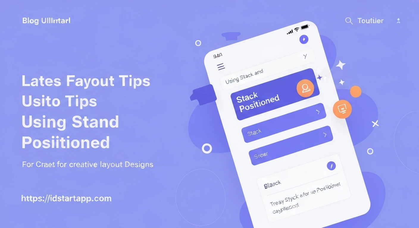

Flutter Layout Tips: Leveraging Stack and Positioned for Creative Designs
Flutter's declarative UI empowers developers to create beautiful and complex user interfaces. While widgets like Column, Row, and Expanded are fundamental for linear layouts, achieving overlapping or layered designs often requires a more specialized approach. This is where the Stack and Positioned widgets become indispensable, allowing you to create truly creative and dynamic layouts.
Understanding the Stack Widget
The Stack widget in Flutter is similar to the concept of a physical stack: it places widgets one on top of the other. The first child in the Stack widget's children list is rendered at the bottom, and subsequent children are rendered above it. By default, Stack tries to size itself to the largest of its non-positioned children, and positions its children at the top-left corner.
Stack(
  children: <Widget>[
    Container(
      width: 200,
      height: 200,
      color: Colors.red,
    ),
    Container(
      width: 150,
      height: 150,
      color: Colors.blue,
    ),
  ],
)
In this basic example, the blue Container will sit on top of the red Container, both aligned to the top-left.
Introducing the Positioned Widget
While Stack arranges children on top of each other, the Positioned widget is what gives you precise control over where each child within a Stack should be placed. A Positioned widget must be a descendant of a Stack widget. It allows you to specify the distance from the top, bottom, left, and right edges of the Stack for its child.
Stack(
  children: <Widget>[
    Container(
      width: 200,
      height: 200,
      color: Colors.grey[200],
    ),
    Positioned(
      top: 20,
      left: 20,
      child: Container(
        width: 100,
        height: 100,
        color: Colors.purple,
      ),
    ),
  ],
)
Here, the purple Container is positioned 20 pixels from the top and 20 pixels from the left edge of its parent Stack.
Combining Stack and Positioned for Creative Layouts
The real power emerges when you use Stack with multiple Positioned children. This combination is ideal for scenarios like:
1. Overlaying Text or Icons on Images
A common UI pattern is to place text captions, buttons, or badges directly on top of an image. Stack and Positioned make this effortless.
Stack(
  children: <Widget>[
    // Background image
    Image.network(
      'https://via.placeholder.com/400x200',
      fit: BoxFit.cover,
      width: double.infinity,
      height: 200,
    ),
    // Text overlay at the bottom-left
    Positioned(
      bottom: 10,
      left: 10,
      child: Text(
        'Beautiful Scenery',
        style: TextStyle(
          color: Colors.white,
          fontSize: 20,
          fontWeight: FontWeight.bold,
          shadows: <Shadow>[
            Shadow(
              offset: Offset(1.0, 1.0),
              blurRadius: 3.0,
              color: Color.fromARGB(255, 0, 0, 0),
            ),
          ],
        ),
      ),
    ),
    // Icon overlay at the top-right
    Positioned(
      top: 10,
      right: 10,
      child: Icon(
        Icons.favorite,
        color: Colors.red,
        size: 30,
      ),
    ),
  ],
)
2. Creating Badges or Notification Indicators
Small badges, like unread message counts on an icon, are perfect candidates for Stack and Positioned.
Stack(
  clipBehavior: Clip.none, // Allows overflow to be visible
  children: <Widget>[
    Icon(
      Icons.notifications,
      size: 40,
      color: Colors.grey[700],
    ),
    Positioned(
      right: -5,
      top: -5,
      child: Container(
        padding: EdgeInsets.all(4),
        decoration: BoxDecoration(
          color: Colors.red,
          shape: BoxShape.circle,
        ),
        child: Text(
          '3',
          style: TextStyle(
            color: Colors.white,
            fontSize: 12,
            fontWeight: FontWeight.bold,
          ),
        ),
      ),
    )
  ],
)
Notice the clipBehavior: Clip.none on the Stack which allows the badge to extend beyond the bounds of the icon itself.
3. Advanced Overlapping Elements (e.g., Profile Avatars)
When you need elements to partially overlap each other, such as a profile picture with a status indicator or stacked avatars.
Stack(
  children: <Widget>[
    Container(
      width: 100,
      height: 100,
      decoration: BoxDecoration(
        shape: BoxShape.circle,
        image: DecorationImage(
          image: NetworkImage('https://via.placeholder.com/150/0000FF/FFFFFF?text=User1'),
          fit: BoxFit.cover,
        ),
      ),
    ),
    Positioned(
      bottom: 0,
      right: 0,
      child: Container(
        width: 25,
        height: 25,
        decoration: BoxDecoration(
          color: Colors.green,
          shape: BoxShape.circle,
          border: Border.all(color: Colors.white, width: 3),
        ),
      ),
    ),
  ],
)
Tips for Effective Stack and Positioned Usage
- Avoid Redundancy: Only use
Positionedfor children you explicitly want to position. Non-positioned children are aligned based on theStack'salignmentproperty (defaultAlignmentDirectional.topStart). - Use
Positioned.fill: If you want a child to fill the entireStack, usePositioned.fillinstead of setting all four coordinates (top: 0, bottom: 0, left: 0, right: 0). Positioned.directional: For more control over text direction-aware positioning, usePositioned.directional.clipBehavior: Be aware of theclipBehaviorproperty onStack. By default, children are clipped to theStack's bounds (Clip.hardEdge). If you want children to overflow, set it toClip.none.- Order Matters: Remember that children are rendered in the order they appear in the
childrenlist, with later children appearing on top.
Conclusion
The Stack and Positioned widgets are powerful tools in your Flutter layout arsenal, enabling you to move beyond linear arrangements and craft sophisticated, visually rich user interfaces. By mastering their combined use, you can achieve precise control over overlapping elements, create dynamic overlays, and bring a new level of creativity to your Flutter applications.


