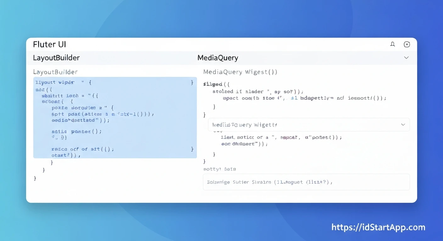

Flutter Layout Tips: Leveraging LayoutBuilder and MediaQuery for Adaptive UI
In today's diverse device landscape, creating user interfaces that look and function beautifully across various screen sizes, orientations, and form factors is paramount. Flutter, with its declarative UI approach, offers powerful tools to achieve this adaptivity. Among the most fundamental and effective are MediaQuery and LayoutBuilder. This article will delve into how these two widgets can be harnessed to build highly adaptive and responsive Flutter applications.
Understanding MediaQuery
MediaQuery is a powerful class that provides information about the current media (e.g., the screen size, orientation, pixel density, text scale factor, etc.) for the entire application. It allows you to access global device characteristics and make layout decisions based on them. Every BuildContext has access to a MediaQueryData object via MediaQuery.of(context).
Key information provided by MediaQueryData includes:
size: The logical size of the media (screen) in pixels.orientation: The current device orientation (portrait or landscape).devicePixelRatio: The number of physical pixels per logical pixel.paddingandviewInsets: Information about system UI elements like status bars, navigation bars, and soft keyboards.
When to use MediaQuery:
- When you need global screen information, such as determining if the device is in portrait or landscape mode, or adjusting a layout based on the overall screen width/height.
- When dealing with system-level UI elements, like adjusting content to avoid the keyboard or notches.
MediaQuery Example: Getting Screen Dimensions
import 'package:flutter/material.dart';

class MediaQueryExample extends StatelessWidget {
  @override
  Widget build(BuildContext context) {
    final mediaQueryData = MediaQuery.of(context);
    final screenWidth = mediaQueryData.size.width;
    final screenHeight = mediaQueryData.size.height;
    final orientation = mediaQueryData.orientation;

    return Scaffold(
      appBar: AppBar(
        title: Text('MediaQuery Example'),
      ),
      body: Center(
        child: Column(
          mainAxisAlignment: MainAxisAlignment.center,
          children: [
            Text('Screen Width: ${screenWidth.toStringAsFixed(2)}'),
            Text('Screen Height: ${screenHeight.toStringAsFixed(2)}'),
            Text('Orientation: ${orientation == Orientation.portrait ? "Portrait" : "Landscape"}'),
            SizedBox(height: 20),
            Container(
              width: screenWidth * 0.5, // Half of screen width
              height: screenHeight * 0.2, // 20% of screen height
              color: Colors.blue,
              child: Center(child: Text('Adaptive Container', style: TextStyle(color: Colors.white))),
            ),
          ],
        ),
      ),
    );
  }
}
Understanding LayoutBuilder
While MediaQuery gives you information about the entire screen, LayoutBuilder provides constraints from its parent widget. This is crucial when you need to make layout decisions based on the available space within a specific part of your UI, rather than the global screen dimensions. It takes a builder function that provides a BuildContext and a BoxConstraints object.
BoxConstraints contains:
minWidthandmaxWidth: The minimum and maximum width the child can be.minHeightandmaxHeight: The minimum and maximum height the child can be.
When to use LayoutBuilder:
- When a widget needs to adapt its layout based on the space offered by its immediate parent.
- When you have a flexible widget that might be placed in different contexts (e.g., a sidebar that changes layout when narrow, or a card that displays differently in a wide vs. narrow column).
- To create responsive components that aren't tied to global screen dimensions but rather to their allocated UI space.
LayoutBuilder Example: Adapting to Parent Constraints
import 'package:flutter/material.dart';

class LayoutBuilderExample extends StatelessWidget {
  @override
  Widget build(BuildContext context) {
    return Scaffold(
      appBar: AppBar(
        title: Text('LayoutBuilder Example'),
      ),
      body: Center(
        child: Container(
          width: 300, // Fixed width for the parent container
          height: 200,
          color: Colors.grey[200],
          child: LayoutBuilder(
            builder: (BuildContext context, BoxConstraints constraints) {
              if (constraints.maxWidth > 250) {
                return Row(
                  mainAxisAlignment: MainAxisAlignment.spaceAround,
                  children: [
                    Icon(Icons.star, size: 50, color: Colors.amber),
                    Text('Wide Layout', style: TextStyle(fontSize: 20)),
                  ],
                );
              } else {
                return Column(
                  mainAxisAlignment: MainAxisAlignment.spaceAround,
                  children: [
                    Icon(Icons.star_border, size: 30, color: Colors.blueGrey),
                    Text('Narrow Layout', style: TextStyle(fontSize: 16)),
                  ],
                );
              }
            },
          ),
        ),
      ),
    );
  }
}
Combining LayoutBuilder and MediaQuery for Ultimate Adaptivity
The true power of adaptive UI often comes from combining these two mechanisms. MediaQuery can provide overarching decisions (e.g., major breakpoints for mobile/tablet/desktop, or global orientation changes), while LayoutBuilder fine-tunes the internal layout of specific components based on the actual space they receive within that global context.
Consider a scenario where you want a responsive master-detail layout. On large screens (determined by MediaQuery), you might show both master and detail panes side-by-side. On smaller screens, you might show only the master, with the detail view appearing on a new screen. Within the master or detail pane, LayoutBuilder can then adjust how elements are arranged based on the specific width given to that pane.
Combined Example: Responsive Card
import 'package:flutter/material.dart';

class AdaptiveCard extends StatelessWidget {
  final String title;
  final String description;

  AdaptiveCard({required this.title, required this.description});

  @override
  Widget build(BuildContext context) {
    final screenWidth = MediaQuery.of(context).size.width;
    final isLargeScreen = screenWidth > 600; // Global breakpoint example

    return LayoutBuilder(
      builder: (context, constraints) {
        final cardWidth = constraints.maxWidth;
        final isWideCard = cardWidth > 300; // Local breakpoint example

        return Card(
          margin: EdgeInsets.all(isLargeScreen ? 16 : 8),
          elevation: 4,
          child: Padding(
            padding: const EdgeInsets.all(16.0),
            child: isWideCard ?
            Row(
              crossAxisAlignment: CrossAxisAlignment.start,
              children: [
                Expanded(
                  flex: 1,
                  child: Icon(Icons.info, size: 48, color: Colors.blue),
                ),
                SizedBox(width: 16),
                Expanded(
                  flex: 3,
                  child: Column(
                    crossAxisAlignment: CrossAxisAlignment.start,
                    children: [
                      Text(title, style: TextStyle(fontSize: 20, fontWeight: FontWeight.bold)),
                      SizedBox(height: 8),
                      Text(description, style: TextStyle(fontSize: 16)),
                    ],
                  ),
                ),
              ],
            ) :
            Column(
              crossAxisAlignment: CrossAxisAlignment.start,
              children: [
                Center(child: Icon(Icons.info_outline, size: 36, color: Colors.blueGrey)),
                SizedBox(height: 12),
                Text(title, style: TextStyle(fontSize: 18, fontWeight: FontWeight.bold)),
                SizedBox(height: 8),
                Text(description, style: TextStyle(fontSize: 14)),
              ],
            ),
          ),
        );
      },
    );
  }
}

// To use it:
class CombinedExamplePage extends StatelessWidget {
  @override
  Widget build(BuildContext context) {
    return Scaffold(
      appBar: AppBar(title: Text('Combined Adaptive UI')),
      body: GridView.builder(
        gridDelegate: SliverGridDelegateWithMaxCrossAxisExtent(
          maxCrossAxisExtent: 400.0, // Cards will try to fill up to 400px width
          crossAxisSpacing: 10,
          mainAxisSpacing: 10,
          childAspectRatio: 2.0, // Adjust height as needed
        ),
        padding: const EdgeInsets.all(10),
        itemCount: 6,
        itemBuilder: (context, index) {
          return AdaptiveCard(
            title: 'Card Title ${index + 1}',
            description: 'This is a description for card number ${index + 1}, adapting to its space and screen size.',
          );
        },
      ),
    );
  }
}
Best Practices and Tips
- Choose the Right Tool: Use
MediaQueryfor global device properties and overarching layout changes (e.g., switching from a single column to a two-column layout on tablets). UseLayoutBuilderfor localized layout adjustments within a specific widget, based on its parent's constraints. - Avoid Excessive Rebuilds: Both
MediaQueryandLayoutBuilderwill cause their respective subtrees to rebuild when the relevant properties change. Be mindful of placing them too high up in the widget tree if the changes are frequent and only affect a small part of the UI. - Define Breakpoints: Establish clear breakpoints (e.g., 600px for mobile/tablet, 1200px for desktop) in your code to consistently apply adaptive logic.
- Consider
OrientationBuilder: For simpler orientation-based layouts,OrientationBuildercan be a more concise alternative toMediaQuery.of(context).orientation. - Test Across Devices: Always test your adaptive UI on a variety of emulators, simulators, and physical devices to ensure a consistent experience.
Conclusion
MediaQuery and LayoutBuilder are indispensable tools for building robust and adaptive user interfaces in Flutter. By understanding their distinct purposes and leveraging them effectively, developers can create applications that not only look great but also provide an optimal user experience across the myriad of devices available today. Mastering these two components is a significant step towards becoming proficient in responsive Flutter development.


