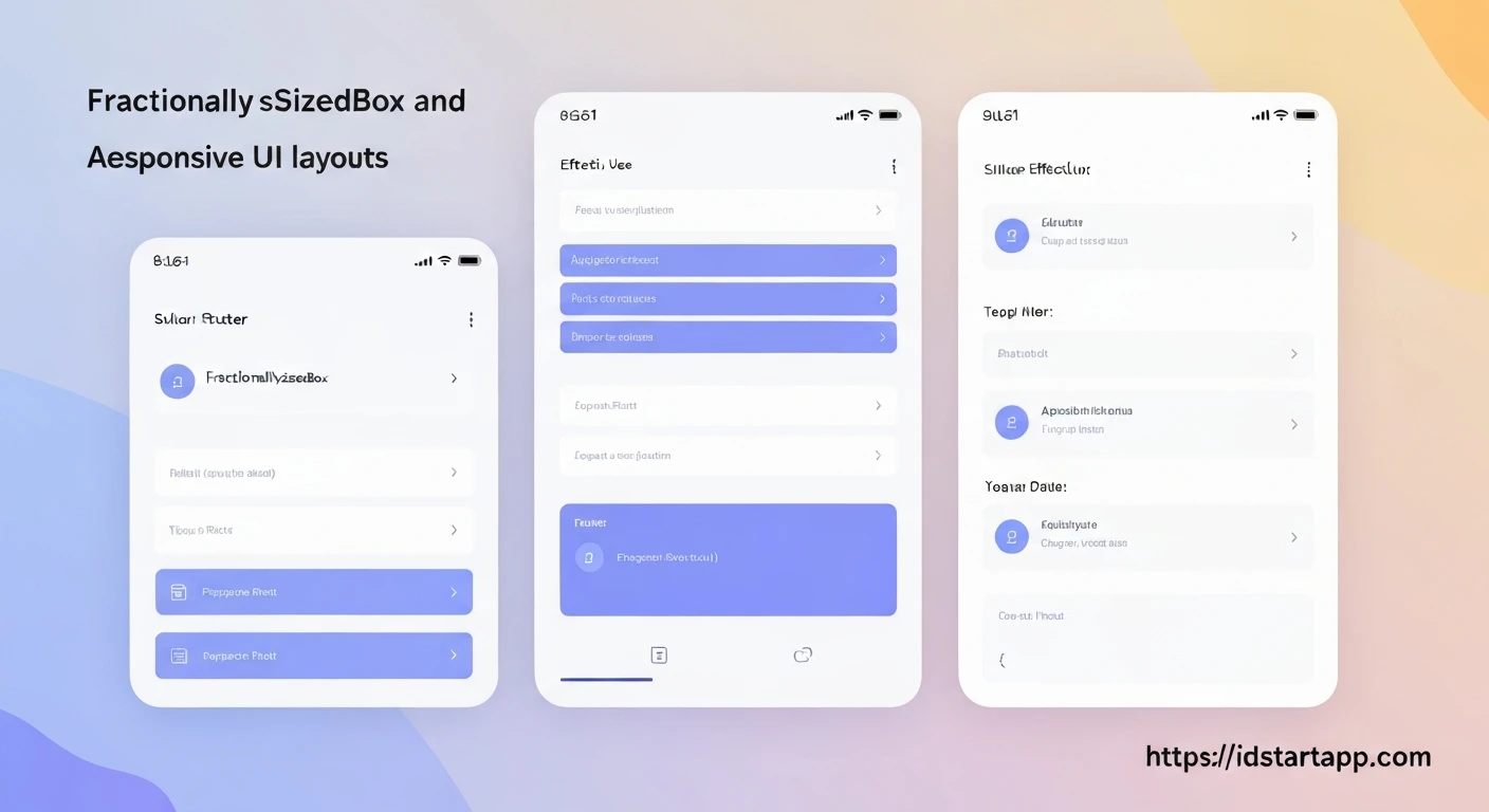

Flutter Layout Tips: Leveraging FractionallySizedBox and AspectRatio for Adaptive UI
Creating beautiful and functional user interfaces that adapt seamlessly across a multitude of device sizes, orientations, and form factors is a cornerstone of modern application development. In Flutter, achieving truly adaptive UI often involves more than just basic Row and Column layouts. Two powerful widgets, FractionallySizedBox and AspectRatio, offer robust solutions for building UIs that intelligently respond to available space.
Understanding FractionallySizedBox
The FractionallySizedBox widget sizes its child to a fraction of the total available space. Instead of fixed pixel dimensions, you define the child's width and/or height as a percentage of its parent's constraints. This is incredibly useful when you want a widget to take up, say, half the screen width or a third of its parent's height, regardless of the absolute pixel values.
How it Works
widthFactor: If non-null, the child's width is set to this fraction of the parent's incoming width constraints.heightFactor: If non-null, the child's height is set to this fraction of the parent's incoming height constraints.
It's important to note that if either factor is omitted or null, the child is sized according to its own preferred size in that dimension, within the parent's constraints.
When to Use FractionallySizedBox
- Creating responsive grids where items take up a percentage of the screen width.
- Dividing a section of the UI into proportional parts.
- Ensuring a component scales relative to its container rather than being a fixed size.
Example: A Button Taking Half the Screen Width
import 'package:flutter/material.dart';

void main() {
  runApp(MyApp());
}

class MyApp extends StatelessWidget {
  @override
  Widget build(BuildContext context) {
    return MaterialApp(
      home: Scaffold(
        appBar: AppBar(title: Text('FractionallySizedBox Demo')),
        body: Center(
          child: Container(
            color: Colors.grey[200],
            width: double.infinity, // Occupy full width of parent (Scaffold body)
            height: 100,
            child: FractionallySizedBox(
              widthFactor: 0.5, // Child takes 50% of the parent's width
              heightFactor: 0.8, // Child takes 80% of the parent's height
              alignment: Alignment.center,
              child: ElevatedButton(
                onPressed: () {},
                child: Text('50% Width Button'),
              ),
            ),
          ),
        ),
      ),
    );
  }
}
Understanding AspectRatio
The AspectRatio widget attempts to size its child to a specific aspect ratio. An aspect ratio is the proportional relationship between its width and its height (width:height). For example, a 16:9 aspect ratio means that for every 16 units of width, there are 9 units of height.
How it Works
aspectRatio: The aspect ratio to attempt to use. The ratio is expressed aswidth / height. For instance, 16:9 would be16/9(1.777...).
The widget tries to make its child's width and height conform to the given aspect ratio, while respecting the incoming constraints from its parent. It typically expands as much as possible in the direction that doesn't violate the aspect ratio, then sizes the other dimension accordingly.
When to Use AspectRatio
- Displaying images or videos that must maintain their original proportions.
- Creating responsive cards or containers with fixed shapes.
- Ensuring consistent UI elements like square avatars or rectangular banners.
Example: An Image Maintaining a 16:9 Ratio
import 'package:flutter/material.dart';

void main() {
  runApp(MyApp());
}

class MyApp extends StatelessWidget {
  @override
  Widget build(BuildContext context) {
    return MaterialApp(
      home: Scaffold(
        appBar: AppBar(title: Text('AspectRatio Demo')),
        body: Center(
          child: Container(
            width: 300, // Constraining parent width
            color: Colors.blueGrey[100],
            child: AspectRatio(
              aspectRatio: 16 / 9, // Maintain 16:9 ratio
              child: Container(
                color: Colors.teal,
                child: Center(
                  child: Text(
                    '16:9 Ratio Box',
                    style: TextStyle(color: Colors.white, fontSize: 20),
                  ),
                ),
              ),
            ),
          ),
        ),
      ),
    );
  }
}
Combining FractionallySizedBox and AspectRatio for Truly Adaptive UI
The real power often comes from combining these two widgets. Imagine you want to create a responsive card that takes up a certain percentage of the screen width and simultaneously maintains a specific aspect ratio, regardless of the screen's dimensions or orientation.
Here's how they work together:
FractionallySizedBoxdetermines the width of its child based on a factor of the parent's available width.- This child (which might be another widget or
AspectRatioitself) then passes this determined width down toAspectRatio. AspectRatiothen uses this given width to calculate the appropriate height to satisfy its `aspectRatio` property.
Example: A Responsive Card
This example demonstrates a card that always occupies 80% of the screen width and maintains a 4:3 aspect ratio, making it perfectly adaptive.
import 'package:flutter/material.dart';

void main() {
  runApp(MyApp());
}

class MyApp extends StatelessWidget {
  @override
  Widget build(BuildContext context) {
    return MaterialApp(
      home: Scaffold(
        appBar: AppBar(title: Text('Adaptive Card Demo')),
        body: Center(
          child: Column(
            mainAxisAlignment: MainAxisAlignment.center,
            children: [
              Text(
                'Card scales with screen width and maintains 4:3 ratio:',
                textAlign: TextAlign.center,
                style: TextStyle(fontSize: 16),
              ),
              SizedBox(height: 20),
              FractionallySizedBox(
                widthFactor: 0.8, // Card takes 80% of the available width
                child: AspectRatio(
                  aspectRatio: 4 / 3, // Maintains a 4:3 width:height ratio
                  child: Card(
                    elevation: 5,
                    color: Colors.lightBlue[100],
                    child: Padding(
                      padding: const EdgeInsets.all(16.0),
                      child: Column(
                        mainAxisAlignment: MainAxisAlignment.center,
                        children: [
                          Icon(Icons.photo_library, size: 50, color: Colors.blue),
                          SizedBox(height: 10),
                          Text(
                            'Adaptive Content Card',
                            textAlign: TextAlign.center,
                            style: TextStyle(fontSize: 18, fontWeight: FontWeight.bold),
                          ),
                          SizedBox(height: 5),
                          Text(
                            'This card resizes dynamically!',
                            textAlign: TextAlign.center,
                            style: TextStyle(fontSize: 14),
                          ),
                        ],
                      ),
                    ),
                  ),
                ),
              ),
            ],
          ),
        ),
      ),
    );
  }
}
Key Benefits for Adaptive UI
- Fluid Responsiveness: UI elements resize gracefully when the screen dimensions change (e.g., device rotation, resizable windows on desktop).
- Predictable Sizing: You have precise control over proportions and relative sizes, reducing unexpected layout shifts.
- Reduced Boilerplate: Avoid manual calculations or complex layout builders for common responsive patterns.
- Consistency Across Devices: Ensures a consistent visual experience for elements that need to maintain specific proportions, regardless of the screen size.
Conclusion
FractionallySizedBox and AspectRatio are indispensable tools in a Flutter developer's toolkit for building robust and adaptive user interfaces. By understanding their individual strengths and, more importantly, how to combine them, you can create layouts that not only look good on a single device but also adapt intelligently and seamlessly across the vast ecosystem of screens your application might encounter. Embrace these widgets to elevate your Flutter UI development to the next level of responsiveness and flexibility.


