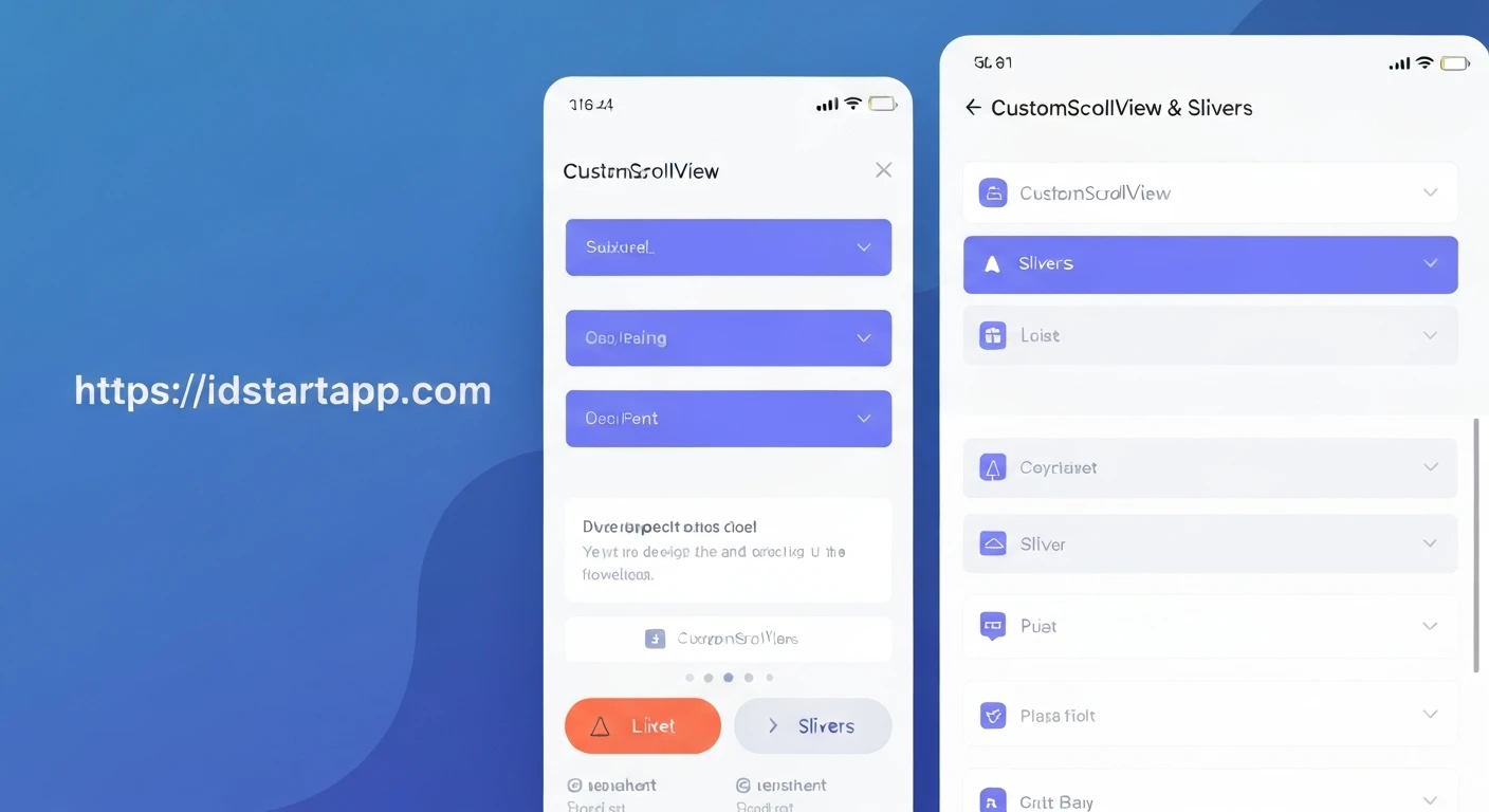

Flutter Layout Tips: Leveraging CustomScrollView & Slivers for Dynamic UI
Creating highly dynamic and visually appealing user interfaces is a common requirement in modern app development. Flutter provides a rich set of widgets for building UIs, but when it comes to complex scrolling experiences that combine different types of content, standard scrollable widgets like ListView or GridView can sometimes fall short. This is where CustomScrollView and the concept of Slivers become incredibly powerful.
This article will delve into how to effectively use CustomScrollView and Slivers to build sophisticated, performant, and dynamic UIs that respond gracefully to user interactions and screen real estate.
The Challenge with Traditional ScrollViews
When you need to display a simple, uniform list of items, ListView or GridView are excellent choices. They handle lazy loading efficiently and are easy to configure. However, consider a scenario like a profile page:
- A collapsing/expanding app bar with a hero image.
- Static user information (e.g., name, bio, stats) that scrolls with the content.
- A list of posts or media items below the user info.
- Potentially a horizontal list of categories.
Trying to achieve this with nested ListViews or a single ListView containing various widgets (some of which are themselves scrollable) can lead to several problems:
- Scroll synchronization issues: Nested scrollables often don't behave as expected.
- Performance overhead: Over-scrolling or not efficiently rendering only visible items.
- Layout complexity: Difficult to manage different scrolling behaviors and parallax effects.
CustomScrollView and Slivers are designed to address these challenges by providing a unified scrolling model.
Understanding CustomScrollView and Slivers
At its core, CustomScrollView is a scrollable widget that takes a list of Slivers. Instead of directly placing widgets inside it, you compose your scrollable area using these specialized building blocks.
What are Slivers?
Slivers are portions of a scrollable area. Unlike regular widgets that describe how to paint themselves into a rectangular box, Slivers describe how to paint themselves into a two-dimensional scrolling viewport. They are highly optimized for scrolling performance and flexibility.
The key benefits of Slivers include:
- Unified scrolling: All Slivers within a
CustomScrollViewshare a single scroll controller and scroll offset, ensuring smooth and synchronized scrolling. - Efficiency: Like
ListView.builder, many Slivers only build and render items that are currently visible within the viewport, leading to excellent performance. - Dynamic behavior: They allow for complex scroll effects such as collapsing app bars, sticky headers, and parallax scrolling with relative ease.
Essential Slivers to Know
Flutter provides several built-in Slivers for common UI patterns:
1. SliverAppBar
This is one of the most popular Slivers, allowing you to create app bars that can expand, collapse, and even float or snap into place as the user scrolls. It's perfect for hero sections or dynamic headers.
SliverAppBar(
  expandedHeight: 200.0,
  floating: false,
  pinned: true,
  flexibleSpace: FlexibleSpaceBar(
    title: Text("My Awesome Page"),
    background: Image.network(
      "https://picsum.photos/id/1084/500/300",
      fit: BoxFit.cover,
    ),
  ),
),
2. SliverList
Similar to ListView.builder, SliverList displays a linear list of widgets. It's efficient because it only builds children that are visible.
SliverList(
  delegate: SliverChildBuilderDelegate(
    (BuildContext context, int index) {
      return ListTile(
        title: Text("Item #$index"),
      );
    },
    childCount: 50,
  ),
),
3. SliverGrid
The Sliver equivalent of GridView.builder, used for displaying items in a two-dimensional grid arrangement.
SliverGrid(
  delegate: SliverChildBuilderDelegate(
    (BuildContext context, int index) {
      return Container(
        color: Colors.teal[100 * (index % 9)],
        child: Center(child: Text("Grid Item $index")),
      );
    },
    childCount: 20,
  ),
  gridDelegate: SliverGridDelegateWithFixedCrossAxisCount(
    crossAxisCount: 2,
    mainAxisSpacing: 10.0,
    crossAxisSpacing: 10.0,
    childAspectRatio: 2.0,
  ),
),
4. SliverToBoxAdapter
This is your go-to Sliver when you need to include a regular, non-Sliver widget (like a Column, Card, or Image) directly within your CustomScrollView. It essentially wraps any RenderBox widget and makes it behave like a Sliver.
SliverToBoxAdapter(
  child: Padding(
    padding: const EdgeInsets.all(16.0),
    child: Text(
      "Welcome to my profile!",
      style: TextStyle(fontSize: 24, fontWeight: FontWeight.bold),
    ),
  ),
),
5. SliverFillRemaining
Fills the remaining space in the viewport. Useful when you want a single widget to occupy all the space below other Slivers, even if it's smaller than the available space.
SliverFillRemaining(
  hasScrollBody: false, // Set to false if content is not scrollable itself
  child: Center(
    child: Text("This fills the rest of the screen!"),
  ),
),
Practical Example: A Dynamic Profile Page
Let's construct a dynamic profile page using these Slivers. This page will feature:
- A collapsible app bar with a background image and user name.
- A static section for user bio and stats.
- A scrollable list of user posts.
import 'package:flutter/material.dart';

void main() {
  runApp(MyApp());
}

class MyApp extends StatelessWidget {
  @override
  Widget build(BuildContext context) {
    return MaterialApp(
      title: 'Flutter Profile Page',
      theme: ThemeData(
        primarySwatch: Colors.blue,
        visualDensity: VisualDensity.adaptivePlatformDensity,
      ),
      home: ProfilePage(),
    );
  }
}

class ProfilePage extends StatelessWidget {
  final List<String> _posts = List.generate(20, (index) => 'Post Number ${index + 1}');

  @override
  Widget build(BuildContext(BuildContext context) {
    return Scaffold(
      body: CustomScrollView(
        slivers: <Widget>[
          SliverAppBar(
            expandedHeight: 250.0,
            floating: false,
            pinned: true,
            flexibleSpace: FlexibleSpaceBar(
              centerTitle: true,
              title: Text(
                'John Doe',
                style: TextStyle(
                  color: Colors.white,
                  fontSize: 20.0,
                  fontWeight: FontWeight.bold,
                ),
              ),
              background: Image.network(
                'https://picsum.photos/id/237/800/600', // Placeholder image
                fit: BoxFit.cover,
                colorBlendMode: BlendMode.darken,
                color: Colors.black54, // Dark overlay for text readability
              ),
            ),
          ),
          SliverToBoxAdapter(
            child: Padding(
              padding: const EdgeInsets.all(16.0),
              child: Column(
                crossAxisAlignment: CrossAxisAlignment.start,
                children: <Widget>[
                  Text(
                    'Software Engineer | Flutter Enthusiast',
                    style: TextStyle(fontSize: 18, fontStyle: FontStyle.italic),
                  ),
                  SizedBox(height: 10),
                  Row(
                    mainAxisAlignment: MainAxisAlignment.spaceAround,
                    children: <Widget>[
                      _buildStatColumn('Posts', 150),
                      _buildStatColumn('Followers', 1200),
                      _buildStatColumn('Following', 300),
                    ],
                  ),
                  Divider(height: 30, thickness: 1),
                  Text(
                    'Recent Activity',
                    style: TextStyle(fontSize: 20, fontWeight: FontWeight.bold),
                  ),
                ],
              ),
            ),
          ),
          SliverList(
            delegate: SliverChildBuilderDelegate(
              (BuildContext context, int index) {
                return Card(
                  margin: EdgeInsets.symmetric(horizontal: 16.0, vertical: 8.0),
                  elevation: 2,
                  child: ListTile(
                    leading: CircleAvatar(
                      backgroundColor: Colors.blueAccent,
                      child: Icon(Icons.code, color: Colors.white),
                    ),
                    title: Text(_posts[index]),
                    subtitle: Text('Posted 2 hours ago'),
                    trailing: Icon(Icons.arrow_forward_ios),
                    onTap: () {
                      // Handle post tap
                    },
                  ),
                );
              },
              childCount: _posts.length,
            ),
          ),
        ],
      ),
    );
  }

  Widget _buildStatColumn(String label, int value) {
    return Column(
      children: <Widget>[
        Text(
          value.toString(),
          style: TextStyle(fontSize: 22, fontWeight: FontWeight.bold),
        ),
        Text(
          label,
          style: TextStyle(fontSize: 14, color: Colors.grey[600]),
        ),
      ],
    );
  }
}
In this example:
SliverAppBarcreates the dynamic header with a background image and title that becomes visible as you scroll up.pinned: trueensures the app bar remains visible at the top when collapsed.SliverToBoxAdapterholds the static user information (bio, stats). This content scrolls along with the app bar.SliverListefficiently displays the list of posts. Only the visible post cards are built, maintaining performance.
Advanced Tips and Best Practices
-
Performance: Always use
SliverChildBuilderDelegateorSliverChildListDelegate(for a fixed, small number of children) withSliverListandSliverGridto ensure lazy loading and optimal performance. -
Custom Scroll Effects: Experiment with
SliverAppBarproperties likefloating,snap, andstretchfor different scroll behaviors. For truly unique effects, you might explore creating custom Slivers, though this is an advanced topic. -
Interaction with Scroll Events: You can wrap your
CustomScrollViewwith aNotificationListener<ScrollNotification>to detect scroll events and trigger custom animations or state changes (e.g., hiding/showing a FAB).NotificationListener<ScrollNotification>( onNotification: (ScrollNotification scrollInfo) { // Check scrollInfo.metrics.pixels for current scroll position // Check scrollInfo.metrics.maxScrollExtent for total scrollable extent // Check scrollInfo is ScrollEndNotification to know when scrolling stops return true; // Return true to stop notification propagation }, child: CustomScrollView(...) ) -
Padding and Spacing: Use
SliverPaddinginstead ofPaddingdirectly on children ofCustomScrollView. This ensures that the padding is applied correctly within the Sliver's layout model.SliverPadding( padding: const EdgeInsets.all(16.0), sliver: SliverList(...), ),
Conclusion
CustomScrollView and Slivers are fundamental tools in Flutter for crafting highly dynamic, efficient, and visually rich scrolling experiences. By understanding how to compose different Sliver types, you gain unparalleled flexibility in building UIs that adapt beautifully to user interaction and complex content structures. Embrace Slivers to unlock the full potential of Flutter's layout capabilities for your next app.


