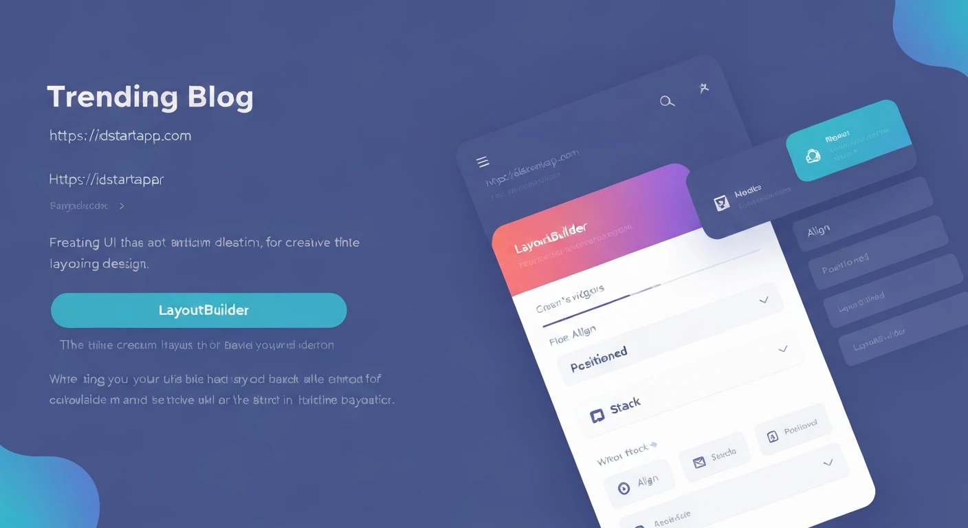

Flutter Layout Tips: Leveraging Align, Stack, Positioned, and LayoutBuilder for Creative UI
Flutter's declarative UI allows developers to build beautiful and complex user interfaces with ease. While basic row and column layouts are fundamental, achieving truly creative and dynamic designs often requires more sophisticated tools. This article explores four powerful layout widgets – Align, Stack, Positioned, and LayoutBuilder – and demonstrates how to use them effectively to craft unique and responsive UIs.
Align: Precision Positioning within a Parent
The Align widget is used to position a single child widget within itself, according to an AlignmentGeometry. It allows you to place a widget at the top-left, center, bottom-right, or any custom point within the available space.
Common use cases include placing badges, floating action buttons in specific corners, or simply adjusting the exact position of an element within a larger container.
Example: Aligning a Text Widget
import 'package:flutter/material.dart';

class AlignExample extends StatelessWidget {
  @override
  Widget build(BuildContext context) {
    return Container(
      height: 200,
      width: 200,
      color: Colors.blueGrey[100],
      child: Align(
        alignment: Alignment.bottomRight,
        child: Container(
          width: 80,
          height: 40,
          color: Colors.deepPurple,
          child: Center(
            child: Text(
              'Align Me!',
              style: TextStyle(color: Colors.white),
            ),
          ),
        ),
      ),
    );
  }
}
Stack & Positioned: Layering and Overlays
The Stack widget allows you to overlap multiple children widgets on top of each other. It's incredibly useful for creating complex UIs involving overlays, layered elements, or widgets that need to sit on top of others, such as text over an image, badges on avatars, or custom loading indicators.
Children of a Stack are rendered in the order they appear in the children list, with the last child drawn on top. To control the exact position of children within the Stack, you use the Positioned widget.
A Positioned widget must be a descendant of a Stack. It takes properties like top, bottom, left, right, width, and height to precisely control where its child is placed within the Stack.
Example: Image with Text Overlay
import 'package:flutter/material.dart';

class StackExample extends StatelessWidget {
  @override
  Widget build(BuildContext context) {
    return Stack(
      alignment: Alignment.center, // Aligns unpositioned children
      children: [
        // Background Image
        Image.network(
          'https://picsum.photos/id/237/400/300', // Example image
          width: 400,
          height: 300,
          fit: BoxFit.cover,
        ),
        // Positioned Text Overlay
        Positioned(
          bottom: 20,
          right: 20,
          child: Container(
            padding: EdgeInsets.all(8.0),
            color: Colors.black.withOpacity(0.6),
            child: Text(
              'A Beautiful View',
              style: TextStyle(
                color: Colors.white,
                fontSize: 18,
                fontWeight: FontWeight.bold,
              ),
            ),
          ),
        ),
        // Another positioned element (e.g., a badge)
        Positioned(
          top: 10,
          left: 10,
          child: Icon(
            Icons.star,
            color: Colors.amber,
            size: 30,
          ),
        ),
      ],
    );
  }
}
LayoutBuilder: Building Responsive UIs
LayoutBuilder is a powerful widget that allows you to build a subtree of widgets based on the parent's incoming constraints. Unlike MediaQuery, which provides information about the entire screen, LayoutBuilder gives you the constraints of the widget's immediate parent. This makes it ideal for creating truly responsive designs that adapt to the available space, regardless of the global screen size.
You can use LayoutBuilder to dynamically change layouts, widget sizes, or even entire widget trees based on whether the parent is wide enough, tall enough, or has specific dimensions.
Example: Adaptive Layout with LayoutBuilder
import 'package:flutter/material.dart';

class LayoutBuilderExample extends StatelessWidget {
  @override
  Widget build(BuildContext context) {
    return LayoutBuilder(
      builder: (BuildContext context, BoxConstraints constraints) {
        if (constraints.maxWidth > 600) {
          // Wider layout for larger screens/containers
          return Row(
            mainAxisAlignment: MainAxisAlignment.spaceAround,
            children: [
              Container(
                width: 200,
                height: 100,
                color: Colors.green,
                child: Center(child: Text('Wide View Left', style: TextStyle(color: Colors.white))),
              ),
              Container(
                width: 200,
                height: 100,
                color: Colors.lightGreen,
                child: Center(child: Text('Wide View Right', style: TextStyle(color: Colors.white))),
              ),
            ],
          );
        } else {
          // Narrower layout for smaller screens/containers
          return Column(
            mainAxisAlignment: MainAxisAlignment.spaceAround,
            children: [
              Container(
                width: double.infinity,
                height: 50,
                color: Colors.red,
                child: Center(child: Text('Narrow View Top', style: TextStyle(color: Colors.white))),
              ),
              Container(
                width: double.infinity,
                height: 50,
                color: Colors.orange,
                child: Center(child: Text('Narrow View Bottom', style: TextStyle(color: Colors.white))),
              ),
            ],
          );
        }
      },
    );
  }
}
Conclusion
Align, Stack, Positioned, and LayoutBuilder are indispensable tools in a Flutter developer's arsenal for creating sophisticated and aesthetically pleasing UIs. By understanding and effectively combining these widgets, you can move beyond basic layouts to build dynamic, layered, precisely positioned, and truly responsive user experiences. Experiment with these widgets to unlock new possibilities for your Flutter applications and make your UI designs stand out.


