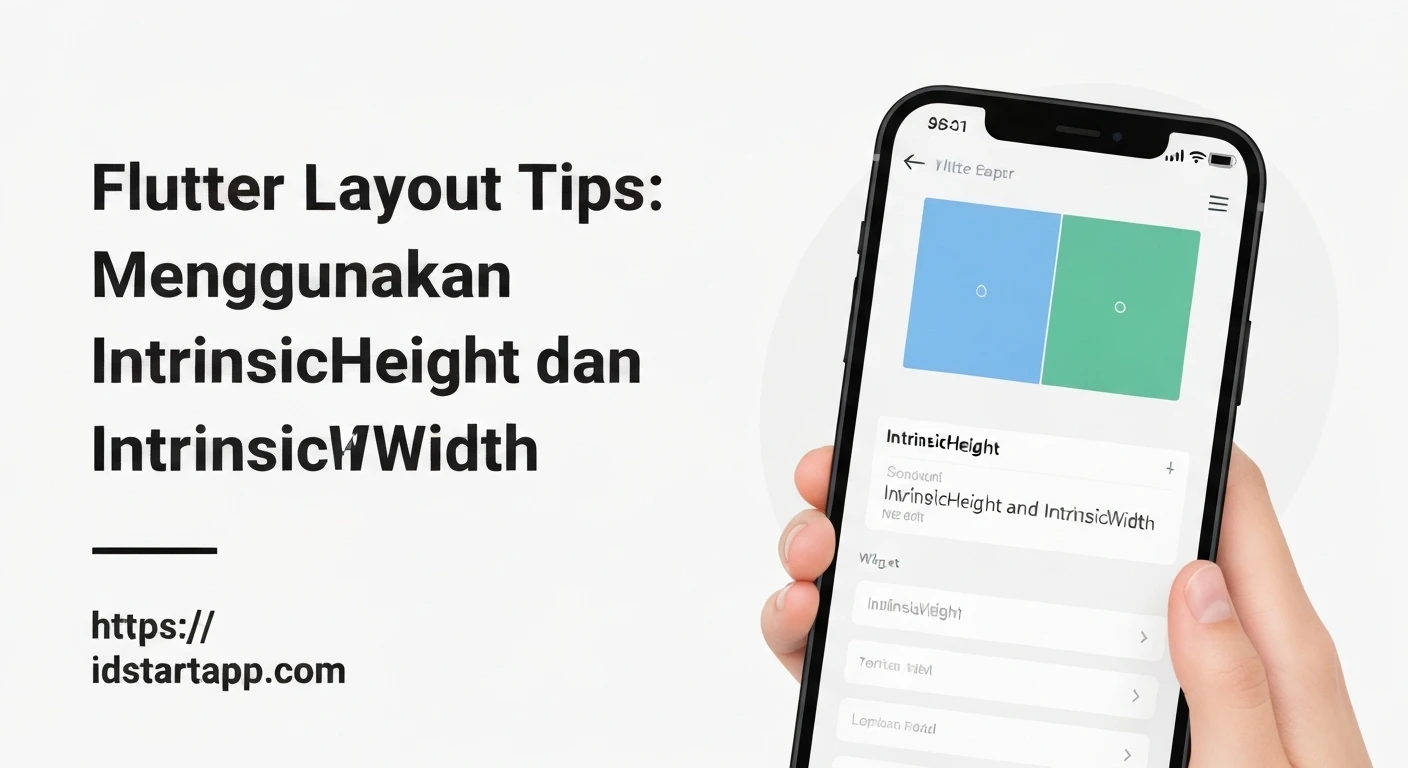

Flutter Layout Tips: Harnessing IntrinsicHeight and IntrinsicWidth
Flutter's declarative UI paradigm excels in creating flexible and responsive layouts. Its layout system, primarily based on constraint propagation, typically works in a top-down fashion: parents pass constraints to children, and children pass their size preferences back up. However, there are specific scenarios where a child's natural (or "intrinsic") size needs to influence its parent's dimensions, especially when dealing with unconstrained widgets or siblings needing to align based on varied content.
This article explores IntrinsicHeight and IntrinsicWidth, two powerful, albeit expensive, widgets that allow you to achieve precise content-driven layouts when standard flex widgets aren't sufficient.
Understanding Flutter's Layout Model
Before diving into intrinsic widgets, it's crucial to recall Flutter's core layout principle: "Constraints go down, sizes go up, parent sets position." A parent widget dictates the maximum (and sometimes minimum) size a child can take. The child then chooses its size within those constraints and passes it back to the parent. This efficient model generally avoids multiple layout passes.
However, what if a parent needs to size itself based on the preferred or natural size of its children, especially when those children aren't given strict constraints? For instance, a Row that needs to determine its own height based on the tallest child, or a Column that needs to determine its own width based on the widest child.
The Challenge: Content-Driven Parent Sizing
Consider a Row containing two items with different content heights, separated by a VerticalDivider. If the Row's height isn't explicitly constrained (e.g., it's inside another Column with mainAxisSize: MainAxisSize.min), the VerticalDivider might not stretch to the height of the tallest item, or the Row itself might not expand to accommodate it properly without additional hints.
This is where IntrinsicHeight and IntrinsicWidth come into play. They force a "double-pass" layout, first determining the intrinsic size of their child, and then laying out the child with that determined size.
IntrinsicHeight
The IntrinsicHeight widget sizes its child to the child's intrinsic height. This means it queries its child to find out what height it would prefer to be if it were given infinite vertical constraints. The parent of IntrinsicHeight can then use this information to size itself appropriately.
When to use IntrinsicHeight:
- When a parent (like a
RoworColumn) needs to size itself vertically based on the maximum intrinsic height of its children. - To make all siblings in a
Row(that haveCrossAxisAlignment.stretch) stretch to the height of the tallest sibling, even if the parentRowis not constrained vertically. - Commonly used with
VerticalDividerto ensure it spans the full height of its content-driven neighbors.
Example: Matching Heights in a Row
In this example, we have a Column that wraps its content vertically. Inside, a Row contains two containers with varying content and a VerticalDivider. By wrapping the Row with IntrinsicHeight, we ensure the Row takes the height of its tallest child, and subsequently, the VerticalDivider stretches to match that height, alongside the other children that also stretch due to CrossAxisAlignment.stretch.
Column(
  mainAxisSize: MainAxisSize.min, // Column wraps its content vertically
  children: [
    Text('Header'),
    IntrinsicHeight( // Forces the Row to determine its height by its tallest child
      child: Row(
        crossAxisAlignment: CrossAxisAlignment.stretch, // Children stretch to parent's height
        children: [
          Container(
            color: Colors.red[100],
            padding: EdgeInsets.all(8),
            child: Column( // This column will determine its intrinsic height
              mainAxisSize: MainAxisSize.min,
              children: [
                Text('Short content'),
                Text('More text'),
              ],
            ),
          ),
          VerticalDivider(width: 20, thickness: 2, color: Colors.black),
          Container(
            color: Colors.blue[100],
            padding: EdgeInsets.all(8),
            child: Column( // This column also determines its intrinsic height
              mainAxisSize: MainAxisSize.min,
              children: [
                Text('A much longer content that wraps multiple lines.'),
                Text('This column will be taller.'),
                Text('Even more content here.'),
              ],
            ),
          ),
        ],
      ),
    ),
    Text('Footer'),
  ],
)
IntrinsicWidth
Similar to IntrinsicHeight, the IntrinsicWidth widget sizes its child to the child's intrinsic width. It queries its child to find out what width it would prefer to be if it were given infinite horizontal constraints. This allows its parent to react to the child's preferred width.
When to use IntrinsicWidth:
- When a parent (like a
ColumnorRow) needs to size itself horizontally based on the maximum intrinsic width of its children. - To make all siblings in a
Column(that haveCrossAxisAlignment.stretch) stretch to the width of the widest sibling, even if the parentColumnis not constrained horizontally. - Useful for aligning text inputs or buttons to the widest item in a vertical list.
Example: Matching Widths in a Column
Here, we have a Row that wraps its content horizontally. Inside, a Column contains two containers with varying text content and a Divider. By wrapping the Column with IntrinsicWidth, the Column expands to the width of its widest child. Then, CrossAxisAlignment.stretch ensures that all children within that Column also match this maximum width.
Row(
  mainAxisSize: MainAxisSize.min, // Row wraps its content horizontally
  children: [
    Text('Left Panel'),
    IntrinsicWidth( // Forces Column to determine its width by its widest child
      child: Column(
        crossAxisAlignment: CrossAxisAlignment.stretch, // Children stretch to parent's width
        children: [
          Container(
            color: Colors.green[100],
            padding: EdgeInsets.all(8),
            child: Text('Short option'),
          ),
          Divider(height: 20, thickness: 2, color: Colors.black),
          Container(
            color: Colors.orange[100],
            padding: EdgeInsets.all(8),
            child: Text('A very long option that needs more space'),
          ),
        ],
      ),
    ),
    Text('Right Panel'),
  ],
)
Key Considerations and Performance Implications
While IntrinsicHeight and IntrinsicWidth solve specific layout challenges, they come with a significant caveat: performance.
- Double-Pass Layout: These widgets work by performing a "double-pass" layout. First, they lay out their child with unconstrained dimensions to determine its intrinsic size. Then, they lay out the child a second time with the determined intrinsic constraints. This process is inherently more expensive than Flutter's standard single-pass layout.
- Avoid Unnecessary Use: Due to their performance cost,
IntrinsicHeightandIntrinsicWidthshould be used sparingly and only when strictly necessary. Always explore alternative layout solutions first, such as:- Using
ExpandedorFlexiblewidgets withinRoworColumn. - Specifying fixed sizes with
SizedBoxorContainer. - Using
AlignorFractionallySizedBoxfor proportional sizing. - Leveraging
LayoutBuilderfor reactive sizing based on parent constraints.
- Using
- Complexity: Introducing intrinsic dimensions can sometimes make your layout code harder to reason about, as it breaks the typical top-down constraint flow.
Conclusion
IntrinsicHeight and IntrinsicWidth are powerful tools in the Flutter layout arsenal, enabling precise content-driven sizing in scenarios where standard constraint-based layouts fall short. They are invaluable for creating highly adaptive UIs, such as aligning elements based on their natural content size or ensuring dividers stretch appropriately. However, always be mindful of their performance impact and consider them a last resort after exploring simpler, more efficient layout alternatives. When used judiciously, they can help you craft sophisticated and visually consistent user interfaces.


