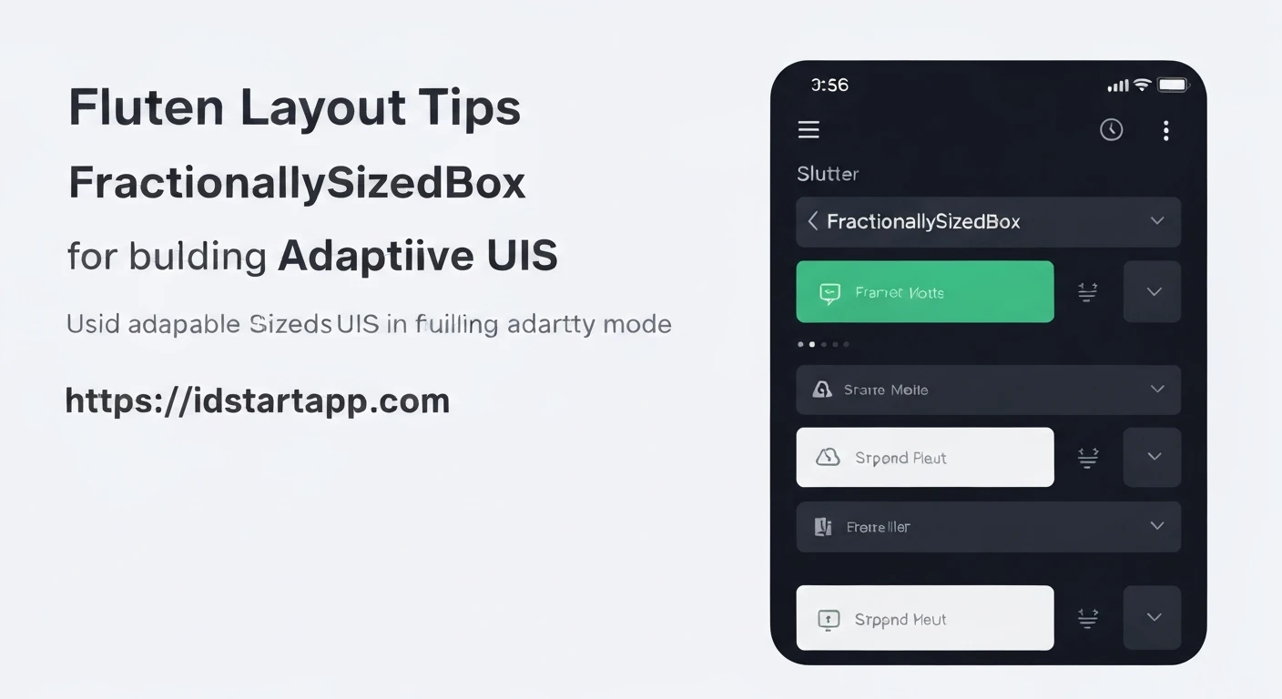

Flutter Layout Tips: Harnessing FractionallySizedBox for Adaptive UI
Building user interfaces that look consistent and function well across a myriad of device sizes, orientations, and aspect ratios is a cornerstone of modern application development. This concept, known as Adaptive UI or Responsive Design, is crucial for delivering a seamless user experience. Flutter, with its declarative UI toolkit, offers a powerful array of layout widgets to achieve this, and among them, FractionallySizedBox stands out as a simple yet highly effective tool for creating proportion-based layouts.
Understanding FractionallySizedBox
The FractionallySizedBox widget sizes its child to a fraction of the *available space* provided by its parent. Unlike fixed-size widgets like SizedBox, which define absolute dimensions, or flexible widgets like Expanded, which fill remaining space, FractionallySizedBox allows you to specify dimensions as a percentage of its direct parent's constraints.
Its primary properties are:
widthFactor: A double value (typically between 0.0 and 1.0) that determines the child's width as a fraction of the parent's width. If null, the child determines its own width.heightFactor: A double value that determines the child's height as a fraction of the parent's height. If null, the child determines its own height.
If both widthFactor and heightFactor are null, FractionallySizedBox effectively behaves like an Align widget, allowing its child to size itself while positioning it according to the alignment property.
How it Works: A Simple Illustration
Let's consider a basic example to demonstrate how FractionallySizedBox works. Imagine you have a container that is 300x300 pixels, and you want its child to occupy 75% of its width and 50% of its height.
import 'package:flutter/material.dart';

void main() {
  runApp(MyApp());
}

class MyApp extends StatelessWidget {
  @override
  Widget build(BuildContext context) {
    return MaterialApp(
      home: Scaffold(
        appBar: AppBar(title: Text('FractionallySizedBox Demo')),
        body: Center(
          child: Container(
            color: Colors.blueGrey[100],
            width: 300,
            height: 300,
            child: FractionallySizedBox(
              widthFactor: 0.75, // Child takes 75% of parent's width (300 * 0.75 = 225)
              heightFactor: 0.5,  // Child takes 50% of parent's height (300 * 0.5 = 150)
              alignment: Alignment.center, // Position child in the center
              child: Container(
                color: Colors.deepPurple,
                child: Center(
                  child: Text(
                    'I am fractional!',
                    style: TextStyle(color: Colors.white, fontSize: 18),
                  ),
                ),
              ),
            ),
          ),
        ),
      ),
    );
  }
}
In this code, the inner Container will automatically resize to 225 pixels wide and 150 pixels tall, centered within its 300x300 parent Container. This demonstrates the core functionality: the child's size is directly proportional to its parent's constraints.
Practical Use Cases
FractionallySizedBox shines in scenarios where you need proportional sizing:
-
Percentage-Based Layouts: Divide your screen or a section of your UI into distinct parts based on percentages. For instance, a header that always occupies 30% of the available vertical space, or a content area that fills 70%.
-
Dynamic Sizing of UI Elements: Ensure that specific widgets, like images, buttons, or input fields, maintain a certain proportion relative to their containing parent. An image might always be 80% of its parent
Card's width, regardless of the card's absolute size. -
Responsive Spacing: While `Padding` is generally preferred for static padding, `FractionallySizedBox` can be used to create responsive "gaps" between elements if you need a spacer that scales with its parent's dimensions, by using it with a transparent or empty child.
Advantages
-
Simplicity: It's straightforward to use, requiring only a factor for width and/or height.
-
Responsiveness: Widgets automatically adapt their size when their parent's size changes, leading to naturally responsive UIs.
-
Consistency: Helps maintain proportional relationships between UI elements across different screen densities and device types.
Considerations and Best Practices
While powerful, FractionallySizedBox has specific interaction behaviors you should be aware of:
-
Parent Constraints are Crucial: For
FractionallySizedBoxto work as intended, its parent must provide bounded constraints (i.e., a defined width and/or height). If placed directly inside a widget likeColumnorRowwithout anExpandedorFlexiblewrapper, it might not receive a constrained size and could either not work or throw an error (e.g., if both factors are non-null and the parent provides infinite constraints in that direction). -
Combining with
Expanded/Flexible: Often, you'll useFractionallySizedBoxin conjunction withExpandedorFlexible.Expanded(within aRoworColumn) provides a bounded space, and thenFractionallySizedBoxcan size its child as a fraction of that allocated space. -
Screen-Based Fractions with
MediaQuery: If you need a fraction of the entire screen, you can combineFractionallySizedBoxwithMediaQuery.of(context).size. You'd typically wrap theFractionallySizedBoxwithin aSizedBoxorContainerwhose dimensions are calculated fromMediaQuery.
Advanced Example: Adaptive Header and Content Layout
Let's create a more complex adaptive layout where a header takes a specific percentage of the screen height, and the main content area adjusts accordingly, containing elements that are also fractionally sized.
import 'package:flutter/material.dart';

void main() {
  runApp(MyApp());
}

class MyApp extends StatelessWidget {
  @override
  Widget build(BuildContext context) {
    return MaterialApp(
      home: Scaffold(
        appBar: AppBar(title: Text('Adaptive Layout with FractionallySizedBox')),
        body: AdaptiveLayoutExample(),
      ),
    );
  }
}

class AdaptiveLayoutExample extends StatelessWidget {
  @override
  Widget build(BuildContext context) {
    // Column automatically receives the full height and width constraints
    // from the Scaffold's body.
    return Column(
      children: [
        // Header section: takes 30% of the available height
        FractionallySizedBox(
          heightFactor: 0.3, // 30% of the Column's available height
          child: Container(
            color: Colors.blueAccent,
            child: Center(
              child: Text(
                'Adaptive Header',
                style: TextStyle(color: Colors.white, fontSize: 24),
              ),
            ),
          ),
        ),
        // Spacer in between, taking 5% of height
        FractionallySizedBox(
          heightFactor: 0.05,
          child: Container(color: Colors.transparent), // Transparent for visual spacing
        ),
        // Content section: takes the remaining 65% of the height
        Expanded( // Expanded within Column to take remaining space
          child: FractionallySizedBox(
            widthFactor: 0.9, // Content block takes 90% of Expanded's width
            child: Container(
              color: Colors.greenAccent,
              padding: EdgeInsets.all(16.0),
              child: Column(
                mainAxisAlignment: MainAxisAlignment.center,
                children: [
                  Text(
                    'Main Content Area',
                    style: TextStyle(fontSize: 20, fontWeight: FontWeight.bold),
                  ),
                  SizedBox(height: 10),
                  Text(
                    'This content block scales to 90% of the available width '
                    'and occupies the remaining vertical space after the header and spacer.',
                    textAlign: TextAlign.center,
                  ),
                  SizedBox(height: 20),
                  // A button that takes 70% of its immediate parent's (FractionallySizedBox's) width
                  FractionallySizedBox(
                    widthFactor: 0.7,
                    child: ElevatedButton(
                      onPressed: () {},
                      child: Text('Adaptive Button'),
                    ),
                  ),
                ],
              ),
            ),
          ),
        ),
      ],
    );
  }
}
In this example:
- The main
Columnfills the entire screen body. - The first
FractionallySizedBoxensures the header always takes 30% of the screen's height. - A second
FractionallySizedBoxcreates a 5% height transparent spacer. - The
Expandedwidget then claims the remaining 65% of the vertical space. - Inside the
Expanded, anotherFractionallySizedBoxmakes the content area occupy 90% of the available horizontal width. - Finally, a button within the content area uses
FractionallySizedBoxto take 70% of its parent's width, demonstrating nested fractional sizing.
Conclusion
FractionallySizedBox is a deceptively simple widget that offers immense power for building adaptive UIs in Flutter. By allowing you to define sizes proportionally, it helps in creating layouts that gracefully adjust to different screen dimensions, providing a consistent and aesthetically pleasing experience. When combined with other flexible layout widgets like Expanded and `MediaQuery`, it becomes an indispensable tool in any Flutter developer's arsenal for crafting truly responsive applications.


