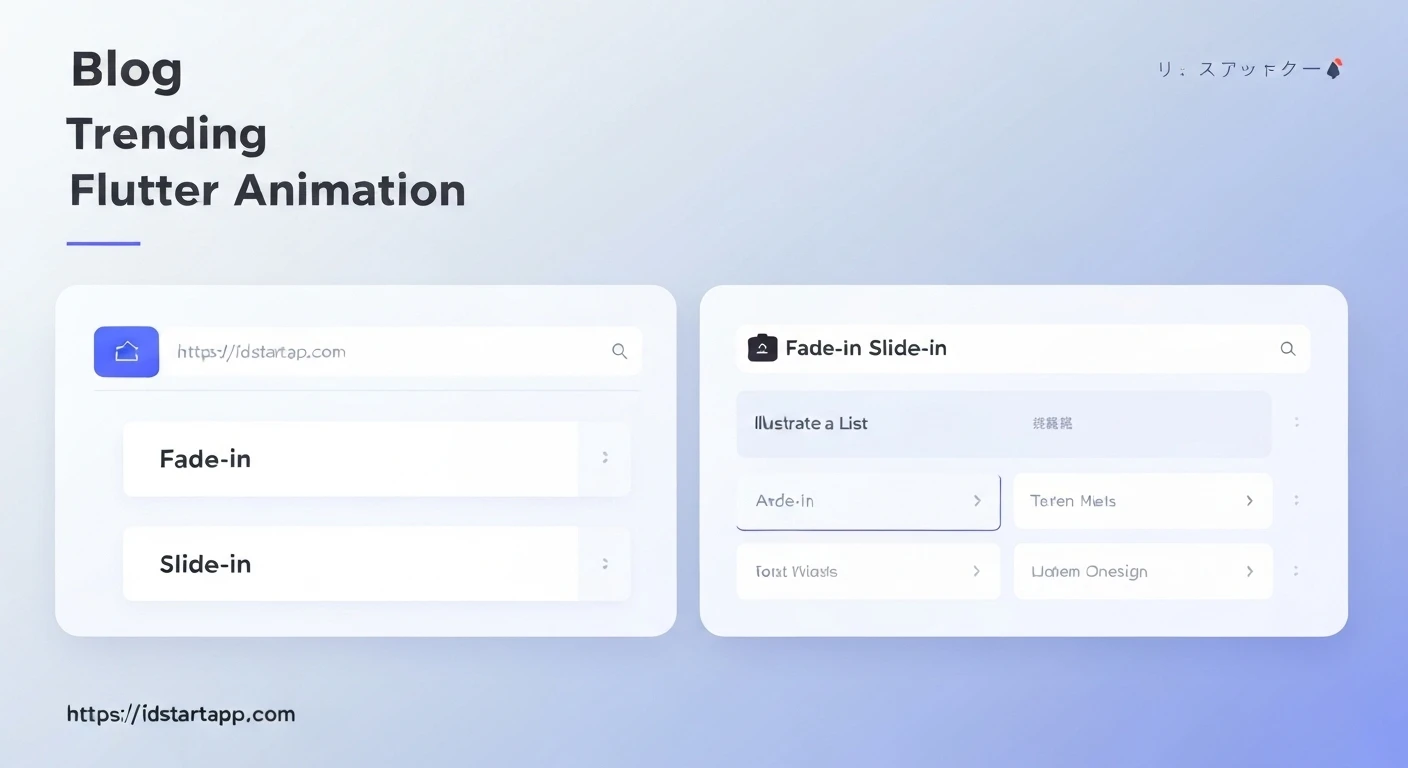

Flutter Fade-In and Slide-In Animations for Lists
Animations play a crucial role in enhancing user experience by providing visual feedback and guiding users through the application's flow. In Flutter, creating beautiful and performant animations, especially for dynamic lists, is both powerful and intuitive. This article will delve into implementing professional-grade fade-in and slide-in animations for list items, covering both initial load scenarios using ListView.builder and dynamic item changes with AnimatedList.
The Power of List Animations
When items appear in a list, whether on initial load or as a result of user interaction (like adding a new item), a sudden appearance can feel jarring. Animations, such as a gentle fade-in or a subtle slide from the side, can:
- Improve User Perception: Make the UI feel more fluid and responsive.
- Highlight Changes: Draw attention to newly added or removed items.
- Enhance Engagement: Create a more delightful and memorable user interface.
Core Animation Concepts in Flutter
Before diving into list-specific animations, let's briefly review the fundamental Flutter animation components we'll be using:
AnimationController: Manages the animation. It can be started, stopped, reversed, and gives a value between 0.0 and 1.0 over a specified duration.Tween<T>: Defines a range of values over which an animation should interpolate. For example,Tween<double>(begin: 0.0, end: 1.0)for opacity orTween<Offset>(begin: Offset(1.0, 0.0), end: Offset.zero)for sliding.CurvedAnimation: Allows the animation to follow a non-linear curve (e.g.,Curves.easeOut,Curves.bounceIn) instead of a linear progression.FadeTransition: An animated widget that fades its child in and out. It takes anAnimation<double>for itsopacityproperty.SlideTransition: An animated widget that animates the position of its child. It takes anAnimation<Offset>for itspositionproperty.
Implementing Fade-In and Slide-In for ListView.builder (Initial Load)
This approach is ideal for animating list items when they first appear on the screen, typically after data has been loaded. We'll create a reusable widget that wraps each list item and animates itself upon initialization, with a staggered delay to make the list appear item by item.
1. Create an AnimatedListItem Widget
This StatefulWidget will manage its own AnimationController and apply both fade and slide transitions to its child.
import 'package:flutter/material.dart';

class AnimatedListItem extends StatefulWidget {
  final Widget child;
  final int index;
  final int totalItems; // Not strictly needed for this example, but useful for context
  final Duration animationDuration;
  final Duration delayMultiplier;

  const AnimatedListItem({
    Key? key,
    required this.child,
    required this.index,
    this.totalItems = 1,
    this.animationDuration = const Duration(milliseconds: 500),
    this.delayMultiplier = const Duration(milliseconds: 50),
  }) : super(key: key);

  @override
  _AnimatedListItemState createState() => _AnimatedListItemState();
}

class _AnimatedListItemState extends State<AnimatedListItem> with SingleTickerProviderStateMixin {
  late AnimationController _animationController;
  late Animation<double> _fadeAnimation;
  late Animation<Offset> _slideAnimation;

  @override
  void initState() {
    super.initState();

    _animationController = AnimationController(
      vsync: this,
      duration: widget.animationDuration,
    );

    _fadeAnimation = Tween<double>(begin: 0.0, end: 1.0).animate(
      CurvedAnimation(
        parent: _animationController,
        curve: Curves.easeOut,
      ),
    );

    _slideAnimation = Tween<Offset>(begin: const Offset(0.5, 0.0), end: Offset.zero).animate(
      CurvedAnimation(
        parent: _animationController,
        curve: Curves.easeOutCubic,
      ),
    );

    // Stagger the animation start based on index
    Future.delayed(widget.delayMultiplier * widget.index, () {
      if (mounted) {
        _animationController.forward();
      }
    });
  }

  @override
  void dispose() {
    _animationController.dispose();
    super.dispose();
  }

  @override
  Widget build(BuildContext context) {
    return FadeTransition(
      opacity: _fadeAnimation,
      child: SlideTransition(
        position: _slideAnimation,
        child: widget.child,
      ),
    );
  }
}
2. Use AnimatedListItem in a ListView.builder
Now, wrap each item in your ListView.builder with the AnimatedListItem, passing the item's index.
import 'package:flutter/material.dart';
// Make sure to import AnimatedListItem from its file

class InitialLoadAnimationScreen extends StatefulWidget {
  const InitialLoadAnimationScreen({Key? key}) : super(key: key);

  @override
  State<InitialLoadAnimationScreen> createState() => _InitialLoadAnimationScreenState();
}

class _InitialLoadAnimationScreenState extends State<InitialLoadAnimationScreen> {
  final List<String> _items = List.generate(20, (index) => 'Item ${index + 1}');

  @override
  Widget build(BuildContext context) {
    return Scaffold(
      appBar: AppBar(
        title: const Text('Initial Load List Animation'),
      ),
      body: ListView.builder(
        padding: const EdgeInsets.all(8.0),
        itemCount: _items.length,
        itemBuilder: (context, index) {
          return AnimatedListItem(
            index: index,
            child: Card(
              margin: const EdgeInsets.symmetric(vertical: 4.0, horizontal: 0.0),
              elevation: 2.0,
              child: ListTile(
                leading: CircleAvatar(child: Text('${index + 1}')),
                title: Text(_items[index]),
                subtitle: const Text('This is a list item with fade-in and slide-in animation.'),
              ),
            ),
          );
        },
      ),
    );
  }
}
In this example, each item animates sequentially from a slightly offset position (`Offset(0.5, 0.0)`) and fades in, creating a pleasing staggered effect as the list loads.
Implementing Fade-In and Slide-In for AnimatedList (Dynamic Changes)
AnimatedList is specifically designed for animating items when they are added or removed from a list. It provides an Animation object directly to its builder functions, which simplifies the process.
1. Set up AnimatedList with a GlobalKey
You need a GlobalKey<AnimatedListState> to control the insertion and removal of items programmatically.
import 'package:flutter/material.dart';

class DynamicListAnimationScreen extends StatefulWidget {
  const DynamicListAnimationScreen({Key? key}) : super(key: key);

  @override
  State<DynamicListAnimationScreen> createState() => _DynamicListAnimationScreenState();
}

class _DynamicListAnimationScreenState extends State<DynamicListAnimationScreen> {
  final GlobalKey<AnimatedListState> _listKey = GlobalKey<AnimatedListState>();
  final List<String> _data = [];
  int _nextItem = 0;

  @override
  void initState() {
    super.initState();
    _addItem(); // Add an initial item
  }

  void _addItem() {
    final int index = _data.length;
    _data.insert(index, 'Item ${_nextItem++}');
    _listKey.currentState!.insertItem(index, duration: const Duration(milliseconds: 500));
  }

  void _removeItem() {
    if (_data.isEmpty) return;
    final int index = _data.length - 1;
    final String removedItem = _data.removeAt(index);
    _listKey.currentState!.removeItem(
      index,
      (context, animation) => _buildRemovedItem(removedItem, animation),
      duration: const Duration(milliseconds: 500),
    );
  }

  // Helper function to build a list tile
  Widget _buildItem(String item, int index, Animation<double> animation) {
    return FadeTransition(
      opacity: animation,
      child: SlideTransition(
        position: Tween<Offset>(
          begin: const Offset(1, 0), // Slide from right
          end: Offset.zero,
        ).animate(CurvedAnimation(parent: animation, curve: Curves.easeOutCubic)),
        child: Card(
          margin: const EdgeInsets.symmetric(vertical: 4.0, horizontal: 0.0),
          elevation: 2.0,
          child: ListTile(
            leading: CircleAvatar(child: Text('${index + 1}')),
            title: Text(item),
            subtitle: Text('Added at: ${DateTime.now().second}s'),
            trailing: IconButton(
              icon: const Icon(Icons.delete, color: Colors.redAccent),
              onPressed: () {
                _removeItemAtIndex(index);
              },
            ),
          ),
        ),
      ),
    );
  }

  // Helper to build the item that is being removed (fades out and slides up)
  Widget _buildRemovedItem(String item, Animation<double> animation) {
    return FadeTransition(
      opacity: animation,
      child: SlideTransition(
        position: Tween<Offset>(
          begin: Offset.zero,
          end: const Offset(0, -1), // Slide up
        ).animate(CurvedAnimation(parent: animation, curve: Curves.easeInCubic)),
        child: Card(
          margin: const EdgeInsets.symmetric(vertical: 4.0, horizontal: 0.0),
          elevation: 2.0,
          color: Colors.red[50], // Indicate it's being removed
          child: ListTile(
            leading: const CircleAvatar(child: Icon(Icons.delete_forever)),
            title: Text(item, style: const TextStyle(fontStyle: FontStyle.italic, color: Colors.grey)),
            subtitle: const Text('Removing...'),
          ),
        ),
      ),
    );
  }

  void _removeItemAtIndex(int index) {
    final String removedItem = _data.removeAt(index);
    _listKey.currentState!.removeItem(
      index,
      (context, animation) => _buildRemovedItem(removedItem, animation),
      duration: const Duration(milliseconds: 500),
    );
  }

  @override
  Widget build(BuildContext context) {
    return Scaffold(
      appBar: AppBar(
        title: const Text('Dynamic List Animation'),
        actions: [
          IconButton(
            icon: const Icon(Icons.add),
            onPressed: _addItem,
          ),
          IconButton(
            icon: const Icon(Icons.remove),
            onPressed: _removeItem,
          ),
        ],
      ),
      body: AnimatedList(
        key: _listKey,
        initialItemCount: _data.length,
        itemBuilder: (context, index, animation) {
          return _buildItem(_data[index], index, animation);
        },
      ),
    );
  }
}
In this example:
_addItem()inserts a new item and calls_listKey.currentState!.insertItem(), which automatically triggers the animation defined initemBuilder._removeItem()removes the last item and calls_listKey.currentState!.removeItem(). This method requires a `builder` function for the item being removed, which allows you to define its specific removal animation. Here, the item slides up and fades out.- Both
FadeTransitionandSlideTransitiondirectly use theanimationobject provided byAnimatedList.
Best Practices and Considerations
- Performance: While Flutter's animation engine is highly optimized, be mindful of animating too many complex widgets simultaneously, especially on older devices. Keep your animations smooth (aim for 60fps).
- Customization: Experiment with different
Curves(e.g.,Curves.bounceOut,Curves.elasticOut) andDurationvalues to find the perfect feel for your app. Thebeginvalues forOffsetinSlideTransitioncan also be adjusted (e.g.,Offset(0.0, 1.0)for sliding from bottom). - Accessibility: Ensure animations don't interfere with accessibility features. Provide options to reduce motion if necessary for users sensitive to animations.
- When to Use Which:
- Use the
ListView.builderapproach with a custom `AnimatedListItem` for initial loading animations where all items appear with a staggered delay. - Use
AnimatedListwhen items are added or removed dynamically, and you need specific entry/exit animations for those changes.
- Use the
- Third-Party Packages: For more intricate staggered animations or when you want to avoid writing custom animation logic for every item, consider packages like
flutter_staggered_animations.
Conclusion
Implementing fade-in and slide-in animations for lists in Flutter significantly elevates the user experience. By leveraging Flutter's powerful animation framework with widgets like FadeTransition, SlideTransition, and managing AnimationControllers, you can create smooth, engaging, and professional-looking list interactions. Whether animating initial content load or dynamic list changes, these techniques provide a solid foundation for building delightful UIs.


